


 Order today for delivery by
 The Complete Guide to Displaying Frog Prints in Gallery Walls
How to build a frog-led gallery wall that reads as collected and curated, never costume party.


Frog prints sit in a strange corner of art history. They can look like a serious natural history collection, or they can tip your living room straight into a children's birthday party, and the difference is almost entirely about how you arrange them. This guide is about staying firmly on the right side of that line.
The golden rule: frog prints as anchors, not the entire wall
A gallery wall is not a theme. The moment every piece on a wall shares a subject, you have stopped curating and started decorating a themed bedroom. Frog prints are at their best when they act as the visual hook of a wider arrangement, not the whole story.
We think the safest working ratio is one frog print for every three to four other pieces. If you have a nine-piece gallery wall, that means two or three frogs, maximum. Anything beyond 30% saturation and the eye starts cataloguing the wall by subject rather than reading it as a composition.
The reason is simple. The brain notices repetition fast. Two frogs in a varied gallery wall reads as a quiet, slightly eccentric collector. Six frogs reads as a gift shop.

Subjects that pair naturally with frog artwork
The trick to keeping a frog gallery wall elevated is choosing companions that share a visual logic without being literal. You want pieces that feel like they belong in the same imaginary museum.
Botanical prints are the most reliable partner. Ferns, monstera leaves, and pressed flowers share the natural history aesthetic without doubling down on amphibians. They also tend to use the same muted greens, ochres and creams you find in vintage frog illustrations. Browse a few options in our botanical art prints collection to see how shared palettes can do the heavy lifting.
Vintage scientific illustrations of insects, fungi, birds and shells extend the cabinet of curiosities feel. If your frog print has a beige aged-paper background and elegant typography, an insect art print in the same visual language will look like it came from the same book. Often it did.
Abstract or geometric pieces sound like an odd choice and that is exactly why they work. A single graphic abstract breaks up the natural history clustering and stops the wall reading as a single category. We will come back to this as the interruption method.
What to avoid: pond scenes, lily pads, and literal frog habitats. They seem like obvious companions but they are too on-the-nose. A frog print next to a painting of a pond is redundant. A frog print next to a fern is interesting.
Choosing a consistent frame colour and size rhythm
Frame consistency is the single biggest factor separating a sophisticated themed wall from a juvenile one. If you take nothing else from this guide, take this: pick one frame finish and stick to it across the entire wall.
Three finishes work reliably:
- Black frames for a graphic, modern look. Particularly good with high-contrast vintage frog prints on cream backgrounds.
- Natural oak or ash for a softer, more organic feel. This is our default recommendation for botanical-heavy walls.
- White frames for bright rooms with lots of natural light. Disappears against pale walls and lets the art carry everything.
Mixing frame finishes on a themed wall is the fastest route to chaos. The shared subject matter already creates visual tension, and varied frames push it over the edge. Our framed prints use solid FSC-certified wood (not MDF or veneer), which matters here because cheap frames warp slightly over time and that wobble is amplified when frames are lined up next to each other.
For size rhythm, vary deliberately rather than randomly. A workable formula is one large anchor piece around 70x100cm, two or three medium pieces at 50x70cm, and three or four smaller pieces at 30x40cm or 40x50cm. Uniform sizing across a themed wall amplifies the theme. Variation makes it feel collected over time.
Three gallery wall layouts that work (with dimensions)
These layouts assume standard UK print sizes and a viewing distance of around 2 to 3 metres.
Layout 1: The 3x3 grid (9 prints, suits a 150x150cm wall area)
Nine prints at 40x50cm each, arranged in a grid with exactly 5cm between frames. Place your two frog prints diagonally opposite each other, never side by side. Top left and bottom right is the classic move. Fill the centre with neutral botanicals and let one abstract piece sit somewhere off-axis to break the symmetry.
This is the most formal option and works above a sofa, sideboard or bed. Pre-build it on the floor first.
Layout 2: Asymmetric salon wall (7 prints, spanning roughly 180x120cm)
One large anchor at 70x100cm sits left of centre. Around it, six smaller prints in varied sizes from 30x40cm up to 50x70cm cluster in an irregular shape. Keep spacing tight, around 5 to 7cm between frames, so the cluster reads as a single composition.
Put one frog print as the large anchor, or use a botanical anchor and tuck two small frog prints into the cluster at different heights. Never stack them vertically.
Layout 3: The horizontal line (5 prints, spanning 200x50cm)
Five prints of identical height (say 50cm tall) but varied widths, hung in a single horizontal line with their top edges aligned. Spacing of 4cm between frames. This is perfect above a long sofa or a console table.
For this layout, place one frog print in position two and one in position five (counting left to right). Avoid the centre. Centre placement makes a frog print feel like a focal point announcement rather than a quiet element.

Mixing vintage frog prints with modern botanical art
This is where most themed gallery walls fall apart. A 19th century Japanese woodblock frog next to a flat, contemporary line drawing of a fern feels like a clash because the visual eras are arguing with each other.
There are two ways to bridge the gap.
Match the colour palette across eras. Pull two or three colours out of your vintage frog print, the sage green of the body, the ochre of the aged paper, the rust of the markings, and choose modern botanicals that echo those exact tones. The pieces will sit together even though their illustration styles are decades apart.
Match the time period across subjects. If your frog print is a vintage scientific illustration, pair it with other vintage scientific illustrations even if they are of completely different subjects. A vintage frog and a vintage moth feel like the same library. A vintage frog and a modern minimalist botanical can feel like two different rooms colliding.
The shortcut here is to choose wall art sets where the curation has already been done, then swap in one or two frog prints. The colour and era cohesion is built in.
A note on finish. Matte prints almost always feel more collected and serious than anything glossy. Glossy finishes catch light unevenly and can skew a frog print toward the cartoon end of the spectrum, which is exactly what you are trying to avoid. Our giclée prints are made on thick matte paper for this reason. No glare, no juvenile sheen.
How many frog prints is too many? Our honest take
We get this question a lot. The honest answer depends on the size of the wall, but the percentages hold.
- Small gallery wall (4 to 6 pieces): one frog print, occasionally two if the rest of the wall is very restrained.
- Medium gallery wall (7 to 10 pieces): two to three frog prints.
- Large gallery wall (11 to 15 pieces): three to four frog prints maximum.
The moment a guest walks in and the first words out of their mouth are "oh, you like frogs," you have gone too far. The goal is for them to notice the frogs on the second or third look, after they have already registered the wall as a whole.
This is also where the interruption method earns its keep. Drop in one piece that has absolutely no relationship to the rest of the wall. A geometric abstract, a piece of typography, a black and white photograph of a building. It sounds disruptive but it actually elevates everything around it, because it tells the viewer's brain that this is a curated collection of things you love, not a category.
You can browse our full frog art prints range if you are starting from scratch, but pick two or three favourites rather than buying the whole row.

Ordering and hanging: getting everything level on the first try
The single biggest reason gallery walls look amateur is that frames sit at slightly different heights or angles. This is fixable with about thirty minutes of preparation.
Step one: lay it out on the floor first
Arrange the entire gallery wall on the floor in front of the wall it will hang on. Move pieces around until the composition feels balanced. Photograph it on your phone so you have a reference.
Step two: cut paper templates
Trace each frame onto kraft paper or newspaper. Tape these templates to the wall with painter's tape in your chosen arrangement. Live with it for 24 hours if you can. This is where you catch the mistakes.
Step three: get the centre point right
The centre of your gallery wall (not the centre of any single piece, the centre of the whole composition) should sit at 145 to 152cm from the floor. That is standard gallery eye level. If the wall is above furniture, leave 15 to 20cm of breathing room between the top of the furniture and the bottom of the lowest frame.
Step four: keep spacing consistent
Between frames, aim for 5 to 7cm in every direction. Tighter than 5cm feels cramped. Wider than 8cm and the pieces stop reading as a single composition.
Step five: hang from the templates
Hammer the picture hooks straight through the paper templates while they are still taped to the wall, then tear the paper away. This is the only way we know to guarantee everything is exactly where you planned it.
Our framed prints arrive ready to hang with fixtures already attached, which removes the most fiddly part of the process. If you are working with canvas instead, the lighter weight means you can often hang straight from a single nail without anchors, useful in plasterboard walls where multiple holes get messy.
Lighting
A picture light or a small wall sconce above your largest frog print transforms the entire wall. It signals "this is art" rather than "this is decoration." Warm white at around 2700K is flattering for most prints. Avoid cool daylight bulbs, which flatten colour and make even the best print look like a poster.

A final thought
The reason frog prints divide opinion is that most people only ever see them deployed badly, in saturated, single-subject arrangements that read as kitsch. Treated as one strong voice in a varied conversation, they are genuinely some of the most characterful pieces you can put on a wall. Pick two or three you actually love, frame them consistently, surround them with botanicals and scientific illustrations that share their palette, and break the pattern with one piece that has nothing to do with any of it. That is the entire trick.

Fab products featured in this blog
-

Frog in the Wildflowers Art Print
Sale price From €16,95€23,95 -

Ribbit! Happy Frog Nursery Print Art Print
Sale price From €16,95€23,95 -

Painter Frog by Matsumoto Hoji Canvas Print
Sale price From €66,95€94,95 -

Frog & Goose Vintage Charm Canvas Print
Sale price From €66,95€94,95 -

Frog in the Wildflowers Canvas Print
Sale price From €66,95€94,95 -

Moonlit Frog Serenade Canvas Print
Sale price From €66,95€94,95 -
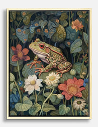
Botanical Frog Retreat Canvas Print
Sale price From €66,95€94,95 -
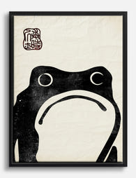
Grumpy Frog by Matsumoto Hoji Canvas Print
Sale price From €66,95€94,95 -

Frog by Matsumoto Hoji Art Print
Sale price From €16,95€23,95 -
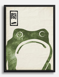
Grumpy Frog by Matsumoto Hoji Canvas Print
Sale price From €66,95€94,95 -

Monet's Unimpressed Frog Canvas Print
Sale price From €66,95€94,95 -

Botanical Frog Retreat Art Print
Sale price From €16,95€23,95 -

White Star Coffee Frogs (1899) Art Print
Sale price From €16,95€23,95 -
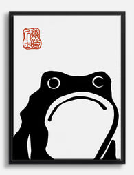
Grumpy Frog after Matsumoto Hoji Canvas Print
Sale price From €66,95€94,95


More from The Frame

You're Overthinking Parrot Wall Decor: A Style-...
Parrots have a reputation problem. Most people assume a parrot print means committing to banana leaves, rattan furniture and a full tropical fantasy. That's a shame, because parrot art is...

Vintage Botanical Prints: A No-Nonsense Guide t...
Vintage botanical prints are having a moment, and the internet is flooded with them. Most are terrible. Here's how to tell the real craftsmanship from the glossy, over-filtered reproductions, and...

The Greenhouse Aesthetic: How to Bring Victoria...
The greenhouse aesthetic has quietly taken over interiors Pinterest, design magazines and the walls of some very photogenic flats. The catch: almost every guide you'll find assumes you own an...