


 Order today for delivery by
 Vintage Frog Prints: From 18th-Century Naturalists to Your Living Room Wall
Three centuries of amphibian illustration, and how to hang the best of it on your walls today.


Frogs have been drawn, painted and engraved for over 300 years, long before they became the unlikely stars of modern wall art. The best vintage frog prints sit at a strange and brilliant intersection of science, folk art and contemporary cottagecore. Here's where they came from, why they're everywhere right now, and how to actually use them at home.
A brief history of frogs in natural history illustration
Before photography, the only way to record a species was to draw it. The 18th century was the great age of the natural history cabinet, and frogs, being plentiful, strange-looking and easy to preserve in spirits, became favourite subjects for the era's illustrator-naturalists.
Albertus Seba, a Dutch apothecary, published his Thesaurus between 1734 and 1765. His hand-coloured engravings arranged frogs, snakes and lizards in symmetrical, almost decorative compositions on the page. They weren't quite scientific by modern standards, but they were extraordinary objects, and his frog plates remain some of the most reproduced natural history images ever made.
Maria Sibylla Merian, working slightly earlier in Surinam, drew frogs in context with the plants and insects they lived alongside. Mark Catesby did the same for the American colonies in his Natural History of Carolina, Florida and the Bahama Islands (1731-1743). Later, 19th-century expedition illustrators working for figures like Louis Agassiz and the Challenger expedition produced increasingly precise lithographs as printing technology improved.
Then there's the Eastern tradition, which developed entirely separately. Matsumoto Hoji's 1814 woodblock frog from the Meika Gafu album, a cheerful, slightly grumpy creature rendered in a few confident brushstrokes, has become one of the most recognisable animal images on the internet. It represents a completely different idea of what a frog illustration can be: observational but expressive, minimal rather than exhaustive.

Scientific illustration vs. artistic interpretation: the key differences
If you're shopping for frog art, the first thing to understand is the split between scientific illustration and artistic interpretation. They look different, they feel different, and they belong in different rooms.
Scientific illustration prioritises anatomical accuracy. You'll see the frog in profile or from above, often with a secondary smaller figure showing underside or skeletal detail. The background is usually blank or minimal. Colour is naturalistic. These prints come out of the engraving and lithograph tradition, so expect visible plate marks, hand-colouring that sits slightly off the linework, and Latin binomial captions.
Artistic interpretation is looser. Watercolours by Merian or her contemporaries show the frog mid-leap, in habitat, interacting with the world. Japanese woodblock prints like Hoji's reduce the animal to its essential character. Victorian decorative prints might surround the frog with ornamental borders. The science matters less than the mood.
Our rule: scientific illustration suits studies, offices, hallways and anywhere you want quiet, intellectual texture. Artistic interpretation suits lounges, bedrooms and kitchens, where you want personality and warmth. Mixing the two on one wall is possible but tricky, you'll need a unifying frame colour to pull it off.
Why vintage frog prints feel modern again
A few things have collided. Cottagecore made amphibians, mushrooms and mossy things fashionable again. Dark academia pulled 18th-century scientific aesthetics into bedrooms and studies. The broader resurgence of maximalism gave people permission to hang weird, specific, slightly eccentric art instead of the usual abstract beige.
Frogs sit at the centre of all of this. They're a bit funny, a bit uncanny, deeply tied to nature, and they carry centuries of visual history. A good vintage frog print does the same job as a Victorian insect case or a pressed botanical specimen: it signals that you find the natural world genuinely interesting, not just decoratively green.
There's also a symbolic layer worth knowing about. Frogs appear across cultures as symbols of fertility, transformation and good luck. In ancient Egypt, the frog goddess Heqet was associated with birth. In Japanese culture, kaeru (frog) is a homophone for "return", making frogs lucky charms for travellers. None of this needs to be the reason you buy a print, but it's quietly there in the background.
Botanical frog prints: where amphibians meet plant art
The term "botanical frog print" gets used loosely, so it's worth being precise. Properly, a botanical frog print belongs to the tradition of botanical illustration: careful observational drawings of plants, often with insects or amphibians included to show scale and ecology. Merian's Surinam plates are the gold standard.
More loosely, the term now covers any print that combines a frog with foliage, lily pads, ferns or flowers. Both are legitimate; just know what you're buying. A true botanical illustration will have the plant as the primary subject with the frog as a supporting character. A decorative "frog with plants" print flips that priority.

Botanical frog prints work beautifully in rooms that already have plants. The visual rhyme between living foliage and illustrated foliage gives the whole room a sense of being part of one coherent idea. Bathrooms with ferns, kitchens with herbs on the windowsill, and conservatories are all natural homes for this style.
If you're building a larger scheme, pair botanical frog prints with pure botanical art prints in the same frame style. A trio of two plant studies flanking a central frog illustration is a classic arrangement that nearly always works.
Tree frog wall art: the tropical alternative
Tree frogs are the showoffs of the amphibian world. Red-eyed tree frogs, blue poison dart frogs, yellow banded poison frogs: these are the species that look painted even in real life, and they translate brilliantly into print.
The visual logic here is different from the muted European tradition. Tree frog prints bring saturated colour: deep rainforest greens, electric blues, acid yellows, startling reds. They work in rooms where you want a single hit of intensity. A large tree frog print at 70x100cm above a dark sofa, or a 60x80cm print in a dim hallway, delivers more impact than almost any abstract piece of the same size.
The trade-off: tree frog prints can dominate a room. If your scheme is already busy, they'll fight it. If your scheme is quiet, they'll bring it to life. Decide which problem you have before you buy.
For a middle path, look at 19th-century lithographs of tree frogs rather than modern photographic-style prints. The vintage treatment softens the colour and roots the print back in the natural history tradition, which keeps it from feeling like a nature documentary still.
How giclée printing brings archival illustrations to life
Giclée printing (pronounced "zhee-clay", from the French for "to spray") is the modern reproduction method that makes vintage frog prints viable as wall art. It matters, and most sellers never explain it.
A giclée print is made on a high-resolution inkjet printer using pigment-based archival inks, printed onto thick matte paper designed to hold detail. Compared to standard printing, the colour range is wider, the tonal transitions are smoother, and the inks are rated to last hundreds of years without fading, even in direct sunlight. Our prints use UV-protective acrylic glazing rather than glass, which adds another layer of fade protection and won't shatter if it falls off the wall.
For a 1734 Seba engraving, this matters enormously. The original has subtle hand-colouring, visible paper texture, and fine linework that cheaper printing methods flatten out. Giclée reproduction preserves all of it. When people say a print "looks even better in person than on screen", it's usually because they've been shown a photo of a cheap print online and received a proper giclée reproduction instead.
A quick price orientation, since this is genuinely confusing. Digital downloads of public domain frog illustrations are often free or a few pounds, but you then need to print and frame them yourself (and most home printers can't do justice to the artwork). Proper giclée reproductions sit in the £20 to £100 range depending on size and framing. Original antique prints from reputable dealers start around £100 and climb quickly into the hundreds or thousands. For most people, a quality giclée reproduction is the sweet spot.

Styling vintage frog prints in contemporary homes
This is where most content on the subject gives up and tells you to "trust your instincts". We think you deserve actual recommendations.
Choose your frame deliberately
Frame colour changes everything. A dark walnut or black frame roots a vintage print in the 18th-century library aesthetic, perfect for studies, hallways and dining rooms. A natural oak or light ash frame pulls the print toward Scandinavian minimalism, which works in bedrooms and kitchens. A thin brass frame bridges the two and suits bathrooms and smaller spaces.
Our frames are solid FSC-certified wood, not MDF or veneer, and they ship with the print already fitted and ready to hang. This matters because the single biggest failure mode in budget art is frames that arrive separately, warp in transit, or don't quite fit the print. If you've ever had to assemble a wobbly frame while trying not to fingerprint the artwork, you know what we mean.
Match the room to the style
Scientific illustrations and darker 19th-century lithographs belong in studies, home offices, dining rooms and hallways. Watercolour and Japanese woodblock pieces suit bedrooms, lounges and kitchens. Botanical frog prints are made for bathrooms, conservatories and any room with real plants. Tree frog prints need a space with enough breathing room to let them shine, usually a lounge or a tall hallway.
Avoid the "funny frog on a toilet" temptation unless that's genuinely your taste. There's nothing wrong with it, but it ages differently from a historically grounded vintage print. A proper 18th-century engraving will still look good in your home in ten years. A kitsch cartoon of a frog smoking a cigarette probably won't.
Build a gallery wall properly
Three to five frog prints in matching frames, hung in a tight grid or a loose salon arrangement, make a far stronger statement than a single piece. Mix scales: one larger central print at 60x80cm with smaller 30x40cm pieces around it creates visual hierarchy.
If you're going broader than frogs, mix in other nature art prints with similar colour palettes and illustration styles. Butterflies, beetles, mushrooms and ferns all live comfortably alongside frogs in the natural history visual language. The unifying thread is the illustration tradition itself, not the subject.

Canvas or framed paper?
For vintage illustration specifically, we'd nearly always choose framed paper over canvas. The matte paper and clean frame preserve the sense that you're looking at a printed plate from a book, which is the whole appeal. Canvas changes the texture of the image and makes the print feel more like a painting than an illustration.
The exception is tree frog art with heavy saturated colour, which can work beautifully on canvas because the fabric texture softens the intensity. Canvas is also the better choice for humid rooms like bathrooms, since it's lighter and more forgiving than framed paper under glass or acrylic.
Where to find source material
If you want to go deep, the Biodiversity Heritage Library and the Smithsonian Open Access archive both host enormous collections of digitised natural history books in the public domain. You can browse Seba, Catesby, Merian and dozens of lesser-known illustrators for free. It's a genuinely rewarding rabbit hole, and it'll teach you more about types of frog art than any shop listing.
The short version
Buy prints with real historical weight behind them, choose a frame colour that matches the room's mood rather than the print's content, and don't be afraid to commit to a whole wall rather than a single piece. Vintage frog illustration is one of the most interesting, least overexposed categories of wall art available right now, and the people who get it right tend to be the ones who treat it as a proper subject rather than a novelty.

Fab products featured in this blog
-

Frog in the Wildflowers Art Print
Sale price From €16,95€23,95 -

William Morris Frog Cotton Prints Exhibition Art Print
Sale price From €16,95€23,95 -

Green Frog in the Foliage Art Print
Sale price From €16,95€23,95 -

William Morris Cotton Prints Exhibition Frog Art Print
Sale price From €16,95€23,95 -

Frog in the Wildflowers Canvas Print
Sale price From €65,95€94,95 -

Botanical Frog Retreat Art Print
Sale price From €16,95€23,95 -

Morris-Inspired Frog in the Flowerbed Art Print
Sale price From €16,95€23,95 -

Green Frog in the Foliage Canvas Print
Sale price From €65,95€94,95 -

Frogue Fashion Cover Frog Art Print
Sale price From €16,95€23,95 -
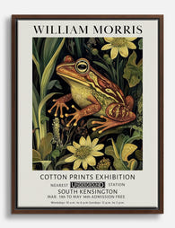
William Morris Frog Cotton Prints Exhibition Canvas Print
Sale price From €65,95€94,95 -

Frogue Fashion Cover Art Print
Sale price From €16,95€23,95 -

Morris-Inspired Botanical Frog Poster Art Print
Sale price From €16,95€23,95 -

Frogs on Penny-Farthings Art Print
Sale price From €16,95€23,95 -

William Morris Cotton Prints Exhibition Frog Canvas Print
Sale price From €65,95€94,95 -

Frog by Matsumoto Hoji Art Print
Sale price From €16,95€23,95 -

Frogue Cover Frog Art Print
Sale price From €16,95€23,95 -

Frogue Fashion Cover Art Print
Sale price From €16,95€23,95 -

Frogue Magazine Cover Frog Art Print
Sale price From €16,95€23,95 -

Frogue Fashion Cover Art Print
Sale price From €16,95€23,95


More from The Frame

The Greenhouse Aesthetic: How to Bring Victoria...
The greenhouse aesthetic has quietly taken over interiors Pinterest, design magazines and the walls of some very photogenic flats. The catch: almost every guide you'll find assumes you own an...

The Best Art for Conservatory Walls (That Won't...
Most people leave their conservatory walls bare, and it's not because they don't want art there. It's because they're quietly worried about fading, warping, and whether anything will look right...

Frog Art for the Bathroom: Why It Works and How...
Frog art has quietly become one of the most-searched subjects for bathroom walls, and it's not hard to see why. The pairing makes sense on an instinctive level, but the...