Why William Morris Animal Prints Work in Modern Interiors
Character without chaos: how to bring foxes, hares and peacocks into a modern home without it feeling like a Victorian parlour.

Morris's floral patterns get all the attention, but his animal designs are quietly the easier win. A fox or a hare gives your eye somewhere to land, which means these prints behave themselves in modern rooms in a way that busy all-over florals don't. Here's how to style them properly.
Why William Morris Prints Work in Modern Homes (Not Just Period Properties)
The fear with Morris is always the same: heritage cottage, dark wood, doilies. It's a reasonable worry if you're looking at Strawberry Thief or Pimpernel, where the pattern fills every inch. Animal prints work differently.
Designs like The Forest tapestry (the lion, peacock, fox, hare and raven panel Morris produced with Philip Webb in 1887) and the various Woodland Animals patterns have natural focal points. Your eye finds the creature first, then explores the foliage around it. That's the same compositional logic behind most modern wall art: a subject, a setting, breathing room.
Webb is worth knowing about. He designed most of the animals you see in Morris's work, while Morris handled the botanical surrounds. This collaborative pedigree is partly why William Morris animal prints sit so well next to contemporary illustration. They were always meant to read as characters, not wallpaper.
Pair one with a mid-century walnut sideboard, a linen sofa, a plaster-pink wall, and the Victorian associations disappear. What's left is a richly detailed nature study, which is something modern interiors are crying out for.
Living Room: Statement Sizes and Where to Hang Them
The living room is where you can go big, but big means something specific. Above a three-seater sofa, you want a print that covers roughly two thirds of the sofa's width. For most sofas that's 70x100cm framed, or a 100x150cm canvas if you want the print to dominate.
Our advice: if you're choosing a Morris animal print as the room's hero, stop at one. These designs reward close looking, and a single large piece above the sofa with empty wall around it lets the detail breathe. Hanging two large Morris prints on opposing walls turns the room into a gallery, and not in a flattering way.
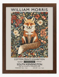
The fox is the obvious choice for a living room because it's warm, characterful and conversational. A decorative fox wall art print above a sage or charcoal sofa anchors the space without demanding the room change around it. Hang the centre of the print at around 145cm from the floor, which puts it at standing eye level and keeps it visually connected to the furniture below.

If the wall is taller than the sofa is wide (think Victorian conversion with high ceilings), go portrait orientation. A 70x100cm framed print in portrait fills vertical space without needing a second piece to balance it.
Bedroom: Warm Tones and Calming Animal Motifs
Bedrooms want softness. The hare, the dove and the songbird Morris designs all work here in a way the lion or the peacock don't. You want the animal to feel restful, not regal.
Scale down from the living room. A 50x70cm print above a bedside table, or a pair of 30x40cm prints flanking the bed, both work better than one huge piece above the headboard. The reason is practical: you spend most of your bedroom time lying down or sitting up in bed, so art at standard hanging height ends up either above your sightline or directly behind your head where you'll never see it.
For colour, lean into the warm end of Morris's palette. The russets, soft golds and muted ochres in his animal designs pair beautifully with bed linen in oat, clay or warm white. Avoid pure cool greys in the bedroom if you're using Morris; the earthy print will look stranded.
If you have a deep wall colour (we're partial to a warm clay or a dusty plum in bedrooms), a Morris hare print in a black frame against that depth looks genuinely sophisticated. The frame stops the print from blending into the wall, and the rich background makes the animal feel like the focus of a small theatre.
Hallway and Entryway: First Impressions with Fox and Bird Prints
Hallways are where Morris animal prints really earn their keep. These spaces are usually narrow, often poorly lit, and rarely have room for furniture, which makes them ideal for art-led decoration.
A single fox print in a hallway sets a tone immediately. You walk in, you see something with character, you understand this isn't a beige rental. Go for 50x70cm if the hallway is reasonably wide, or 30x40cm if you're working with a tight corridor.

Lighting matters more than people realise. Morris's earthy palette can look muddy in a north-facing hallway with no natural light. If your entryway is dim, either choose a print with a lighter background (some of the bird studies have cream or pale ground colours) or fit a small picture light above the frame. A warm 2700K bulb brings out the russets and greens without distorting them.
For longer hallways, a run of three matching-size prints at even spacing works better than a gallery wall of mismatched pieces. Pick three different animals from the same Morris design family (fox, hare, songbird, say) and frame them identically. The repetition turns a transitional space into a considered one.
Home Office and Study: Detail-Rich Art You Won't Get Tired Of
The case for Morris in a study is straightforward: you're going to look at this wall thousands of times. You want something that rewards repeated viewing.
The density of Morris animal prints is the point here. There's always another leaf, another berry, another curl of foliage you hadn't noticed. Compare that to a graphic poster or a single-line drawing, both of which give you everything in the first two seconds.
Hang above the desk if the desk faces a wall, or on the wall opposite the desk if you sit facing the room. The opposite-wall placement is often better because it gives your eye somewhere to rest when you look up from the screen.
For sizing, 50x70cm hits the right note. Big enough to be a presence, small enough that it doesn't dominate a working space. The peacock from The Forest tapestry is particularly good in studies because the colours (deep teal, ochre, forest green) work well with the kind of furniture studies tend to have: dark wood, leather, brass.
We'd choose framed over canvas here. A study tends to be a more polished space, and the matte paper finish under acrylic glaze of a framed arts and crafts animal print gives you the museum-grade detail Morris's work deserves. The acrylic glaze also means you can position the print near a window without worrying about fade.
Colour Palettes That Complement Morris's Earthy Greens and Reds
The obvious pairing is forest green walls with brass accents. It works, but it's also exactly what people expect, which is how rooms end up feeling like a National Trust gift shop.
More interesting combinations:
Navy and Morris. Deep navy walls make the russets and ochres in a fox or hare print glow. The cool depth of the navy stops the earthy tones from feeling rustic. Add brass picture lights and a cream rug to keep it from going too heavy.
Warm terracotta and Morris. A clay or terracotta wall picks up the warm tones in Morris's animal palette and amplifies them. This works particularly well in south-facing rooms where the natural light already has warmth.
Charcoal and Morris. A near-black wall with a Morris animal print in a black frame is the most modern combination possible. The print becomes the only colour in the composition, and it reads almost like a still life.
Sage and Morris. If you want green but not Morris-green, go softer. A muted sage on the walls with the deeper greens of the print creates a tonal layering effect that feels current.
What to avoid: cool grey (drains the warmth out of Morris's palette), pure brilliant white (too much contrast, makes the print look like it's floating), and any of the heritage paint colours specifically marketed alongside Morris wallpapers. You'll tip into pastiche.

Frame Choices: Black, Oak, or White for Arts and Crafts Prints
This is where most people get Morris wrong. The frame does more work than the print in determining whether your room reads modern or heritage.
Black frames make Morris animal prints feel graphic and contemporary. The black creates a hard edge that contains all that botanical detail and tells the eye to read the print as an image, not a textile. This is our default recommendation for modern interiors.
Oak frames push Morris in the cottagecore direction. They're not wrong, but they double down on the traditional reading of the print. Choose oak if you have a genuine period property with wooden floors and you want to lean into the heritage. Avoid oak if your space is otherwise modern, because you'll end up with one corner of the room looking like a different century.
White frames sound safe and almost always disappoint with Morris. The earthy tones in the prints need a frame with weight, and white frames can make the whole composition feel insubstantial, like a print you bought at a craft fair.
A note on framing quality, because this matters more with detailed work than with simple graphic art. Poor framing kills Morris prints. Warped backing, prints that bow inside the frame, frames that arrive separately and need assembling, glass that creates glare across the fine linework. All of these turn a beautiful print into a frustrating object. Our framed prints arrive ready to hang in a single box, with the print properly mounted under UV-protective acrylic, and they stay flat. With Morris specifically, the matte paper and museum-grade giclée matters because you can see every leaf vein up close.
Mixing William Morris Animal Prints on a Gallery Wall
Gallery walls and Morris are a difficult combination. The instinct is to put multiple Morris animal prints together, and the result is usually visual indigestion.
Two approaches work.
The matched set. Three or four Morris animal prints, all the same size, all in identical black frames, hung in a tight grid with equal spacing. The repetition of frame and size makes the busy interiors of the prints feel intentional rather than chaotic. A 2x2 grid of 30x40cm prints works particularly well above a sideboard or in a stairwell.
The Morris-plus-quiet mix. One Morris animal print as the busy centrepiece, surrounded by simpler pieces: a botanical line drawing, a piece of abstract colour, a small photograph. The quiet pieces give your eye somewhere to rest, which lets the Morris print be as detailed as it wants to be.
What doesn't work: mixing multiple Morris animal prints with multiple Morris floral prints. The patterns fight each other. You also want to avoid mixing Morris with other heavily patterned heritage designs from the same era, which tips the whole wall toward pastiche.
If you're building a gallery wall around an animal art print collection more broadly, Morris works beautifully as the most detailed piece in a mix that includes contemporary animal illustration, vintage natural history plates, and simple line work. The Morris becomes the anchor; the simpler pieces frame its complexity.

A Few Final Things
Buy fewer, larger prints than you think you need. One excellent Morris animal print at the right size will do more work for a room than three smaller ones scattered around.
Trust black frames unless you have a specific reason not to. They modernise these prints more effectively than any other styling decision.
And take Morris's animals out of the heritage box. Webb's fox and hare were drawn from close observation of living creatures, not as decorative motifs. Treat them as nature studies rather than period pieces and they'll behave like contemporary art.

Fab products featured in this blog
-

William Morris Tiger Art Print
Translation missing: en.products.product.sale_price From €16,95€23,95 -

William Morris Birds Art Print
Translation missing: en.products.product.sale_price From €16,95€23,95 -

Morris Fox Print Art Print
Translation missing: en.products.product.sale_price From €16,95€23,95 -
William Morris Fox Art Print
Translation missing: en.products.product.sale_price From €16,95€23,95 -

William Morris Fox Art Print
Translation missing: en.products.product.sale_price From €16,95€23,95 -

William Morris Dog Art Print
Translation missing: en.products.product.sale_price From €16,95€23,95 -

William Morris Floral Bird Art Print
Translation missing: en.products.product.sale_price From €16,95€23,95 -

William Morris Botanical White Cats Print
Translation missing: en.products.product.sale_price From €16,95€23,95 -

William Morris Bear Art Print
Translation missing: en.products.product.sale_price From €16,95€23,95 -

William Morris Botanical Art Print
Translation missing: en.products.product.sale_price From €16,95€23,95 -

William Morris Fox Art Print
Translation missing: en.products.product.sale_price From €16,95€23,95 -

William Morris Botanical Cats Art Print
Translation missing: en.products.product.sale_price From €16,95€23,95 -

William Morris Pheasant Art Print
Translation missing: en.products.product.sale_price From €16,95€23,95 -

William Morris Cat Art Print
Translation missing: en.products.product.sale_price From €16,95€23,95 -

William Morris Classic Cats Canvas Print
Translation missing: en.products.product.sale_price From €64,95€92,95 -

William Morris Cat Charm Art Print
Translation missing: en.products.product.sale_price From €16,95€23,95 -

William Morris Classic Cats Black Art Print
Translation missing: en.products.product.sale_price From €16,95€23,95 -

Morris Cat Floral Art Print
Translation missing: en.products.product.sale_price From €16,95€23,95 -

William Morris Fox Canvas Print
Translation missing: en.products.product.sale_price From €64,95€92,95


More from The Frame

Living Room Botanical Prints: The Right Way to ...
Botanical prints are one of the most forgiving categories of wall art to choose, and one of the easiest to ruin with bad framing. A warped frame, the wrong glazing,...

The Best Botanical Prints for Your Conservatory...
Conservatories are sun traps, and most art prints are not built for them. The same light that makes the space so lovely to sit in will cook a poorly made...

Arts and Crafts Cat Art: Victorian Roots, Moder...
Cat art is everywhere right now, and most of it is forgettable. The pieces that actually hold up on a wall borrow from a much older tradition, one that runs...