William Morris Tree Designs: Why They Still Captivate Us
From the Woodpecker tapestry to wallpaper repeats, how Morris turned trees into a quiet act of rebellion.

William Morris is remembered for his florals, but his trees tell a different story. They are slower, more architectural, and rooted in a tradition older than the wallpapers that made him famous. Look closely and you will find them threaded through tapestries, textiles and printed designs, each one engineered to do something most pattern-makers wouldn't attempt.
Nature as rebellion: why Morris turned to trees
Morris worked in the middle of the industrial revolution, when British factories were churning out cheap printed cottons and machine-loomed wallpapers in colours he found genuinely ugly. His response was political as much as aesthetic. He believed that beauty in the home was a right, not a luxury, and that mass production had severed the link between maker, material and nature.
Trees became central to that argument. Where flowers could decorate a surface, trees structured it. A tree implied growth, time, and a relationship with the land that no factory could replicate. For Morris and the wider Arts and Crafts movement, choosing a tree was a way of choosing slowness, craft and the medieval workshop over the steam-powered loom.
This is what makes Morris's nature inspired art different from the generic botanicals that followed him. His trees are not pretty backdrops. They are an argument about how we should live.

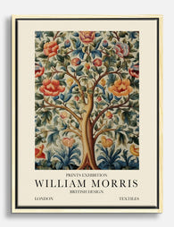
The Tree of Life and its roots in medieval tapestry
Mention Morris and trees in the same sentence and most people picture the Tree of Life tapestry. It is worth getting the credit right. The well-known Tree of Life design was created around 1910 by John Henry Dearle, Morris's longtime collaborator and chief designer at Morris & Co. after Morris's death in 1896. It evolved from earlier patterns, including work connected to May Morris's Melsetter embroideries.
This matters because it shows how "Morris tree designs" was always a collaborative vocabulary, not a single signature. Philip Webb drew the birds for the Trellis wallpaper. Dearle developed the tapestries into the early twentieth century. May Morris carried the family hand into embroidery. The studio thought of itself as a workshop in the medieval sense, where attribution mattered less than craft.
The medieval influence runs deeper than the workshop model. Morris was obsessed with the late Gothic tapestries he had studied in French and Flemish collections, particularly the millefleurs technique, literally "a thousand flowers", where a dense carpet of small plants filled the background behind a central figure or tree. You can see this directly in the tapestries produced at Merton Abbey, where a strong central tree rises against a bed of tiny scattered blooms. It is a compositional idea borrowed wholesale from the fifteenth century.
The Woodpecker: Morris's most ambitious tree composition
If you want to see Morris designing a tree entirely on his own terms, look at the Woodpecker tapestry of 1885. It is the only large-scale tapestry he designed completely by himself, from cartoon to finished weave, and it is arguably his most ambitious composition of any kind.
The Woodpecker shows a single fruit tree, heavy with apples and pears, with two birds working their way around the trunk. A scrolling banner at the base carries a verse Morris wrote himself, telling the Ovidian story of King Picus transformed into a woodpecker. The tree fills the full height of the piece, branches reaching into every corner, leaves stylised but botanically legible.
What makes it remarkable is the confidence. The tree is not decorative. It is the entire subject. Compared to the later Dearle tapestries, where trees often share space with deer, peacocks and elaborate borders, the Woodpecker is almost austere. One tree, two birds, a verse. It is Morris making the case that a tree alone can carry a whole wall.
This is the work that should anchor any serious conversation about Morris tree motifs, and it is the one most often left out.
How Morris structured trees as repeating pattern, not landscape
Morris's florals get most of the attention, but his trees were the harder design problem. A flower scatters. A tree grows in one direction, with a trunk, a crown, and a clear top and bottom. Making that repeat across a wall without looking like a row of cut-out silhouettes is genuinely difficult.
Morris's solution was to abandon the idea of trees as landscape. He never tried to show a forest, or a horizon, or anything you might call a scene. Instead he treated the tree as an architectural framework, a set of branching lines that could interlock with their neighbours and disappear into a continuous surface.
Look at Trellis, his first wallpaper from 1864. The rose stems form a square grid, with birds and thorns sitting inside it. Or look at Tulip and Willow, where willow leaves form a flowing diagonal lattice and tulips hang off the structure like ornaments. The tree elements are doing the load-bearing work, holding the pattern together so the smaller flowers can scatter freely.
This is the technical achievement competitors rarely mention. Morris engineered his trees so the eye reads them as natural growth, even though every branch has been carefully positioned to tile seamlessly with the next repeat. You can stare at a wall of Willow Bough for an hour and never spot the join.

Trees across Morris's work: wallpaper, textiles, and printed design
Once you start looking, trees turn up across almost every category Morris worked in.
Wallpaper
Willow Bough (1887) is the most famous. It is pure foliage, a curtain of overlapping willow leaves with no flowers at all, which was unusual for Morris. The leaves are stylised but specific enough that you can identify the species. Apple, with its pale fruit and gentle green leaves, is the softer cousin. Trellis brings the rose stems into a more architectural frame.
Textiles
The printed cotton and linen designs include patterns like Bird and Anemone and the various willow-derived prints used for curtains and upholstery. Morris's textile trees tend to be looser than his wallpaper trees, taking advantage of the way fabric drapes and breaks the repeat naturally.
Tapestry
Beyond the Woodpecker, the Merton Abbey workshop produced a series of tree-centred tapestries, including the Forest tapestry with Webb's animals set against a millefleurs ground. These are where Morris's medieval influences are most visible.
Acanthus
Worth a section to itself. The acanthus leaf appears across Morris's tree and foliage work, most famously in the Acanthus wallpaper of 1875. It is not a real tree leaf in any botanical sense. It is a classical, stylised form borrowed from Greek and Roman ornament, then filtered through medieval manuscript illumination. Morris used it as a kind of universal foliage, a leaf shape that signalled "tree" without committing to any particular species.
This stylisation was deliberate. Morris wrote that exact imitation of nature was "neither possible nor desirable" in pattern design. The job of the designer was to suggest, to evoke, to give the eye enough information to fill in the rest. His trees are botanically literate but never botanically accurate, and that is precisely why they work.
Why these 150-year-old tree designs still suit contemporary walls
A Morris tree print should not work in a 2024 flat. The designs are Victorian, the colour palettes were originally mixed from natural dyes like indigo and madder, and the subject matter belongs to a vanished rural England. And yet they slot into modern interiors more comfortably than almost any other historical art.
A few reasons.
First, the structure. Because Morris designed trees as architecture rather than scenery, his patterns have a calm, repeating rhythm that reads as texture from across the room. In a minimalist space they function almost like a tile or a textile, adding depth without clutter. In a maximalist room they hold their own against bolder furniture.
Second, the colour. Morris's palette was muted by Victorian standards and looks positively restrained against contemporary printed art. The soft sages, indigos, terracottas and ochres sit naturally with the warm neutrals that dominate current interiors. A Willow Bough print in its original green works with everything from oak floors to painted panelling.
Third, the stylisation. Because the leaves and branches are flattened and graphic, Morris designs read more like contemporary illustration than fussy Victorian decor. They have more in common visually with a modern Scandinavian print than with the heavy oil paintings of the same era.
This is what separates Morris's nature art prints from generic botanical wall art. You are not buying a picture of a plant. You are buying a piece of pattern design that has already been stress-tested against 150 years of changing interiors and won every time.

Choosing a William Morris tree print for your space
A few practical thoughts, because Morris designs behave differently from most art at different sizes and in different rooms.
Match the pattern density to the room
Dense, all-over patterns like Willow Bough and Acanthus work best when they have space to breathe. Hang them large, ideally 60x80cm or above, on a wall where they can act as a feature. A small print of a dense Morris pattern can look busy because the eye cannot read the repeat properly. Conversely, more open compositions like the Woodpecker or single-tree tapestry designs work at smaller scales because there is a clear focal point.
Frame or canvas
Morris's designs were originally printed on paper or woven into textile, so the matte, paper-based finish of an art print is the most historically faithful option. A framed print with a wooden frame echoes the Arts and Crafts emphasis on solid timber and honest materials. Canvas works well for the larger tapestry-derived designs, where the woven cloth reference feels natural, and it sits flatter against the wall without glass.
If you are going framed, look for solid wood rather than veneer or MDF. It is a small detail Morris himself would have insisted on, and it makes a real difference to how the piece sits on the wall over time.
Pair them carefully
Morris designs are strong patterns. One large print per wall is usually enough. If you want a gallery wall, mix a Morris tree pattern with something quieter, a botanical study or a plain typographic print, rather than stacking multiple Morris designs together. The exception is a deliberate set of three smaller prints in a row, which can work if the designs share a colour palette.
Consider the room's light
Morris's original colours were designed for rooms lit by gas lamps and small windows. They glow in low light. In a bright south-facing room the deeper indigos and forest greens can look richer than the lighter apple and willow tones. In a darker north-facing room the paler designs lift the space considerably.
Trust the design, not the trend
The reason Morris's tree designs have survived this long is that they were never designed to be fashionable. They were designed to be lived with. Pick the one you genuinely like looking at, hang it somewhere you will see it every day, and it will outlast whatever else is on your walls.

The trees are the quiet heart of Morris's work. Start there and the rest of his vocabulary, the flowers, the birds, the borders, falls into place.

Fab products featured in this blog
-

Tree of Life by William Morris Art Print
Translation missing: en.products.product.sale_price From €16,95€23,95 -

Tree of Life by William Morris Art Print
Translation missing: en.products.product.sale_price From €16,95€23,95 -

Tree of Life by William Morris Canvas Print
Translation missing: en.products.product.sale_price From €64,95€92,95 -

William Morris Tree of Life Exhibition Poster Art Print
Translation missing: en.products.product.sale_price From €16,95€23,95 -

William Morris Tree of Life Exhibition Canvas Print
Translation missing: en.products.product.sale_price From €64,95€92,95 -

Tree of Life by William Morris Art Print
Translation missing: en.products.product.sale_price From €16,95€23,95 -

Tree of Life by William Morris Canvas Print
Translation missing: en.products.product.sale_price From €64,95€92,95 -

William Morris Tree of Life Poster Canvas Print
Translation missing: en.products.product.sale_price From €64,95€92,95 -

Tree of Life by William Morris Art Print
Translation missing: en.products.product.sale_price From €16,95€23,95 -

Tree of Life by William Morris Art Print
Translation missing: en.products.product.sale_price From €16,95€23,95 -

Tree of Life by William Morris Art Print
Translation missing: en.products.product.sale_price From €16,95€23,95 -

Tree of Life by William Morris Canvas Print
Translation missing: en.products.product.sale_price From €64,95€92,95 -

William Morris Tree of Life Exhibition Art Print
Translation missing: en.products.product.sale_price From €16,95€23,95 -

William Morris Tree of Life Exhibition Poster Art Print
Translation missing: en.products.product.sale_price From €16,95€23,95 -

William Morris Tree of Life Exhibition Canvas Print
Translation missing: en.products.product.sale_price From €64,95€92,95 -

William Morris Tree of Life Poster Art Print
Translation missing: en.products.product.sale_price From €16,95€23,95 -

Tree of Life Exhibition by William Morris Canvas Print
Translation missing: en.products.product.sale_price From €64,95€92,95 -

William Morris Tree of Life Exhibition Art Print
Translation missing: en.products.product.sale_price From €16,95€23,95 -

Tree of Life Exhibition by William Morris Art Print
Translation missing: en.products.product.sale_price From €16,95€23,95 -
Tree of Life by William Morris Canvas Print
Translation missing: en.products.product.sale_price From €64,95€92,95


More from The Frame

Kids' Room Art: Playful Without Childish
Most kids' room art falls into two camps: aggressively cute (rainbows, cartoon animals, alphabet posters) or weirdly adult (minimal black and white prints that could hang in a dentist's office)....

Nursery Art That Grows with the Room
Most nursery art gets retired by the time the cot comes down. That's a waste of money, wall space and the chance to build something genuinely meaningful. This guide is...

Office and Study: Art That Helps You Focus or A...
The art you hang in a workspace isn't neutral decoration. It either supports the kind of thinking you do at your desk, or it quietly works against it. The trick...