You're Overthinking Your Architecture Gallery Wall
The curatorial decisions that turn a pile of skylines and street shots into a wall worth stopping for.

Why architecture is one of the best subjects for a gallery wall
Architecture is the easiest subject to build a cohesive gallery wall around, and almost nobody talks about why. Buildings give you geometry, repetition, and clean lines, which means even wildly different prints share an underlying visual grammar. A skyline shot in Tokyo and a doorway detail in Lisbon look like they belong together because they're both fundamentally about structure.
Compare that to mixing landscapes, portraits, and abstracts on one wall. You're juggling three visual languages. With architecture, you're working in one. That's a head start.
The catch is that beginners still manage to make architecture walls look chaotic, and it's almost always because they skipped the curatorial step and went straight to shopping. This guide fixes that.
Picking a thread: colour palette, city, or photographic style
Before you buy a single print, pick your thread. This is the rule that holds everything together when subjects vary. You need exactly one unifying element across every print on the wall.
There are three threads that work for architecture, and you only need one:
A colour palette. All warm, golden hour tones. Or all cool, blue hour blues and slate greys. Or strictly black and white, which is the most forgiving option because you remove the colour variable entirely.
A single city. Six prints of London at different scales and angles. The location does the unifying work, so you can mix a skyline, a tube station, and a Georgian terrace and it still reads as one collection.
A photographic style. Symmetrical centred compositions. Or all dramatic low-angle shots looking up. Or all minimalist, negative-space-heavy frames. The eye recognises a consistent point of view even when the subjects are different.
What doesn't work is mixing all three threads loosely. A warm-toned Paris skyline next to a cool-toned New York street shot next to a black and white Barcelona detail is just three nice prints in the same room. It's not a gallery wall.
Pick your thread first. Shop second. If a print doesn't fit the thread, it doesn't go on this wall, no matter how much you like it.

How many prints you actually need
Three or five. Start there.
Odd numbers create natural visual balance because there's a clear centre, and the eye doesn't try to split the arrangement into two halves. Even numbers can work but they require more discipline to lay out, and most beginners don't have that discipline yet.
Three prints is the easiest gallery wall to pull off. It's barely a gallery wall, technically, but it teaches you how prints relate to each other without overwhelming the space. Five is where you start getting real curatorial complexity, with a centre print and balanced flanking pairs.
Skip nine-print grids until you've done a smaller wall first. They look incredible when they work and like a junk shop when they don't. The margin for error is tiny.
For sizing, mix two scales. A common five-print setup uses one large 70x100cm anchor and four 30x40cm supporting prints. A three-print setup might be three matching 50x70cm prints in a row, or one 60x80cm centre with two 40x50cm flanks. Two scales create rhythm. Three or more scales create chaos.
Mixing skylines, building details, and street-level shots
Architecture photography naturally happens at three scales: wide skylines, mid-range building shots, and close-up details like doorways, windows, or ironwork. Most people buy three skylines and call it done. That's the boring version.
The interesting version mixes scales, but with intent. Here's the ratio that works: roughly 20% wide skylines, 50% mid-range building shots, and 30% close-up details. In a five-print wall, that's one skyline, two or three building shots, and one or two details.
Why this ratio? Visual weight. A wide skyline carries enormous visual information, dozens of buildings, sky, often water. Three skylines together feel relentless, like the wall is shouting. Details give the eye somewhere quiet to land. Building shots are the connective tissue.
The trick is matching perspective angles within each scale. If your skyline is shot dead-on at horizon level, your building shots should also be roughly eye-level rather than dramatic upward angles. Mismatched perspectives are the single biggest cause of "why does this look weird" energy on architecture walls.
Avoid what I call tourist postcard syndrome: the Eiffel Tower, Big Ben, the Empire State Building, the Sydney Opera House, all on one wall. It looks like a souvenir shop. If you want famous landmarks, pick one and surround it with lesser-known shots from the same city or in the same style. Browse urban architecture prints with this in mind. You're looking for the supporting cast, not five lead actors.
Frame consistency: why matching frames make mismatched subjects work
Here's the design principle nobody explains: when your subjects vary, your frames must not.
Identical frames create a visual container that tells the eye "these things belong together," even when the prints inside are quite different. The frame becomes the constant, and your brain stops trying to find differences and starts looking for relationships.
For architecture walls specifically, this matters more than for any other subject. You're already mixing skylines, details, colour temperatures, and possibly cities. Adding mixed frames on top of that visual variety is the moment a gallery wall becomes a collage of unrelated objects.
Three frame choices work brilliantly for architecture:
Black frames. Sharp, urban, graphic. They echo the geometry in the prints themselves and work especially well with black and white photography and modernist subjects.
Natural oak frames. Warmer, less aggressive. Soften high-contrast city shots and pair beautifully with golden hour palettes or warmer interior schemes.
White frames. Lighter visual weight, work well in smaller spaces or against darker walls. Slightly less common for architecture because they can feel a bit gallery-clinical, but excellent for minimalist schemes.
Match the frame across every print. Same colour, same profile width, same finish. Solid wood frames hold up better than veneered or composite ones, which can warp slightly over time and ruin the alignment that makes a gallery wall work. The other detail worth getting right: prints and frames that ship together properly fitted, not the flat-pack-yourself approach where you're left aligning the print inside the frame on your kitchen table.

Layout templates with exact spacing and sizes
Hanging height first: the centre point of your gallery wall (not the centre of the top print, the centre of the whole arrangement) should sit between 145 and 152cm from the floor. That's eye level for most adults and the standard professional galleries use.
Spacing between frames: 5 to 8cm. Closer than 5cm and the prints feel cramped. Wider than 8cm and the arrangement loses cohesion and reads as separate pieces.
Now the templates.
Above a 220cm sofa
This is the most common scenario. Your wall has roughly 200 to 240cm of usable horizontal space, and you want the arrangement to span about two-thirds of the sofa width.
Three-print row: Three 50x70cm prints in portrait orientation, 6cm apart. Total width: 162cm. Hang the centre point 25cm above the sofa back.
Five-print row: One 60x80cm centre print flanked by two 40x50cm prints on each side, 6cm spacing throughout. Total width: roughly 200cm. Centre this on the sofa.
Five-print balanced cluster: One 70x100cm anchor on the left, with four 30x40cm prints arranged in a 2x2 grid on the right. This is the more editorial layout, less symmetrical, more designed.
Narrow hallway (wall width 80 to 120cm)
Hallways want vertical emphasis because you're walking past them rather than sitting opposite them.
Three-print vertical stack: Three 40x50cm prints stacked, 5cm spacing. Total height: roughly 160cm. Centre the middle print at 150cm from the floor.
Two-column cluster: Four 30x40cm prints in a 2x2 grid, 5cm spacing. Total dimensions: 65x85cm. Compact and considered.
Bedroom above bed (king bed, 150cm wide headboard)
Calmer subjects work better here. Skip the high-contrast skylines and lean into softer building details, neutral colour palettes, and quieter compositions. The modern art prints collection has more architectural abstracts that suit bedrooms.
Three-print row: Three 50x70cm prints in landscape orientation, 6cm apart. Total width: 162cm. Hang 20 to 25cm above the headboard.
Square wall (110x110cm or larger)
Nine-print grid: Nine 30x40cm prints in a 3x3 layout, 5cm spacing. Total dimensions: 100x130cm. Only attempt this if you're confident with your thread, because nine prints amplifies any inconsistency.
If you want the layout work done for you, pre-curated wall art sets take the guessing out of matching scales and palettes.
Mark out everything on the wall with painter's tape before you put a single nail in. Cut paper templates the exact size of each print, tape them up, live with it for 24 hours. You will adjust. Everyone adjusts.
Mistakes that make gallery walls look like a junk shop
Mixing colour and black and white randomly. Pick one. If you must mix, the rule is 80/20: dominant in one mode, with one or two prints in the other for accent. Three colour, two black and white feels confused. Five colour with one black and white anchor feels intentional.
Wildly different colour temperatures. Warm golden hour next to cool blue hour next to overcast grey reads as three different photographers' Instagram feeds stuck on one wall. Match the light. This is where the colour palette thread does its real work.
Famous landmarks only. As mentioned above, this turns your wall into a souvenir shop. One iconic shot per wall, maximum.
Too many sizes. Two scales, occasionally three. Beyond that, the eye can't find rhythm.
Mismatched frame profiles. Even if the frames are all black, mixing a 2cm thin profile with a 4cm chunky profile creates visual noise. Same colour, same profile width, same finish.

Hanging too high. The single most common mistake. If you're standing in front of your wall looking up, your prints are too high. 145 to 152cm centre point. Measure it.
Buying everything one print at a time over six months. Each individual purchase made sense at the time, but they don't add up to a collection. Establish the thread first, then buy in deliberate batches.
Ignoring the wall colour. A gallery wall on white reads completely differently from the same prints on deep navy or terracotta. High-contrast subjects (black and white photography) work on dark walls. Softer warm-toned prints get lost on dark walls and need pale backgrounds. Test against your actual wall colour before you commit.
Glass frames in sunny rooms. Glare ruins the print every time the light shifts. UV-protective acrylic glaze does the same protective job without the reflection problem, and your prints don't fade in direct sunlight.

Where to start
Pick the thread before you pick the prints. Three or five prints, not nine. One scale dominant, two scales mixed in, identical frames across the lot. Centre point at 150cm. Spacing of 6cm. Tape it up first, nail it second.
If you do nothing else, get the thread right. Everything else is mechanics, and mechanics can be fixed with a tape measure. Curation can't.

Fab products featured in this blog
-
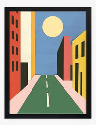
Sunny City Street Cut-Out Art Print
Translation missing: en.products.product.sale_price From €16,95€23,95 -

City Strolls and Skylines Art Print
Translation missing: en.products.product.sale_price From €16,95€23,95 -
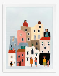
Little Town, Tall Houses Art Print
Translation missing: en.products.product.sale_price From €16,95€23,95 -

Vibrant City Streets Canvas Print
Translation missing: en.products.product.sale_price From €65,95€93,95 -
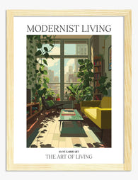
Modernist Living — The Art of Living Art Print
Translation missing: en.products.product.sale_price From €16,95€23,95 -

Street Lamp Cut-Out Cityscape Canvas Print
Translation missing: en.products.product.sale_price From €65,95€93,95 -

Tower on Terracotta Canvas Print
Translation missing: en.products.product.sale_price From €65,95€93,95 -

Tower on Terracotta Art Print
Translation missing: en.products.product.sale_price From €16,95€23,95 -

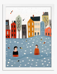
Rowboat on a Still Lake Art Print
Translation missing: en.products.product.sale_price From €16,95€23,95 -

Red Tower on Dusty Blue Art Print
Translation missing: en.products.product.sale_price From €16,95€23,95 -

Chicago in Pastels Art Print
Translation missing: en.products.product.sale_price From €16,95€23,95 -

Bauhaus Summer Vibes Canvas Print
Translation missing: en.products.product.sale_price From €65,95€93,95 -
Urban Strolls by the Canal Art Print
Translation missing: en.products.product.sale_price From €16,95€23,95 -

City Skyline with Fireworks Art Print
Translation missing: en.products.product.sale_price From €16,95€23,95 -

Spring in the Cityscape Art Print
Translation missing: en.products.product.sale_price From €16,95€23,95 -

Coral Minimal Cityscape Canvas Print
Translation missing: en.products.product.sale_price From €65,95€93,95 -

New York Skyline in Black and White Canvas Print
Translation missing: en.products.product.sale_price From €65,95€93,95 -

Red Tower on Dusty Blue Canvas Print
Translation missing: en.products.product.sale_price From €65,95€93,95


More from The Frame

Our Favourite Jungle Prints for Every Room: The...
Jungle prints have a reputation problem. Done badly, they tip a room into themed-restaurant territory faster than almost any other trend. Done well, they add depth, movement and a sense...

Thrushes, Hares, and Peacocks: The Animals in W...
Why Morris put animals at the centre of his designs William Morris wasn't decorating walls with cute creatures. He was making a quiet argument. While Victorian factories churned out cheap,...

From Dutch Masters to Modern Minimalism: The Ke...
Search "types of flower bouquet art" and you'll get wedding centrepieces, posy guides, and cascading bridal arrangements. Useful if you're getting married. Useless if you're trying to choose what goes...