Seaside Siesta with Spot Canvas Print - White

Seaside Siesta with Pup Canvas Print

Sale price From €66,95 €94,95
Vibrant Tuscan Escape Canvas Print Oak

Tuscan Hills at Sunset Canvas Print

Sale price From €66,95 €94,95
Mediterranean Table by Matisse Canvas Print White

Riviera Lunch with Wine and Lilies Canvas Print

Sale price From €66,95 €94,95
Folk Pattern Boston Terrier Canvas Print Black

Folk Pattern Boston Terrier Canvas Print

Sale price From €66,95 €94,95
Colorblock Cat Portrait Canvas Print - White

Color Pop Cat Portrait Canvas Print

Sale price From €66,95 €94,95
Matisse Inspired Seaside Retreat Canvas Print White

Shuttered Window, Sea Beyond Canvas Print

Sale price From €66,95 €94,95
Ace of Hearts in Blue Canvas Print White

Blue Ace of Hearts Canvas Print

Sale price From €66,95 €94,95
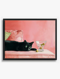
Black Cat & Olives Chic Canvas Print Black

Black Cat & Olive Hour Canvas Print

Sale price From €66,95 €94,95
Cool Canine Collective Canvas Print White

Playful Pups in Shades Canvas Print

Sale price From €66,95 €94,95
Vibrant Queen of Hearts Canvas Print White

Queen of Cocktails Canvas Print

Sale price From €66,95 €94,95
Scarlet Poppy Bloom Canvas Print White

Wild Red Poppies Canvas Print

Sale price From €66,95 €94,95
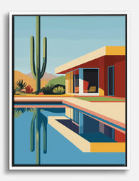
Modern Desert Retreat Canvas Print White

Desert Modern Oasis Canvas Print

Sale price From €66,95 €94,95

More Fab art curations

4.8 out of 5

What people say about Bold & Bright Canvas Prints

Auto-generated

Vibrant colours and good quality stand out, with the canvases bringing lively character to kitchens, living rooms and bathrooms.
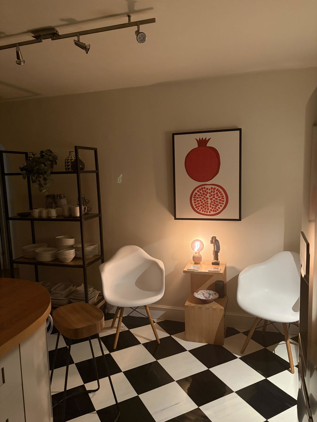
Pomegranate canvas

Prompt delivery and packaged well. Love this canvas, so striking and looks great on the wall in kitchen!

Pam B. · Verified shopper
Pomegranate Whole and Halved Canvas Print Oak Reviewed Pomegranate Whole and Halved Canvas Print →

Looks as good in person as it did online!!

Received my print quickly and it looks as good in person as it did online!! Good quality canvas - you will need to attach your own hardware to the back for hanging. Got it because it actually looks like one of my cats :) Will definitely purchase other things from Fab!

Bobbi B. · Verified shopper
Colorblock Cat Portrait Canvas Print - White Reviewed Color Pop Cat Portrait Canvas Print →
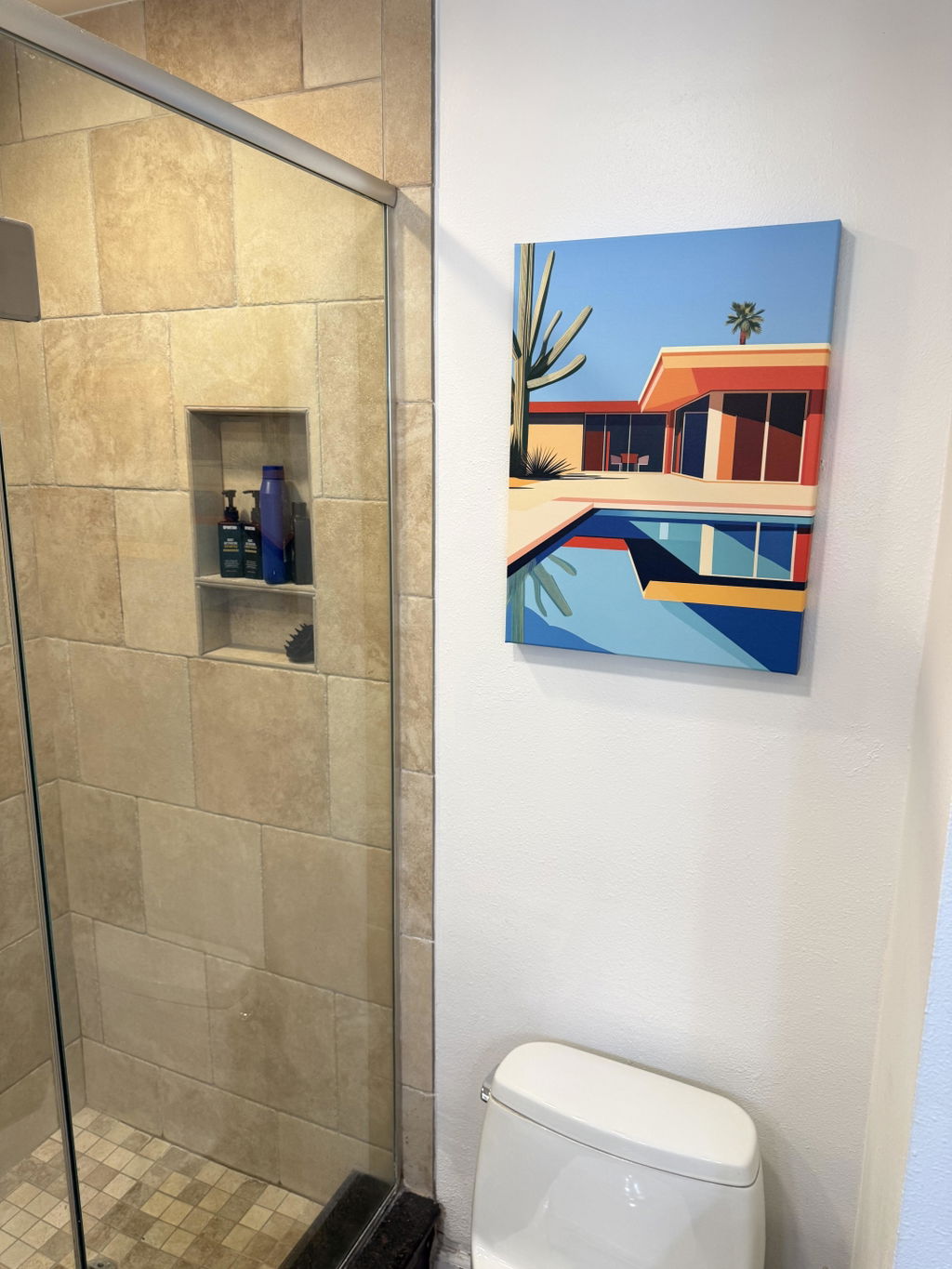
Love it

Love it. I hung it over the toilet and I feel like I’m at the pool in Palm Springs whenever I have to stare at the wall for 47 seconds. The colors pop in the bathroom mirror behind me. I can see it through my glass shower door. It is everywhere. All the time.

Justin C. · Verified shopper
Modern Desert Retreat Canvas Print White Reviewed Palm Springs Poolside Canvas Print →

Buying bold colour: what to know

Short answers on picking shades, placing loud pieces and the framed or unframed decision.

Need more help? Contact our team here

How do you style a bold, bright canvas print in a neutral room without it clashing?

Let the print be the room's single loud voice, then repeat one of its colors two or three times in small doses so the bold shade looks intentional. Start by matching undertones: warm neutrals like cream, oatmeal and camel sit best with warm brights such as coral, ochre or terracotta, while gray and greige walls handle cooler pinks, blues and greens. Hang it as the focal point, usually with the center near eye level and about two-thirds the width of the sofa or bed below. Echo the hue in a pillow, throw or vase, and keep everything else quiet and textural. A slim frame in black, white or natural wood, or an unframed canvas, keeps the look clean.

Which rooms suit bright, high-color canvas art best, and which rooms should you keep calmer?

Bright, high-color canvas art works best in rooms built for energy and interaction: entryways, where a saturated piece sets the tone in seconds, home offices that benefit from a focal point during long work stretches, dining rooms where color encourages conversation, plus playrooms, kitchens and family spaces. Keep bedrooms, nurseries and quiet reading corners calmer, using one bold piece against soft walls rather than several. Designers currently recommend balancing saturated hues with neutrals and leaving visual rest, so the color reads joyful instead of restless.

Which bright colors work together in wall art, and how do you pick a palette that matches your room?

Bright colors work best in pairs or trios that have a clear hierarchy. Complementary opposites like blue and orange, pink and green, or yellow and violet create the strongest punch, while analogous neighbors such as coral, tangerine and gold feel bolder but calmer. To match a room, borrow one hue already present in a rug, pillow or sofa, then let the art supply the accent in a roughly 60-30-10 split of dominant, secondary and pop color. Repeat that accent two or three times elsewhere so the piece looks intentional, and keep walls and large furniture quieter so saturated art can lead.