


 Order today for delivery by
 Bold & Bright Canvas Prints
Art that raises the volume: saturated colour blocks, high-contrast abstracts, pop portraits and tropical florals that give a quiet wall something to say. Bold works tend to earn their place above a sofa, on a landing, or anywhere a room feels flat. If one shade is already pulling the scheme together, start there, red canvas prints for warmth, blue canvas prints for depth, or pink canvas prints when you want energy without heat.


Flower Garden by Gustav Klimt Canvas Print

Open Window, Harbour View Canvas Print

Striped Fish Parade Canvas Print

Boho Flower Burst Canvas Print

Tranquil Poolside Oasis Canvas Print

Red and Orange Glow, after Rothko Canvas Print

Colourful Pups Parade Canvas Print
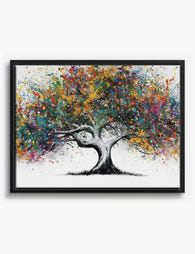
Colour Splash Tree Canvas Print
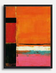
Orange Glow — Rothko-Inspired Abstract Canvas Print

Pop Cowgirl in White Hat Canvas Print

Big Pack of Happy Dogs Canvas Print

Vibrant Summer Tabletop Canvas Print
More Fab art curations


Hanging in 100k+ homes
What people say about Bold & Bright Canvas Prints
Auto-generatedVibrant colours and good quality stand out, with the canvases bringing lively character to kitchens, living rooms and bathrooms.
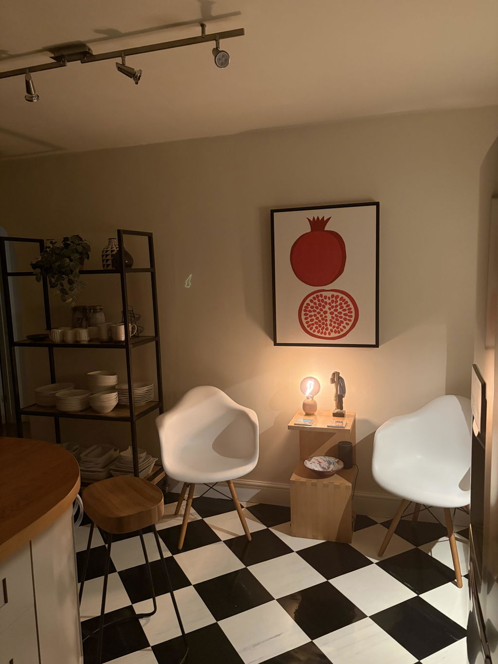
Pomegranate canvas
Prompt delivery and packaged well. Love this canvas, so striking and looks great on the wall in kitchen!
 Reviewed
Pomegranate Whole and Halved Canvas Print →
Reviewed
Pomegranate Whole and Halved Canvas Print →
Looks as good in person as it did online!!
Received my print quickly and it looks as good in person as it did online!! Good quality canvas - you will need to attach your own hardware to the back for hanging. Got it because it actually looks like one of my cats :) Will definitely purchase other things from Fab!
 Reviewed
Color Pop Cat Portrait Canvas Print →
Reviewed
Color Pop Cat Portrait Canvas Print →
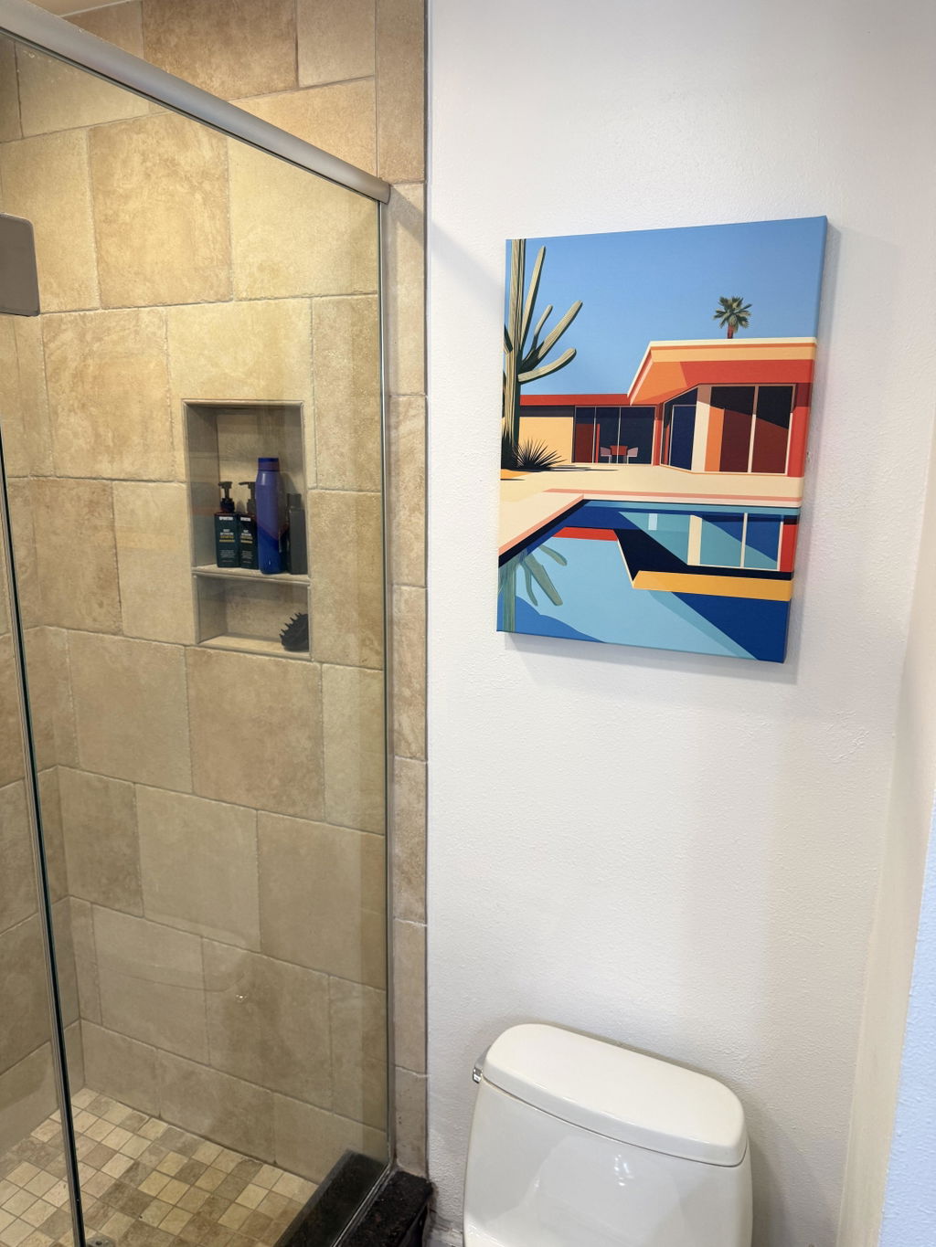
Love it
Love it. I hung it over the toilet and I feel like I’m at the pool in Palm Springs whenever I have to stare at the wall for 47 seconds. The colors pop in the bathroom mirror behind me. I can see it through my glass shower door. It is everywhere. All the time.
 Reviewed
Palm Springs Poolside Canvas Print →
Reviewed
Palm Springs Poolside Canvas Print →


 Buying bold colour: what to know



Short answers on picking shades, placing loud pieces and the framed or unframed decision.