I had no idea that Gustav Klimt painted cats before I visited your site
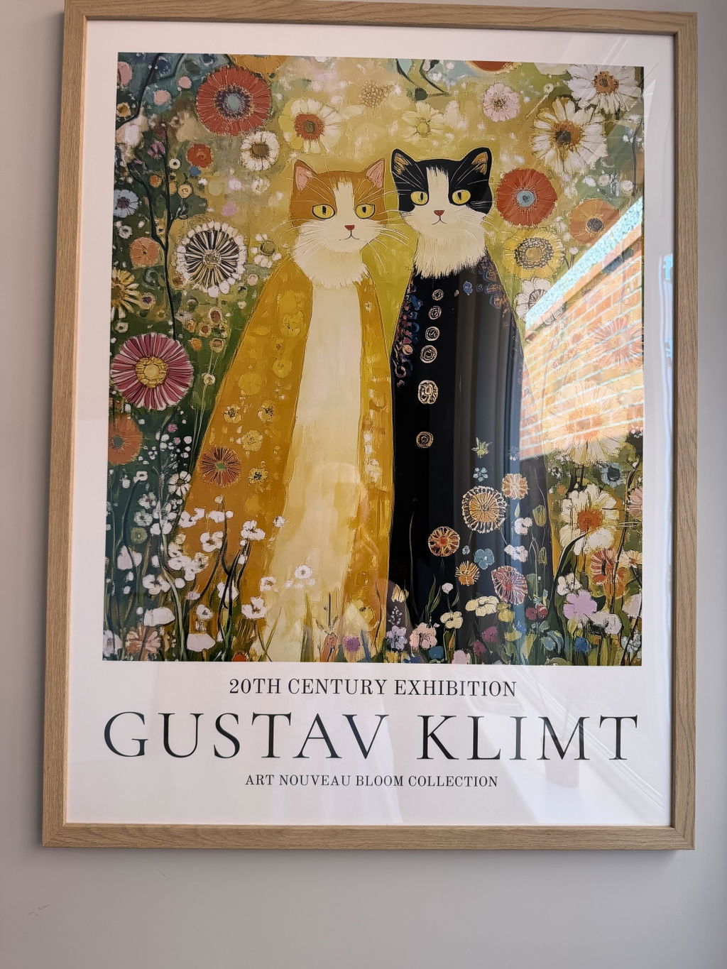
I had no idea that Gustav Klimt painted cats before I visited your site. The picture is lovely and colourful and the frame goes perfectly with it. It’s very quirky and it’s perfect in the room I put it in. Very satisfied, thank you..
Beautiful print on nice paper. Standard sizes, so you can get it framed by Fab or do it yourself. I've now bought 4 prints from Fab and love them all. Also, I accidentally ordered the wrong size once and was easily able to cancel and reorder.
The Van Gogh print arrived in perfect condition and looks beautiful
The Van Gogh print arrived in perfect condition and looks beautiful. I had just returned from a visit to the Van Gogh Museum in Amsterdam and wanted to get a print, but didn't want to carry it on the plane. This framed print that I ordered is just perfect!
Thanks for the opportunity to order this wonderful Van Gogh framed printed. It goes wonderfully with my previous Klimt art from you. The framing was well done and arrived within 2 weeks of ordering.
You have a botanical print from the 1890s and a bold abstract from last year, and you're worried they'll look like they fell out of two different houses. They won't,...
Most gallery wall advice treats "eclectic" as a synonym for "anything goes." It isn't. A mixed-era wall that feels collected rather than chaotic relies on specific pairings, a clear hierarchy,...
We’re serious about art, ask away
From sizing to framing and print quality, Fab's art experts break it all down—so you can find the right art for your space.
Which art period pairings actually look good together on one wall?
The pairings that read as intentional are the ones with maximum stylistic contrast but a shared color thread. Reliable combinations: a 19th-century botanical or natural history plate beside a hard-edged geometric abstract; an old master style portrait next to moody black-and-white photography; a calm classical landscape alongside a bold modern abstract of similar scale; Art Deco or mid-century poster graphics with contemporary line drawings. Unify each pairing with two or three repeating colors, warm neutrals for older work and cooler grays for modern, plus consistent frame finishes and even spacing.
Which subjects bridge eras best, like botanicals, portraits or maps?
Botanicals, portraits and maps all bridge eras well, because each subject has been drawn, painted and photographed continuously for centuries. Botanical studies pair naturally with modern leaf line drawings; a classical portrait converses easily with contemporary black-and-white photography; and old maps read as graphic, so they sit comfortably beside modern type or abstract work. Choose one subject family as the through-line, then vary period, scale and treatment. Tie the group together with a shared color range or consistent frame tone, and cluster two or three related pieces so the wall feels curated rather than random.
What is the difference between vintage, retro and antique art prints?
With decorative wall art, these three words describe eras and looks rather than the age of the print itself. Antique generally points to imagery from about 100 years ago or more, such as 18th and 19th century engravings, classical illustration and natural history plates. Vintage covers genuine period design roughly 20 to 100 years old, often 1920s to 1980s travel posters, softened color and era typography. Retro means newly created work that deliberately borrows an older style. Since reproductions are printed now, shop by the mood, palette and period feel you want.
Should frames match when the prints come from different eras?
They do not have to match, but they should agree on something. When prints span different eras, designers suggest picking two or three frame finishes that repeat across the wall, such as warm wood plus a soft brass or black, so the mix reads collected rather than random. Matching frames give a calmer, more formal look, while varied profiles suit an eclectic, layered room. Let mat width, spacing and a shared color thread carry the cohesion, and hang the ornate pieces where they can breathe. Framed options arrive ready to hang.
How do I mix vintage and modern art without my wall looking like a jumble sale?
The trick is to find a common thread. Pick mixed era art prints that share either a colour palette or a consistent tone (all muted, all bold) and let the time periods clash on purpose. For example, a 70x100cm Baroque-inspired still life framed in natural oak looks incredible flanked by two smaller mid-century graphic prints in the same warm tones. When the framing is consistent, even wildly different eras feel intentional rather than chaotic. Our framed prints arrive ready to hang with solid wood frames, so the finish across your set will match perfectly out of the box.
Can I create a gallery wall using prints from completely different art periods?
Absolutely, and we'd argue it's the best kind of gallery wall. A gallery wall with mixed styles works when you unify it with one frame finish and keep spacing consistent at around 5-7cm between each piece. Start with one large anchor print (we'd suggest 50x70cm or bigger) from a period you love, say a Renaissance-style portrait, then build outward with smaller retro modern wall art prints and contemporary abstracts. The eclectic tension between periods is exactly what makes visitors stop and stare.
Which rooms suit eclectic, multi-era wall art best?
Living rooms and hallways are the sweet spot. A living room above the sofa is the obvious choice because you have the wall space to let different periods breathe, and guests actually spend time looking. But don't overlook a long hallway: a row of three or four eclectic art prints in matching frames, each from a different era, turns a boring pass-through into something with real personality. We'd lean toward matte framed prints here because hallways often get hit with direct light, and our UV-protective acrylic glaze means you won't lose colour over time.
Do mixed era prints work as a gift for someone who already has art up?
They're one of the safest art gifts you can give precisely because they don't need to match anything. A single vintage modern art print in a well-made frame slots into almost any existing collection, which is the whole point of eclectic decorating. Go for a 30x40cm or 40x50cm framed print so the recipient can add it to a shelf, lean it, or hang it without rearranging their whole wall. And with our 99-day returns policy, they've got plenty of time to decide where it lives.
What does eclectic art actually mean, and why is it so popular right now?
Eclectic art is work that deliberately draws from multiple periods, styles, or movements rather than sitting neatly in one box. Think a print that nods to classical composition but uses a pop-art palette, or a piece that collages Baroque motifs with modern typography. It's popular because interiors have moved away from the all-matching, catalogue-room look. People want spaces that feel layered and collected over time, and eclectic wall art prints are the fastest way to get that look without spending years thrift shopping.
Choosing a selection results in a full page refresh.


 Order today for delivery by









 Reviewed
Klimt's Whimsical Cats in the Meadow Art Print →
Reviewed
Klimt's Whimsical Cats in the Meadow Art Print →
 Reviewed
Black Cat in Klimt’s Garden →
Reviewed
Black Cat in Klimt’s Garden →
 Reviewed
Enchanted Nightscape by William Morris Art Print →
Reviewed
Enchanted Nightscape by William Morris Art Print →




 We’re serious about art, ask away


