How to Build a Cocktail Gallery Wall That Looks Curated, Not Cluttered
A step-by-step approach to building a cocktail gallery wall with proper spacing, frame logic, and prints that actually belong together.

Most cocktail gallery walls fail for the same reason: they're a pile of prints someone liked, hung roughly together, hoping the theme will do the heavy lifting. It won't. A gallery wall that looks curated is the result of three deliberate decisions: what you hang, how you arrange it, and how consistent your framing is.
This guide walks through the full process, from picking your prints to getting the spirit level out, with specific size combinations and layouts you can copy.
Why themed gallery walls work better than random ones
A themed wall gives your eye somewhere to land. When every print shares a subject, a palette, or a printing style, your brain reads the wall as one composition rather than a collection of unrelated objects. That's why a cocktail wall with six prints can feel calmer than a random wall with three.
Cocktail art works particularly well as a theme because the subject matter is inherently decorative. Glassware, citrus, ice, deep amber spirits, mint, and copper mugs are already styled. The compositions are usually centred and graphic, which means they read clearly from across a room and don't compete with each other the way landscapes or portraits often do.
There's also a mood argument. Cocktail prints set a tone of evenings, hosting, and a slightly indulgent kind of leisure. Hanging them in the right room turns a wall into a signal: this is where we relax, drink, and have people over.

Choosing your cocktail art: recipe prints, illustrations, or vintage posters
Before you think about layout, decide which lane of cocktail wall art you're in. There are three broad categories, and mixing them badly is the fastest way to make a wall feel chaotic.
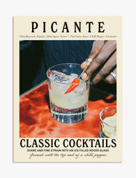
Recipe prints
These are typographic prints that list a cocktail's ingredients and method. They're functional, guests can actually read them, and they suit kitchens and bar areas where the practical and decorative overlap. Recipe prints work best when they share the same typographic style. Six different fonts on six different recipe prints will look like a noticeboard.
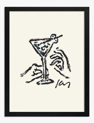
Cocktail illustrations
Stylised drawings of glasses, garnishes, and finished drinks. These are the most flexible category because illustration styles tend to be cohesive within a series. A set of six minimalist line-drawn cocktail illustrations is almost impossible to get wrong. Browse cocktail illustrations prints as a single visual family rather than picking favourites individually.
Vintage posters
Reproduction adverts for vermouth, aperitifs, champagne houses, and 1920s bars. Rich in colour, often with a lot of typography, and full of personality. They demand more visual breathing room than illustrations, which means fewer prints, larger sizes, and more spacing. The vintage art prints collection is where to start if this is your direction.
Our position: pick one lane and stay in it. If you want to mix, mix illustration with recipe prints (both graphic, both modern). Keep vintage posters with vintage posters.
The best size combinations for a 3, 4, or 6 print gallery wall
Size combinations are where most gallery walls go wrong. Either everything is the same size and the wall feels like a contact sheet, or sizes are random and nothing anchors the eye. Use these as starting points.
Three-print walls (best for narrow walls or above a bar cart)
- Linear, equal sizes: 3 x 30x40cm in a row. Clean, symmetrical, hard to mess up.
- Anchored asymmetric: 1 x 50x70cm centre, 2 x 30x40cm flanking. The big print does the work, the smaller two add rhythm.
- Stepped: 3 x 40x50cm, hung with the centre print 10cm higher than the outer two. Subtle, works well in modern rooms.
Four-print walls (best for square-ish wall sections)
- Two-by-two grid: 4 x 40x50cm, evenly spaced. The most forgiving layout in existence.
- Asymmetric quartet: 1 x 60x80cm anchor, 3 x 30x40cm grouped beside or below it.
- Horizontal row: 4 x 30x40cm in a long line. Suits long, low walls above sideboards or banquettes.
Six-print walls (best for statement walls and dedicated bar zones)
- Three-by-two grid: 6 x 30x40cm. Looks like a proper curated set, especially in matching frames.
- Mixed grid: 2 x 50x70cm on the top row, 4 x 30x40cm on the bottom row.
- Salon style: 1 x 70x100cm, 2 x 40x50cm, 3 x 30x40cm arranged organically. The hardest layout to nail but the most rewarding.
For grids, wall art sets are worth looking at because the prints are already designed to work together at scale.
Layout templates you can trace onto your wall
The single best thing you can do before hanging anything is to lay it out on the floor first, then transfer the layout to your wall using paper templates. Cut paper or newspaper to the exact dimensions of each print, tape them to the wall with low-tack tape, and live with the arrangement for a day. Move them around. Take a photo from across the room. Adjust.
Here are the three template shapes worth knowing.
The grid
Equal-sized prints in straight rows and columns. Spacing between frames must be identical (we recommend 5cm for prints up to 40x50cm, 7cm for anything larger). The grid is the most curated-looking layout and the one that punishes inconsistent framing the most.
The salon
A clustered, organic arrangement built around an invisible rectangle. Pick the outer dimensions of your rectangle first, then arrange prints inside it so the edges of the cluster line up with that rectangle. Inside the cluster, vary print sizes but keep spacing tight and consistent.
A trick from professional hangers: arrange prints so any three of them form an invisible triangle. Triangles create visual stability. If you can mentally draw triangles between print centres across the whole arrangement, the wall will feel balanced.
The linear
Prints in a single horizontal or vertical line, centres aligned. The simplest layout and arguably the most modern. Works particularly well above narrow bar carts and console tables.

Mixing cocktail prints with other subjects without losing the theme
A pure cocktail wall can feel one-note in a larger room. The fix isn't to abandon the theme, it's to extend it.
The principle: introduce subjects that share either palette, era, or context with cocktails. Three categories that work:
- Botanical prints of cocktail ingredients. Lemon, lime, mint, juniper berries, oranges. They read as decorative botanicals to most people, but they're thematically locked to the bar.
- Glassware studies. Still life prints of empty coupes, decanters, or champagne flutes. Same visual language, slightly different subject.
- Bar scenes and interiors. Vintage posters of cafés, bars, and brasseries. They sit naturally with cocktail prints because they're the same world.
What to avoid: random subjects that share only a colour palette. A print of a sailing boat in similar warm tones to a Negroni illustration will not read as themed. It will read as "things that happen to be orange."
The ratio we like: at least 60% cocktail-specific prints, no more than 40% adjacent subjects. Below 60% the theme dilutes.
Frame colour: why consistency matters more than matching the wall
The biggest single upgrade you can make to any gallery wall is using one frame colour throughout. Mixed frames almost always look accidental. Matching frames look intentional even when the prints inside are varied.
Three choices, each with a clear use case:
Black frames
Best for: modern bars, dark walls, cocktail illustrations with strong graphic lines. Black frames create high contrast and make prints feel like proper artwork. They suit deep green, navy, oxblood, and charcoal walls particularly well.
Oak frames
Best for: warm, lived-in spaces, kitchens, vintage posters, and walls painted in cream, plaster, or sage. Oak softens the look and makes the wall feel less formal. It's also the most forgiving frame colour for mixing print eras.
White frames
Best for: minimalist spaces, gallery-style walls, and rooms with a lot of existing colour. White frames disappear into pale walls and let the print do all the talking. Less dramatic than black, less warm than oak.
Our advice: don't try to match your frames to your wall colour. Match them to the mood. A black-framed cocktail wall on a sage green background looks more curated than the same wall in sage-matching frames.
A note on quality. The most common gallery wall failure isn't layout, it's framing that warps, fades, or arrives looking cheap. Solid wood frames hold their shape over time, and UV-protective acrylic glaze keeps colours from shifting in sunlight. If your bar wall gets afternoon light, this matters more than you think.
Spacing, hanging tools, and getting it level first time
The professional spacing convention is 5 to 7cm between frames (roughly 2 to 3 inches). Less than 5cm and the wall feels cramped. More than 8cm and the prints stop reading as a group.
Use the same spacing across the entire arrangement. If you go 5cm between two prints and 7cm between two others, your eye will register the inconsistency even if it can't articulate why.
Tools you actually need
- A spirit level (or the level app on your phone, used carefully)
- A pencil, ideally one with a soft lead so marks rub off easily
- A tape measure
- Low-tack masking tape for the paper template phase
- Picture hooks rated for the weight of your frames
The hanging sequence
- Lay the full arrangement out on the floor first. Photograph it from above.
- Cut paper templates to the exact size of each frame. Mark where the hanging fixture sits on the back of each frame, then mark the equivalent point on each paper template.
- Tape the templates to the wall in your chosen layout. Check spacing with a tape measure, not your eye.
- Step back. Sit on the sofa. Walk past from the hallway. If anything looks off, adjust.
- When you're committed, push your picture hooks through the marked point on each template, into the wall.
- Tear the paper away and hang.
Framed prints that arrive ready to hang with fixtures already attached save a meaningful amount of faff at this stage. You're not measuring fixture positions on the back of each frame, just hanging.

Gallery wall examples for above a bar, in a kitchen, and in a dining room
Above a bar cart
The classic placement. Hang the bottom edge of your lowest print 20 to 25cm above the top of the bar cart so bottles and glassware don't crowd the art. A linear three-print row at 30x40cm each, in black frames, works almost universally above a 90cm-wide bar cart. For a wider cart or built-in bar, scale up to a six-print grid.
Lighting matters here. Bar areas tend to have moody, low-level lighting in the evenings, which can swallow detail. Choose prints with high contrast (dark backgrounds, bright cocktails, or pale backgrounds with bold illustrations). Subtle, low-contrast prints will disappear after sunset.
In a kitchen
Recipe prints earn their place here because guests will read them while you're making drinks. A two-by-two grid of 30x40cm recipe prints in oak frames, hung above a worktop or in a breakfast nook, looks intentional without trying too hard. Keep them at least 30cm above any worktop where splashes or steam are likely.
In a dining room
Dining rooms suit larger, more dramatic arrangements because you're looking at the wall while seated for long stretches. A salon-style cluster of vintage cocktail posters in matching frames, hung above a sideboard or behind one end of the dining table, sets the mood for the entire room. Aim for the centre of the cluster to sit roughly 145 to 150cm from the floor, which is standard gallery hanging height.

Final thought
Build the wall on the floor before you build it on the wall. Pick one frame colour and stick to it. Keep your spacing identical across every gap. Stay in one cocktail art lane (illustration, recipe, or vintage) and only extend the theme with subjects that genuinely belong to the same world. Do those four things and the wall will look curated, even before you've hung the first nail.

Fab products featured in this blog
-

Vibrant Cocktail Gathering Art Print
Translation missing: en.products.product.sale_price From €16,95€23,95 -

Climb the Cocktail Canvas Print
Translation missing: en.products.product.sale_price From €54,95€91,95 -

Cocktail Hour Line Drawing Canvas Print
Translation missing: en.products.product.sale_price From €54,95€91,95 -

Chic Cocktail Quartet Canvas Print
Translation missing: en.products.product.sale_price From €64,95€92,95 -

Modern Cocktail Sketch Art Print
Translation missing: en.products.product.sale_price From €16,95€23,95 -

Vibrant Cocktail Sketch Canvas Print
Translation missing: en.products.product.sale_price From €64,95€92,95 -
Martini Line Sketch Art Print
Translation missing: en.products.product.sale_price From €14,95€24,95 -

Vibrant Cocktail Print Art Print
Translation missing: en.products.product.sale_price From €14,95€24,95 -

Vintage Cocktail Recipe Art Canvas Print
Translation missing: en.products.product.sale_price From €54,95€91,95 -
Spicy Cocktail Recipe Art Print
Translation missing: en.products.product.sale_price From €14,95€24,95 -

Paloma Cocktail Chic Art Print
Translation missing: en.products.product.sale_price From €14,95€24,95 -

Modern Martini Vibes Canvas Print
Translation missing: en.products.product.sale_price From €54,95€91,95 -

Modern Martini Chic Art Print
Translation missing: en.products.product.sale_price From €14,95€24,95 -

Margarita Cocktail Chic Canvas Print
Translation missing: en.products.product.sale_price From €54,95€91,95 -

Modern Gimlet Cocktail Canvas Print
Translation missing: en.products.product.sale_price From €54,95€91,95 -

Pastel Cocktail Pyramid Art Print
Translation missing: en.products.product.sale_price From €16,95€23,95 -

Cocktail King Vibes Canvas Print
Translation missing: en.products.product.sale_price From €54,95€91,95 -

Queen of Cocktails Canvas Print
Translation missing: en.products.product.sale_price From €54,95€91,95


More from The Frame

How to Build a Botanical Gallery Wall That Actu...
Most botanical gallery walls fail for the same reason: too many prints, too many plant types, too many frame finishes. The fix is structural, not aesthetic. This guide gives you...

How to Build a Butterfly Gallery Wall That Look...
You've bought the prints. Or you're about to. Either way, you're now standing in front of a blank wall wondering how on earth to turn three or five or seven...

Road Themed Gallery Walls: How to Build One Tha...
Most gallery wall guides will tell you how to space frames and which nail to use. Almost none will tell you what actually pairs with a winding mountain road or...