Geometric Wall Art Trends Worth Paying Attention To (And One to Skip)
A 2026 trend forecast for geometric prints, with honest guidance on what to buy and what to leave on the shelf.

Geometric art has been having a long moment, and the moment is shifting. The maximalist, multi-shape compositions that dominated 2022 and 2023 are giving way to something quieter, more confident, and considerably easier to live with. Here's what's actually worth your wall space right now, and one trend we'd happily watch fade out.
The shift from busy patterns to single-shape statements
The biggest movement in geometric wall art trends is also the most under-reported: people are buying fewer shapes per print. A single arch. One off-centre circle. A solitary irregular polygon floating in generous negative space. This is a direct reaction to the layered, Memphis-adjacent compositions that flooded interiors a few years ago.
There's a practical reason for the shift. Busy geometric prints fight with everything else in a room. Patterned cushions, textured rugs, even an interesting lampshade starts to compete. A single-shape composition does the opposite: it acts as a visual rest, which is exactly what most rooms actually need.
Negative space is doing the heavy lifting here. The shape itself matters less than the proportion of empty paper around it. We'd argue a 60x80cm print with one well-placed arch reads as more sophisticated than the same size print packed with overlapping triangles, hexagons, and squiggles. The minimalism feels intentional rather than indecisive.
If you're shopping for the best shapes for minimalist decor, look for prints where you could describe the composition in five words or fewer. That's usually the test.

Earth tones and muted palettes: why geometry has softened
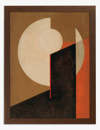
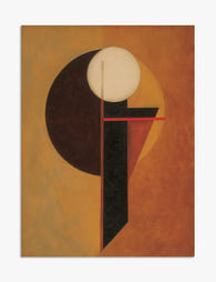
Bauhaus colour theory gave us bold primaries: red, yellow, blue, black. It was decisive and graphic and worked brilliantly in 1925. It works less well in a north-facing flat in Manchester in 2026.
The current palette is dustier and warmer. Terracotta, ochre, sage green, oat, putty, burnt sienna, faded brick, and a particular shade of muted plum that keeps appearing in new collections. These colours flatter both natural light and lamp light, which is something primary colours genuinely struggle to do.
Why the shift? Partly it's a reaction to the cooler grey-and-white interiors of the 2010s, and partly it's because warm neutrals make rooms feel finished even when the rest of the space is in progress. A sage and clay-coloured print on a white wall does a lot of work. The same composition in cobalt and lemon can feel costume-y.
A useful rule: pick prints where the brightest colour in the artwork would still feel at home as a paint colour. If you wouldn't paint a wall in it, you probably won't want to look at a large print of it for ten years either. Our abstract art prints collection leans heavily into this softer palette, and it's the easiest way to bring geometry into a room without it shouting.
Vintage geometric prints and the 70s revival in modern interiors
Vintage abstract geometric prints have come back hard, but the execution that actually works in contemporary spaces is more specific than the trend coverage suggests. The 70s revival isn't really about reproducing 70s rooms. It's about borrowing one or two 70s elements and dropping them into otherwise modern interiors.
The prints that work tend to share a few traits: hand-drawn or screen-printed quality (rather than glossy digital perfection), warm palettes that lean brown, rust, and mustard, and compositions that feel slightly off-balance on purpose. Think Verner Panton, Bruno Munari, early Sonia Delaunay. The geometry is precise but the colour fields look like they were laid down by hand.
Where people go wrong is pairing vintage geometric prints with vintage furniture. A rust-and-ochre print above a teak sideboard with a rattan chair and a macramé hanging is a costume, not a room. The same print above a clean linen sofa, with a contemporary floor lamp and a plain wool rug, is interior design.
The other mistake is scale. Original 70s prints were often quite small, around A3 or smaller. A faithful reproduction at that size in a modern open-plan space disappears. We'd size up. A 50x70cm or 70x100cm print holds the wall properly without the room reading as a pastiche.

Oversized geometric canvas prints as room anchors
Scale is doing more work than it used to. A single 100x150cm canvas print over a sofa or bed has replaced the gallery wall as the default move for a feature wall, and we think this is the right call.
Gallery walls are demanding. They require you to commit to a grid, balance multiple frames, and account for sight lines from every angle in the room. One oversized piece does the same job with a fraction of the decision-making. It also photographs better, which sounds frivolous but matters if you actually live in your space and want it to feel composed.
Canvas is the right format for large-scale geometric work for a few reasons. The matte canvas surface absorbs light rather than reflecting it, which keeps colour fields reading as solid rather than glossy. At 100x150cm, canvas is also significantly lighter than a framed print of the same size, which makes hanging it on a plasterboard wall much less stressful. The mirrored edge wrapping means the composition doesn't get cropped at the edges, which is genuinely important for geometric work where every line and angle was intentional.
The trade-off, and we'll be honest about it, is that canvas reads as slightly less formal than a framed print. In a polished living room or a more traditional space, a framed print at 70x100cm often looks more considered than a 100x150cm canvas. Canvas wins for casual, large, and contemporary. Frames win for formal, polished, and detailed work.
The trend we'd skip: why 3D geometric wall art rarely delivers
3D geometric wall art, the kind made from cut wood, metal, or acrylic panels that protrude from the wall, has been pushed hard by trend articles for the past two years. We'd give it a pass.
The execution issues are real. Most 3D geometric pieces are made from MDF or cheap composite, painted to look like something more substantial. They chip easily, the paint scuffs at the edges, and once they're damaged there's no good way to repair them. The good versions, made from actual solid wood or metal, are expensive enough that the value proposition collapses.
Then there's dust. Every horizontal surface in a 3D wall sculpture is a dust shelf, and they're awkward to clean without dismantling. After six months, the texture you bought becomes a grey film you can't quite reach.
Installation is the third issue. 3D pieces often need multiple wall fixings to sit flush, and they cast shadows that change throughout the day in ways that aren't always flattering. What looks sculptural in a showroom can look like clutter in real light.
The deeper problem is that 3D geometric art reads as decorative, in the slightly dismissive sense of the word. Two-dimensional modern art prints feel like art. Wall sculptures of overlapping hexagons feel like a thing you bought to fill a wall. And they date fast. A 3D piece that felt fresh in 2023 already looks like a hotel lobby in 2026.
If you want texture and depth, get a framed print with a generous mount and a solid wood frame. The depth comes from the framing, not from the artwork sticking out at you.

How to buy into a trend without redecorating in 18 months
Trend-led purchases get a bad reputation, mostly because people buy badly. Here's how to buy into a current geometric look in a way that survives the next style shift.
Choose simple shapes over complex compositions. A single arch, circle, or rectangle will read as classic in ten years. A composition of fifteen overlapping coloured shapes won't. Simplicity ages well because it doesn't tie itself to a specific moment in graphic design.
Stay in muted territory for the dominant colours. If the largest shape in the print is bright cobalt, you've bought a piece that has to be the loudest thing in the room for the rest of its life. If the largest shape is oat or putty, the print can sit comfortably alongside whatever you redecorate around it.
Scale up rather than buying multiples. One large piece is easier to relocate, easier to restyle, and easier to take seriously than a set of four matching small ones. Sets of matching prints date faster than single statement pieces, partly because they signal "I bought these together" rather than "I chose this."
Invest in framing and paper quality. A great composition on thin paper in a flimsy frame looks cheap within a year. Thick matte paper with a solid wood frame and proper UV-protective glazing holds up indefinitely. This matters more than the specific image, because good materials forgive a lot of stylistic ageing.
Avoid prints that reference very specific subcultures or moments. Vaporwave geometry, Y2K chrome shapes, anything that screams a particular year. These pieces don't transition into different interiors as your taste shifts.
Our favourite shapes art prints for the current moment
If we're being specific, here's what's working right now in our shapes art prints collection and elsewhere.
Single arches in warm neutrals. The arch is the shape of the moment, and a well-executed single-arch composition in terracotta, sage, or cream is the closest thing to a safe bet in geometric art right now. It works above a sofa, above a bed, or in a hallway, and it pairs with almost any furniture style.
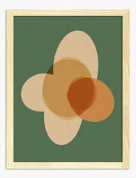
Asymmetric circles. A circle that sits deliberately off-centre, sometimes partially cropped by the edge of the paper. There's a quiet tension in it that fully centred compositions don't have. These read as contemporary without feeling trend-chasing.
Irregular polygons in earth tones. Hand-drawn or hand-cut shapes with imperfect edges, rather than computer-perfect geometry. This "imperfect geometry" movement is a direct response to the rise of AI-generated art, and the appetite for visible human hand is going to keep growing.
Japandi-influenced geometric forms. Soft, organic shapes in oat, charcoal, and warm wood tones, often with a single accent of muted colour. Japanese restraint meets Scandinavian geometry, and the combination is unusually durable across different interior styles.
Vintage-influenced abstract compositions with no more than three colours and three shapes. The 70s palette, the 2026 restraint.
What we'd leave on the shelf: anything with more than five distinct shapes, anything in pure primary colours, anything 3D, anything that comes as a matching set of four, and anything labelled "boho geometric." That last category is doing nobody any favours.
A final thought
Geometric art is one of the few categories where buying less and buying bigger genuinely works. One large, restrained, well-framed piece in a colour you'd happily live with for a decade will outperform a wall of small trendy prints every time. The shapes will keep changing. The principle won't.


Fab products featured in this blog
-

Bauhaus Modern Geometry Art Print
Translation missing: en.products.product.sale_price From €14,95€24,95 -

Bauhaus Modern Geometry Art Print
Translation missing: en.products.product.sale_price From €14,95€24,95 -

Modern Geometric Home Art Print
Translation missing: en.products.product.sale_price From €14,95€24,95 -

Modern Geometric Haven Art Print
Translation missing: en.products.product.sale_price From €14,95€24,95 -
Terracotta Geometry Art Print
Translation missing: en.products.product.sale_price From €14,95€24,95 -

Terracotta Glow Geometry Art Print
Translation missing: en.products.product.sale_price From €14,95€24,95 -

Bauhaus Geometric Pattern Canvas Print
Translation missing: en.products.product.sale_price From €54,95€91,95 -

Terracotta Geometry Canvas Print
Translation missing: en.products.product.sale_price From €54,95€91,95 -

Earthy Modern Geometry Art Print
Translation missing: en.products.product.sale_price From €14,95€24,95 -

Modern Geo Shapes Canvas Print
Translation missing: en.products.product.sale_price From €54,95€91,95 -

Bauhaus Geometric Modern Canvas Print
Translation missing: en.products.product.sale_price From €54,95€91,95 -
Modern Earthy Shapes Art Print
Translation missing: en.products.product.sale_price From €14,95€24,95 -

Modern Monochrome Geometry Art Print
Translation missing: en.products.product.sale_price From €14,95€24,95 -

Modern Neutral Geometry Art Print
Translation missing: en.products.product.sale_price From €14,95€24,95 -
Terracotta Geometry Glow Art Print
Translation missing: en.products.product.sale_price From €14,95€24,95 -

Bauhaus Modern Geometry Art Print
Translation missing: en.products.product.sale_price From €14,95€24,95 -

Modern Bauhaus Geometry Art Print
Translation missing: en.products.product.sale_price From €14,95€24,95 -

Bold Boho Geometry Canvas Print
Translation missing: en.products.product.sale_price From €54,95€91,95 -

Bauhaus Modern Geometry Canvas Print
Translation missing: en.products.product.sale_price From €54,95€91,95


More from The Frame

The Complete Guide to Displaying Frog Prints in...
Frog prints sit in a strange corner of art history. They can look like a serious natural history collection, or they can tip your living room straight into a children's...

The Kitchen Gallery Wall Edit: Curated Food Pri...
Most kitchen gallery walls fail for the same reason: people pick prints they like individually, hang them roughly, and hope for the best. This guide gives you the formulas, the...

You're Overthinking Your St. Louis Gallery Wall
Most St. Louis gallery walls fail for the same reason: too many ideas competing for attention. You bought a beautiful Gateway Arch print, found a Soulard map you love, threw...