Building a Gallery Wall Around Floral Prints: A Step-by-Step Approach
A practical blueprint for turning a blank wall into a curated arrangement with florals at its centre.

Most gallery wall advice skips the hard part: deciding what goes where, and why. This guide assumes you've got a blank wall, you want florals at the heart of it, and you want to get it right the first time. We'll cover the planning, the layout maths, and the three schemes you can actually copy.
Start with your anchor: choosing the hero floral print
Every successful gallery wall has a single piece that carries the room. With a floral arrangement, that hero print is doing two jobs at once: setting the mood and locking in your colour palette. Pick this print before you choose anything else.
Go bigger than feels comfortable. For a gallery wall above a 3-seater sofa, your hero print should be at least 50x70cm. Above a bed, push to 60x80cm or 70x100cm. If the hero feels too small, the whole wall will look like wallpaper rather than a curated arrangement.
Style matters more than subject here. A loose, painterly peony in dusty pink reads romantic and soft. A botanical study of a fern on cream paper reads scholarly and calm. A graphic, high-contrast tulip in mustard and black reads modern and bold. Decide which mood you want the room to hold, then choose a hero that commits to it.
Browse floral art prints and botanical art prints with this in mind. Botanicals lean structured and illustrative. Florals lean expressive and painterly. Both work as anchors; they just set very different tones.

How many prints you need for different wall sizes
This is where most people go wrong. They buy three prints, hang them with too much space between, and end up with something that looks unfinished. Here's the rough maths.
Above a sofa (180cm wide): Aim for 5 to 7 pieces. Your hero print plus 4 to 6 supporting pieces in mixed sizes. The total arrangement should span about two-thirds of the sofa width, roughly 120cm.
Above a bed (140cm wide double): 5 pieces works beautifully. One large hero centred over the bed, with two medium pieces flanking and two smaller pieces filling the corners.
A full feature wall (2.5m wide or more): 7 to 11 pieces. This is where you can play with real variety in size, including one statement piece at 70x100cm.
A narrow vertical wall (between two doorways): 3 pieces stacked, all portrait orientation. Keep it tight and intentional.
The principle: the gallery should cover roughly 60 to 75% of the available wall area. Less than that and it looks lost. More and it starts to feel claustrophobic.
Mixing florals with abstracts, landscapes, and line art without chaos
A gallery wall made entirely of florals can tip into chintz quickly. The fix is mixing in two or three non-floral pieces that share a visual thread but contrast in subject. Here's how to do it without the wall descending into chaos.
Abstracts are the easiest mix. Choose an abstract print that pulls one or two colours directly from your hero floral. If your hero peony is dusty pink with sage leaves, an abstract in those exact tones acts like a chord change in the same key.
Line art (single-line botanicals, figure drawings, simple ink studies) adds breathing room. Florals are visually busy. A piece of black-and-white line art on cream paper gives the eye somewhere to rest. Use one line art piece for every three to four florals.
Landscapes work if the palette overlaps. A misty hillside in sage and cream sits beautifully with a sage-and-pink floral. A bright tropical beach scene will fight it.
What to avoid: photography of people, busy typography prints, and anything with a colour palette that doesn't appear anywhere else on the wall. If a piece doesn't share at least one colour with the hero, it doesn't belong.
The ratio we keep returning to: 60% florals and botanicals, 25% abstracts or landscapes, 15% line art or negative-space pieces. It works.
The colour-thread rule: keeping it cohesive
This is the rule that separates intentional gallery walls from accidental ones. Every single piece on your wall must share at least one colour with at least two other pieces. We call it the colour thread.
Pick three colours from your hero floral. For a classic spring peony, that might be blush pink, sage green, and warm cream. Every other print you add must contain at least one of those three colours, ideally two.
This doesn't mean every piece looks the same. A charcoal abstract with a thin sage line passes the test. A landscape in cream and rust with a pink-flowering tree passes. A bright cobalt fish print does not, unless you bring cobalt into the hero too.
Lay your prints out on the floor before committing. If one piece feels like it's shouting, it's failing the colour thread test. Replace it.

Layout templates that work (and the one layout to avoid)
Four layouts cover almost every gallery wall situation. Pick based on your wall shape and how much risk you want to take.
The grid
Equal-sized prints arranged in a clean grid. Best for: 4, 6, or 9 prints of identical dimensions. Works beautifully with a series, like four 40x50cm botanicals from the same artist. Calm, formal, easy to execute.
The salon hang
Mixed sizes, mixed orientations, packed close together. This is the layout that looks most like a curated home. The hero print sits slightly off-centre, with smaller pieces filling around it organically. Requires more planning but rewards it.
The horizontal line
Three to five prints in a straight row, all centred on a single horizontal axis. Perfect above a sofa or console table. Mix sizes but keep tops or centres aligned.
The asymmetric cluster
One large hero on one side, three to five smaller pieces clustered on the other. Modern, dynamic, and easier than the salon hang because the imbalance is intentional.
The one to avoid
The staircase: prints arranged in a diagonal line, each slightly higher than the last. It almost always looks dated and accidental, regardless of how carefully you measure. Skip it.
Spacing, hanging height, and the tools that make it painless
Hang the centre of your arrangement at 145cm from the floor. This is the gallery standard. Adjust slightly downward (140cm) for low ceilings or seating-area walls where people are mostly looking from a sofa.
Between prints, leave a 5 to 7cm gap. Any less and the arrangement reads as one chaotic block. Any more and the pieces stop talking to each other. We find 6cm hits the sweet spot for mixed-size salon hangs.
When the wall sits above furniture, leave 15 to 20cm between the top of the sofa or headboard and the bottom of the lowest print. Closer than that feels cramped. Further and the art floats untethered.
The tools you actually need:
- A pencil
- A spirit level (or the level on your phone)
- A tape measure
- A roll of brown kraft paper or old newspaper
- Painter's tape (the low-tack blue kind)
- A hammer and picture hooks suited to your wall type
The kraft paper is the secret. Cut each print's outline to size, tape them to the wall with painter's tape, and shuffle them around until the layout works. Mark the hook position on each paper template, hammer through the paper, then tear it away. No regret-holes.
For renters or anyone who doesn't want to drill, removable adhesive strips work well for prints up to 50x70cm. For anything larger, use proper hooks. Framed prints in particular have real weight to them, especially in larger sizes.
Framed vs unframed vs canvas: mixing formats on a gallery wall
Most gallery wall guides ignore this entirely, which is a mistake. Format mixing is one of the easiest ways to add visual interest without breaking cohesion.
All framed, consistent frame colour: the most formal option. Black frames read modern and graphic. Natural oak frames read warm and Scandinavian. White frames disappear and let the prints do the work. We'd avoid mixing more than two frame colours on a single wall.
Framed mixed with canvas: a brilliant middle ground. Use framed art prints for the smaller supporting pieces and one large canvas as the hero. The flat finish of a framed piece sits nicely against the slight depth of a stretched canvas. Just check the canvas hangs at the same depth from the wall as your frames, or close enough that it doesn't read as protruding.
Unframed prints: harder to pull off on a gallery wall but possible with binder clips, washi tape, or simple bulldog clips on a string. Best reserved for one or two pieces among framed ones, never the whole wall.
Our Fab framed prints arrive ready to hang with the fixtures already attached and the print properly fitted behind UV-protective acrylic glaze. The whole thing ships in one box with the frame already on. Worth noting because the most common gallery wall disaster is prints arriving warped or frames shipped separately and assembled badly at home. If you're hanging seven pieces, you don't want seven separate assembly jobs.
Canvases are lighter than framed prints, which matters for plasterboard walls or anyone hanging multiple pieces. They also handle humidity better, so they're a better choice for bathroom or kitchen gallery walls.

Three gallery wall schemes built around floral art prints
Here are three schemes you can use as direct blueprints. Each is built around the colour-thread rule and the layout templates above.
Scheme 1: The English Country Bedroom
Mood: soft, romantic, slightly faded.
Palette: dusty pink, sage green, cream, soft charcoal.
Pieces (5 total, salon hang above a double bed):
- Hero: 70x100cm loose peony watercolour in pink and sage, oak frame, portrait
- 50x70cm fern botanical study on cream, oak frame, portrait
- 40x50cm soft abstract in sage and cream, oak frame, landscape
- 30x40cm single-line drawing of wildflowers on cream, oak frame, portrait
- 30x40cm small foxglove botanical, oak frame, portrait
Why it works: every piece carries cream or sage. The hero brings the pink, and one supporting abstract echoes it faintly. Consistent oak frames hold it together.
Scheme 2: The Modern Living Room
Mood: bold, graphic, conversational.
Palette: mustard yellow, black, cream, terracotta.
Pieces (5 total, horizontal line above a 3-seater sofa):
- Hero: 60x80cm graphic tulip print in mustard and black, black frame, landscape, centred
- 50x70cm terracotta abstract with black brushstrokes, black frame, portrait, left
- 50x70cm black-and-white line drawing of a vase of flowers, black frame, portrait, right
- 40x50cm small mustard floral on cream, black frame, portrait, far left
- 40x50cm cream and terracotta minimal landscape, black frame, portrait, far right
Why it works: high contrast palette, all black frames for cohesion, mix of subjects bound by the same four colours. The graphic hero anchors a row that could otherwise feel busy.
Scheme 3: The Botanical Hallway
Mood: structured, scholarly, calm.
Palette: deep forest green, cream, warm brown.
Pieces (6 total, 2x3 grid in a narrow hallway):
- Six 40x50cm botanical studies of different leaves and flowers on cream backgrounds, all in matching natural oak frames, all portrait orientation
- Each piece shares the cream background and varying shades of green
Why it works: a grid layout with consistent framing and a single subject category creates the highest possible cohesion. This is the safest scheme to execute and looks expensive immediately. Browse wall art sets if you want a pre-coordinated grid like this without building it from scratch.

A note on seasonal rotation
One advantage of a floral-anchored wall is its adaptability. Swap the hero print seasonally if you enjoy that kind of refresh: bright peonies and ranunculus in spring, warm dahlias and seedheads in autumn, moody dark florals in winter. Keep the supporting pieces fixed and rotate only the anchor. The wall reads completely different with minimal effort.
Final thought
Plan on the floor before you touch the wall. Lay every print out, photograph it, move pieces around, photograph it again. The arrangement that looks best in those photos is the one to hang. Trust the kraft paper, follow the colour thread, and resist the urge to fill every gap. A gallery wall that breathes is a gallery wall that lasts.

Fab products featured in this blog
-

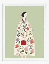
Woman in Floral Coat Canvas Print
Sale price From €54,95€91,95 -

Botanical Stairway Canvas Print
Sale price From €54,95€91,95 -

Botanical Stairway Art Print
Sale price From €14,95€24,95 -
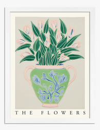
Botanical Muse Art Print
Sale price From €14,95€24,95 -

Tulip on Checkered Floor Art Print
Sale price From €16,95€23,95 -

Woman in Floral Coat Art Print
Sale price From €14,95€24,95 -

Les Formes Botaniques Canvas Print
Sale price From €54,95€91,95 -

Le Paysage - Wild Herb Garden Art Print
Sale price From €14,95€24,95 -

Woman Among the Bird Plates Canvas Print
Sale price From €54,95€91,95 -

Floral Statement Style Art Print
Sale price From €14,95€24,95 -

Garden Welcome Art Print
Sale price From €14,95€24,95 -

Flower Garden by Gustav Klimt Art Print
Sale price From €14,95€24,95 -

Botanical Muse Canvas Print
Sale price From €54,95€91,95 -

Orange Bloom Garden Canvas Print
Sale price From €54,95€91,95 -

Houseplants on a Step Stool Art Print
Sale price From €14,95€24,95 -

Tropical Cut Outs Botanical Paradise Art Print
Sale price From €14,95€24,95 -

Bold Botanical Vases Art Print
Sale price From €16,95€23,95 -
Botanical Bloom Vase Art Print
Sale price From €14,95€24,95 -

Boho Botanical Harmony Art Print
Sale price From €14,95€24,95


More from The Frame

Room-by-Room or Whole-Home? Styling Botanical P...
Most botanical prints are hung wrong. They're too small for the wall, glossy in rooms that need calm, and floating at eye level above sofas they should be anchoring. This...

You're Overthinking Art Above Your Sofa
The blank wall above your sofa isn't a maths problem. It's a mood decision, a colour decision, and a "what do I actually want to look at every evening" decision....

Our Favourite Art Prints for Bedrooms That Help...
Bedroom art is the one place in your home where a "statement piece" is usually the wrong instinct. The job here is quieter, and getting it right means unlearning most...