What Art Prints Are Trending Right Now (And Which Ones Will Actually Last)
A straight-talking guide to which print trends are worth your money and which will look tired by next spring.

Trend forecasts are usually written by people who want to sell you something next season. This one isn't. We've sorted through what's actually moving in the print world right now and split it into two camps: trends with real staying power, and the ones quietly heading for the charity shop pile.
The big shift: why warm, earthy tones are replacing monochrome
The cool grey, stark white, black-and-white-everything era is over. It started fading around 2021 and by now it's properly gone. What's replaced it is a palette pulled straight from the ground: terracotta, ochre, olive, clay, sand, burnt sienna, mushroom, oat. Warm minimalism, if you want a label for it.
There's a real reason this has legs. Cool monochrome interiors photograph beautifully but live coldly. Warm earth tones do the opposite. They look quieter in photos and feel better in the room, especially under the yellow-leaning bulbs most of us actually use at home. They also play nicely with wood, linen, ceramic, and plaster, which are the materials the wider interiors world has settled into for the long haul.
The practical takeaway: a print in dusty terracotta or olive will sit comfortably next to almost any neutral sofa, oak floor, or cream wall you already own. A stark black-and-white geometric print will not. One of these is a trend. The other is a colour scheme dressed up as one.

If you want to test the water without committing, look at modern art prints in the warmer end of the palette. Anything with clay, rust or olive as a dominant note will still feel current in five years, because it's drawing on colours that have been used in interiors for centuries.
Skip this: cool grey abstracts and stark monochrome
Anything that screams "2017 Scandi rental flat" is on the way out. Cool grey watercolour blobs, harsh black-and-white triangles, anything in pure greyscale with no warmth. These have peaked, plateaued, and are now visibly dating rooms.
Abstract and textured prints: the trend with the longest shelf life
If we had to bet on one category staying current for the next decade, it would be textured abstracts. There's a reason museums have been hanging abstract work for a hundred years and nobody calls it dated: it doesn't anchor itself to a moment.
What's specifically hot right now is the sense of texture. Visible brushwork, tonal layering, organic shapes that look like they were made with a palette knife rather than a mouse. The good news is you don't need a physical impasto painting to get the effect. Giclée printing on thick matte paper picks up the depth of brushwork beautifully, and the lack of glare from a matte finish means the texture actually reads from across the room rather than disappearing into a shiny rectangle.
A quick honest note on this: printed texture is not the same as physical paint texture. If you stand 30cm away and squint, you'll tell the difference. But hung properly on a wall and viewed from a sofa, a high-resolution textured print does the job at a fraction of the cost, and you can have it in a 70x100cm size without remortgaging.
Textured abstracts also pass what we call the "ten-year test." Ask yourself: will I be able to describe this print in one sentence in 2035? If the answer is "a soft cream and ochre abstract with brushy texture," you're fine. If the answer is "you know, that thing everyone had in 2024," reconsider.
Browse abstract art prints with this filter in mind: warm palette, visible mark-making, no hard geometric edges. That combination has the longest runway.
Botanical and nature prints: still going strong or peaked?
Botanicals are interesting. The literal Victorian-style botanical illustration, the kind with neat Latin labels under a single fern frond, has peaked. It had a strong run from about 2016 to 2022 and now it's everywhere, which is the kiss of death for any trend.
What's replaced it is more interesting and, we'd argue, more durable. Stylised nature prints. Loose ink studies of grasses. Abstract landscapes that suggest a horizon without painting one. Single-stem prints with negative space doing most of the work. Anything that takes the natural world as a starting point but doesn't try to be a botany textbook.
This evolution makes sense within the wider biophilic design movement, which is the professional consensus that humans feel calmer in spaces that reference the natural world. That instinct isn't going anywhere. The specific aesthetic of how we reference nature will keep evolving, but the underlying urge is permanent. Bet on the urge, not the aesthetic.

If you're drawn to greenery, look at botanical art prints that lean stylised rather than scientific. A loose ink drawing of olive branches will outlast a hyper-detailed monstera leaf every time.
Skip this: hyper-realistic single houseplant prints
The illustrated houseplant trend, especially anything that looks like a stock illustration of a fiddle leaf fig, is done. So is the "tropical leaf wall" gallery cluster. If you've seen it on a coffee shop menu, take that as a signal.
Minimalist line art: where it works and where it's overdone
Line art is the trend everyone wants us to declare dead. We won't, because good line art is genuinely timeless. Picasso was doing it in 1923. Matisse cut shapes out of paper in the 1940s. The form has a long, serious history.
What's overdone is the specific genre that dominated marketplace sites for the last five years: a single thin black line forming a vague face, often two of them facing each other, sometimes with a token leaf. You know the ones. They became visual wallpaper for a certain kind of beige Instagram flat and now they instantly date a room.
The line art that still works is the line art that has actual artistic merit. Bolder strokes, more confident composition, real intention behind the marks. A genuine figurative study in ink. A loose abstract line piece with weight and rhythm. Anything that looks like a person made a decision rather than a template was filled in.
The test is simple: if you could describe the print in five seconds to someone who couldn't see it, and they could roughly redraw it, it's too generic. Good art resists summary.
How to add a trending print without redecorating the whole room
This is the bit nobody tells you. You don't need to overhaul a room to bring in a trend. You need exactly one piece, in exactly the right spot, doing exactly the right amount of work.
Here's the approach we'd take:
Pick one wall, ideally the one your eye lands on first when you enter the room. Not a side wall, not a corner, not above a radiator. The main event.
Go bigger than feels comfortable. Oversized art is itself a trend with serious longevity, because it acts as a focal point and reduces visual clutter. A single 70x100cm piece almost always reads better than three 30x40cm pieces clustered together. Gallery walls aren't dead, but oversized statement pieces are doing the heavier lifting right now and will continue to.
Keep everything else in the room neutral. If your sofa, rug, and curtains are already busy, a trending print becomes one loud voice in a shouting match. If they're calm, the print sings.
Choose a frame that won't date. A warm oak or natural wood frame extends the life of any print by years. A trendy coloured frame (think sage green or burnt orange mouldings) ties the piece to a specific moment. Solid wood frames in natural finishes are the safe long-term bet, which is partly why we use FSC-certified solid wood across the range rather than painted MDF that chips and dates.
Ignore the rest of the room. Seriously. The trend doesn't need to be repeated in cushions, throws, vases, and lampshades. One strong piece of art is enough. Repetition is what makes a room look like a showroom trying too hard.

Trend-proof buying: picking art you'll love in ten years
Before buying any print, run it through these five questions. We use this internally and it filters out about 80% of impulse buys.
- Would I have liked this five years ago? If yes, it has staying power. If no, ask why. Sometimes the answer is "my taste has matured." Sometimes it's "this is a fad."
- Can I describe it without using a trend label? "Warm abstract with ochre and cream brushwork" is a description. "That boho terracotta vibe" is a trend. Descriptions outlast vibes.
- Does it work with the bones of my room, not just the current styling? Floors, walls, and built-ins are permanent. Cushions and throws are not. A print should agree with the permanent stuff.
- Would I still hang it if I moved house? Good art is portable. If you can only imagine it in this exact spot in this exact flat, it's decoration, not art.
- Is it printed and framed properly? This is the bit people forget. A great image on warped paper in a flimsy frame won't last two years regardless of style. Look for thick matte paper, solid wood frames, UV-protective glazing to stop fading in sunlight, and prints that arrive ready to hang rather than in three pieces you have to assemble yourself.
That last point matters more than it sounds. The most common complaint in the art print category is poor framing: warped mounts, prints shipped separately from frames, bubbling under glass. A print only lasts if it physically survives, and that comes down to materials and proper fitting before it leaves the workshop.
Our current favourites from the collection
Rather than list ten things at random, here's what we'd actually buy right now if we were starting from scratch.
For the living room: an oversized warm abstract, ideally 70x100cm or larger, in the terracotta-ochre-cream family. Framed in natural oak. Hung centrally on the main wall above the sofa or fireplace. This is the single highest-impact piece you can buy and the one with the longest shelf life.
For the bedroom: a stylised botanical or loose nature study, calmer in palette, in soft sage, sand, or muted clay. A pair works above the bed if you want symmetry, but one large piece off-centre is more current. Canvas works particularly well here because the matte surface absorbs morning light rather than reflecting it.
For the kitchen or dining area: something with more personality. A bolder abstract, a confident line piece, or a textured landscape. This is the room where you can afford to take a small risk because you're not staring at it from a horizontal position for eight hours.
For the hallway or smaller walls: smaller framed prints in the 30x40cm or 40x50cm range. These are where you can experiment with slightly trendier pieces, because the financial commitment is lower and they're easier to swap if you tire of them.

If you want a starting point, the wider home decor art prints collection is organised by palette and style, which makes the warm-tone filtering easier than scrolling endlessly.
The shortest version
Buy warm, buy textured, buy bigger than feels safe, and frame it in natural wood. Skip anything you've seen on a coffee shop wall in the last six months. If a print still makes sense to you in plain descriptive language with no trend words attached, it will probably still make sense in ten years. That's the whole game.

Fab products featured in this blog
-
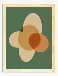
Modern Earthy Shapes Art Print
Translation missing: en.products.product.sale_price From €14,95€24,95 -

Soft Shapes Modern Mood Art Print
Translation missing: en.products.product.sale_price From €16,95€23,95 -

Modern Striped Portrait Art Print
Translation missing: en.products.product.sale_price From €16,95€23,95 -
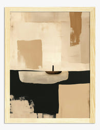
Beige and Black Abstract Minimal Dusk Art Print
Translation missing: en.products.product.sale_price From €14,95€24,95 -

Warm Terracotta Layers Art Print
Translation missing: en.products.product.sale_price From €14,95€24,95 -

Colorful Modern Living Art Print
Translation missing: en.products.product.sale_price From €14,95€24,95 -
The Modern Muse Art Print
Translation missing: en.products.product.sale_price From €14,95€24,95 -

Pastel Rustic Radiance Art Print
Translation missing: en.products.product.sale_price From €16,95€23,95 -

Modern Geometric Home Art Print
Translation missing: en.products.product.sale_price From €14,95€24,95 -

Bold Blue Portrait Art Print
Translation missing: en.products.product.sale_price From €16,95€23,95 -
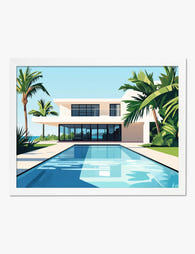
Modern Oasis Retreat Art Print
Translation missing: en.products.product.sale_price From €14,95€24,95 -

Modern Earth Tones Harmony Art Print
Translation missing: en.products.product.sale_price From €14,95€24,95 -

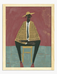
Modern Folk Portrait Art Print
Translation missing: en.products.product.sale_price From €14,95€24,95 -

Modern Indigo Wave Art Print
Translation missing: en.products.product.sale_price From €14,95€24,95 -

Modern Oasis Retreat Art Print
Translation missing: en.products.product.sale_price From €14,95€24,95 -

Modern Curve Composition Art Print
Translation missing: en.products.product.sale_price From €16,95€23,95 -

Modern Terracotta Muse Canvas Print
Translation missing: en.products.product.sale_price From €54,95€91,95 -

Rustic Radiance Art Print
Translation missing: en.products.product.sale_price From €16,95€23,95


More from The Frame

Matisse Cut-Outs vs Traditional Botanical Art: ...
Both styles put nature on your wall, but they do completely different things to a room. One is quiet, studied, and architectural. The other is loud, joyful, and unapologetically modern....

Why Matisse Botanical Prints Work in Every Room...
Why Matisse's botanicals are the most versatile wall art you can buy Matisse's botanical work sits in a rare sweet spot. The shapes are bold enough to anchor a wall...

Cherry Blossom Art Meaning: Symbolism, History,...
Cherry blossom art has a strange grip on people. You can scroll past a hundred botanical prints and stop, properly stop, at a branch of pink sakura against a pale...