The Most Famous William Morris Designs: From Peonies to Strawberry Thief
A shopper's guide to Morris's most beloved patterns, from the lush peonies of Wild Tulip to the thrushes of Strawberry Thief.

William Morris in 60 seconds: the man behind the movement
William Morris (1834-1896) was a designer, poet, socialist, and the loudest voice of the Arts and Crafts movement, the late-Victorian backlash against shoddy machine-made goods and overstuffed Victorian taste. He believed beautiful things should be made well, by people who enjoyed making them, and that nature, not industry, was the proper source of pattern.
His company, Morris & Co., produced wallpapers, textiles, stained glass, and tapestries that quietly dismantled the Victorian obsession with exotic hothouse blooms and replaced them with English hedgerows, cottage gardens, and medieval orchards. More than a century later, his patterns are still in production, still being copied, and still hanging in more homes than almost any other designer's work. There's a reason.
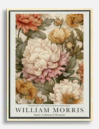
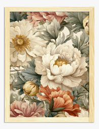
His peony designs: lush, layered, and endlessly popular
Peonies are the Morris flower that nobody talks about properly. They appear across his catalogue, layered through patterns like Wild Tulip and the Cheshire textile, and they're the reason certain Morris designs feel romantic rather than restrained. Where roses give Morris patterns their formality and willow their calm, peonies bring drama: blowsy, multi-petalled, almost too much.
Wild Tulip (1884) is the peony lover's pattern. Despite the name, the design is dominated by enormous open peony blooms in soft coral and rose, surrounded by tulip heads and trailing foliage. The scale is generous and the density high, which means it reads as lush rather than busy. It's one of the warmer Morris patterns, less green-and-blue than Willow Bough or Pimpernel, and far better suited to rooms where you want richness rather than restraint.
Cheshire (a later Morris & Co. textile design) takes the peony motif further, treating the flower almost like a centrepiece with leaves and smaller blooms radiating outwards. The colour stories tend toward deep burgundies, dusty pinks, and sage greens.

If you're drawn to peonies specifically, the William Morris peonies collection is the place to start. These are the patterns we'd recommend for bedrooms, dining rooms, and any space where you want softness with weight behind it. Pair them with linen, brass, and warm wood. Avoid stark white walls; they'll fight the palette.
Strawberry Thief, Willow Boughs, and the other icons
The "famous five" of Morris's catalogue are roughly Strawberry Thief, Willow Bough, Pimpernel, Acanthus, and Trellis. Each has a personality. Choosing between them is mostly a question of scale, density, and mood.
Strawberry Thief (1883)
Probably Morris's single most famous design. Two thrushes face each other across a strawberry plant, with deep indigo backgrounds and pops of red fruit and cream flowers. The pattern was inspired by birds raiding the kitchen garden at Kelmscott Manor, Morris's country house in Oxfordshire, and the indigo dyeing process took him years to perfect.
It's a medium-scale, medium-density pattern with a strong navy base, which makes it surprisingly versatile. Works in small rooms because the dark background recedes. Works in big rooms because the bird motif gives it presence.
Willow Bough (1887)
The quietest of the icons. Just willow leaves, no flowers, no fauna, in soft greens against cream. Morris designed it on a walk along the Thames near Kelmscott.
Willow Bough is what you choose when you want a Morris pattern that behaves like a neutral. It's calm, it doesn't compete with furniture, and it makes bedrooms feel cool and shaded. The trade-off: it can read as bland in rooms with no other texture or warmth.
Pimpernel (1876)
A dense, large-scale pattern of scarlet pimpernel flowers and curling tulips on a deep ground. Morris hung this one in his own dining room at Kelmscott House.
Pimpernel is dramatic. The motifs are big, the colours saturated, the rhythm bold. Use it where you want a room to feel enclosed and atmospheric: dining rooms, studies, snug lounges. It will overwhelm a small white bedroom.
Acanthus (1875)
All leaves. Vast, scrolling acanthus foliage in olive, ochre, and faded gold. No flowers at all, just architectural greenery inspired by Roman and medieval ornament.
Acanthus is Morris at his most sculptural. The scale is huge, the colours muted, the effect rich without being floral. Good for hallways, lounges, and anyone who finds peonies too sweet.
Trellis (1864)
Morris's first wallpaper design, inspired by the rose trellises in the garden of Red House, his Kentish home. Climbing roses, birds, and a wooden lattice. Lighter and more open than Pimpernel or Acanthus, with cream backgrounds and gentle pinks and greens.
Trellis suits cottage interiors, country bedrooms, and anyone who wants Morris with breathing room.

You'll find the full lineup in the William Morris print collection.
What inspired Morris's floral patterns
Morris's design inspiration came from three places, layered on top of each other.
Gardens he actually walked in. Red House in Kent, where he designed Trellis after the climbing roses outside his window. Kelmscott Manor in Oxfordshire, where Strawberry Thief, Willow Bough, and many of the late designs were drawn from the riverbanks, kitchen garden, and orchard. Morris was a hands-on gardener and most of his patterns map onto plants he grew himself.
Medieval manuscripts and tapestries. Morris was obsessed with the illuminated manuscripts and woven hangings of the 13th and 14th centuries. The flat, layered, symmetrical quality of his patterns, the way leaves overlap without proper perspective, comes directly from medieval art rather than Victorian naturalism. His william morris botanical illustrations don't try to look like photographs; they look like tapestries.
English wildflowers, deliberately chosen. This is the part that gets missed. Victorian taste favoured exotic blooms: orchids, hothouse lilies, anything that signalled wealth and empire. Morris went the other way on purpose. Pimpernel, willow, honeysuckle, daisies, marigolds, and yes, peonies (long-naturalised in English gardens), were a quiet political statement. Beauty in common things.
Why these 150-year-old designs still feel fresh
Three reasons, and they're worth understanding because they explain what to pair Morris with.
First, the colour palettes are mineral, not chemical. Morris hated the harsh aniline dyes that became fashionable in his lifetime and revived old vegetable dyeing techniques: indigo, madder, weld. The result is colours that sit happily next to natural materials, linen, oak, terracotta, brass, in a way that Victorian or mid-century palettes don't always manage.
Second, the patterns are flat. Morris designed for wallpaper and textile, not for framed pictures, which means his work doesn't try to create depth or illusion. That flatness reads as modern. It sits comfortably alongside contemporary graphic art and even abstract prints.
Third, the motifs are botanical and seasonal rather than tied to a specific decade. Unlike, say, 1970s geometrics or 1990s florals, you can't date a Morris pattern by glancing at it. It looks like a garden, and gardens don't go out of style.

How to choose between Morris's major patterns for your wall
A rough framework, based on what we'd actually recommend in practice.
By room size. Small rooms can take dark, dense patterns (Strawberry Thief, Pimpernel) because the dark background visually recedes. Large rooms need scale to balance the space; Acanthus and Wild Tulip work well. Medium rooms are most flexible.
By light levels. North-facing or shaded rooms come alive with warm Morris palettes: Wild Tulip's corals, Trellis's pinks, Acanthus's golds. South-facing rooms can take the cooler patterns without feeling cold: Willow Bough, Strawberry Thief.
By existing décor. Modern minimalist interiors work best with a single large Morris piece as a focal point; Willow Bough or Acanthus are the most "quiet" choices. Traditional or cottage interiors can handle multiples and the busier patterns like Pimpernel and Wild Tulip. Mid-century furniture pairs surprisingly well with Strawberry Thief because the indigo and the bird motif read graphically.
By desired mood. Romantic: Wild Tulip, Cheshire, Trellis. Dramatic: Pimpernel, Acanthus. Serene: Willow Bough. Storytelling: Strawberry Thief.
On grouping. A pair or trio of Morris prints in matching frames is one of the easiest ways to anchor a wall, but only if the patterns share a palette. Strawberry Thief and Willow Bough work as a pair because both lean cool and green-blue. Wild Tulip and Pimpernel work because both are warm and dense. Mixing a cool and a warm pattern usually doesn't.
Sizing-wise, 50x70cm is the workhorse size for a single statement above a sofa or bed. 30x40cm prints work in groupings or in tighter spaces like above a desk or a console. For a real focal piece, go to 70x100cm.
If you want to browse beyond Morris, the floral art prints collection sits alongside this period nicely, and the vintage art prints collection covers the broader Arts and Crafts era and its descendants.
The quality gap: reproductions vs museum-grade giclée prints
This matters more for Morris than for almost any other artist, and it's worth being blunt about why.
Morris's patterns were originally produced using multi-block printing, where each colour was applied with a separate hand-cut wooden block. Strawberry Thief famously required Morris to master indigo discharge dyeing because no other technique could give him the layered, slightly imperfect colour he wanted. The patterns are intricate, multi-layered, and rich in tonal subtlety.
Cheap reproductions flatten all of that. A £15 poster printed on thin paper with four-colour process inks turns the indigo of Strawberry Thief into a flat blue. Acanthus loses its olive-and-gold layering and becomes one muddy green. The botanical detail Morris obsessed over, the veining on leaves, the petal shading, the way two adjacent colours sit on top of each other, disappears into pixel mush.
Museum-grade giclée printing is the difference. Our William Morris art prints are printed on thick matte paper with pigment inks designed to last centuries even in direct sunlight, which means you see the layering, the depth, and the actual indigo Morris fought so hard to perfect. Up close, the matte finish reads like the original textile rather than a glossy poster. From across the room, the colours hold their weight.
A few other practical points worth knowing. Framed prints sometimes arrive with the frame and print shipped separately, leaving you to assemble them yourself with predictable warping, bubbling, and misalignment. We ship the frame and print together in one box, properly fitted, with the hanging fixtures attached. The frames are solid FSC-certified wood (not MDF, not veneer) and the glazing is UV-protective acrylic, which is lighter than glass and won't shatter. For Morris's intricate work, the matte paper plus acrylic glaze means no glare obscuring the detail, which is the single biggest reason cheap framed prints disappoint.

A final word on choosing
If you're new to Morris and want one print to start with, Strawberry Thief is the safest pick: medium scale, versatile palette, a story behind it, and it works in almost any room. If you want something quieter, go Willow Bough. If you want drama and warmth, Wild Tulip or Pimpernel. If you want sculptural calm, Acanthus.
Buy the largest size your wall can comfortably take, frame it properly, and hang it at eye level (the centre of the print roughly 145cm from the floor). Morris designed these patterns to be lived with, not glanced at. Give them the room.

Fab products featured in this blog
-

Strawberry Thief by William Morris Art Print
Translation missing: en.products.product.sale_price From €14,95€24,95 -

Studies in Botanical Ornament by William Morris Art Print
Translation missing: en.products.product.sale_price From €14,95€24,95 -

William Morris Peony Exhibition Poster Art Print
Translation missing: en.products.product.sale_price From €14,95€24,95 -

Studies in Botanical Ornament by William Morris Art Print
Translation missing: en.products.product.sale_price From €14,95€24,95 -

William Morris Peony Exhibition Poster Art Print
Translation missing: en.products.product.sale_price From €14,95€24,95 -

Strawberry Thief by William Morris Art Print
Translation missing: en.products.product.sale_price From €14,95€24,95 -

Artful Nature Peonies, Morris-Inspired Art Print
Translation missing: en.products.product.sale_price From €14,95€24,95 -

Strawberry Thief by William Morris Art Print
Translation missing: en.products.product.sale_price From €14,95€24,95 -

Artful Nature Peonies by William Morris Art Print
Translation missing: en.products.product.sale_price From €14,95€24,95 -

William Morris Peony Exhibition Poster Art Print
Translation missing: en.products.product.sale_price From €14,95€24,95 -

William Morris Purple Peony Art Print
Translation missing: en.products.product.sale_price From €14,95€24,95 -
Studies in Botanical Ornament by William Morris Canvas Print
Translation missing: en.products.product.sale_price From €54,95€91,95 -

Studies in Botanical Ornament by William Morris Canvas Print
Translation missing: en.products.product.sale_price From €54,95€91,95 -

William Morris Peony Exhibition Poster Canvas Print
Translation missing: en.products.product.sale_price From €54,95€91,95 -

Artful Nature Peonies by William Morris Art Print
Translation missing: en.products.product.sale_price From €14,95€24,95 -

Morris-Inspired Purple Peony Art Print
Translation missing: en.products.product.sale_price From €14,95€24,95 -
Peony Reverie — William Morris Inspired Art Print
Translation missing: en.products.product.sale_price From €14,95€24,95 -

Morris-Inspired Peony Blooms Canvas Print
Translation missing: en.products.product.sale_price From €54,95€91,95 -

Strawberry Thief by William Morris Canvas Print
Translation missing: en.products.product.sale_price From €54,95€91,95 -

Studies in Botanical Ornament by William Morris Art Print
Translation missing: en.products.product.sale_price From €14,95€24,95


More from The Frame

Kids' Room Art: Playful Without Childish
Most kids' room art falls into two camps: aggressively cute (rainbows, cartoon animals, alphabet posters) or weirdly adult (minimal black and white prints that could hang in a dentist's office)....

Nursery Art That Grows with the Room
Most nursery art gets retired by the time the cot comes down. That's a waste of money, wall space and the chance to build something genuinely meaningful. This guide is...

Office and Study: Art That Helps You Focus or A...
The art you hang in a workspace isn't neutral decoration. It either supports the kind of thinking you do at your desk, or it quietly works against it. The trick...