


 Order today for delivery by
 Botanical Petal Art: Why Close-Up Prints Feel More Modern Than Full Florals
Why one petal, magnified, says more about contemporary design than an entire bouquet ever could.


Full florals have had a long run, and they're not going anywhere. But if you've noticed that the botanical art appearing in design magazines, boutique hotel lobbies, and the better-styled flats on your feed looks different now, you're right. Close-up petal prints have quietly taken over, and the reason is more interesting than just "trends."
Full florals vs. petal close-ups: a visual comparison
A traditional full floral print shows you the whole flower. Often the whole stem. Sometimes a vase. The composition is literal. Your eye reads it as "a picture of a rose" and moves on. It's pretty, it's recognisable, and it sits in the same visual tradition as Dutch still life paintings from four centuries ago.
A petal close-up does something different. Crop in tight enough on a single petal and the flower stops being a flower. It becomes texture, gradient, line, and shadow. Your eye doesn't immediately label it. It lingers. That moment of "what am I looking at" is the entire point, and it's why close-ups feel contemporary even when the subject matter, a flower, is the oldest subject in art.
The shift is essentially the same one that happened in photography in the 1920s, when artists like Imogen Cunningham and Karl Blossfeldt started shooting plants at close range and the results looked more like sculpture than botany. Almost a hundred years later, that visual language has filtered down into interiors, and it pairs naturally with the minimalist, texture-led rooms most of us are now trying to build.

Why close-up petal art reads as contemporary and abstract
Three things make a petal close-up feel modern rather than traditional.
The first is abstraction by proximity. When you can't see the whole subject, your brain stops categorising and starts responding to form and colour directly. That's the same mechanism behind colour field painting and most of the abstract art you'd hang in a current interior. A tightly cropped petal sits comfortably next to a Rothko-style print in a way a full bouquet never could.
The second is negative space. Full floral compositions tend to fill the frame. Close-ups, especially well-styled ones, are generous with empty space. A single petal floating against a soft, undefined background gives the eye somewhere to rest. Negative space is one of the defining traits of modern interior design, and your art needs to match.
The third is scale distortion. A petal photographed at macro range looks enormous, almost architectural. That shift in scale flips the relationship between viewer and subject. You're not looking at a delicate little flower on a wall. You're standing in front of something monumental. That tension, intimate subject at imposing scale, is what gives petal art prints their particular pull.
This is also why petal close-ups slot so easily into the abstract art prints conversation. The line between "abstract" and "botanical" gets blurry once you crop in far enough, and that ambiguity is a feature, not a problem.
Photography vs. painted petal prints: different moods, different rooms
The two main styles you'll encounter are macro photography and painterly interpretations, usually watercolour or oil-inspired. They look superficially similar at thumbnail size and behave completely differently on a wall.
Macro photography prints
Photographic petal close-ups are precise. You see every vein, every droplet, every gradient from one shade to the next. The mood is cool, considered, almost scientific. They read as contemporary by default because the medium itself, high-resolution photography, is contemporary.
These work best in rooms with clean lines and restrained palettes. Think bedrooms with white walls and natural linen, bathrooms with concrete or stone, or kitchens with handleless cabinetry. Photography prints can take the polish of a slim black or natural oak frame and look effortless. The detail rewards close viewing, which matters more in a smaller room where the print is seen from a metre or two away.
A note on quality: photographic detail only survives if the print itself is good. Cheap inkjet output flattens gradients and turns subtle pinks into muddy beige. Giclée printing on thick matte paper holds the depth of tone that makes petal photography prints worth hanging in the first place.
Painterly petal prints
Painted styles, whether watercolour, gouache or oil-inspired, soften the same subject considerably. Edges blur. Colours bleed. The result feels warmer, more emotional, and more hand-made.
Painterly prints suit rooms where you want softness: a living room with a deep sofa and layered textiles, a bedroom with brass lighting and warm-toned bedding, a snug or reading nook. They pair beautifully with antique or vintage furniture and can stop a modern room feeling sterile.
The trade-off is that painted styles can tip into traditional if you're not careful. The way to keep them modern is to choose paintings where the brushwork is loose and the composition is asymmetric, not centred and tidy.

Minimalist petal prints and why they work in modern interiors
Minimalist petal prints are the most direct expression of this whole conversation. Strip the composition back to one petal, sometimes half a petal, against a clean background, and you've got an artwork that does an enormous amount of visual work with almost nothing on the page.
A few things define the category. The colour palette is usually limited to two or three tones. The composition is often off-centre, with the petal sitting low or to one side. The background is rarely pure white, more often a soft warm grey, dusty rose, sage, or muted clay. And the cropping is aggressive. You see less of the subject than you'd expect.
The reason minimalist petal prints work so well in current interiors is that they don't compete. Most modern rooms are already doing things with texture, like bouclé, linen, plaster walls, oak. Busy art fights all of that. A minimal petal print provides a focal point without adding visual noise, which is exactly what a styled room needs.
For wall placement, these prints handle scale beautifully. A single 70x100cm minimalist petal print above a sofa or bed often works better than a busier piece at the same size, because the empty space within the artwork extends the empty space of the wall. The room feels bigger, not smaller.
Frame choice matters here. We'd suggest a thin natural oak or matte black frame, generous white border, no mount. Heavy ornate frames will undo the minimalism immediately.
How to mix petal art with other botanical prints in a gallery wall
Gallery walls built entirely from petal close-ups can feel one-note. The way to keep them interesting is to mix in adjacent styles from across the broader botanical art prints and flower art prints categories, but with intention.
The 3-2-1 formula we keep coming back to
For a six-print gallery wall, try this ratio: three petal close-ups, two line drawings or single-stem botanicals, one wildcard (an abstract, a piece of typography, or a black and white photograph). The petal prints anchor the wall in subject matter. The line drawings echo the botanical theme without repeating it visually. The wildcard breaks any sense of theme-park curation.
Frame consistency, image variety
The trick to making a mixed gallery wall look intentional is keeping the framing consistent. Same wood, same finish, same border width. That way the variety in the images reads as deliberate curation, not chaos. If you want a softer look, mix two frame finishes maximum (oak and black, say), but no more.
Room-specific advice
In a living room, scale up. One large piece, 70x100cm or bigger, paired with two or three smaller works around it, will look more confident than six small prints in a grid. The eye needs an anchor.
In a bedroom, lean quieter. Pastel petal close-ups, soft painterly work, lots of negative space. Avoid anything with strong contrast above the bed because high-contrast art directly above your head can feel agitating when you're trying to sleep.
In a hallway, repetition works. A row of three petal close-ups in identical frames, same size, same spacing, creates rhythm in a space you usually pass through quickly. Choose prints with related but not identical palettes.
In a bathroom or kitchen, the canvas option is worth considering. Canvas handles humidity better than framed paper, and a stretched canvas petal print on a steamy bathroom wall will hold up where a framed print might struggle long-term.

Trending petal art styles we're seeing in interiors right now
Here's what's actually showing up in the design publications and boutique interiors worth paying attention to.
Moody dark-background petals
Single petals or small clusters photographed against deep black or charcoal backgrounds, often with strong directional lighting. The result is theatrical, almost Dutch Golden Age in spirit but unmistakably modern in execution. These work brilliantly in panelled rooms, libraries, dining rooms with dark walls, and anywhere you want drama. Burgundy, deep red, and aubergine petals dominate this category.
Sun-bleached pastels
The opposite end of the spectrum. Petals shot in flat, overcast light or rendered in pale watercolour, with palettes built around bone, blush, butter, and dusty lilac. This is the look filling Scandinavian-leaning interiors and quiet luxury bedrooms. The mood is calm, almost washed out, and pairs naturally with raw plaster walls and unbleached linen.
Single-petal compositions
Where most petal art uses several petals or a partial flower, the most current work isolates one petal. Just one. Filling most of the frame, or sitting alone in a sea of soft background. It's the most abstract end of the category and the closest petal art gets to pure colour-and-form abstraction.
Asymmetric and off-centre framing
Composition is doing more of the heavy lifting now. Petals positioned in the bottom third of the frame, or tucked into a corner with three-quarters of the image left empty, feel more contemporary than centred, symmetrical compositions. This mirrors what's happening in interiors generally, where studied asymmetry has replaced the matchy-matchy mirror-image styling of the previous decade.
Botanical macro hybrids
Prints that sit between scientific illustration and abstract photography. Highly detailed, often with a single petal photographed so closely that the cellular structure becomes visible. These have shown up in a wave of new boutique hotels and reference the long tradition of botanical study without ever feeling like wallpaper from a country house.

A few things to check before you buy
Petal art lives or dies on print quality. Up close, which is how most people view it, the difference between a good print and a mediocre one is enormous. A few things to look for: thick matte paper rather than glossy (no glare, more natural colour), giclée printing rather than standard inkjet, and UV-protective glazing if the wall gets any direct sunlight. Acrylic glaze rather than glass is lighter and won't shatter, which matters when you're hanging anything above a sofa or bed.
If you're going framed, check that the frame and print ship together, properly fitted. Prints arriving in one box and frames in another, with you doing the assembly, is where most disappointments happen. Solid wood frames hold their shape. MDF and veneer frames warp, especially in humid rooms.
And on size: most people hang art too small. For a sofa wall, your art should fill roughly two-thirds of the sofa's width. A 60x80cm print above a three-seater will look stranded. Go bigger than you think.
Pick the petal that genuinely makes you stop scrolling, then trust the cropping, the palette, and the scale to do their job on the wall. Close-up petal art works because it asks very little of the room around it. Give it space, frame it cleanly, and it will quietly carry the whole composition.

Fab products featured in this blog
-

Quiet Blooms on Black Art Print
Sale price From €16,95€23,95 -

Big Cream Bloom on Green Art Print
Sale price From €16,95€23,95 -

Modern Petal Harmony Art Print
Sale price From €16,95€23,95 -

Green Petal Fan Art Print
Sale price From €16,95€23,95 -

Blue Petal Reverie Art Print
Sale price From €16,95€23,95 -

Modern Botanical Burst Art Print
Sale price From €16,95€23,95 -

Petal Pop in Green Art Print
Sale price From €16,95€23,95 -

Blush Petal Duo Art Print
Sale price From €16,95€23,95 -

Monochrome Petal Flow Art Print
Sale price From €16,95€23,95 -

Blush Petal Daydream Art Print
Sale price From €16,95€23,95 -

Quiet Blooms on Black Canvas Print
Sale price From €66,95€94,95 -

Proteas in a Blue Vase Art Print
Sale price From €16,95€23,95 -

Modern Daisy Petals Art Print
Sale price From €16,95€23,95 -

Botanical Flow in Beige and Black Art Print
Sale price From €16,95€23,95 -

Risograph Daisies in Pink and Green Art Print
Sale price From €16,95€23,95 -

Modern Petal Harmony Canvas Print
Sale price From €66,95€94,95 -

Quiet Bloom in Deep Red Art Print
Sale price From €16,95€23,95 -
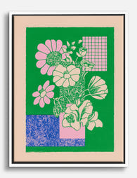
Risograph Daisies in Pink and Green Canvas Print
Sale price From €66,95€94,95 -

Soft Petal Spiral Art Print
Sale price From €16,95€23,95 -

Lilac Petal Bloom Art Print
Sale price From €16,95€23,95


More from The Frame

Vintage Botanical Prints: A No-Nonsense Guide t...
Vintage botanical prints are having a moment, and the internet is flooded with them. Most are terrible. Here's how to tell the real craftsmanship from the glossy, over-filtered reproductions, and...

The Greenhouse Aesthetic: How to Bring Victoria...
The greenhouse aesthetic has quietly taken over interiors Pinterest, design magazines and the walls of some very photogenic flats. The catch: almost every guide you'll find assumes you own an...

The Best Art for Conservatory Walls (That Won't...
Most people leave their conservatory walls bare, and it's not because they don't want art there. It's because they're quietly worried about fading, warping, and whether anything will look right...