How to Build a Cat-Themed Gallery Wall That Doesn't Look Chaotic
A designer-approved approach to cat art that looks intentional, sophisticated, and entirely free of crazy-cat-lady energy.

Loving cats and loving good interior design are not mutually exclusive, despite what the internet would have you believe. The trick to a cat-themed gallery wall that looks designed rather than accumulated comes down to three decisions made before you drill anything. This guide walks you through all of them.
Why gallery walls work brilliantly with cat art (and the one mistake to avoid)
Cat art has more stylistic range than almost any other subject. You can find minimalist line drawings, painterly portraits, vintage botanical-style illustrations, photographic prints, and surreal contemporary work, all centred on the same subject. That variety is exactly why a gallery wall format suits cats so well. You can build genuine visual interest without your wall feeling repetitive.
The mistake to avoid: treating "cats" as the unifying theme. It isn't enough. A wall of five different cat prints in five different art styles, five different colour palettes, and five different frame finishes will look like a noticeboard, not a gallery. The subject is the starting point, not the structure.
What pulls a themed wall together is a second, stricter consistency. Same palette. Same medium. Same frame. Pick one and hold the line.

Choosing a unifying thread: colour palette, art style, or frame finish
Before you buy a single print, pick your unifying thread. There are three good options and you only need one.
Colour palette
The easiest route. Decide on a palette of two or three colours that already exist in the room (the sofa, the curtains, an existing rug) and only buy cat prints that sit within that palette. Soft sage and cream. Burnt orange and charcoal. Dusty pink and warm white. The cats themselves can vary wildly. The colours hold the wall together.
Art style
Pick a single artistic medium and commit. All line art. All watercolour. All vintage-style botanical illustrations of cats. All black and white photography. This is the most sophisticated choice because it makes the wall feel curated, like something from a small gallery rather than a gift shop.
Frame finish
The most forgiving option, especially if you already own prints. Identical frames in the same wood tone or finish (matte black, natural oak, warm walnut) will paper over an enormous amount of stylistic inconsistency. We'll come back to this in more detail later because it does most of the heavy lifting on a gallery wall.
You can combine two of these threads, but never try to vary all three at once. That's the chaos zone.
The best layout for a cat gallery wall: our recommended 3-to-5 print arrangement
Most professional gallery wall guides recommend seven to nine pieces, and we disagree for themed walls. With cat art, three to five prints is the sweet spot. Fewer pieces force you to curate ruthlessly, which is exactly what stops a themed wall tipping into kitsch.
Here are the four arrangements we recommend, in order of difficulty.
The horizontal trio
Three prints of the same size (we like 40x50cm) hung in a perfect horizontal line, equal spacing between each. Calm, gallery-like, works above a sofa or sideboard. Hard to get wrong.
The asymmetric four
One large statement piece (60x80cm or 70x100cm) on the left, three smaller prints (30x40cm) stacked or grid-arranged on the right. The big piece anchors the wall and the smaller prints provide rhythm. This is the most magazine-looking option.
The salon five
A loose, organic arrangement of five prints in mixed sizes, with one piece clearly acting as the anchor. The trick is keeping spacing consistent (more on this below) even when the sizes vary. Best for narrow walls and stairwells.
The grid of four
Four prints of identical size in a 2x2 grid. Crisp, modern, slightly more formal. Works well in offices, bedrooms, and dining rooms. Demands matching frames to look its best.
Our pick for most homes is the asymmetric four. It feels considered without feeling stiff, and that single statement piece gives your eye somewhere to land first. If you have one print you genuinely love, build the wall around it.
Mixing cat prints with other subjects: botanicals, abstracts, and typography
Most cat lovers don't actually want an all-cat wall, and that's fine. Mixing cat art with complementary subjects is one of the easiest ways to make a themed wall feel grown-up.
Three combinations we particularly like:
Cats and botanicals. Cats have a long art-historical association with plants and gardens. A pairing of two cat prints with two botanical art prints in matching frames is a classic move. Look for botanicals in the same palette as your cat prints (the same sage, the same ochre, the same dusty rose) and the wall will feel coherent immediately.
Cats and abstracts. Soft, organic abstract shapes balance the figurative weight of a cat portrait. One large abstract paired with two or three smaller cat prints reads as a deliberate, curated gallery rather than a fan wall.
Cats and typography. A single typographic print (a poem, a quote, a piece of considered hand-lettering) inserted into a group of cat prints adds breathing space. Avoid anything that says "Crazy Cat Lady." We mean it. A line from a poem about light, or a single word in a beautiful serif, is the move.
The ratio we recommend: roughly 60% cat art, 40% complementary subjects. Below 50% cat art and the theme starts to dissolve. Above 75% and you lose the visual variety that makes the wall interesting. If you're browsing for ideas, our animal art prints collection sits well alongside cat art prints for adding subtle thematic variation without breaking the spell.

Size and spacing: how to plan before you drill a single hole
This is the part most people skip and most people regret. Before any holes get drilled, you need to plan the arrangement on the floor and then on the wall using paper templates.
The floor layout
Lay all your prints on the floor in front of the wall they'll hang on. Move them around. Try the asymmetric four, then try the salon five. Take photos on your phone from a few steps back. Photos flatten the arrangement and show you what your eye won't see in person. You'll be surprised how often the layout you thought worked looks lopsided in a photo.
The paper template trick
Cut sheets of newspaper or kraft paper to the exact dimensions of each framed print. Use masking tape to stick them to the wall in your chosen arrangement. Live with it for a day. Walk past it. See how it looks at breakfast and at dinner with the lights on.
When you're sure, mark the hanging point on each piece of paper, drill straight through it, and remove the paper. The hole is in exactly the right place.
Spacing
The non-negotiable rule across professional design consensus: 5 to 7cm between frames (roughly 2 to 3 inches). Less than that and the wall looks crowded. More than that and the prints stop reading as a single arrangement. Use a ruler. Don't eyeball it.
Eye-level
The centre point of the entire arrangement (not each individual print, the whole grouping) should sit at roughly 145cm from the floor. That's standard gallery eye-level. If you're hanging above a sofa or sideboard, leave 15 to 20cm between the top of the furniture and the bottom edge of the lowest frame. Any closer and the art looks like it's resting on the sofa. Any further and it floats.
Frame consistency: why matching frames pull everything together
If you take one thing from this guide, take this. Matching frames will rescue a wall of mismatched art. Mismatched frames will sabotage a wall of perfectly coordinated art. Frames matter more than the art itself when it comes to cohesion.
We recommend picking one frame finish and using it across every print. Matte black is the most versatile and works in almost any room. Natural oak is warmer and softer and suits Scandinavian, Japandi, and farmhouse interiors. Warm walnut feels richer and more traditional, beautiful in rooms with antique furniture or deep paint colours.
Avoid mixing wood tones (light oak with dark walnut, for example) on the same wall. The eye reads it as an accident, not a design choice. If you want variation, vary the size of the frames, not the finish.
A note on materials. Cheap frames warp. The MDF and veneer frames common at lower price points bow within months, especially in rooms with humidity changes (kitchens, bathrooms, anywhere near a radiator). Solid wood frames hold their shape. Our framed prints use solid FSC-certified wood for exactly this reason, and a UV-protective acrylic glaze instead of glass, which means no glare from windows or lamps and no risk of shattered glass if a frame ever falls.

How our framed prints make gallery walls easier (ready to hang, no warping)
The reason most DIY gallery walls look cheaper than they should comes down to two things: poorly fitted frames and inconsistent print quality. Both are solvable.
When prints and frames ship separately and you fit them yourself, you'll often find the print sits slightly crooked in the frame, the mat doesn't quite line up, or the print itself has bowed in transit. Multiply that across five frames on one wall and the whole arrangement starts to look amateur even if every individual piece is fine.
Our framed prints arrive ready to hang. The print is fitted into the frame in our workshop, the fixtures are already attached to the back, and everything ships in a single box, properly packaged. You hang them. That's it. For a gallery wall where consistency matters more than anywhere else in the home, this is the difference between a wall that looks designed and a wall that looks assembled.
A few other things worth knowing if you're building a cat-themed wall from scratch:
- Prints are made to order, so you can mix sizes within the same arrangement (a 70x100cm anchor with 40x50cm satellites, for example) and trust that the printing, paper, and frame finish will be identical across all of them.
- The giclée printing on thick matte paper means no glare from any angle, which matters when you're looking at a wall of five prints from different positions in the room.
- The inks are museum quality and won't fade, even in direct sunlight. Useful if your gallery wall is opposite a south-facing window.
If you're starting from zero and want to skip the curation work entirely, our wall art sets collection groups prints designed to hang together, palette and style already coordinated.
A quick checklist before you commit
Run through this before drilling:
- Have you chosen one unifying thread (palette, style, or frame finish)?
- Are you working with three to five prints, not nine?
- Do you have one clear statement piece anchoring the arrangement?
- Have you laid it out on the floor and photographed it?
- Have you taped paper templates to the wall and lived with them for a day?
- Are your frame spaces 5 to 7cm apart and the centre of the arrangement at roughly 145cm height?
- Are all your frames the same finish?
If you can answer yes to all seven, you're going to end up with a wall that looks like it was styled by someone who knew what they were doing. Which, by that point, you will be.

The hardest part of a cat-themed gallery wall isn't picking the prints. It's having the discipline to leave some out. Edit harder than feels comfortable, commit to one consistency anchor, and resist the temptation to keep adding pieces once the wall is up. A focused gallery of four prints will always look better than a sprawling collection of eight.

Fab products featured in this blog
-

Curious Cat Gathering Canvas Print
Translation missing: en.products.product.sale_price From €64,95€92,95 -

Whimsical Cat Couture Canvas Print
Translation missing: en.products.product.sale_price From €64,95€92,95 -

Chaos Gradient Cat Canvas Print
Translation missing: en.products.product.sale_price From €64,95€92,95 -

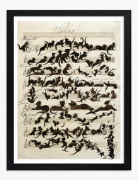
Cat Café Gathering Art Print
Translation missing: en.products.product.sale_price From €16,95€23,95 -

Colorful Cats Matisse Style Art Print
Translation missing: en.products.product.sale_price From €16,95€23,95 -

Cat Café Gathering Canvas Print
Translation missing: en.products.product.sale_price From €64,95€92,95 -

Whimsical Cat Garden Canvas Print
Translation missing: en.products.product.sale_price From €64,95€92,95 -

Whimsical Cat in Blooms Canvas Print
Translation missing: en.products.product.sale_price From €64,95€92,95 -
Cat Symphony Melody Art Print
Translation missing: en.products.product.sale_price From €16,95€23,95 -

Sunny Sanctuary with Cat Art Print
Translation missing: en.products.product.sale_price From €16,95€23,95 -
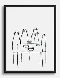
Cat Gathering at the Table Canvas Print
Translation missing: en.products.product.sale_price From €64,95€92,95 -

Fashionable Feline Fantasy Canvas Print
Translation missing: en.products.product.sale_price From €64,95€92,95 -

Enchanted Cat Gathering Canvas Print
Translation missing: en.products.product.sale_price From €64,95€92,95 -

Cozy Cat Café Gathering Canvas Print
Translation missing: en.products.product.sale_price From €64,95€92,95 -

Playful Cat Personalities Art Print
Translation missing: en.products.product.sale_price From €16,95€23,95 -

Charming Cat & Floral Elegance Canvas Print
Translation missing: en.products.product.sale_price From €64,95€92,95 -

Floral Fashionista Cat Art Print
Translation missing: en.products.product.sale_price From €16,95€23,95 -

Colorful Cat Stack Art Print
Translation missing: en.products.product.sale_price From €16,95€23,95 -

Cat Lover Statement Piece Art Print
Translation missing: en.products.product.sale_price From €16,95€23,95 -

Kusama Style Cat Art Print
Translation missing: en.products.product.sale_price From €16,95€23,95


More from The Frame

Curated or Collected? Creating Your Equestrian ...
There is a fine line between a gallery wall that reads as considered and one that reads as a horse-mad teenager's bedroom. The difference is not how much you spend...

Curated Tropical Gallery Wall vs Chaotic Jungle...
Tropical prints are the trickiest gallery wall category to pull off. Get it right and your wall feels like a considered Mediterranean villa. Get it wrong and it looks like...

Landscape vs Portrait Wall Art: Which Orientati...
Most advice on this topic ends with "trust your eye" and leaves you scrolling for another hour. We're going to do the opposite: give you specific rules tied to specific...