


 Order today for delivery by
The 7 Contemporary Art Styles You'll Actually See in Interiors Right Now
A visual recognition guide to the styles actually shaping walls in 2024 and 2025, paired with the rooms they belong in.


"Contemporary art" gets used as a catch-all for anything that isn't a Monet print or a motivational quote, which is useless if you're trying to work out what to put on your wall. This guide breaks down the seven styles genuinely dominating interiors in 2024 and 2025, how to spot each one, and where it works. By the end, you'll be able to walk into a room, read its personality, and pick a style that actually fits.
Why 'contemporary' covers way more ground than you think
Contemporary art refers to work made from roughly the 1970s to the present. That's it. It isn't a style, it's a timeframe, which is why it covers everything from stark minimalist geometry to riotous neo-expressionist brushwork. This is the single most common confusion we see.
Modern art, confusingly, is older. It roughly spans the 1860s to the 1960s, covering Impressionism, Cubism, Abstract Expressionism, and Pop Art. So Rothko is modern. A print made last year in the style of Rothko, by a living artist, is contemporary. Same visual language, different category.
What defines contemporary art today is less about shared aesthetics and more about shared concerns: a looser relationship with tradition, cross-pollination between digital and physical media, and a willingness to borrow freely from design, photography, and illustration. That's why a single "contemporary" collection can contain seven wildly different styles, which is exactly what we're about to walk through.
Here's the useful bit for your walls: once you can identify these styles by sight, you can match them deliberately to rooms instead of guessing.
Minimalist abstraction: clean lines for calm spaces
Minimalist abstraction is the quiet one. Think flat planes of muted colour, geometric shapes with generous negative space, and compositions that feel considered rather than busy. The palette tends toward off-white, bone, sand, terracotta, dusty blue, and soft black.
How to spot it: limited colour palette (usually three or fewer), hard or softly hand-drawn geometric shapes, significant empty space, no obvious brushwork or texture, often a single focal element against a plain ground.

Where it works: bedrooms, meditation corners, bathrooms, home offices that need to feel focused rather than stimulating. If your room already has a lot going on (patterned rugs, strong furniture shapes, bold wall colours), minimalist abstraction gives the eye somewhere to rest.
Sizing: go bigger than you think. Minimalist pieces rely on scale and space to carry weight. A 70x100cm framed print above a bed or sofa will feel balanced where a smaller size looks apologetic. Browse abstract art prints if you want to see the range of subcategories we're about to cover.
A quick note on abstract subcategories, because most guides lump these together: minimalist abstraction is one thing, but gestural abstraction (loose, visible brushstrokes, emotional energy), geometric abstraction (hard-edged shapes, often colourful), and colour field (large zones of flat colour, like Rothko's heirs) are all distinct. They look different, they feel different, and they belong in different rooms.
Neo-expressionism: bold, emotional, and perfect for feature walls
Neo-expressionism is the loud one, and it's having a serious moment. Think thick, visible brushwork, saturated or deliberately clashing colours, figurative elements that feel urgent or unfinished, and a sense that the artist made it in one sitting with the window open.
How to spot it: energetic brushstrokes you can see from across the room, raw or unfinished edges, figurative subjects (faces, bodies, animals) rendered loosely, often large scale, emotional charge rather than technical polish.
Where it works: dining rooms, feature walls in living rooms, hallway ends, entryways. Anywhere you want a conversation starter. Neo-expressionist work needs to be the loudest voice in the room, so pair it with calmer surroundings: a plain wall, simple furniture, restrained accessories.
Who it's for: this is a style for people who want their home to feel like them, not like a showroom. If you host a lot, if your lounge has personality, if you'd rather have one strong piece than three safe ones, this is your style.
Trade-off to know: neo-expressionism is relentlessly present. It won't fade into the background on a quiet Sunday morning, which is exactly the point. Put it somewhere you pass through or gather in, not where you unwind.
A large framed print works beautifully here because the UV-protective acrylic glaze keeps saturated colours from dulling, even if that feature wall catches afternoon sun.
Contemporary botanical and nature prints: not your grandmother's florals
Contemporary botanicals have moved a long way from Victorian pressed flowers and twee cottage florals. The current version is sparser, more graphic, and often monochrome or near-monochrome. Think single stems on cream backgrounds, pressed leaves photographed against black, abstracted plant forms rendered in ink or watercolour.
How to spot it: restraint over abundance (one stem, not a bouquet), confident negative space, limited palette (often just two or three tones), botanical accuracy or deliberate stylisation rather than decorative prettiness.

Where it works: kitchens, dining rooms, bathrooms, bedrooms, hallways. Botanicals are the most forgiving contemporary style and genuinely work almost anywhere. They bring the outdoors in without the cliché of a landscape painting.
Pairing tip: contemporary botanicals love being hung as pairs or trios. Three 50x70cm prints in matching black frames, evenly spaced, will transform a long wall. Two prints flanking a bed read as considered and symmetrical without feeling stiff.
Our botanical art prints lean toward this contemporary interpretation: graphic, confident, and genuinely modern rather than nostalgic.
Humidity note: if you're hanging in a bathroom or steamy kitchen, canvas tends to handle moisture better than paper over the long term. The hand-stretched poly-cotton canvas on a solid wood frame holds its shape where cheaper materials would warp.
Digital and graphic art: where illustration meets fine art
Digital and graphic art is the fastest-growing contemporary category, and the hardest to pin down because it borrows from so many places. At its best, it combines the precision of illustration with the compositional confidence of fine art. Think flat colour, strong shapes, clear concepts, and a visual language that owes as much to editorial design as to painting.
How to spot it: crisp edges, flat or lightly gradient colour (no visible brushwork), figurative or conceptual subjects rendered with graphic clarity, often playful or witty, sometimes incorporating collage elements or layered imagery.
Where it works: home offices, kids' rooms (the grown-up kind), creative studios, kitchens, media rooms. Graphic art energises without overwhelming, which makes it ideal for spaces where you want visual interest but not emotional intensity.
Why it prints beautifully: digital and graphic work was often designed on screen first, which means it translates to high-quality giclée printing without any loss. Flat colour reproduces cleanly, edges stay crisp, and the matte paper finish removes glare so you can see detail clearly even up close.
Collage subcategory worth knowing: digital collage, where photographic elements are cut, layered, and recombined, is one of the defining looks of 2024 and 2025. It feels current in a way that's hard to describe but immediately recognisable. If you want your walls to feel of-the-moment rather than timeless, this is the style to look at.
Contemporary photography as wall art
Contemporary photography has quietly become one of the most sophisticated wall art choices. It isn't about pretty landscapes or beach sunsets. The current moment favours architectural detail, abstract close-ups, moody still life, and documentary portraits.
How to spot it: strong composition over obvious subject matter, intentional use of light and shadow, muted or monochrome palettes more often than saturated colour, a sense of stillness or caught moment rather than staged perfection.

Where it works: living rooms, bedrooms, hallways, home offices. Photography suits spaces that are already architecturally interesting (exposed brick, concrete floors, large windows) because it echoes that language. It also works beautifully as a counterpoint in softer, more traditional rooms.
Black and white vs colour: black and white reads as more serious and timeless. Colour reads as more immediate and specific. Neither is better, but they do different jobs. For a calm bedroom, we'd lean black and white. For a kitchen or breakfast nook, colour.
Scale advice: photography benefits from being either very large (statement piece, 100x70cm or bigger) or arranged as a tight gallery grid of smaller prints. The in-between size (around 40x50cm, hung alone) often looks lost on a big wall. See our photography art prints for examples of both approaches.
Textural and mixed-media-style prints
Textural prints are the trickiest category because the whole point is physical texture, and prints are flat. The ones that work are prints of original textural or mixed-media artworks, where the giclée reproduction captures the depth, layering, and surface variation of the original piece.
How to spot it: apparent depth and layering even though the print itself is flat, visible references to materials like plaster, paper, fabric, or metal leaf, muted or earthy palettes, compositions that feel built rather than drawn.
Where it works: living rooms, bedrooms, hallways with good lighting. Textural prints need light to come alive. In a dim corner they flatten; in a well-lit room they can look remarkable.
Trade-off to know honestly: a print of a textural piece will never have the physical presence of the original. What you're buying is the composition, the palette, and the visual illusion of texture, which high-detail giclée printing on thick matte paper handles better than any other method. If deep physical texture is non-negotiable, this isn't the style for you. If you love the look of layered, built-up surfaces at a price that makes sense, it absolutely is.
Pairing tip: textural prints look best in solid wood frames with a slim profile. The frame adds genuine depth that complements the printed depth of the image.
How to pick the right contemporary style for your room's personality
Instead of asking "what goes in a living room," ask what personality your room has. This is where most style advice falls apart, so here's a more useful framework.
If your room is calm and considered
(Soft palette, minimal clutter, you use it to rest or focus.)
Go for minimalist abstraction, black and white photography, or sparse contemporary botanicals. One large piece beats three small ones. Keep the frame simple: natural wood or thin black.
If your room is eclectic and energetic
(Mixed furniture, personality, you spend time there with other people.)
Neo-expressionism, digital collage, or bold graphic art. This is where a statement piece earns its keep. Don't dilute it with other strong art nearby. Let it be the loudest thing in the room.
If your room is warm and traditional
(Older furniture, warm tones, layered textiles.)
Contemporary botanicals or textural prints bridge the gap beautifully. They feel current without clashing with traditional elements. Avoid cold geometric abstraction here, it'll feel like it was airlifted in from a different house.
If your room is architectural and modern
(Clean lines, concrete, metal, large windows.)
Photography, geometric abstraction, or textural prints echo the architectural language. Scale up: large prints suit modern spaces where small ones can look fussy.

Common mistakes to avoid
Mixing too many loud styles. One neo-expressionist piece plus one bold graphic print plus one saturated photograph is a visual argument. Pick one voice and let the others support it.
Going too small. The single biggest mistake we see. A 30x40cm print above a sofa is a postage stamp. Measure your wall, then go one size bigger than instinct tells you.
Framing afterthoughts. The frame is part of the artwork. A cheap frame undermines a good print, and badly fitted framing (warped backing, prints that slip, frames shipped separately from the print) is the single most common complaint in this category. If you're buying framed, buy from somewhere that fits the print properly and ships it ready to hang in one box.
Matching too literally. If your sofa is sage green, you don't need sage green art. You need art that has one note of sage somewhere, or that sits in a palette that gets along with sage. Matching exactly looks like a showroom.
Browse our full contemporary art prints collection if you want to see these styles side by side. Seeing them together is often the fastest way to work out which one is actually yours.
Pick the style that matches how your room feels when you walk into it on a Tuesday evening, not how you wish it felt. The right art reinforces a room's personality, it doesn't try to change it.

Fab products featured in this blog
-

Modernist Living - The Art of Living Art Print
Sale price From €16,95€23,95 -
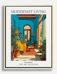
Modernist Living - The Art of Living Canvas Print
Sale price From €66,95€95,95 -

Modernist Living — The Art of Living Art Print
Sale price From €16,95€23,95 -

Modernist Living - The Art of Living Art Print
Sale price From €16,95€23,95 -

Modernist Living — The Art of Living Art Print
Sale price From €16,95€23,95 -

Modernist Living - The Art of Living Art Print
Sale price From €16,95€23,95 -

Modernist Living — The Art of Living Canvas Print
Sale price From €66,95€95,95 -
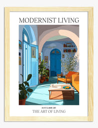
Modernist Living — The Art of Living Art Print
Sale price From €16,95€23,95 -

Modernist Living - The Art of Living Canvas Print
Sale price From €66,95€95,95 -
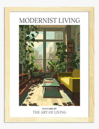
Modernist Living — The Art of Living Art Print
Sale price From €16,95€23,95 -

Modernist Living, Miami Interior Poster Art Print
Sale price From €16,95€23,95 -

Modernist Living — The Art of Living Art Print
Sale price From €16,95€23,95 -
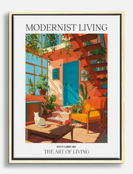
Modernist Living — The Art of Living Canvas Print
Sale price From €66,95€95,95 -

Modernist Living — The Art of Living Canvas Print
Sale price From €66,95€95,95 -

Modernist Living - The Art of Living Canvas Print
Sale price From €66,95€95,95 -
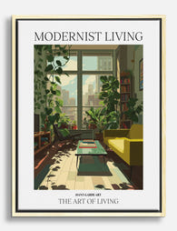
Modernist Living — The Art of Living Canvas Print
Sale price From €66,95€95,95 -

Modernist Living — The Art of Living Art Print
Sale price From €16,95€23,95 -

Vibrant Interiors Studio Apartment Art Print
Sale price From €16,95€23,95 -

Modernist Living - The Art of Living Art Print
Sale price From €16,95€23,95 -

Modernist Living Colour Pop Room Art Print
Sale price From €16,95€23,95


More from The Frame

Klimt Beyond The Kiss: Why His Landscapes and F...
Why Klimt's Landscapes Are Criminally Overlooked Everyone knows The Kiss. Fewer people know that Gustav Klimt spent every summer from 1900 to 1916 painting trees, flower beds and lakeshores so...

The Best Art for Maximalist Homes: What Actuall...
Most advice about maximalist art stops at "go bold." That's not advice, that's a shrug. This guide breaks down the actual subjects, palettes, print styles and framing choices that make...

From Postbox to Wall Art: The Surprising Art Hi...
Greeting cards were never really about the words. From the 1840s onwards, they were small, affordable art objects that put serious illustration into the hands of ordinary people. That's why...