
 Order today for delivery by
 French Country Wall Decor: How to Get the Look Without the Château
A realistic guide to layered, sun-bleached French country style using wall art alone, no renovation required.


Most French country decor guides assume you own a farmhouse in Provence, a budget for antiques, and permission to rip up your kitchen. This one doesn't. If you love the soft, lived-in feeling of a French country home but you're working with a rental flat, a modern semi, or a house you're not about to renovate, wall art is the fastest way in.
What French country style actually means for your walls
French country style is not roosters. It's not fleur-de-lis wallpaper. It's not a plaque that says "Bonjour" in cursive. Those are the Pinterest tropes that have made the whole aesthetic feel like a costume.
The real thing is quieter. It's about age, warmth, and the sense that a room has been slowly assembled over years rather than styled in an afternoon. Think of a stone farmhouse kitchen in the Luberon: chalky walls, a wooden table that's been oiled a hundred times, dried herbs, and one weathered painting of the village nobody remembers buying.
For your walls, this translates into three things. Muted, sun-bleached colours. Subjects rooted in rural or small-town French life. And frames that feel like furniture, not showroom pieces. Get those right and you don't need a single new piece of furniture to sell the look.
It's also worth clearing up what French country isn't. American farmhouse leans more industrial, with black metal, shiplap, and higher contrast. English cottage is cosier and more floral, with chintz and busier patterns. French country sits in the middle: pared back, elegant, agricultural rather than twee.

The colour palette: soft greens, warm stone, lavender, and wheat
The palette is the single biggest thing separating an authentic French country print from something that looks like a gift shop souvenir. The colours should feel like they've been sitting in sunlight for a decade.
Sage and olive greens for foliage, never emerald or forest. Warm putty and limestone tones for buildings, never crisp white or grey. Dusty lavender that leans grey rather than purple. Wheat, straw, and pale ochre for fields. A weathered terracotta on rooftops or pots, more rust than orange.
The test is simple. Squint at the print. If the colours stay soft and hazy, you're on track. If anything jumps out as bright or saturated, especially blues and purples, it's the wrong tone. A lot of "lavender field" prints get this wrong: the sky is postcard blue, the lavender is fluorescent, and the whole thing looks like it was digitally boosted. Real Provence, and real Provençal painting, is dustier than the internet suggests.
If you're layering multiple prints on one wall, keep the palette within this narrow range across all of them. Even wildly different subjects will look coherent if the tones agree.
Best French countryside print subjects
The subjects that work hardest are the ones showing texture, wear, and everyday rural life. The ones that don't are anything postcard-obvious.
Villages and architecture. Hilltop villages, narrow lanes, weathered shutters, stone doorways with climbing bougainvillea. These carry the sense of place better than anything else. Look for prints where the buildings are the subject, not a backdrop to a tourist scene.
Vineyards and fields. Rows of vines in late summer, wheat fields at golden hour, sunflower fields going slightly past their prime. The key word is "worked." A landscape that shows human labour, whether that's a stone wall, a tractor line, or a farmer's cottage in the distance, feels more French country than a pure wilderness shot.
Markets and still life. A basket of artichokes on a market table. Bunches of dried lavender. Copper pots. Bread on linen. These work brilliantly in kitchens and dining spaces, and they add the "lived-in" element without needing to be busy.
Botanicals and herbs. Rosemary, thyme, olive branches, single-stem lavender studies. These bridge French country and modern styles beautifully, which is why they're one of the safest starting points if you're mixing aesthetics. Our botanical print collection has plenty of options that lean into the muted, herbarium feel rather than tropical brightness.
Rustic textures and details. Close-ups of peeling paint on a blue shutter, a chalk-white church wall, terracotta tiles. These are the most modern-feeling French country subjects and often the most sophisticated.
What to avoid: the Eiffel Tower, anything with the word "Paris" written on it, Provence in bright cartoon colours, and matched sets of three "farmhouse" prints where two of them are wine bottles. If you can imagine it on a fridge magnet, don't put it on your wall.
Browse the France print collection with these filters in mind and you'll quickly see the difference between the tourist end and the editorial end.
Rooms where French country wall art works hardest
Not every room needs it. French country works best where warmth and texture already have somewhere to land.
Kitchens
Kitchens are the natural home. You've already got wood, tile, and probably some open shelving. A large print of a village scene or a still life above a dining table anchors the whole room. A pair of botanicals or herb studies flanking a window or above open shelves adds texture without cluttering.
If you have a small galley kitchen, one considered print at eye height beats three small ones fighting for space. In a bigger kitchen-diner, you can go up to 70x100cm or a canvas at 100x150cm above the table without it feeling oversized.
Bedrooms
The French country bedroom is soft, layered, and slightly faded. A single large landscape above the bed, framed in natural wood, does more than any headboard. Muted lavender fields, olive groves, or morning light on a stone building all work here because the palette is inherently restful.
Avoid anything with too much visual busyness or crowd scenes. You want your bedroom art to slow you down. There's a good starting point in our bedroom art selection if you want to see what tends to work above a bed versus a chest of drawers.
Hallways and stairwells
Hallways are where French country really earns its keep, because they're often the awkward, forgotten rooms in a house. A vertical arrangement of two or three smaller prints going up a staircase, all in matching oak frames, transforms a bland corridor into something that feels deliberate.
Long hallways can take a horizontal series: three 30x40cm village or vineyard prints in a row, spaced evenly, hung at eye level.

Living rooms
Living rooms are trickier because most of us have a lot of competing stuff in there already. If your sofa and rugs are neutral, a large 70x100cm landscape above the sofa will pull the room together. If your existing scheme is more colourful, keep the French country contribution to a single feature wall or a small grouping on a side wall.
Framing: why natural oak is your best friend
Framing is where most people accidentally kill the aesthetic. A beautiful sun-bleached Provençal print in a glossy black frame looks like a corporate hotel. In a chunky ornate gold frame, it looks like a theme restaurant. In crisp white, it looks like a dentist's waiting room.
Natural oak is the answer almost every time. The pale warm tone matches the palette of the prints themselves and mimics the aged wood you'd find in a real French country interior. Ash and light walnut also work if oak isn't available.
A few specific things to look for. A slim to medium frame profile, roughly 20 to 30mm wide, avoids looking either flimsy or clunky. A matte or lightly oiled finish, never high gloss. And ideally, a proper mount (the paper border between print and frame) of around 5 to 8cm. That mount is what makes a print look expensive rather than like something you bought in a service station.
Solid wood matters here too. Cheap veneered frames warp, split at the corners, and always look like what they are. Frames made from solid FSC-certified wood hold their shape and age better, which is what you want if you're going for a lived-in feel rather than a temporary look.
One quiet advantage of our framed prints: they arrive already fitted together in one box with the print properly mounted, the fixtures on, and UV-protective acrylic glazing instead of glass. That last one matters if you're hanging near a sunny window, which most French country rooms tend to be. The whole point of the aesthetic is bright, filtered daylight, and you don't want your prints fading in six months.
Pairing French prints with other wall decor
A wall of just prints, however good, can look flat. What makes French country walls feel truly lived-in is the mix.
Mirrors. An antique-style mirror with a distressed gilt or wooden frame is the single best partner for French country prints. Hang one alongside a grouping of two or three prints and the whole arrangement gains depth. Charity shops and car boot sales are gold for this. A £15 mirror with a slightly battered frame beats a new one every time.
Open shelving and ledges. A narrow picture ledge lets you lean prints rather than hang them, which instantly feels more casual and collected. Layer an unframed print behind a small framed one, add a ceramic jug or a sprig of dried lavender, and you've built a shelf-scape in ten minutes.
Textiles. A linen wall hanging, a small vintage rug, or a piece of embroidered fabric hung as art all soften the space between prints. If you have a plain wall behind a bed or sofa, a large piece of raw linen behind a framed print, either as a hanging or draped, adds texture immediately.
Baskets and dried botanicals. A woven basket on the wall next to a print, or a bundle of dried wheat, olive branches, or lavender, brings the aesthetic into three dimensions. This is how you avoid the "gallery wall" feeling that can make prints look sterile.
The trick is asymmetry. French country walls aren't grid arrangements. They're clustered, slightly off-balance, and look like they've grown over time.

Size guide: cottage hallway vs. large kitchen-diner
Getting size right is the difference between "curated" and "why is that so small."
Cottage hallways and small rooms (2.4m ceilings). Stick to 30x40cm or 40x50cm as your standard, with the occasional 50x70cm as a feature piece. Anything larger will loom. For a series along a wall, three 30x40cm prints with 8 to 10cm between them reads as a single considered arrangement.
Standard bedrooms. Above a double bed, a single 70x100cm print or a pair of 50x70cm prints side by side. Above a chest of drawers or bedside table, 40x50cm works well. The rule of thumb is that art above furniture should be roughly two-thirds the width of the furniture below it.
Living rooms with a sofa. Above a standard three-seater, aim for 70x100cm as a single piece, or a pair of 50x70cm portraits. If you want to go bigger and bolder, a canvas at 100x150cm makes a real statement and, being lighter than a large framed print, is easier to hang on plasterboard walls without heavy fixings.
Large kitchen-diners and open-plan spaces. This is where you can go big. A 100x70cm framed landscape or a full 150x100cm canvas above a dining table or on a feature wall holds the space. Small prints in big rooms just look apologetic.
Awkward narrow walls. Vertical prints at 50x70cm or a stack of two 30x40cm prints one above the other. Landscape orientation on a narrow wall never works.
Canvas versus framed is worth a quick note here. Canvas suits humid kitchens and bathrooms better, hangs lighter, and gives a softer edge. Framed prints look more polished and formal, and the mount-and-frame combination is what really sells the "collected" French country feel. In most cases, we'd lean framed for French country, with canvas as a good option for very large statement pieces or damper rooms. The landscape print collection covers both formats if you want to compare at your chosen size.
A few common mistakes worth avoiding
Buying matched sets of three from the same seller. It looks like a hotel. Mix subjects within the same palette instead.
Choosing frames before prints. The print dictates the frame, not the other way around.
Going too saturated. If a print looks vivid on a bright screen, it will look garish on a wall. Always err toward muted.
Ignoring the wall behind. French country works best on warm off-white, chalky cream, or soft putty walls. It struggles on cool grey and dies on brilliant white. If you can't repaint, choose prints with slightly warmer, higher-contrast tones to compensate.
Where to start
Pick one room. Pick one palette (say, olive green and warm stone). Choose one anchor print at the largest size the wall will take, in a natural oak frame with a generous mount. Live with it for a fortnight. Then add a second, smaller piece nearby, or a mirror, or a shelf. French country style is built slowly, and the walls should look like they were too.


Fab products featured in this blog
-

Pastel Countryside Charm Art Print
Sale price From €16,95€23,95 -
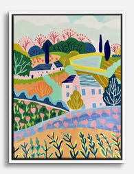
Pastel Countryside Charm Canvas Print
Sale price From €65,95€93,95 -

Parisian Charm Canvas Print
Sale price From €65,95€93,95 -
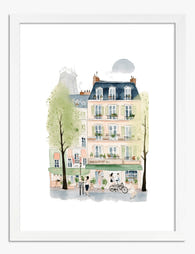
Parisian Charm Art Print
Sale price From €16,95€23,95 -
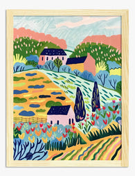
Sunlit Country Retreat Art Print
Sale price From €16,95€23,95 -

Sunlit Country Retreat Canvas Print
Sale price From €65,95€93,95 -

Parisian Street Charm Art Print
Sale price From €16,95€23,95 -

Farmhouse in Provence by Van Gogh Art Print
Sale price From €16,95€23,95 -

Le Paysage — Countryside Pathway Canvas Print
Sale price From €65,95€93,95 -

Parisian Charm Canvas Print
Sale price From €65,95€93,95 -

Le Paysage — Countryside Pathway Art Print
Sale price From €16,95€23,95 -

Pastel French Quarter Street Art Print
Sale price From €16,95€23,95 -

Pastel French Quarter Street Canvas Print
Sale price From €65,95€93,95 -

Parisian Charm Art Print
Sale price From €16,95€23,95 -

Pastel Parisian Street Art Print
Sale price From €16,95€23,95 -

Pastel French Quarter Street Art Print
Sale price From €16,95€23,95 -

Parisian Charm Art Print
Sale price From €16,95€23,95 -

Parisian Street Charm Canvas Print
Sale price From €65,95€93,95 -

Parisian Charm Canvas Print
Sale price From €65,95€93,95 -

Parisian Corner Cafe Watercolour Art Print
Sale price From €16,95€23,95


More from The Frame

Our Favourite Van Gogh Garden Prints for Every ...
Why Van Gogh garden prints work in modern interiors (not just traditional ones) There's a stubborn assumption that Van Gogh's garden paintings belong in cottage kitchens and grandmother's parlour. That's...

Why Do Most Park Wall Art Gallery Walls Fail Be...
Most gallery walls fail on paper, not on the wall. People buy prints they love, guess at spacing, hammer in a nail, and hope. This guide walks through the actual...

Curated or Cluttered? Decorating with Nature Pr...
Nature prints are the easiest wall art to buy and the easiest to get wrong. One botanical here, a moody forest there, a vintage bird plate your aunt gave you,...