Modern vs Classical Architecture Prints: A Side-by-Side Style Guide
A practical decoder for choosing between Corinthian columns and Bauhaus geometry, plus the trick for mixing both.

Architecture prints are one of the few wall art categories that work in almost any room, but the difference between a Pantheon dome and a Brutalist concrete facade isn't just aesthetic. It changes the entire mood of your space. This guide breaks down how to identify each style at a glance, where each one belongs, and what to do when you genuinely love both.
What makes an architecture print 'modern' vs 'classical'
Before you can pair architecture prints with your interior, you need to read them quickly. Most people lump everything pre-1900 into "classical" and everything after into "modern," which is roughly accurate but not useful for choosing wall art. Here's the cheat sheet.
Classical visual cues
- Columns and capitals. Doric, Ionic, Corinthian. Anything with carved acanthus leaves at the top.
- Ornament and detail. Friezes, pediments, cornices, mouldings. The eye has somewhere to rest every few centimetres.
- Symmetry. Classical buildings are almost always mirror-image symmetrical from the front.
- Domes, arches, vaults. Curves doing structural work.
- Materials that read as stone. Marble, limestone, sandstone. Warm neutrals.
Think the Pantheon, Palladian villas, Haussmann-era Paris, Georgian terraces, Beaux-Arts train stations.
Modern visual cues
- Clean lines and geometric forms. Rectangles, cantilevers, grids.
- Asymmetry. Volumes pushed off-axis, windows placed by function rather than balance.
- Glass, steel, exposed concrete. Materials shown honestly rather than dressed up.
- Negative space. Large flat planes that read as graphic shapes.
- Repetition over ornament. A facade of identical windows instead of a carved frieze.
Think Bauhaus, Le Corbusier, Mies van der Rohe, Brutalist housing, mid-century desert houses, contemporary glass towers.
The middle ground (Art Deco, early modernism) borrows from both, which is part of why it's so versatile. But for choosing prints, the cleanest decision tree is: does the building rely on ornament, or does it rely on form?

Classical architecture prints: best room types, colour palettes, and frame choices
Classical prints carry weight. They suggest permanence, history, and a slower kind of taste. They reward rooms that already have a bit of formality or that want to borrow some.
Best rooms: dining rooms, traditional lounges, hallways, libraries and reading nooks, panelled studies. The reason isn't snobbery. Classical prints have dense detail (mouldings, carved figures, fluted columns) that read best when you're sitting still and looking at them. A dining room where you spend an hour over food is ideal. A corridor you walk through quickly is wasted.
Colour palettes that work: warm neutrals, deep greens, oxblood, navy, mustard, parchment, terracotta. These echo the stone tones in most classical photography and lithographs. Cool greys and stark whites can flatten classical detail and make it look like a museum brochure.
Frame choices: classical subjects suit warmth. A solid wood frame in oak, walnut, or black with a generous white mat tends to be the most flexible choice. A wide white mat is the secret to making classical prints feel current rather than fusty. It gives the detail breathing room and signals that you're treating the image as art, not as period decor.
Sizes here matter differently to modern. Classical prints reward medium scale (30x40cm to 50x70cm) because the detail is the point. Go too large and the ornament starts to feel oppressive. Browse the architecture art prints collection for examples that lean classical without tipping into pastiche.
Modern architecture prints: why they dominate minimalist and Scandi interiors
Modern architecture prints have become the default in clean, contemporary homes for one reason: they share a visual language with the interiors themselves. A photograph of a Mies pavilion is essentially a study in flat planes, negative space, and geometric rhythm, which is exactly what a minimalist or Scandi room is trying to be.
Best rooms: home offices, open-plan kitchens, living rooms with low-slung furniture, bedrooms in calm palettes, hallways in newer builds. Modern architecture works in offices because it reinforces focus. The lines are calm and uncluttered, which keeps the wall from competing with your screen.
Colour palettes: modern prints tolerate (and often demand) cooler, sharper palettes. Pure white, charcoal, off-black, soft greige, sage, dusty blue, ochre as an accent. Bold colour can work when the architecture itself is graphic (a Luis Barragán pink wall, a yellow Rotterdam apartment block) but for most modern subjects, restraint is the move.
Frame choices: thin profiles in black, white, or natural oak. No ornate mouldings, no gilding. A slim black metal-look frame is almost always the right answer for stark modern subjects. For softer modern (mid-century desert houses, Scandi cabins) a thin natural oak frame keeps things warm without breaking the era code.
Modern architecture also benefits from larger scale. A 70x100cm print of a single concrete tower commands a room in a way that a small version simply can't. The ambition of the architecture wants matching ambition on the wall. If you're working with a big empty wall behind a sofa or bed, this is where to go big. The minimalist art prints collection is a good starting point if you're going for the calm, graphic end of the spectrum.

Mixing eras: how to pair classical and modern architecture in a gallery wall without it looking random
The PAA question "can classical and modern architecture coexist" is usually answered in terms of literal buildings. On a gallery wall, the answer is yes, but only if you follow a method. Random mixing reads as indecision.
Here's the three-step formula.
1. Pick a unifying palette
Decide upfront whether your gallery wall is colour, monochrome, or sepia. Mixing all three breaks the wall into competing zones. Monochrome is the easiest to pull off (more on this below), but a tightly held colour palette (warm earth tones, or a cool grey-blue family) works too.
2. Vary sizes, not styles, randomly
Pick one era as your dominant. Roughly 60% of the wall area should belong to one style, 40% to the other. If your hero piece is a 70x100cm classical print of a Roman ruin, your supporting modern pieces should be 30x40cm or smaller. Hierarchy prevents chaos. Equal sizes from competing eras fight each other.
3. Use consistent framing
This is where most gallery walls fall apart. If you frame the classical pieces in ornate gold and the modern pieces in thin black, you've doubled down on the contrast and the wall starts to feel like two separate exhibitions glued together. Pick one frame language (thin black, natural oak, or white) and apply it across everything. The art still reads as different eras, but the presentation tells your eye it belongs together. A coordinated wall art set takes this decision off your hands entirely.
The faux pas to avoid: ornate gold frames on Brutalist buildings (it looks like irony nobody asked for), classical prints in an industrial loft with no bridging warmth, and tiny detailed classical prints on a huge wall where you can't actually see the detail.
The black and white shortcut: why monochrome unifies any architectural style
If you take one thing from this article: black and white is the single most powerful tool for mixing architecture prints, and almost no one talks about why.
The mechanism is simple. Era in architecture is communicated heavily through material colour. Classical reads as warm because stone is warm. Modern reads as cool because concrete, steel, and glass are cool. Strip out the colour and you strip out half the era cue. What's left is form, light, and shadow, which all architecture shares regardless of century.
A black and white photograph of the Parthenon and a black and white photograph of a Tadao Ando concrete church share more visual DNA than either does with its colour version. Both become studies in light hitting geometric form. That's why monochrome gallery walls of mixed-era architecture work effortlessly while colour ones require careful curation.
There's a practical bonus too. Monochrome architecture prints sit comfortably in almost any colour scheme. A sage green lounge, a terracotta bedroom, a pure white kitchen. Colour prints have to negotiate with the room. Black and white doesn't. Browse the black and white art prints collection if you want the easiest entry point to mixing styles.
When does colour add value? When the architecture itself is the colour story. Barragán's pinks, Memphis-era Milan, painted Burano facades, Wes Anderson-style symmetrical pastels. If the building's identity is inseparable from its hue, keep the colour. Otherwise, monochrome is the safer and often more sophisticated choice.

Five pairings we love: specific room + architecture style combinations
Less theory, more specifics.
1. Georgian terrace exterior in a panelled dining room. A 50x70cm print of a London Georgian facade, framed in black with a wide white mat, hung above a dark wood sideboard. The repetition of windows in the print echoes the repetition of panels on the wall. Use warm bulb lighting.
2. Bauhaus building study in a home office. Go large (70x100cm) on a clean white wall behind your desk. Thin black frame, no mat. The graphic lines reinforce focus and the negative space stops the room feeling cluttered when you're on calls.
3. Roman ruins triptych in a stairwell. Three medium prints (40x50cm each) climbing the wall as you ascend. Sepia or warm monochrome works better than full colour here because stairwells often have inconsistent lighting. Solid wood frames in walnut.
4. Brutalist tower in a concrete-floored kitchen. A single statement piece, 60x80cm, in a slim black frame. The honesty of Brutalism (concrete shown as concrete) pairs beautifully with industrial kitchen surfaces. Avoid this pairing if your kitchen is shaker-style and warm: the bridge isn't there.
5. Mid-century desert house above a low Scandi bed. A horizontal 100x70cm print in a thin oak frame. The warm tones of desert architecture (terracotta roofs, ochre walls, blue sky) match the muted Scandi palette without going too cool.
How to choose when you genuinely love both
If you've read this far and still can't decide, here's the deciding logic.
Choose classical if your room has architectural detail of its own (mouldings, panelling, fireplaces, period features), if you spend time sitting still in the room, if your furniture is traditional or transitional, and if you want the wall to feel timeless rather than current.
Choose modern if your room is a newer build or has been stripped back, if your furniture is low-slung and graphic, if you want the wall to feel intentional and editorial, and if you have large empty wall planes that need filling with confidence.
Choose monochrome of either (or both) if you can't commit, if you're building toward a gallery wall over time, or if your room palette is going to shift and you don't want to redecorate around the art.
A note on what you're actually buying. Architecture prints live or die on detail. Blurry classical ornament looks like a holiday postcard. Poor contrast on a modern geometric building looks like a smudge. Whatever you buy, make sure the print is high resolution, properly fitted in its frame on arrival, and printed on matte paper that doesn't glare under your room lighting. A well-printed architecture image rewards close looking, which is the whole point.

Pick your dominant era, commit to one frame language across the wall, and use monochrome whenever you want flexibility. Everything else is fine-tuning.

Fab products featured in this blog
-

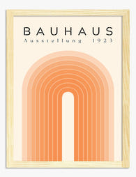
Bauhaus Modern Minimal Art Print
Translation missing: en.products.product.sale_price From €16,95€23,95 -

Sunset Sail Escape Art Print
Translation missing: en.products.product.sale_price From €16,95€23,95 -

Monochrome Modern Arch Art Print
Translation missing: en.products.product.sale_price From €16,95€23,95 -

Bauhaus Modern Minimal Art Print
Translation missing: en.products.product.sale_price From €16,95€23,95 -

Modern Archway Minimal Canvas Print
Translation missing: en.products.product.sale_price From €64,95€92,95 -
Bauhaus Modern Arch Art Print
Translation missing: en.products.product.sale_price From €16,95€23,95 -

Modern Bauhaus Retreat Canvas Print
Translation missing: en.products.product.sale_price From €64,95€92,95 -

Modern Bauhaus Haven Canvas Print
Translation missing: en.products.product.sale_price From €64,95€92,95 -

Bauhaus Modern Minimal Canvas Print
Translation missing: en.products.product.sale_price From €64,95€92,95 -

Modern Bauhaus Pattern Art Print
Translation missing: en.products.product.sale_price From €16,95€23,95 -

Bauhaus Modern Minimal Art Print
Translation missing: en.products.product.sale_price From €16,95€23,95 -

Bauhaus Modern Geometry Art Print
Translation missing: en.products.product.sale_price From €16,95€23,95 -

Modern Archway Lines Canvas Print
Translation missing: en.products.product.sale_price From €64,95€92,95 -

Modern Archway Lines Art Print
Translation missing: en.products.product.sale_price From €16,95€23,95 -

Modernist Bauhaus Building Art Print
Translation missing: en.products.product.sale_price From €16,95€23,95 -

Classical Elegance Art Print
Translation missing: en.products.product.sale_price From €16,95€23,95 -

Bauhaus Modern Geometry Art Print
Translation missing: en.products.product.sale_price From €16,95€23,95 -

Modern Archway Lines Art Print
Translation missing: en.products.product.sale_price From €16,95€23,95 -

Modern Bauhaus Arch Canvas Print
Translation missing: en.products.product.sale_price From €64,95€92,95


More from The Frame

How to Build a Gallery Wall with Watercolor Cit...
You love watercolour cityscapes, but you've seen the gallery walls where Paris, Tokyo and New York fight each other for attention like postcards on a fridge. The problem isn't the...

How to Build a French-Themed Gallery Wall That ...
A French-themed gallery wall can go one of two ways: refined Left Bank apartment, or first-year student dorm with a beret problem. The difference is not the prints you choose....

Best Labrador Wall Art: Styles, Ideas, and What...
You love your labrador. That doesn't mean your hallway should look like a tribute to him. This is a style-first guide to choosing labrador wall art that earns its place...