Best Orange Artwork for Bedrooms: Shades, Sizes, and Where to Hang It
The right shade of orange warms a bedroom without wrecking your sleep. Here's how to choose it.

Orange has a reputation problem in bedrooms. Designers regularly warn against bright, saturated oranges because they stimulate rather than soothe, which is the opposite of what you want in a space built for sleep. The good news is that "orange" covers a vast spectrum, and the dustier, earthier end of it is one of the most calming palettes you can put on a wall.
Is orange really a good colour for a bedroom?
Yes, with caveats. The concern is real: intense, saturated oranges (think tangerine, traffic-cone, neon) are widely considered sleep disruptors because they read as high-energy and visually loud. If you've ever tried to wind down in a room painted bright pumpkin, you know.
But that's not the only orange. Terracotta, burnt sienna, amber and soft peach all sit in a much quieter register. They behave more like neutrals, borrowing warmth from clay, sunset light and aged plaster rather than the cereal aisle. These are the shades you want above your bed.
The rule we'd follow: the more grey, brown or pink mixed into the orange, the better it works in a bedroom. The more it leans towards pure, saturated hue, the worse.

The shades that work: terracotta, amber, burnt sienna, and soft peach
Specificity matters here because "orange" as a search term will throw up everything from neon abstracts to muted desert landscapes. Here's how we'd break down the bedroom-friendly end of the spectrum.
Terracotta
The clay-based orange you see on Mediterranean roof tiles and Moroccan plaster. It's earthy, slightly dusty, and tends to read warm without shouting. Terracotta is the most forgiving orange for a bedroom because it pairs effortlessly with linen, oak, cream and most greens. If you're nervous about orange at all, start here. Our terracotta art prints tend to lean this way.
Amber
A touch more golden and translucent than terracotta, amber works beautifully under warm artificial light. It glows rather than glares. Think honey-toned abstracts, golden-hour landscapes, or botanicals shot against late-afternoon sun.
Burnt sienna
Deeper, browner, more autumnal. Burnt sienna has a grounded quality that suits larger pieces above the bed because it doesn't fight for attention. It's the orange you'd choose if you also love navy, forest green or charcoal in the room.
Soft peach
The lightest option, and the most underrated. Peach reads almost as a neutral when paired with white bedding and pale wood. It adds warmth without making the room feel like an autumn mood board. Good for north-facing bedrooms that need lifting.
What to avoid: bright tangerine, hi-vis orange, anything that looks like it belongs on safety equipment. Also be wary of orange art that's actually 80% white with a small orange accent, which can look thin on a bedroom wall.
Subjects that suit bedrooms: botanicals, abstracts, and sunset prints
The shade is half the equation. The subject matters just as much, because some compositions are inherently calmer than others.
Botanicals
Plants are the easiest win. Orange botanical prints, particularly pressed-flower style illustrations, single-stem studies and dried grass compositions, bring natural warmth without visual noise. The eye reads them as organic, familiar and quiet. A single botanical with terracotta tones above the bed will do more for a room's atmosphere than three loud abstracts.
We'd suggest looking for botanicals where orange is the dominant tone rather than a small accent. Faded poppies, autumn leaves, rust-coloured ferns, dried protea. These feel intentional rather than incidental.
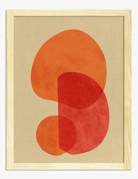
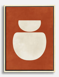
Abstracts
Abstract art works in bedrooms when the composition is loose and the palette is restrained. Soft, washy shapes in terracotta and cream read as restful. Hard-edged geometric work in saturated orange reads as a graphic design portfolio. There's a real difference between an abstract that suggests a landscape or a body and one that looks like a logo.
Look for organic forms, brush-stroke textures, and palettes that include a grounding neutral (cream, sand, soft grey). Avoid anything with sharp contrast or high-saturation colour blocking.
Sunsets and landscapes
Sunset prints are arguably the most bedroom-appropriate subject in the orange family. They're inherently calming because we associate them with the end of the day, winding down, and warm horizontal light. Desert landscapes, dune photography and minimalist horizon paintings all sit comfortably above a bed.
The one subject we'd be cautious about: graphic, pop-art style orange prints. Bold typography, comic-influenced work and high-contrast illustration tend to keep the visual cortex active. Save those for hallways, studies and kitchens.

Above the bed: sizing guide for single prints and pairs
Getting the size right is where most people go wrong, and it's almost always by going too small. A 30x40cm print floating above a king-size bed looks like an afterthought.
The two rules we use
Two-thirds to three-quarters of the furniture width. Your art should span roughly 66 to 75% of the bed's width. So above a standard UK double (135cm wide), aim for art that spans 90 to 100cm total. Above a king (150cm), aim for 100 to 115cm.
60 to 75% of the empty wall space. If you have a tall wall and a low headboard, the art should fill a generous portion of the space between the headboard and the ceiling, leaving roughly 15 to 25cm of breathing room above the headboard.
Single prints
For a single statement piece above a double bed, we'd recommend 70x100cm (portrait) or a large landscape format. Above a king, push to the larger end of the available range. A single large piece tends to feel more restful than several smaller ones, which is exactly what you want in a bedroom.
Pairs
Two prints side by side work beautifully above wider beds. Use two 50x70cm or 60x80cm pieces with around 5 to 10cm of space between them. Pairs work best when the images echo each other (two botanicals, two desert landscapes, two abstract studies in the same palette) rather than competing.
Triptychs
We'd generally skip triptychs above the bed unless the wall is genuinely wide. Three small prints can feel busy in a bedroom, which undermines the point of the room.
A note on hanging weight: framed prints are heavier than canvas, so if you're going large above a bed and the wall is plasterboard, use proper fixings. Our bedroom art prints ship ready to hang with fixtures attached, but the wall plug is on you.
Accent walls and side tables: smaller prints that add warmth
Above the bed isn't the only place orange art belongs. In fact, if you're nervous about committing, start somewhere smaller.
Side table and dresser tops
A 21x30cm or 30x40cm framed print propped on a chest of drawers or a side table is a low-risk way to introduce orange. It costs less, commits less, and lets you test how the colour reads at different times of day before going big. If terracotta on the dresser feels right after a fortnight, scale up to something above the bed.
Reading nooks and corner walls
If you have an armchair in the corner or a small reading nook, this is prime real estate for a 30x40cm or 40x50cm framed botanical. It pulls warmth into a part of the room that often feels neglected.
Gallery walls (used sparingly)
Bedroom gallery walls work best when they're tight, restrained and tonal. Three to five small prints in a similar palette, hung close together, will feel intentional. Sprawling, eclectic gallery walls tend to overstimulate in a space meant for sleep.
A note on existing orange walls
If you've already painted an accent wall in terracotta or rust, don't double down with more orange art. The wall is doing the colour work. Instead, hang something that complements: a cream abstract, a green botanical, a black-and-white photograph. The orange will frame the art rather than fight it.

Bedding and textile pairings that tie the room together
Art doesn't live in isolation, and bedrooms are textile-heavy spaces. The duvet, pillows, curtains and rug will either reinforce your art or undermine it.
Cream and terracotta
The classic combination. Cream or oatmeal bedding with a terracotta print above the bed is almost impossible to get wrong. Add a single rust-coloured throw at the foot of the bed and the room reads as cohesive without being matchy.
Grey and orange
Soft grey bedding tones down warmer oranges and stops them feeling overwhelming. This pairing works particularly well with amber and burnt sienna pieces. Go warm grey rather than cool grey to keep the room feeling restful.
Navy and orange
A bolder pairing, but a good one. Navy bedding with a burnt sienna or terracotta print creates real contrast without resorting to high-saturation colour. This works best in larger bedrooms with good natural light, because both colours absorb light.
Sage or olive green
Green is orange's complementary colour on the wheel, but in a bedroom you want the muted versions of both. Sage bedding with terracotta art, or olive cushions with an amber print, taps into a desert-meets-Mediterranean palette that's been having a long moment.
What to skip
Avoid pairing orange art with bright white bedding and stark black accents. The contrast turns the room graphic rather than restful. Equally, don't try to coordinate with bright pink, red or yellow textiles, because the warm colours will start competing.
Frames
Natural oak or walnut frames are the easiest match for orange art. They share the same warm undertone and feel cohesive. Black frames work for sharper, more graphic terracotta abstracts and add a bit of weight. White frames work with peach and lighter palettes but can feel thin around deeper burnt sienna pieces. We'd avoid bright or polished metallic frames in a bedroom entirely.
Our favourite orange bedroom prints right now
A few categories we think work particularly well, without naming specific pieces (taste is personal and stock shifts).
Single-stem botanicals in terracotta tones. Quiet, graphic enough to hold a wall, soft enough to wind down to. Look for pressed-flower style or simple line illustrations with a wash of rust or clay.
Desert and dune landscapes. Horizontal compositions with a low horizon line and a warm sky. These read as calming because the eye travels along them rather than getting stuck.
Abstract sunset studies. Loose, washy compositions in amber, peach and cream. They suggest landscape without committing to one, which gives the eye somewhere soft to rest.
Vintage botanical illustrations with autumnal palettes. Faded poppies, dried grasses, autumn leaves. The patina built into these pieces does a lot of the work for you.
Minimalist line work with a single terracotta wash. Figure studies, vases, abstract shapes. These hold space above a bed without dominating.

A final note on lighting
One thing worth flagging before you buy: orange shifts more than most colours under different light. Terracotta that looks gorgeous in afternoon sun can turn muddy under cool LED bulbs. Amber that glows under warm light can look washed out at midday.
If your bedroom has warm 2700K bulbs and decent natural light, almost any of these shades will work. If you've got cool white bulbs (4000K and up), lean towards terracotta and burnt sienna, which hold their warmth better, and skip soft peach, which can read grey under cool light.
Start with one piece, see how it lives in the room for a week or two across different times of day, then build from there. Bedrooms reward patience more than any other room in the house.

Fab products featured in this blog
-
Bold Orange & Red Shapes Art Print
Translation missing: en.products.product.sale_price From €16,95€23,95 -

Terracotta Traces Canvas Print
Translation missing: en.products.product.sale_price From €64,95€92,95 -

Cozy Minimalist Bedscape Art Print
Translation missing: en.products.product.sale_price From €16,95€23,95 -
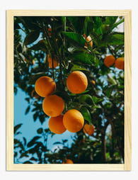
Sun-Kissed Oranges Art Print
Translation missing: en.products.product.sale_price From €16,95€23,95 -

Terracotta Flow Art Print
Translation missing: en.products.product.sale_price From €16,95€23,95 -

Cozy Modern Bedscape Canvas Print
Translation missing: en.products.product.sale_price From €64,95€92,95 -

Terracotta Harmony Art Print
Translation missing: en.products.product.sale_price From €16,95€23,95 -

Sunlit Orange Grove Art Print
Translation missing: en.products.product.sale_price From €16,95€23,95 -

Citrus Coastline Art Print
Translation missing: en.products.product.sale_price From €16,95€23,95 -
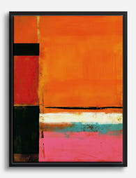
Orange Glow — Rothko-Inspired Abstract Canvas Print
Translation missing: en.products.product.sale_price From €64,95€92,95 -

Warm Terracotta Layers Art Print
Translation missing: en.products.product.sale_price From €16,95€23,95 -

Sunlit Orange Grove Canvas Print
Translation missing: en.products.product.sale_price From €64,95€92,95 -

Modern Striped Bedscape Art Print
Translation missing: en.products.product.sale_price From €16,95€23,95 -

Orange Tree by William Morris Art Print
Translation missing: en.products.product.sale_price From €16,95€23,95 -

Citrus Grove Vibes Canvas Print
Translation missing: en.products.product.sale_price From €64,95€92,95 -
Modern Terracotta Minimal Canvas Print
Translation missing: en.products.product.sale_price From €64,95€92,95 -

Bold Pink & Orange Shapes Art Print
Translation missing: en.products.product.sale_price From €16,95€23,95 -

Rothko Abstract Color Block Art Print
Translation missing: en.products.product.sale_price From €16,95€23,95 -

Terracotta Muse Canvas Print
Translation missing: en.products.product.sale_price From €64,95€92,95 -

Citrus Glow Shapes Art Print
Translation missing: en.products.product.sale_price From €16,95€23,95


More from The Frame

Art for Green Walls: What Works, What Fights
You painted the walls green. Maybe sage, maybe forest, maybe something in between. Now the room feels half-finished and the art you owned before suddenly looks wrong against it. Green...

What to Put in a Stairwell: The Hardest Wall in...
Stairwells are the wall everyone postpones. The ceiling is too high, the angle is wrong, the lighting is bad, and every nail hole feels like a permanent mistake on a...

Art at the Top and Bottom of a Staircase
Staircases are the most overlooked walls in the house. They are also the trickiest, because the top of the stairs, the bottom of the stairs, and the landing in between...