


 Order today for delivery by
Transform Your Bedroom with Botanical Art: A Curation Plan
The anti-garden-centre guide to styling leafy prints above your bed without turning your bedroom into a florist's window.


Botanical prints are the easiest art to buy and the hardest to style. One print looks considered; four looks like a garden centre gift shop. This guide is about restraint: what to put above the bed, what to leave off the wall, and how to make a leafy palette feel like a hotel suite rather than a greenhouse.
Why bedrooms and botanical art are a natural fit
Bedrooms are the one room where soft, slow imagery earns its keep. You wake up looking at the walls, and botanicals (ferns, fig leaves, pressed herbarium studies, loose watercolour palms) read as calm without being bland. They carry colour and texture without the narrative weight of figurative art, which is why they slip into bedrooms more easily than portraits or bold abstracts.
They also play nicely with the textiles already in the room: linen bedding, washed cotton, wool throws. Botanical prints share a quiet, organic language with those materials, so the room pulls together rather than fighting itself.
The trap is thinking that if one fern is good, five ferns are better. That is the exact instinct this guide is trying to kill.
Above the bed: sizing, layout, and the 2/3 rule in practice
The single most useful rule for art above a bed is the 2/3 rule: your artwork (or arrangement) should span roughly two thirds of the width of the bed below it. Narrower than that and the art floats, disconnected from the headboard. Wider and it starts to feel top-heavy.
In real numbers:
- Double bed (135cm wide): aim for art around 90cm wide. A single 70x100cm portrait print, or a 60x90cm landscape, lands beautifully.
- King bed (150cm wide): aim for 100 to 110cm wide. A 100x70cm landscape framed print, or two 50x70cm portraits hung with a 5cm gap, both work.
- Super king (180cm wide): aim for 120cm or more. This is canvas territory. A 100x150cm canvas, hung landscape, is the easiest statement you can make.
Hang the bottom edge of the frame 15 to 25cm above the headboard. Any higher and the art detaches from the bed; any lower and it starts to feel cramped. If you have no headboard, treat the top of your pillows as the reference line and work up from there.

Portrait orientation suits tall walls above low headboards. Landscape suits wide walls and tall headboards, because it echoes the horizontal line of the bed below. If you have a very tall headboard (say over 120cm), skip the single print and go to a pair.
The accent wall nobody thinks about
Everyone defaults to the wall above the bed. It is the obvious canvas, and because everyone fills it, that wall often ends up being the only one considered. The more interesting opportunities are elsewhere.
Above the dresser
A dresser is a readymade anchor: it gives the art something to sit on top of, which solves the floating problem instantly. A 50x70cm or 60x80cm print, hung so the bottom edge sits 15 to 20cm above the dresser surface, finishes the vignette. Stack it with a small lamp, a tray, a stem in a bud vase, and you have the kind of styled corner that reads as deliberate.
Beside the wardrobe
The strip of wall between a tall wardrobe and the corner is almost always ignored. A single tall portrait print (think 50x70cm or 70x100cm) in that gap draws the eye vertically and makes the room feel taller. This is especially good in bedrooms with low ceilings or heavy built-in storage.
The wall opposite the bed
The wall you see as you fall asleep and when you wake up. Treat it with the same care as the headboard wall. A large single piece from our bedroom wall art collection works better here than a gallery wall, because you want to look at it, not scan it.
Colour matching: picking botanical prints that work with your bedding and walls
Generic advice says "pick colours you like." That is useless. Here is a working method.
Step one: pull three colours from the room. Not from a mood board, from the actual room. Usually that is your bedding (the dominant colour), your walls (the backdrop), and one furniture or textile accent (a rug, a lampshade, a throw).
Step two: match the botanical print to the backdrop, not the bedding. Most people try to match prints to their duvet cover, which almost always leads to too much of one colour. Match to the wall tone instead and let the bedding provide contrast.
- White walls: anything goes, but deep greens and warm terracottas look most expensive. Washed-out pastel botanicals disappear.
- Warm beige or oatmeal walls: sage, olive, dusty eucalyptus, soft browns. Avoid cool blue-greens, which clash with the warmth.
- Grey walls: cool greens, inky blacks, blue-tinted foliage, botanical silhouettes on black backgrounds. Warm earthy greens tend to muddy against grey.
- Deep green or dark walls: botanical prints with pale or cream backgrounds for contrast. A dark print on a dark wall vanishes.
Step three: watch the green count. If your bedding is already green, if you have real plants, if your lampshade is green, then adding three green botanicals is too much. Pick one hero print and let it carry the theme. If the room is otherwise neutral, you can push greener. Browse green art prints with your existing colour count in mind, not in isolation.
Sets of 2 or 3 vs one large statement print
We have a position on this: one large, well-chosen print beats a set of three nearly every time in a bedroom.
Sets of three can look brilliant in hallways, dining rooms, and above long sofas, because the horizontal rhythm suits those spaces. But bedrooms are quieter rooms, and three prints above a bed often end up competing for attention rather than cooperating.
A single large piece does several useful things at once. It solves the sizing problem (you only have to get one measurement right). It avoids the spacing problem (the gap between prints in a set is where cheap arrangements fall apart). And it reads as confident, which is the exact feeling you want in a bedroom.

When a set does work: a pair of matching prints above a bed with no headboard, hung close together so they read as one piece. Or a pair flanking a window. Three prints only really work above a very wide super king, and even then we would often argue for one 100x150cm canvas instead.
If you want to explore the format, our botanical art prints collection has both standalone statement pieces and pairs that work together.
Framed vs unframed botanical prints in the bedroom
Both work, but they say different things.
Framed prints look more intentional. In a bedroom, a frame signals that you chose this piece, measured the wall, and committed. For botanical art specifically, framing matters because the subject is soft and organic; a crisp frame gives it structure. Our framed prints come with UV-protective acrylic glaze rather than glass, which means no distracting reflections from a bedside lamp or a window opposite, and the inks are protected from fading even on sun-facing walls.
A quick note on finishes: matte paper is almost always the right choice for a bedroom. Gloss catches light from lamps and reflects it back at you when you are trying to sleep. Our prints are museum-grade giclée on thick matte paper, which is the finish you want when the room is dim and lit from the side.
Unframed canvas reads more relaxed. It also solves two bedroom-specific problems: canvas is lighter than a framed print, which matters above a bed from a safety point of view, and it handles humidity better in rooms with en-suites. The mirrored edge wrapping on our canvases means no part of the main image is cropped on the sides, which is especially important for botanical subjects where a leaf vanishing around a corner looks wrong.
Unframed poster prints, tacked straight to the wall, almost always look unfinished in a bedroom. If budget is the issue, choose a smaller framed print over a larger unframed one.
For frame colour: natural oak suits warm, neutral bedrooms and softens the botanical subject. Black frames add contrast and work best against pale walls or alongside black bedside lamps and hardware. White frames disappear into white walls (sometimes you want this, sometimes it looks like the frame is missing). Avoid gold unless the rest of the room has gold hardware; a lone gold frame looks orphaned.
Common mistakes that make botanical walls look cheap
Most "cheap" botanical walls fail for the same handful of reasons. If you avoid these, you are already ahead.
1. Prints too small for the wall. A 30x40cm print above a king bed looks like a postage stamp. Measure the wall, apply the 2/3 rule, and buy for the space you have.
2. Hung too high. Art floats when it is more than 25cm above the headboard. Lower is almost always better.
3. Mixed frame styles. One black, one oak, one white, all in the same arrangement. If you want a gallery wall, commit to one frame colour and one frame width.
4. Spacing too wide. Prints in a set should sit 3 to 7cm apart. Wider than 10cm and they stop reading as a group.
5. Over-styling the whole room. Botanical print above the bed, botanical cushions on the bed, botanical wallpaper behind, three real plants on the dresser. Pick two botanical touches, maximum. The art is the hero. The rest supports it.
6. Matching the print too literally to the bedding. Sage duvet and sage botanical print creates a flat, catalogue-y feel. Let the art contrast, even subtly.
7. Ignoring the furniture below. A print hung in the dead centre of a wall, with a dresser pushed off to one side underneath, feels disconnected. Centre the art over the furniture, not the wall.

Our favourite botanical bedroom combinations right now
A few pairings we keep coming back to, pulled from our botanical art for bedroom collection.
The slow Sunday bedroom. Oatmeal walls, white linen bedding, oak furniture. One large landscape print of pressed ferns on a cream background, in a natural oak frame, hung above the bed. Nothing else on the walls. One ceramic vase with a single dried stem on the bedside table.
The deep green hotel suite. Sage or forest green walls, white bedding, black bedside lamps. A single portrait print of a dark monstera leaf in a black frame, hung above a walnut dresser opposite the bed. The wall above the bed left bare to let the colour breathe.
The soft romantic bedroom. Blush or warm white walls, washed cotton bedding in a dusty rose. A pair of matching watercolour botanical prints (something loose, like palm fronds or wildflowers) in white frames, hung above the headboard with a 5cm gap. One trailing plant on a high shelf.
The small bedroom. Pale walls, compact double bed, limited floor space. One 50x70cm portrait print in a slim black frame, hung on the wall beside the wardrobe. Nothing above the bed. The vertical art tricks the eye upward and makes the ceiling feel higher.

Where to start
Measure the wall above your bed, work out your 2/3 number, and shortlist one print that fits. Pick based on the colour of your walls, not your duvet. Hang it low, within 25cm of the headboard, and resist the urge to add anything else to the wall for a week. If the room still feels empty after that, then consider the dresser or the wall opposite. One good decision at a time beats five hasty ones.

Fab products featured in this blog
-

The Plants and the Flowers Art Print
Sale price From €16,95€24,95 -
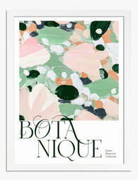
Botanique — Green Botanical Collection Art Print
Sale price From €16,95€24,95 -

Botanique — Green Botanical Collection Canvas Print
Sale price From €67,95€95,95 -

Botanique — Green Botanical Collection Art Print
Sale price From €16,95€24,95 -

Botanique — Green Botanical Collection Canvas Print
Sale price From €67,95€95,95 -

The Plants and the Flowers Canvas Print
Sale price From €67,95€95,95 -

Modern Botanical Balance Art Print
Sale price From €16,95€24,95 -

The Plants and The Flowers Art Print
Sale price From €16,95€24,95 -

Modern Botanical Balance Canvas Print
Sale price From €67,95€95,95 -
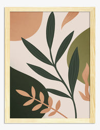
Modern Boho Botanicals Art Print
Sale price From €16,95€24,95 -

Studies in Botanical Ornament by William Morris Art Print
Sale price From €16,95€24,95 -

Royal Botanic Garden, Edinburgh Art Print
Sale price From €16,95€24,95 -

Modern Botanical Burst Art Print
Sale price From €16,95€24,95 -

Gardens of the World Botanical Art Print
Sale price From €16,95€24,95 -

The Botanical House Art Print
Sale price From €16,95€24,95 -

Vibrant Botanical Burst Art Print
Sale price From €16,95€24,95 -
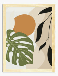
Boho Botanical Harmony Art Print
Sale price From €16,95€24,95 -

Bold Botanical Sketch Art Print
Sale price From €16,95€24,95 -

Vintage Botanical Medley Art Print
Sale price From €16,95€24,95 -

Boho Botanical Haven Art Print
Sale price From €16,95€24,95


More from The Frame

Why Botanical Art Works Better in Small Living ...
Botanical art does something strange to small rooms: it softens them without crowding them. In large rooms, it often gets lost, floating on a wall that needs more weight. This...

Blending Vintage and Modern Décor? Start With Y...
Your furniture is already a mix. A mid-century sideboard here, a modern bouclé chair there, maybe your grandmother's wingback holding court in the corner. The walls are where you make...

7 Steps to Style a Woodland Gallery Wall with F...
A fox print is one of the most forgiving anchors you can build a gallery wall around. The silhouette is distinctive, the colour palette (rust, cream, charcoal, forest green) plays...