Building a Gallery Wall Around Vase Art Prints
A plug-and-play formula for arranging vase prints, botanicals and abstracts into a gallery wall that actually works.

Vase prints are the most underrated anchor subject in wall art. The vertical shape gives a gallery wall a built-in compositional spine, and the painterly subject matter sits comfortably alongside botanicals, line drawings and soft abstracts. This guide walks you through the exact layout, sizes, spacing and frame choices that make it work.
Why vase prints make ideal gallery wall anchors
Most gallery walls fail because nothing on them is doing the structural work. You end up with a scatter of similarly-sized prints that compete rather than cooperate. A vase print solves this immediately: the vessel sits at the centre of the composition, drawing the eye to a single visual point, and the vertical orientation gives surrounding prints something to balance against.
There's a second advantage. Vase artwork tends to be quieter than, say, a bold abstract or a high-contrast photograph. That makes it forgiving company. You can pair a soft ceramic still life with a loose floral, a minimal line drawing or a muted shape study and the wall stays calm. Try the same trick with a graphic poster as your anchor and you'll spend weeks chasing balance.
Vase prints also tend to share a colour vocabulary across artists: terracotta, bone, sage, ochre, dusty blue. That makes them unusually easy to coordinate, which matters when you're buying five or seven pieces and hoping they'll feel like a set.

Choosing a colour thread to tie the whole wall together
The single most useful concept for gallery wall planning is the colour thread. You pick one or two accent colours and make sure they appear, somewhere, in every print on the wall. Not as the dominant tone necessarily, just as a thread running through.
Here's how to do it. Look at your anchor vase print and identify two colours: a primary (often the vase or background) and a secondary (often a leaf, flower, or shadow). Those two colours become your filter for every other print you add. A botanical with sage stems works because sage is in your thread. A geometric abstract with a bright cobalt block doesn't, even if it's a beautiful print on its own.
This is the bit competitors leave out when they tell you to "coordinate colours." Coordination without a rule is just guesswork. The thread gives you a yes/no test you can apply in seconds.
For warm, earthy interiors, a terracotta and bone thread works beautifully across vase print decor ideas. For cooler rooms, try sage and chalk white. For something more contemporary, charcoal and rust.
Subjects that pair naturally with vase art
Three subject categories sit alongside vase prints without fighting them:
Loose botanicals. Single stems, pressed leaves, watercolour florals. Anything with a painterly quality and plenty of negative space. Browse botanical art prints and look for pieces with clean backgrounds and one or two focal stems rather than dense, edge-to-edge foliage.
Minimal line drawings. Continuous-line figures, simple face studies, abstract botanical line work. These add rhythm without weight. They function almost like punctuation on the wall.
Muted abstracts. Shape studies, soft colour fields, gestural brushwork in restrained palettes. The key word is muted. A high-saturation abstract will pull focus away from your anchor. Look through abstract art prints and filter mentally for pieces that feel quiet rather than loud.
What to avoid: busy repeating patterns, portrait photography, photographic landscapes with lots of detail, and any print where the subject reaches the edges of the frame. These all compete for attention and break the calm that vase artwork creates.
A specific clash to watch for: pairing a heavily decorated vase print (think Delft blue patterning or Greek figures) with an equally busy botanical. Two patterned prints next to each other read as visual noise. Pair busy with quiet, always.
A tried-and-tested 5-print layout for a standard wall
This layout is designed for a wall around 2.5m wide, hung above a sofa, console, or sideboard. It uses a single hero vase print flanked by four supporting pieces. You can copy it exactly.
The composition:
- 1x 50x70cm vase print (centre, hero piece)
- 2x 30x40cm botanicals (flanking the centre, hung at the same height as the hero's midpoint)
- 2x 21x30cm abstracts or line drawings (outermost positions, hung slightly higher to create a soft arc)
Spacing:
- 5cm between the centre print and each flanking botanical
- 5cm between each botanical and the outer abstract
- The outer abstracts hang with their top edges roughly 4cm above the top edge of the centre print, creating a gentle upward sweep
Total wall span: approximately 200cm wide, 70cm tall. That leaves around 25cm of breathing room either side on a 2.5m wall, which is what you want. Gallery walls that run the full width of a wall always feel cramped.
Hanging height: the centre of the hero vase print should sit at roughly 145cm from the floor, or about 20cm above the back of a sofa. If you're hanging above a sideboard, leave 20 to 25cm between the top of the furniture and the bottom of the lowest frame.
This layout works because it's symmetrical at the centre but asymmetrical at the edges. The eye lands on the vase, then travels outward in a balanced but slightly playful path. Strict symmetry feels formal, even stiff. The arc keeps it relaxed.

Frame finishes and why consistency beats variety here
There is a school of gallery wall design that says mix your frames: different woods, different finishes, different widths. For vase-centric walls, ignore that advice. Mixing frames adds visual chaos to a composition that depends on calm to function.
Pick one finish and stay with it across all five prints. We think two finishes work best:
Matte black. Sharpens the wall, makes soft prints feel more deliberate, suits modern interiors and high-contrast colour schemes. Best when your prints lean towards line work and graphic shapes.
Natural oak or ash. Warmer, quieter, lets the artwork breathe. Suits earthy palettes, period homes, and any room with warm wood furniture. Best when your prints are painterly and your colour thread is in the terracotta or sage family.
Avoid mixing wood tones with black, and avoid metallic finishes entirely on a vase wall. Gold, brass and chrome read as decorative in their own right and steal attention from the prints.
A note on quality: badly made frames are the single biggest reason gallery walls look amateurish. Warped wood, MDF construction, and frames that ship separately from prints (so you have to fit them yourself, often badly) produce that slightly off-the-shelf feel. Fab's framed prints arrive with the print already fitted in solid FSC-certified wood, with UV-protective acrylic glaze instead of glass. They turn up ready to hang in one box, fixtures attached.
The mat vs no-mat decision
Mats (the white border between print and frame) add formality. For vase artwork specifically, we recommend skipping the mat on smaller prints (21x30cm and 30x40cm) and using a mat only on the hero piece if your wall feels visually heavy. Too much matting on a five-print wall fragments the composition and creates white space that competes with the artwork.
Spacing, alignment, and the tools you actually need
Forget elaborate hanging systems. Here's what you actually need: a tape measure, a spirit level, a pencil, painter's tape, and a hammer.
The paper template method. Cut newspaper or kraft paper to the exact size of each frame. Tape them to the wall in your planned layout. Live with it for 24 hours. Adjust until it feels right, then mark hanging points through the paper before removing it. This single step prevents 90% of gallery wall regret.
Spacing rules to follow:
- 5cm between frames is the sweet spot for prints this size. Closer than 4cm and the wall reads as a block. Wider than 7cm and the composition fragments.
- Align by midpoint, not by top or bottom edge. When prints are different sizes, shared midpoints create visual cohesion that edge-alignment can't.
- Use a spirit level on every single frame. Eyeballing it never works.
The visual audit. Before you commit, stand back six feet and check three things. Symmetry: does the wall feel balanced left-to-right? Colour distribution: are your accent colours spread across the wall, not clustered on one side? Visual weight: does any single print feel like it's pulling the composition off-centre? If yes, swap it for something with more negative space.
Scaling up: when to go from 5 prints to a full salon wall
Once you've lived with five prints for a few weeks, you'll know whether you want more. The signs that you're ready: the wall feels too sparse for the room, the furniture beneath it feels visually heavier than the artwork above, or you've found pieces you genuinely love that fit your colour thread.
To scale to seven prints, add two 21x30cm pieces above and below the hero, creating a vertical extension of the centre column. To scale to nine, add a smaller 13x18cm piece in each of the outer corners. Keep adding in pairs to preserve symmetry.
Crucially, your colour thread and frame finish rules don't change. The bigger the wall, the more important consistency becomes. A nine-print wall with mixed frame finishes looks like a charity shop. A nine-print wall with disciplined framing and a tight colour thread looks curated.
For larger walls (over 3m wide), consider going up in size on the hero piece to 70x100cm. The flanking prints can move up to 40x50cm. The proportions stay the same, the impact gets bigger.

Common beginner mistakes
A few things to actively avoid:
- Hanging too low. The midpoint of your hero should be at roughly 145cm from the floor, or 20cm above furniture. Most people hang too low because they're standing close to the wall when they mark it.
- Choosing vase prints with clashing palettes. Two vase prints in different colour worlds will fight each other. If you want multiple vase pieces on the wall, pick from the same artist or same series.
- Forgetting the room context. A gallery wall doesn't exist in isolation. Look at your sofa, rug, curtains. Your colour thread should pull from the room, not contradict it.
How to order the right sizes so everything arrives ready to hang
The shopping bit is where most people get stuck. You know roughly what you want but you've no idea what sizes to actually buy.
Use this as your starter shopping list for the 2.5m wall layout:
- 1x 50x70cm framed vase print (your hero)
- 2x 30x40cm framed botanicals
- 2x 21x30cm framed abstracts or line drawings
Browse vase art prints for the hero, then pull botanicals and abstracts that share your colour thread from the relevant collections. If you'd rather skip the curation step entirely, wall art sets come pre-coordinated.
A few practical notes on ordering. Order all five prints at the same time so they ship together and arrive in the same window. Choose the same frame finish across every piece. Choose framed rather than unframed if this is your first gallery wall: framed prints arrive ready to hang with fixtures attached, which removes the most frustrating part of the process.
If you're working with vase illustration prints in particular, the matte paper finish (rather than canvas) is the right call. Matte paper holds fine line detail and subtle colour shifts that canvas texture can blur. The lack of glare also means you can hang the wall opposite a window without fighting reflections.

A final word on patience
The temptation with gallery walls is to do everything in one weekend: pick the prints Friday, order Saturday, hang Sunday. Resist that. The walls that look best are the ones where someone spent a week with paper templates taped up, lived with the layout, swapped one piece for another, and only committed when the composition felt inevitable. Decorating with vase art rewards that patience more than almost any other subject. Take the time.

Fab products featured in this blog
-

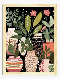
Boho Botanical Vases Art Print
Translation missing: en.products.product.sale_price From €16,95€23,95 -

Bold Botanical Vases Canvas Print
Translation missing: en.products.product.sale_price From €65,95€93,95 -
Botanical Bloom Vase Art Print
Translation missing: en.products.product.sale_price From €16,95€23,95 -

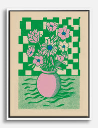
Bold Botanical Vases Art Print
Translation missing: en.products.product.sale_price From €16,95€23,95 -

Flowing Greenery Vase Art Print
Translation missing: en.products.product.sale_price From €16,95€23,95 -

Boho Botanical Vases Canvas Print
Translation missing: en.products.product.sale_price From €65,95€93,95 -
Boho Vases and House Plants Art Print
Translation missing: en.products.product.sale_price From €16,95€23,95 -

Boho Vases and House Plants Canvas Print
Translation missing: en.products.product.sale_price From €65,95€93,95 -

Ceramic Collection Vase 5 Art Print
Translation missing: en.products.product.sale_price From €16,95€23,95 -

Blue Fern Vase Still Life Art Print
Translation missing: en.products.product.sale_price From €16,95€23,95 -

Blue Fern Vase Still Life Canvas Print
Translation missing: en.products.product.sale_price From €65,95€93,95 -
Graphic Floral Pop Bouquet Canvas Print
Translation missing: en.products.product.sale_price From €65,95€93,95 -

Ceramic Collection Vase 3 Art Print
Translation missing: en.products.product.sale_price From €16,95€23,95 -

The Flowered Vase by Cézanne Art Print
Translation missing: en.products.product.sale_price From €16,95€23,95 -

Irises in a Vase by Vincent van Gogh Art Print
Translation missing: en.products.product.sale_price From €16,95€23,95 -

Modern Vase Bloom Still Life Art Print
Translation missing: en.products.product.sale_price From €16,95€23,95 -

Floral Vase in Teal Art Print
Translation missing: en.products.product.sale_price From €16,95€23,95 -

Blue Fern Vase Still Life Art Print
Translation missing: en.products.product.sale_price From €16,95€23,95 -

Modern Vase Bloom Still Life Canvas Print
Translation missing: en.products.product.sale_price From €65,95€93,95 -

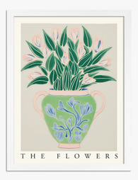
The Flowers — Pink Vase Botanical Art Print
Translation missing: en.products.product.sale_price From €16,95€23,95


More from The Frame

Urban Jungle Interiors: Using Wall Art Instead ...
The urban jungle look is having a moment that refuses to end. But most of the people pinning those plant-drenched living rooms will never own 47 monsteras, and that's fine....

Room by Room: How to Hang William Morris Floral...
You've fallen for Morris. The question now is which floral goes where, at what size, in what frame. This guide skips the Arts and Crafts lecture and gets straight to...

Jungle Bedroom Ideas for Adults: Grown-Up Ways ...
Jungle bedrooms have a reputation problem. Search the term and you'll find nursery mood boards, cartoon monkeys, and bright kelly green walls that would keep anyone awake. The grown-up version...