


 Order today for delivery by
 Why Do Matisse Tree Prints Work in Every Room?
The prescriptive styling guide for Matisse's quietest, most versatile work, from The Plane Tree to his olive groves.


Matisse's trees and gardens sit in a strange sweet spot: recognisable enough to feel considered, quiet enough to live with. Unlike his cut-outs, which shout, his tree work whispers. That's exactly why it works above your sofa, beside your bed, and behind your monitor.

Living room: choosing the right size for above the sofa
The single most useful rule for above-sofa art is the two-thirds rule. Your print should span roughly two-thirds to three-quarters of the sofa's width. Any smaller and it looks stranded. Any larger and it starts to compete with the furniture underneath it.
For a standard 210cm three-seater, a 70x100cm framed print in landscape orientation lands almost exactly right. For a 180cm two-seater, drop to 60x80cm. For a wide 240cm sofa, go for two 50x70cm prints hung side by side, or push into canvas territory at 100x150cm.
Hang the centre of the print at 145 to 150cm from the floor, with 15 to 20cm of clear wall between the bottom of the frame and the top of the sofa back. Any higher and the composition floats; any lower and the frame will catch heads.
Landscape-orientation tree scenes like the olive groves at Collioure work particularly well here because they echo the horizontal line of the sofa. The Matisse landscape prints with their soft ochres and dusty greens are what we'd reach for first in a living room with warm neutrals or natural wood.
Bedroom: why softer tree and garden scenes work for restful spaces
Bedrooms need art that lowers your heart rate, not raises it. Matisse's tree work is unusual in his catalogue because it does exactly that. The palettes are muted, the lines are slow, and there's none of the graphic snap of his cut-outs.
Above the bed, size to your headboard rather than your mattress. For a standard 150cm double, a single 50x70cm print centred above the headboard works. For a 180cm king, either a single 70x100cm print or a pair of 40x50cm prints spaced 6cm apart.
The Plane Tree is our first pick here. Its stripped-back line work reads almost like a botanical study, and the neutral cream-and-charcoal palette slots into any bedroom scheme without dictating the rest of the room. If you want something with a touch more warmth, the garden and interior-with-window scenes bring in soft greens and terracottas without ever tipping into busy.
Avoid anything with strong reds or high colour contrast in a bedroom. You want the print to recede as you fall asleep, not perform for you.

Hallway: making a narrow space feel alive with a portrait-format tree print
Hallways are the most misjudged spaces in the house. People either leave them blank or cram them with a gallery wall that turns walking through into an obstacle course. Trees are the answer, and specifically portrait-format tree prints.
A vertical tree print does two useful things in a narrow space: it draws the eye upward, which makes low ceilings feel taller, and it echoes the shape of the wall itself, which makes the whole corridor feel intentional rather than accidental.
For a standard hallway wall between two doors, a single 50x70cm print in portrait orientation hung at eye level is enough. For a longer hallway, space three 30x40cm prints evenly along the wall with roughly 40 to 50cm between each frame. That's more generous spacing than a gallery wall because you're viewing them in sequence as you walk, not all at once.
The Plane Tree in portrait format is almost purpose-built for this. Its vertical composition and quiet palette make it feel like part of the architecture. Browse the wider Matisse tree prints collection if you want to see the full range of portrait-oriented options.
One thing to check: hallways often have poor natural light, so lean into prints with lighter backgrounds. Dark, moody prints get lost in low light. Cream and off-white grounds with dark line work stay legible even in the gloomiest corridor.
Home office: the case for a Matisse landscape behind your desk
Behind-the-desk art is having a moment for obvious reasons, but most people get it wrong. They pick something too busy (constant visual noise while you're trying to concentrate) or too small (looks apologetic on the video call).
A Matisse landscape print is the answer. The horizontal composition mirrors your desk, the soft palette doesn't fight your monitor, and there's enough visual interest to look considered on camera without becoming a distraction when you're actually working.
For a standard 120cm desk, a 60x80cm framed landscape print centred behind your chair works. For a wider 160cm desk, size up to 70x100cm. Hang it so the top of the frame sits around 15cm above your head when you're seated, which usually puts the centre around 150cm from the floor.
The olive tree landscapes are our go-to here. The greens are the exact right shade to feel calm without being sleepy, and the compositions have enough movement to keep the wall from feeling static. If you're mostly on video calls, avoid anything with strong horizontal lines that will read as odd behind your head.
Frame finish pairings: natural oak vs black vs white
Frame choice matters more than people think. The wrong finish can make a beautiful print feel cheap; the right one can make an inexpensive room feel gallery-grade.
Natural oak (our default)
Natural oak is the safest choice for Matisse tree and nature prints, and by some distance. The warm grain picks up the ochres, olives, and creams that run through his palette, and the finish sits comfortably in almost any room style, from Scandi-minimal to Victorian townhouse.
Use natural oak with any of the Matisse tree prints, particularly the olive landscapes and garden scenes. If you're not sure what to pick, pick this.
Black
Black frames make Matisse's line work punch. If you're drawn to The Plane Tree or any of his more graphic, black-line-on-cream compositions, a black frame will amplify that contrast and give the wall a more modern, graphic feel.
Black also works if your room already has strong black anchors: a black metal coffee table, black window frames, black kitchen cabinetry. Avoid black frames in rooms that lean warm and rustic. They'll feel oddly severe.
White
White frames are the coastal, airy choice. They disappear against off-white walls and let the print itself do all the work, which is useful for smaller prints or busy walls where you don't want the frame to add another visual element.
Reserve white for lighter interiors: pale walls, natural linens, whitewashed floors. In a warmer or darker room, white frames can look flat and floaty.

Hanging a pair or set of three: spacing, alignment, and combinations
Multiples need discipline. The two things people get wrong are spacing (too much or too varied) and combinations (prints that don't talk to each other).
Spacing
For a pair or a trio hung in a line, keep 5 to 8cm between the frames. That's tighter than most people instinctively go. Wider gaps make the prints feel unrelated. Measure from frame edge to frame edge, not print edge to print edge.
Align the centres, not the tops or bottoms. This matters most when you're mixing sizes: two 50x70cm prints flanking a central 70x100cm print, for example. Line up the horizontal midlines and the arrangement will feel intentional.
Combinations
The best trios pair one hero print with two supporting acts. Rather than three equally busy prints, pick one with a strong composition (The Plane Tree, or a full-colour landscape) and flank it with two quieter, related prints: a botanical study, a small garden interior, a nude or window scene from the same period.
Stay within one broad palette. If your hero is a warm olive landscape, the supporting prints should also lean warm. Introducing a cool blue print into a warm trio breaks the spell instantly. The wider Matisse collection makes this easier than it sounds because his palette is remarkably consistent across decades.
If you want to bring in a related but non-Matisse element, botanical prints with similar line-work sit alongside his tree studies without fighting them.
Common mistakes to avoid
The most useful thing we can tell you is what not to do. These are the mistakes we see most often.
Hanging too high. The single most common styling error, full stop. Art belongs at eye level, which for most people means the centre of the print at 145 to 150cm. Above a sofa, keep the bottom of the frame 15 to 20cm above the sofa back. If you have to tilt your head up to look at your art, it's too high.
Undersizing above the sofa. A 40x50cm print above a three-seater looks like a postage stamp. Match the print to the furniture. Two-thirds of the sofa width is the minimum; three-quarters is the sweet spot.
Mixing frame woods that clash. If you're building a gallery wall, commit to one frame finish. Mixing natural oak with walnut with black looks scattered, not eclectic. Pick one and stick to it.
Busy prints in the bedroom. Save the high-contrast, high-detail work for hallways and living rooms. Bedrooms want to slow you down.
Overcrowding a hallway. Three prints spaced generously beats seven prints crammed together. Corridors are viewed on the move, so give the eye space to land on each piece.
Placing prints directly opposite a south-facing window. Even with UV-protective glazing, direct sun all day will eventually affect any paper. Our framed prints use UV-protective acrylic glaze and museum-grade inks designed to last for centuries, but a small angle change away from direct sun is still worth doing where you can.
Buying frame and print separately. This is where most people get burnt. Ill-fitting frames, warped mounts, prints that bubble in humid rooms. Frames and prints should ship together, fitted properly, in one box. That's the difference between art that looks gallery-grade on day one and art that never quite sits right.

Where to start
If you're styling one room, start with the living room and size to your sofa. If you're styling a whole flat, buy the living room print first, live with it for a week, then add to the bedroom and hallway once your eye has adjusted to the palette. Matisse's tree work rewards a slow build. Add one print at a time and the wall will tell you what it needs next.

Fab products featured in this blog
-

The Artist's Garden at Issy by Matisse Art Print
Sale price From €16,95€23,95 -

Matisse in the Garden Room Art Print
Sale price From €16,95€23,95 -

Foliage by Henri Matisse Art Print
Sale price From €16,95€23,95 -

Matisse-Inspired Garden Retreat Art Print
Sale price From €16,95€23,95 -
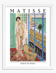
Matisse Nude by the Window Art Print
Sale price From €16,95€23,95 -

Summer Muse, Matisse Inspired Art Print
Sale price From €16,95€23,95 -
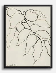
Foliage by Henri Matisse Canvas Print
Sale price From €65,95€94,95 -

Le Grand Bois by Matisse Art Print
Sale price From €16,95€23,95 -

Matisse Red Interior Exhibition Poster Art Print
Sale price From €16,95€23,95 -

The Artist's Garden at Issy by Matisse Canvas Print
Sale price From €65,95€94,95 -

Matisse Red Interior Exhibition Poster Canvas Print
Sale price From €65,95€94,95 -

Landscape at Collioure by Henri Matisse Art Print
Sale price From €16,95€23,95 -

Bedroom with a View, Matisse Inspired Art Print
Sale price From €16,95€23,95 -

Sunlit Botanical Room, Matisse-Inspired Art Print
Sale price From €16,95€23,95 -

Matisse-Inspired Garden Retreat Canvas Print
Sale price From €65,95€94,95 -

Matisse in the Garden Room Canvas Print
Sale price From €65,95€94,95 -

Matisse Nude by the Window Canvas Print
Sale price From €65,95€94,95 -

Paysage marocain by Matisse Art Print
Sale price From €16,95€23,95 -

Landscape near Collioure by Matisse Art Print
Sale price From €16,95€23,95 -

Striped Muse with Flower Art Print
Sale price From €16,95€23,95


More from The Frame

Vintage Frog Prints: From 18th-Century Naturali...
Frogs have been drawn, painted and engraved for over 300 years, long before they became the unlikely stars of modern wall art. The best vintage frog prints sit at a...

Frog Art for the Bathroom: Why It Works and How...
Frog art has quietly become one of the most-searched subjects for bathroom walls, and it's not hard to see why. The pairing makes sense on an instinctive level, but the...

Decorating with Frog Art: How to Make It Look I...
Frog art has a reputation problem. Mention it and people picture cartoon prints in a nursery, or worse, a novelty tea towel someone brought back from a garden centre. Done...