Why Matching Frames Make Botanical Gallery Walls Look Cohesive
The measurements, frame rules, and plant combinations that separate a cohesive botanical wall from a chaotic one.

Botanical gallery walls have a higher failure rate than almost any other style. Too many leaf varieties, mismatched frames, and guesswork spacing turn what should feel like a calm indoor garden into visual noise. This guide gives you the exact frame rule, plant combinations, and measurements to get it right the first time.
Why botanical themes make the best gallery walls
Botanicals share a built-in visual language: green tones, organic shapes, similar tonal ranges. That shared DNA means six or nine prints can hang together without fighting for attention, which is exactly what makes them ideal for gallery walls.
They also age well. Abstract trends shift fast, but a fern print looks as relevant now as it did in a Victorian conservatory. You're investing in something that won't feel dated in three years.
The catch is that "shared DNA" only works when you respect the rules. Mix a watercolour monstera with a vintage etched fern and a colour-pop succulent, and you've broken the cohesion that made botanicals work in the first place. Cohesion is the whole point.

Choosing your layout: grid, salon hang, or triptych
There are three layouts that consistently work for botanical prints. Pick one and commit. Don't try to invent a hybrid.
The grid
Two, three, or four rows of identical-sized prints in straight columns. Best for ferns, leaf studies, and anything with repeating shapes. A grid looks intentional and architectural, and it forgives almost any room style from minimalist to traditional.
We think 3x3 grids using 30x40cm prints are the single most foolproof botanical wall you can hang. Total span: roughly 100x130cm including spacing. Works above a sofa, sideboard, or bed.
The salon hang
An asymmetrical cluster of mixed sizes. Harder to execute, but more relaxed once you nail it. The trick is keeping the outer edges roughly rectangular and the spacing consistent, even when print sizes vary.
Salon hangs need a stronger anchoring element to stop them feeling chaotic. With botanicals, that anchor is the frame, which we'll get to in a moment.
The triptych
Three prints in a row, often a single image split across panels or three closely related botanicals (three palm varieties, three fern species). Cleanest layout for above a sofa or bed. Use 50x70cm prints with 5cm gaps for a total span around 160cm.
The frame rule: why matching frames make or break a botanical wall
Here is the rule, stated plainly: every frame on a botanical gallery wall should be identical in colour, material, and width. Not "similar." Identical.
Eclectic gallery walls (family photos, mixed art, holiday memories) can mix frame styles because the variety is the point. Botanical walls are different. They rely on repetition to feel like a curated specimen collection rather than a jumble. Break the frame consistency and the whole illusion collapses.
Three frame choices we'd actually recommend:
- Black frames. Modern, graphic, work best with high-contrast prints (white backgrounds, dark leaves). Most flexible across room styles.
- Natural oak or light wood. Warm, Scandinavian feel. Pairs beautifully with sage green walls, linen sofas, and rattan furniture.
- Off-white or cream. Best for vintage botanical illustrations on aged paper backgrounds. Disappears against white walls so the prints do all the talking.
Skip ornate gold, distressed finishes, or anything decorative. Botanicals already have visual texture in the leaves. The frame's job is to recede.
Our framed prints come with UV-protective acrylic glaze rather than glass, which matters for botanicals specifically because greens and yellows fade fastest in sunlight. If your wall gets afternoon sun, this isn't optional.
Mixing leaf types: tropical, fern, succulent, and palm combinations that work
The biggest mistake people make with botanical wall art prints is treating "botanical" as one category. It isn't. There are roughly four families, and only certain combinations sit well together.
Combinations that work
- Tropical + palm. Monstera, philodendron, banana leaf, and fan palm share dramatic scale and bold silhouettes. This is the easiest cohesive mix.
- Fern + fern. Different fern species (maidenhair, boston, staghorn, hart's tongue) look incredible together because they share fine detail and similar tonal ranges. Pure fern walls are underrated.
- Vintage botanical illustrations together. Aged-paper backgrounds and scientific labelling create instant cohesion regardless of which plants are featured.
Combinations that fight
- Tropical + succulent. Lush, flowing tropical leaves clash with the geometric, spiky shapes of succulents. They belong in different rooms.
- Watercolour + line drawing. Even if the plants are the same, mixing illustration styles breaks cohesion faster than mixing plant types.
- Coloured backgrounds + white backgrounds. Keep your background colour consistent across all prints.
Our rule of thumb: maximum two or three plant varieties per wall, all in the same illustration style. If you want a tropical feel, browse tropical art prints and stick to that family.

Size combinations: our recommended arrangements for standard walls
Most UK living rooms have a feature wall around 200 to 280cm wide. Most sofas sit 180 to 220cm wide. Use these as your reference points.
Above a 200cm sofa
You want your gallery wall to span roughly 60 to 75 percent of the sofa's width. That's 120 to 150cm of art.
- Option A: Three 50x70cm prints in a row, 5cm apart. Total span: 160cm.
- Option B: Six 30x40cm prints in two rows of three, 5cm apart. Total span: 100x90cm.
- Option C: One 70x100cm centrepiece flanked by two 30x40cm prints either side. Total span: 145cm.
Above a sideboard or console (140cm wide)
- Option A: 3x3 grid of 30x40cm prints, 5cm spacing. Total span: 100x130cm.
- Option B: Two 50x70cm prints side by side, 5cm gap. Total span: 105x70cm.
Narrow wall or stairwell (under 100cm wide)
- Option A: Vertical stack of three 30x40cm prints, 5cm spacing. Total height: 130cm.
- Option B: Single 70x100cm statement print.
Step-by-step hanging guide (with spacing measurements)
Here's the part nobody explains properly.
1. Set your centre height
The centre of your gallery wall should sit at 145 to 152cm from the floor (57 to 60 inches). This is gallery industry standard and matches average eye level.
If you're hanging above furniture, ignore the eye-level rule and instead leave 15 to 20cm between the top of the furniture and the bottom of the lowest frame. Closer than that and the art looks crammed. Further and it floats disconnected from the room.
2. Lay it out on the floor first
Always. Arrange your prints on the floor in front of the wall and step back. Photograph it from above on your phone. If it doesn't work flat, it won't work vertical.
3. Use 5cm spacing between frames
This is the magic number for botanical walls. Two to three inches. Closer than 5cm and the frames feel cramped. Wider than 8cm and the prints stop reading as a single composition.
Pro trick: cut a strip of cardboard exactly 5cm wide. Use it as a spacer between every frame as you hang. Faster and more accurate than measuring each gap.
4. Make a paper template
Trace each frame onto newspaper or kraft paper. Cut out the shapes. Tape them to the wall in your planned arrangement using painter's tape. Live with it for a day. Adjust until it feels right.
Mark the hanging point on each paper template (measure from the top of the frame to the hook on the back of the actual print). Hammer your nails through the paper, then tear the paper away.
5. Hang from the centre outward
Start with the centre print and work outward. This stops small measurement errors from compounding across the wall.
Our framed prints arrive with fixtures already attached, so you're hanging directly from the back hook rather than fiddling with separate hardware.
Three ready-made botanical gallery wall sets to steal
Take any of these and run with them. All measurements are total span including 5cm spacing.
The fern grid
For: Above a sofa or bed in a calm, neutral room.
Layout: 3x3 grid of 30x40cm prints.
Total span: 100x130cm.
Frame: Black, narrow profile.
Prints: Nine different fern species in matching botanical illustration style. Keep all backgrounds the same off-white tone.
The tropical triptych
For: Above a sofa in a brighter, more relaxed room.
Layout: Three 50x70cm prints in a horizontal row.
Total span: 160x70cm.
Frame: Natural oak.
Prints: Monstera leaf, banana leaf, fan palm. All on white backgrounds, all in the same illustration style (we'd go with simple watercolour or photographic).
The asymmetric vintage salon
For: A hallway, dining room, or study.
Layout: One 50x70cm centrepiece with five to seven 30x40cm and 21x30cm prints clustered around it.
Total span: Roughly 150x110cm.
Frame: Off-white or cream, matching width.
Prints: Vintage-style botanical illustrations on aged paper. Mix plant types here (this is the one time you can) because the unified illustration style holds it together.
Pre-curated wall art sets take the matching guesswork out entirely if you'd rather not assemble your own.

Common gallery wall fails and how to avoid them
Fail 1: Too many plant types
You picked a beautiful fern, a stunning monstera, a graphic succulent, and a delicate wildflower. Individually they're great. Together they look like a botanical garden gift shop.
Fix: Two or three varieties maximum, ideally from the same family (all tropicals, all ferns, all vintage illustrations).
Fail 2: Mixed frame styles
Black metal next to oak next to gold next to white plastic. Even if the prints inside are perfect, the frames create chaos.
Fix: Identical frames, full stop. If you've already bought mismatched frames, repaint them all the same colour.
Fail 3: Wrong spacing
Frames touching each other look cramped. Frames 15cm apart look like unrelated prints. Both are common.
Fix: 5cm. Always 5cm. Cardboard spacer.
Fail 4: Hung too high
Art hung at forehead height or above looks disconnected from the furniture and the room. This is the single most common gallery wall mistake.
Fix: Centre at 145 to 152cm from the floor, or 15 to 20cm above your furniture.
Fail 5: Cheap framing that warps
This is the silent killer. Prints arrive with bubbled paper, frames that bow within months, or worse, prints and frames shipped separately for you to assemble badly.
Fix: Buy framed prints that ship pre-assembled in one box with proper fitting. Our framed prints use solid FSC-certified wood (no MDF), arrive ready to hang, and don't warp because the print is properly mounted at the source. If you've ever had a print bubble in a humid kitchen or living room, this is why.
Fail 6: Ignoring wall colour
Black-and-white botanicals get lost on dark walls. Colourful vintage prints disappear on busy wallpaper.
Fix: Sage green walls work best with high-contrast black and white botanicals. White walls handle colourful vintage prints beautifully. Navy and deep green walls love wood frames with bright green prints inside. Browse green art prints and hold them against your wall colour before committing.

A final word on getting it right
Botanical gallery walls reward restraint, not creativity. The most beautiful ones you'll see use the fewest variables: one plant family, one illustration style, one frame, one spacing measurement. The discipline is the design.
Pick your layout, lock in your frame, measure your 5cm gaps, and trust that repetition is doing the work. That's the whole guide.

Fab products featured in this blog
-

Botanical Stairway Canvas Print
Translation missing: en.products.product.sale_price From €65,95€93,95 -

Houseplants on a Step Stool Art Print
Translation missing: en.products.product.sale_price From €16,95€23,95 -
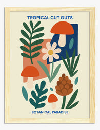
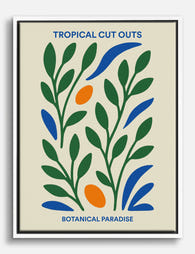
Tropical Cut Outs Botanical Paradise Art Print
Translation missing: en.products.product.sale_price From €16,95€23,95 -

Tropical Cut Outs Botanical Paradise Canvas Print
Translation missing: en.products.product.sale_price From €65,95€93,95 -
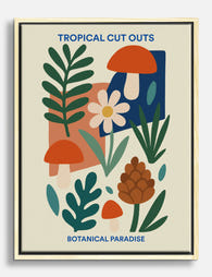
Tropical Cut Outs Botanical Paradise Canvas Print
Translation missing: en.products.product.sale_price From €65,95€93,95 -

Botanical Stairway Art Print
Translation missing: en.products.product.sale_price From €16,95€23,95 -

Botanical Staircase Haven Canvas Print
Translation missing: en.products.product.sale_price From €65,95€93,95 -

The Botanical House Canvas Print
Translation missing: en.products.product.sale_price From €65,95€93,95 -

Boho Botanical Vases Canvas Print
Translation missing: en.products.product.sale_price From €65,95€93,95 -
Botanical Muse Art Print
Translation missing: en.products.product.sale_price From €16,95€23,95 -

Boho Botanical Vases Art Print
Translation missing: en.products.product.sale_price From €16,95€23,95 -

Boho Botanical Haven Art Print
Translation missing: en.products.product.sale_price From €16,95€23,95 -

Kew Gardens Arboretum Botanical Poster Canvas Print
Translation missing: en.products.product.sale_price From €65,95€93,95 -

The Botanical House — Heritage Print Canvas Print
Translation missing: en.products.product.sale_price From €65,95€93,95 -

Tropical Cut Outs Botanical Paradise Art Print
Translation missing: en.products.product.sale_price From €16,95€23,95 -

The Botanical House Chrysanthemum Study Art Print
Translation missing: en.products.product.sale_price From €16,95€23,95 -

Mediterranean Plant Parade Canvas Print
Translation missing: en.products.product.sale_price From €65,95€93,95 -

Boho Botanical Harmony Canvas Print
Translation missing: en.products.product.sale_price From €65,95€93,95 -
Tropical Cut Outs Botanical Paradise Canvas Print
Translation missing: en.products.product.sale_price From €65,95€93,95 -

Kew Gardens Botanical House Art Print
Translation missing: en.products.product.sale_price From €16,95€23,95


More from The Frame

Our Favourite Jungle Prints for Every Room: The...
Jungle prints have a reputation problem. Done badly, they tip a room into themed-restaurant territory faster than almost any other trend. Done well, they add depth, movement and a sense...

Thrushes, Hares, and Peacocks: The Animals in W...
Why Morris put animals at the centre of his designs William Morris wasn't decorating walls with cute creatures. He was making a quiet argument. While Victorian factories churned out cheap,...

From Dutch Masters to Modern Minimalism: The Ke...
Search "types of flower bouquet art" and you'll get wedding centrepieces, posy guides, and cascading bridal arrangements. Useful if you're getting married. Useless if you're trying to choose what goes...