Art Print vs Poster: Why the Difference Is Bigger Than You Think
What you're actually paying for when you choose a proper print over a £15 poster, and when it genuinely matters.

Most people use "poster" and "art print" interchangeably. They're not the same thing, and the gap between them shows up in your room every single day, in the light, on the wall, under your hand. Here's what actually separates them, and when the difference is worth paying for.
The basics: what separates an art print from a poster
A poster is a piece of imagery printed cheaply at scale, usually on thin paper with dye-based inks, designed to be eye-catching at low cost. It's a commodity. It's meant to be replaced.
An art print is a considered reproduction. The paper is heavier, the inks are pigment-based, the resolution is higher, and the production is closer to how a gallery would print a limited edition than how a shop prints a film promo. The intent is permanence and fidelity, not impact-per-pound.
The confusion is mostly because retailers have realised "art print" sounds nicer than "poster" and started calling everything an art print. So you'll see 170gsm dye-printed sheets sold as "fine art prints" for £12. They're posters. The label has been borrowed.
What makes art prints unique isn't really the image. It's the substrate, the inks, and the process. Two retailers can sell the exact same illustration, and one version will look richer on day one and still look that way in 30 years, while the other will be sun-bleached and curled by year three.

Paper weight, ink quality, and why they matter more than you think
Paper weight is measured in grams per square metre (gsm). Cheap posters typically come in at 150 to 170gsm. Proper art prints sit between 200 and 310gsm. That's not a small difference. A 300gsm sheet feels like a thin card. A 150gsm sheet feels like a magazine page.
Why does this matter beyond "it feels nicer"? Three reasons. Heavier paper holds more ink without bleeding, so colours stay sharper and gradients stay smooth. It resists warping when humidity changes, which is what causes that wavy, bubbled look in cheap framed posters. And it physically lasts longer because thicker fibres don't break down as quickly under light exposure.
Ink is the other half. Posters use dye-based inks, which sit on the surface of the paper and start fading within months in direct light. Pigment-based inks, which good art prints use, embed coloured particles into the paper itself. The shorthand most retailers use is "archival" or "museum-grade." In plain English, that means the colour will still look right when your kids inherit it.
There's a tactile test you can do. Hold the print between thumb and finger and give it a gentle flex. A quality print has a "snap" to it, a stiffness that resists folding. A poster bends limply and creases if you look at it wrong. If a retailer won't tell you the gsm, that's usually because the answer would put you off.
The framing problem: why cheap frames ruin good art
This is the part nobody talks about, and it's where most people waste money. You can buy the best print in the world and still end up with something that looks cheap because the framing is wrong.
Cheap frames have three problems. The materials are usually MDF with a printed wood-effect veneer, which warps over time and looks plasticky up close. The "glass" is often a thin acrylic with no UV protection, so the print fades just as fast as it would unframed. And the print is rarely fitted properly, which means bubbling, slippage, or that telltale gap where the print sags away from the mat.
Even worse, a lot of frames ship separately from the print. So you receive two boxes, you fight with the back panel, you trap dust under the glass, and the corners never quite line up. We've seen £80 prints look like £8 prints because of this exact sequence.
Proper framing means solid wood (FSC-certified is the standard worth looking for), the print fitted at the framer's bench rather than your kitchen table, and a glazing material that does more than just sit there. Our framed art prints ship in one box, fitted, with the fixtures already attached. You hang it. That's the whole job.
If you're going to invest in good art, the framing budget should be roughly equal to the print budget. A £60 print in a £15 frame is worse than a £30 print in a £45 frame. We'll die on that hill.

How UV-protective glazing keeps prints looking fresh for decades
Sunlight is the enemy. Even prints not in direct sun get hit by ambient UV all day, and over time it bleaches dyes, oxidises pigments, and yellows paper. A poster in a sunny room can visibly fade in 18 months. A poster in a north-facing room might last five years before it starts looking tired.
UV-protective glazing blocks the wavelengths responsible for fading before they reach the print. It's the single biggest factor in how long your art looks like art. Regular glass blocks some UV, but not enough. Standard acrylic blocks even less. UV-protective acrylic, which is what we use, blocks the vast majority and adds an anti-glare benefit on top.
There's also the practical side. Acrylic is significantly lighter than glass, which matters for larger sizes (try hanging a 70x100cm framed piece with glass and you'll understand). It's also shatter-resistant, which is genuinely important if you have kids, pets, or any plans to ever move house.
The glare difference is worth mentioning too. Glass reflects light back at you, especially in rooms with windows opposite the wall. Anti-glare acrylic diffuses it, so you actually see the print rather than your own reflection trying to look at the print.
What 'museum-grade giclée' actually means (in plain English)
Giclée is French for "spray," and it's pronounced "zhee-clay." It refers to a high-resolution inkjet process that uses many more inks than a standard printer (typically 10 to 12, versus the 4 in your home office), at a much higher resolution (300 DPI minimum, often higher).
Why does this matter? Because more inks means a wider colour range. A standard 4-ink printer fakes purple by mixing red and blue dots, and your eye sees the dots if you look closely. A 12-ink printer has actual purple, plus several variations of grey, plus light cyan and light magenta for subtle gradients. Skin tones look like skin. Skies look like skies. Shadows have depth instead of looking muddy.
300 DPI means the printer is laying down 300 dots in every inch of paper. At that density, you can put your face up against the print and still not see the dots. Cheap posters are often printed at 150 DPI or lower, which is fine from across the room but falls apart up close.
"Museum-grade" is the term used because this is the same process galleries use to reproduce works for exhibition and sale. It's not marketing fluff. It's a specific standard involving the inks, the paper, and the resolution working together. The result is a print that holds detail in the dark areas, holds colour in the light areas, and looks like it was printed yesterday even after decades on the wall.
This is why you'll often hear that giclée prints last 100+ years. With pigment inks, archival paper, and UV protection, that's a realistic figure based on accelerated ageing tests run by ink and paper manufacturers. It's not a guess.

Side-by-side: what the same image looks like as a poster vs. a quality art print
Imagine the same photograph, a misty forest with low light filtering through trees, printed two ways.
The poster version: the dark areas of the trees turn into solid black blobs because the dye-based inks can't hold detail in shadow. The mist looks like a smooth grey wash with no texture. The greens are slightly off, leaning yellow. Up close, you can see the dot pattern. The paper has a slight gloss that catches the overhead light and bounces it into your eyes.
The art print version: the shadows have depth, with branches and leaves still visible inside the dark areas. The mist has actual gradient, soft variation from grey to almost-white. The greens are accurate, including the subtle reddish tint of new growth. Up close, the surface looks continuous. The matte paper absorbs ambient light so you see the image, not the room.
Now fast-forward five years, both hung on the same wall. The poster has shifted noticeably. The blacks have turned slightly grey. The greens have moved towards yellow. There's a faint warm cast across the whole image where the paper has aged. The art print looks identical to the day you hung it.
This is the part that's hard to convey in product photos. The difference isn't dramatic in any single moment. It's cumulative. It's the way light hits it, the way it changes (or doesn't) over time, the way it feels when you walk past it.
When a poster is fine, and when you should invest in a proper print
We're not going to pretend posters are pointless. They have a place, and snobbery about this is silly.
Posters make sense for temporary decor. If you're renting a flat for a year and want to fill blank walls, a £12 poster is the right answer. They make sense for kids' rooms, where things get drawn on, taped up, and replaced as taste evolves. They make sense for trend pieces you know you'll be over by next summer. They make sense for film posters in cinemas, gig posters from a night you remember, anything where the cultural value outweighs the material quality.
Where posters stop making sense is when you're trying to create a room you actually live in. A lounge you're proud of. A bedroom that feels like an adult lives there. A piece you want to keep when you move. The cost-per-year maths is also worth doing: a £15 poster lasting two years costs you £7.50 a year. An £80 print lasting fifty years costs you £1.60 a year. The cheap option is more expensive over time, and it looks worse the whole time.
If you're building a gallery wall, framing matters even more, because inconsistencies stack visually. One faded poster in a row of crisp prints will pull your eye every time. Either commit to all posters (cheap, fine, replace every couple of years) or commit to proper prints. Mixing the two looks worse than either alone.
Our Fab favourites are a good place to start if you're not sure what you want, and our unique art prints collection is where to look if you're after original design art prints rather than the same five images everyone else has on their walls.

What to ask before you buy
Three questions will tell you almost everything about what you're being sold.
What's the paper gsm? Anything under 200 is a poster, regardless of what it's called. 250 to 310 is the range you want.
Are the inks pigment-based or dye-based? Pigment for prints you want to keep. Dye for things you'll replace.
Does the frame include UV-protective glazing, and is the print fitted before shipping? If the answer is "frame ships separately" or "standard acrylic," you're going to be disappointed within two years.
If a retailer can't answer these, walk away. The good ones are proud to tell you. The cheap ones hope you won't ask.

Fab products featured in this blog
-

South End Free Art Exhibition, 1895 Canvas Print
Sale price From €65,95€93,95 -

Springfield Bicycle Club by Bradley Canvas Print
Sale price From €65,95€93,95 -

Springfield Bicycle Club by Bradley Art Print
Sale price From €19,95€33,25 -

Bearings Decoration Day Cycle Races Art Print
Sale price From €19,95€33,25 -

Bauhaus Ausstellung 1923 Blue Canvas Print
Sale price From €65,95€93,95 -

Bauhaus Ausstellung 1919 in Deep Green Canvas Print
Sale price From €65,95€93,95 -

Saint-Tropez Modern Travel Poster Art Print
Sale price From €19,95€33,25 -
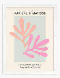
Papiers Découpés Pink Cut-Outs Art Print
Sale price From €19,95€33,25 -

One Step Counts Canvas Print
Sale price From €65,95€93,95 -

Endless Glow Typography Poster Canvas Print
Sale price From €65,95€93,95 -

Georges Richard Cycles Vintage Poster Art Print
Sale price From €19,95€33,25 -
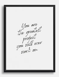
You Are The Greatest Project Canvas Print
Sale price From €65,95€93,95 -

Rose Retro Risograph Poster Art Print
Sale price From €19,95€33,25


More from The Frame

Our Favourite Art Prints for Bedrooms That Help...
Bedroom art is the one place in your home where a "statement piece" is usually the wrong instinct. The job here is quieter, and getting it right means unlearning most...

Vintage Rose Prints: From Botanical Illustratio...
Vintage rose prints are having a proper moment. Not the dusty, chintzy kind your nan had over the settee, but the considered, well-framed kind that anchor a modern room and...

Why Rose Print Decor Works Better Without the C...
Why Roses Are the One Floral That Never Truly Goes Out of Style Roses have been painted, printed and photographed for centuries, and they still turn up in the work...