
 Order today for delivery by
 What Art Actually Works in a Kitchen (And What to Avoid)
A working guide to kitchen wall art that looks intentional, handles the steam, and skips the "Bon Appétit" cliché.


Most kitchen art looks like it was chosen last, in a rush, from a homewares aisle. It doesn't have to. With the right materials and a bit of restraint, your kitchen can hold art as confidently as your lounge does.
Why most kitchen art looks like an afterthought (and how to fix it)
The problem isn't that people don't care about kitchen art. It's that the dominant style for kitchen walls is typography signage telling you to drink coffee, eat well, or gather with family. You already know this. You're standing in the kitchen. The instruction is redundant.
Generic food signage reads as cheap because it's decorative wallpaper pretending to be art. It has no point of view, no composition worth studying, and nothing to look at after the first glance. Swap it for a single considered piece, even a small one, and the room shifts immediately.
The fix is to treat your kitchen like a real room with real walls. The same rules that work elsewhere in your home apply here: pick art you'd want to look at for years, size it properly, hang it at the right height, and use materials that can cope with the environment. That last point matters more in a kitchen than anywhere else.

The styles that actually work: food prints, botanical art, and graphic illustration
If you want food on the walls, do it properly. A well-photographed still life of citrus, a moody oil-painting-style print of pears on linen, or a vintage botanical illustration of herbs reads very differently to a "But First Coffee" canvas. The subject can be food. The execution has to be considered.
Botanical prints are the safest and most versatile choice for a kitchen. They reference the room's purpose without being literal about it, they handle most colour palettes, and they have enough detail to reward a closer look while you wait for the kettle. Antique botanical illustration in particular suits older kitchens with painted cabinets, while cleaner contemporary line-work botanicals sit better in flat-fronted modern kitchens.
Graphic illustration is the under-used category. A bold, flat-colour print of a market scene, a single piece of fruit rendered in three colours, or an architectural print of a Parisian café front gives you the food-adjacent feel without descending into cliché. These also tend to read well from across an open-plan space, which matters if your kitchen flows into a living area.
Still life prints are the most underrated option. A proper still life, even a small one, brings the kind of compositional weight you'd normally see in a dining room. The genre was literally invented to celebrate food and domestic objects. It belongs here.
What to avoid
Skip anything with words on it unless the typography is genuinely the artwork (a properly designed poster, not a slogan in a script font). Skip stock photography of coffee beans, wine bottles, or chilli peppers. Skip "live laugh love" energy in any of its dialects. If you can imagine the same print in the toilets of a chain restaurant, don't hang it in your kitchen.
Where to hang art in a kitchen (and where not to)
The two zones to avoid are directly above the hob and directly above the sink. Above the hob you get grease mist, steam, and heat fluctuation, which will degrade any artwork over time and make even wipeable surfaces look hazy. Above the sink you get constant splash and humidity, plus people leaning in close with wet hands.
A good rule is to keep art at least 90cm to 1.2m (3 to 4 feet) from the cooktop and out of the direct line of sink splash. That sounds restrictive until you map it out. Most kitchens have a generous wall opposite the cooking zone, a stretch of wall between the end of the cabinets and a doorway, or a breakfast nook that's effectively its own room.
The breakfast nook is the easiest win in any kitchen. Treat it like a small dining room. It's far enough from the hob and sink that environmental concerns drop away, and it usually has the wall space to hold a larger statement piece or a proper gallery arrangement.
For working kitchens with little spare wall, look at the gap above a run of base cabinets where there are no wall cabinets above, the end panel of a tall cabinet run, or a narrow strip of wall next to the fridge. Vertical prints in slim formats (30x40cm or 40x60cm) work well in these awkward gaps.

Sizing your kitchen prints: the wall-space rules that matter
The professional consensus on art sizing is the two-thirds rule: your art (or grouping) should fill roughly two-thirds of the available wall width above whatever piece of furniture or feature it sits over. In a kitchen, "furniture" usually means a worktop, a sideboard, or a dining bench.
Above a 1.5m run of worktop, you want art that's around 90cm to 1m wide. That's a 70x100cm framed print in landscape, or a pair of 40x50cm prints hung side by side with a 5cm gap. Going smaller looks tentative. Going larger starts to crowd the splashback.
For tall narrow gaps (between a fridge and a wall, or beside a tall pantry cabinet), a vertical 30x40cm or 50x70cm print works better than trying to squeeze a square piece in. Match the orientation of the artwork to the orientation of the available wall.
In a breakfast nook, treat the wall as you would in a dining room. A single 70x100cm framed print sits perfectly above a banquette, hung so the centre of the image lands about 145-150cm from the floor (slightly lower than usual because people are usually seated when they see it).
How high to hang above a worktop
Above a worktop, leave around 15-25cm of clear wall between the top of the splashback (or worktop, if there's no splashback) and the bottom of the frame. Any closer and the art feels cramped. Any higher and it floats off into the cabinets above.
If you have wall cabinets above the worktop in question, you've usually only got 40-50cm of wall to play with. Don't try to force a large piece in. Use a slim ledge with a small leaning print and a couple of objects instead. It looks deliberate rather than squeezed.
Framing and materials: what survives steam, grease, and sunlight
This is where most kitchen art guides get vague. The honest answer is that materials matter more here than in any other room, and the choice between canvas and framed print under glazing has real consequences.
Canvas handles humidity well. The poly-cotton weave breathes, and a properly stretched canvas on a solid wood frame won't warp the way thin paper or cheap board will. The matte finish doesn't show steam haze the way glass does. For a kitchen that gets a lot of cooking traffic, canvas is genuinely the more practical choice, and it can be wiped down with a barely damp cloth when grease mist settles.
Framed prints under acrylic glazing are the other strong option, and in some ways the better one. Acrylic doesn't shatter (useful in a room full of hard surfaces), it's lighter than glass, and a good UV-protective acrylic prevents fading in sunny kitchens. The glazing also seals the paper away from grease and moisture entirely, which means you're cleaning the surface of the acrylic, not the artwork. A quick wipe with a soft microfibre is all it needs.
What you want to avoid is unframed paper prints in a working kitchen. Without glazing, paper absorbs ambient moisture, cockles over time, and picks up grease that can't be cleaned off. Save unframed prints for the breakfast nook or a kitchen that genuinely doesn't see much heavy cooking.
A practical note on construction: kitchens are unforgiving of poorly made frames. Cheap MDF frames warp when humidity cycles up and down, veneers lift at the corners, and prints that weren't properly fitted in the factory will start to ripple within months. Solid wood frames with the print fitted and sealed at the point of manufacture hold up far better. Anything that arrives in pieces and asks you to assemble it is going to age badly in a kitchen.

Three kitchen art layouts we love (with exact sizes and spacing)
1. The single statement over a breakfast banquette
One large framed print, 70x100cm in portrait orientation, hung with the centre of the image at 145cm from the floor. Leave 25-30cm of wall between the top of the banquette cushions and the bottom of the frame. Works best with a moody still life, a graphic food illustration, or a contemporary botanical.
This is the highest-impact layout you can do in a kitchen, and the easiest to get right. There's only one decision: pick the right print.
2. The triptych above a sideboard
Three 40x50cm framed prints in matching frames, hung in a row with exactly 5cm between each frame. Total width comes to about 130cm, which suits a 180-200cm sideboard nicely (the two-thirds rule in action). Centre the middle frame on the sideboard and align the others off it.
Botanical sets work brilliantly here. So do three related food illustrations (three citrus fruits, three herbs, three vessels). The repetition makes the wall feel composed rather than busy.
3. The shelf-styled corner
A single oak picture ledge, 60-80cm long, fixed to the wall at around 150cm from the floor. Lean two prints on it: a 30x40cm at the back and a smaller 20x25cm at the front, slightly offset. Add one ceramic object (a small vase, a stoneware jug) to anchor the composition.
This layout is perfect for renters because the ledge takes one fixing and the prints don't need hanging. It's also the easiest layout to refresh, since you can swap prints out without touching the wall.
Food art prints vs. abstract art vs. photography: our honest take
Food art prints are the obvious choice, and when they're done well they're the right choice. A proper food still life, a vintage market illustration, or a graphic single-fruit print can be the best thing in your kitchen. The risk is leaning into cliché. Pick food art the way you'd pick any other art, on the strength of the image, not because it ticks a thematic box.
Abstract art works better in kitchens than people expect. A muted abstract in colours pulled from your backsplash or cabinets ties the room together without being literal about what the room is for. It also ages well, which matters in a room you redecorate less often than your lounge.
Photography is the third option and the most polarising. Black and white architectural photography (Parisian rooftops, market arcades, vineyard rows) looks fantastic in modern kitchens. Saturated colour photography of food tends to date quickly and read as commercial. If you go for photography, lean towards black and white or muted colour palettes.
Our honest position: a single strong botanical or still life print, properly framed, in the right spot, beats almost any other approach. It's the option that works in the widest range of kitchens, suits the widest range of palettes, and is the least likely to look dated in three years. If you want to browse a curated edit, our kitchen wall art collection is organised around exactly these principles.

A final note
If your kitchen is genuinely over-cabineted and there's no wall that works, don't force it. Blank wall is better than a print squeezed into a space that can't hold it. Put your art in the adjoining dining area or the hallway leading in, and let the kitchen breathe. The best decorating decision is sometimes not to decorate.

Fab products featured in this blog
-

Whimsical Kitchen Essentials Art Print
Sale price From €19,95€33,25 -

No Bitchin In My Kitchen Art Print
Sale price From €19,95€33,25 -

Food — Don't Waste It Canvas Print
Sale price From €65,95€93,95 -

Whimsical Kitchen Essentials Canvas Print
Sale price From €65,95€93,95 -

Bold Ampersand Art Print
Sale price From €19,95€33,25 -
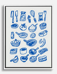
Playful Kitchen Sketches Canvas Print
Sale price From €65,95€93,95 -
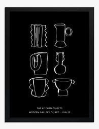
The Kitchen Objects Exhibition Poster Art Print
Sale price From €19,95€33,25 -

The Kitchen Is the Heart of the Home Art Print
Sale price From €19,95€33,25 -

Purple Kitchen Tools Art Print
Sale price From €19,95€33,25 -

Blue Kitchen Sketches Canvas Print
Sale price From €65,95€93,95 -

The Kitchen Objects Exhibition Print Canvas Print
Sale price From €65,95€93,95 -
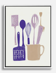
Whimsical Kitchen Tools Canvas Print
Sale price From €65,95€93,95 -

Kitchen Tools in Pink and Purple Canvas Print
Sale price From €65,95€93,95 -

Kitchen Tools in Pink and Purple Art Print
Sale price From €19,95€33,25 -

Kitchen Sink Still Life Canvas Print
Sale price From €65,95€93,95 -

Good Food, Good Mood Art Print
Sale price From €19,95€33,25 -

The Kitchen Objects Exhibition Print Canvas Print
Sale price From €65,95€93,95 -

Playful Kitchen Sketches Art Print
Sale price From €19,95€33,25 -

Pink Kitchen Utensils Still Life Art Print
Sale price From €19,95€33,25 -

Whimsical Kitchen Essentials Art Print
Sale price From €19,95€33,25


More from The Frame

The Best Water Lily Prints for Every Room (And ...
Water lily art has a rare quality: it slots into almost any room without asking the rest of the decor to change around it. The tricky part is knowing which...

The Best Wall Art for Plant Lovers (That Doesn'...
You already have too many plants. You know it, your partner knows it, the fiddle leaf fig blocking the window knows it. But your walls are still bare, and there's...

Are Botanical Prints Still in Style? The Trend ...
Botanical prints have been declared "over" roughly every three years since 2015, and yet they keep hanging on more walls than ever. The truth is they're not a trend at...