How to Build a City-Themed Gallery Wall That Actually Looks Intentional
The difference between a curated city gallery wall and a chaotic mess comes down to six decisions, made in the right order.

Most failed gallery walls die at the same step: someone buys five prints they love individually, hangs them, and realises they have nothing in common. City art is especially prone to this because skylines, street photography, maps and typography all live in the same emotional category but rarely look like they belong on the same wall. This guide walks you through the decisions, in order, that make the difference between a wall that looks curated and one that looks confused.
Start with a theme: one city, multiple cities, or a mood
Before you look at a single print, decide which of three approaches you're taking. This is the most important decision you'll make, and almost nobody makes it consciously.
One city, multiple views. Pick London, Paris, Tokyo or wherever you have a real connection to. Combine a skyline, a street scene, a landmark, and maybe a typographic print of the city name or postcode. This works beautifully because the subject matter does the cohesion work for you. If you've lived somewhere or honeymooned there, this is usually the strongest emotional choice.
Multiple cities, travel map style. Three to six cities you've visited or want to visit, each represented by one print in the same format. The risk here is that different architectural styles (Manhattan towers next to Parisian Haussmann next to Kyoto temples) can clash if you don't lock down your unifying thread. We'll get to that next.
Mood-based. All warm-toned sunset skylines, or all moody black-and-white street photography, regardless of location. This is the most forgiving option for people who want gallery wall aesthetics without sentimental attachment to a specific place.
There's no wrong answer, but pick one and commit. Browsing city art prints with a defined theme in mind is genuinely faster than browsing without one.

The secret to cohesion: pick your unifying thread
A gallery wall needs one element that runs through every print. One. Not three. The most common mistake is trying to coordinate too many variables at once and ending up with prints that share nothing.
Your three options for the unifying thread:
Colour palette. Every print contains the same two or three colours. Navy and cream skylines. Warm sunset oranges and pinks. Monochrome black and white. This is the most flexible option because you can mix subject matter freely as long as the palette holds.
Frame and format. Identical frames in the same finish, same mount style, same orientation. Subject matter and colour can vary because the framing creates the visual rhythm. This is what makes "different cities" gallery walls work without looking like a souvenir shop.
Print style. All line drawings. All vintage travel poster style. All photographic. The illustration technique creates the through-line.
Pick one. If you're new to gallery walls, frame consistency is the easiest to execute and the hardest to mess up. We'll come back to why frames matter so much in section seven.
How many prints you actually need
Print quantity should be dictated by your wall, not by an aesthetic ideal. Measure first, decide second.
For a standard sofa wall (around 200cm wide), your art should occupy roughly two-thirds of the sofa width, so 130 to 150cm of total visual area. That gives you:
- Three prints at 50x70cm in a row
- Four prints at 40x50cm in a 2x2 grid
- One large 70x100cm anchor with two or three smaller 30x40cm prints clustered around it
For a narrow hallway or stairwell, vertical clusters of three to five prints at 30x40cm or 40x50cm work better than wide arrangements. Hallways reward portrait orientation.
For a dining room or feature wall (anything over 250cm wide), you can scale up to five or six prints, or anchor with a single XL canvas at 100x150cm. Going too small on a big wall is the most common sizing error. Better to have fewer, larger prints than many tiny ones marooned in space.
The minimum for a gallery wall to read as a gallery wall, rather than a few prints stuck near each other, is three. The practical maximum before things start looking chaotic is around seven. Most rooms look best with four or five.
Layout templates that work
Three layouts cover roughly 95% of successful city gallery walls. Pick the one that suits both your prints and your room.
The grid
Two by two, three by two, or three by three. All prints identical in size, identical frames, evenly spaced. Spacing should be 2 to 3cm between prints for a tight, contemporary look, or up to 5cm if you want each print to breathe.
The grid is the right choice when you want a calm, considered look, when your prints share a strong visual identity (a series of skylines from different angles, for example), or when your room is already busy and the wall needs to feel quiet. Grids reward patience because alignment is unforgiving. A print 1cm out of true will look wrong from across the room.
The salon hang
Mixed sizes, mixed orientations, arranged densely with consistent spacing of 5 to 8cm between pieces. Salon style originated in 18th century Paris where paintings were hung floor to ceiling, and it works brilliantly for travel and city collections because the variation mirrors how memories actually accumulate.
The trick with salon hangs is to keep one edge as an invisible anchor line. Either the top, the bottom, or an imaginary horizontal axis through the middle. Without that, the arrangement looks scattered rather than collected.
The asymmetric cluster
One large anchor print (often 70x100cm) with three to five smaller prints arranged off-centre to one side. The anchor carries the visual weight, the satellites provide rhythm.
This works best when you have one print you genuinely love more than the others. A statement London or New York skyline, for example, surrounded by smaller supporting pieces in a coordinated palette. Asymmetric clusters look intentional when the smaller prints visibly relate to the anchor in colour or subject.

Paper templates: the only method that prevents regret
This is the single technique that separates polished gallery walls from holes-in-the-wrong-place gallery walls. Do not skip it.
Cut sheets of paper (newspaper, brown parcel paper, anything thin) to the exact dimensions of each framed print. Mark the position of the hanging hook on each sheet, measured from the top of the actual frame. Tape the paper templates to the wall using low-tack masking tape.
Live with the arrangement for at least 24 hours. Walk past it. See it in morning light and evening light. Move pieces 5cm one way or the other. Try one print higher, one lower. The arrangement that looks right in your head almost never looks right on the wall, and paper costs nothing to reposition.
When you're certain, hammer your nails or picture hooks directly through the paper at the marked hanging point. Tear the paper away, hang the print. The hook is exactly where it needs to be.
The centre of your gallery wall (the visual middle, not necessarily the geometric centre of the cluster) should sit at roughly 145 to 150cm from the floor. This is gallery standard eye level. Above a sofa, leave 20 to 25cm between the top of the sofa and the bottom of the lowest frame.
Mixing cityscapes with typography, maps, and abstract prints
This is where most gallery walls level up from "nice" to "actually intentional." A wall of pure skylines can read as repetitive. Adding two or three complementary print types creates rhythm without losing the city theme.
Typography prints with city names, postcodes, coordinates, or quotes work beautifully alongside skylines. Keep the typography in a tone that exists somewhere in your photographic prints. A cream and black typographic print belongs next to a black and white skyline. A warm cream typographic print does not belong next to a cool blue skyline.
Maps are the obvious pairing and the most overused. They work, but they need to share a visual language with your other prints. A vintage cream map clashes with a contemporary monochrome skyline. A modern minimalist map in matching tones does not.
Abstract prints are the secret weapon for breaking up too much realism. An abstract print that pulls one or two colours from your skylines (the orange of a sunset, the deep navy of a night view) gives the eye somewhere to rest. Use one abstract per gallery wall maximum.
The rule: if you wouldn't be able to explain why a print belongs on the wall in one sentence, it doesn't belong. "It pulls the same warm tones as the Paris print" is a sentence. "I just liked it" is not.
Framing consistency and why it's the single biggest factor
If you take one thing from this article: frame consistency does more heavy lifting than any other element. You can mix cities, formats, and even some colour variation, and the wall will still look intentional if every print is framed the same way.
When to use identical frames: Always, unless you have a specific reason not to. Same wood, same finish, same mount width. This is non-negotiable for grids and strongly recommended for asymmetric clusters.
When mixed frames can work: Salon-style hangs with a deliberately collected, layered feel can handle two frame finishes (say, all black and all natural oak) if used in roughly equal proportion and distributed evenly across the arrangement. Three or more frame finishes almost never works.
A few specifics worth knowing about framing in general. Cheap frames warp, especially with humidity changes, and the print inside shifts and bubbles. Frames that ship separately from prints rarely fit properly. Glass frames create glare that obscures detail and reflects every light source in the room. The Fab framed prints sidestep these issues: solid FSC-certified wood frames (no MDF, no veneers), UV-protective acrylic glaze instead of glass, and the print and frame ship together in one box, properly fitted, ready to hang. If you're building a gallery wall, frame quality is where consistency lives or dies.
For mount style: a wide white mount around each print adds breathing room and makes prints feel more considered. A tight mount or no mount feels more contemporary and graphic. Pick one approach and apply it across every print.

Ordering and hanging: practical tips for getting prints up quickly
A few practical points to take you from decision to hung wall.
Order everything at once. Especially if you want frame consistency. Ordering in batches risks subtle differences in finish, mount colour, or paper tone between deliveries. Pre-curated wall art sets take the matching question off the table entirely.
Check sizing on the floor first. When your prints arrive, lay them out on the floor in the layout you've planned before doing anything else. Look at them from standing height. Sometimes the proportions you imagined don't match reality, and it's far easier to swap a print before you've made the paper templates.
Hardware matters more than people think. For prints up to 50x70cm, a single picture hook rated for 5kg is enough. For larger framed prints (70x100cm and up), use two hooks spaced roughly a third of the frame width apart for a level hang that won't shift. On plasterboard walls, use proper plasterboard fixings, not just nails.
Hanging order. Hang the largest or central print first, then work outwards. This way any small adjustments accumulate at the edges of the arrangement rather than throwing off the centrepiece.
Light it. A gallery wall in shadow looks like a wall with prints on it. A gallery wall with directional light from a floor lamp, picture light, or nearby window looks like a feature. If your wall is dim, that's solvable with one well-placed lamp.

A final note
The gap between a chaotic gallery wall and an intentional one isn't taste, budget, or having an eye for design. It's sequence. Theme first, unifying thread second, sizes and quantities third, layout fourth, paper templates fifth, frames consistent throughout. If you make those decisions in that order, almost any combination of London prints, New York skylines, or mood-based cityscapes will hang together. Skip a step and you'll spend the next year wondering what's wrong with it.
Measure your wall this weekend. The rest gets easier from there.

Fab products featured in this blog
-

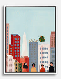
City Strolls & Skylines Art Print
Translation missing: en.products.product.sale_price From €19,95€33,25 -
Vibrant City Gathering Canvas Print
Translation missing: en.products.product.sale_price From €64,95€92,95 -
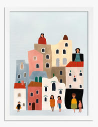
Colorful City Gathering Art Print
Translation missing: en.products.product.sale_price From €19,95€33,25 -

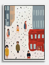
Colorful City Streetscape Canvas Print
Translation missing: en.products.product.sale_price From €64,95€92,95 -
City Strolls & Tiny Moments Canvas Print
Translation missing: en.products.product.sale_price From €64,95€92,95 -
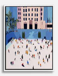
City Skaters Gathering Canvas Print
Translation missing: en.products.product.sale_price From €64,95€92,95 -

Minimalist Urban Tower Canvas Print
Translation missing: en.products.product.sale_price From €64,95€92,95 -
City Life in Color Canvas Print
Translation missing: en.products.product.sale_price From €64,95€92,95 -

Vibrant City Streets Art Print
Translation missing: en.products.product.sale_price From €16,95€23,95 -
Colorful City Stroll Canvas Print
Translation missing: en.products.product.sale_price From €64,95€92,95 -

Charming City Block Art Print
Translation missing: en.products.product.sale_price From €19,95€33,25 -

Blue City Streets Canvas Print
Translation missing: en.products.product.sale_price From €64,95€92,95 -

Vibrant Cityscape Art Print
Translation missing: en.products.product.sale_price From €19,95€33,25 -

City Strolls, San Francisco Canvas Print
Translation missing: en.products.product.sale_price From €64,95€92,95 -
Urban Sunscape Art Print
Translation missing: en.products.product.sale_price From €19,95€33,25 -

Colorful City Life Art Print
Translation missing: en.products.product.sale_price From €19,95€33,25 -

Painted Ladies Cityscape Art Print
Translation missing: en.products.product.sale_price From €19,95€33,25 -

Urban Minimalist Block Art Print
Translation missing: en.products.product.sale_price From €19,95€33,25 -

City Holiday Gathering Art Print
Translation missing: en.products.product.sale_price From €19,95€33,25


More from The Frame

How to Build an Architecture Gallery Wall That ...
Gallery walls intimidate people because they look like they require a designer's eye. They don't, especially if you choose architecture as your subject. The geometry, repetition, and structural language of...

How to Build a Gallery Wall That's Funny Withou...
A gallery wall with one perfectly placed witty print feels considered. A gallery wall with five feels like a gift shop. The difference between personality and parody comes down to...

How to Decorate with Vintage London Prints (Roo...
Vintage London prints are everywhere right now, from Brooklyn brownstones to Bristol terraces. The trick is making them feel collected and considered rather than like you raided a National Trust...