Every Flower Van Gogh Painted: From Sunflowers to Almond Blossom and Beyond
A complete field guide to Van Gogh's botanical work, and how to choose the right bloom for your walls.

Van Gogh painted flowers obsessively for one practical reason: they were cheap models that sat still. Across his career he produced more than 170 floral works, ranging from intimate vases of carnations to entire fields of poppies under a Provençal sun. This is a guide to every flower he painted, and how to choose the right one for your wall.
Van Gogh's favourite flower (and why he couldn't stop painting it)
Ask anyone to name a Van Gogh painting and they will say Sunflowers. He knew it too. "The sunflower is mine," he wrote to his brother Theo, claiming the bloom as his personal signature the way Monet claimed water lilies.
He painted them in two distinct series. The 1887 Paris paintings show cut sunflowers lying flat, almost autopsied, against dark earthy backgrounds. The 1888 Arles series, the famous ones, are upright in earthenware vases and were made specifically to decorate the bedroom of Paul Gauguin, who was coming to stay at the Yellow House. Van Gogh wanted his friend to walk into a room "entirely yellow."
Look closely at the Arles sunflowers and you see something unusual. Each painting captures a different stage of life: tight buds, full blooms, drooping heads, dried-out seed casings. He was painting time, not just flowers. The National Gallery in London holds one version, the Van Gogh Museum in Amsterdam another, and Munich's Neue Pinakothek a third. They are not interchangeable.
For decorating, Sunflowers are loud. They want a social room. A dining wall, a kitchen, a hallway that needs lifting. They are not a bedroom flower.

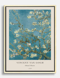
The Almond Blossom: a birth gift that became an icon
In February 1890, Theo and his wife Jo had a son and named him Vincent Willem, after his uncle. Van Gogh painted Almond Blossom as a gift for the nursery, and it became the most personal floral work he ever produced.
The painting is unlike almost anything else in his catalogue. The composition is flat, the outlines crisp, the colour palette restricted to pale turquoise sky and white-pink blossom. This is Van Gogh borrowing directly from Japanese woodblock prints, which he collected and studied obsessively. There is no swirling impasto, no emotional turbulence. Just branches against sky.
Almond trees bloom in late winter, before any other tree, which is why they have symbolised new life and resilience for centuries. As a gift for a newborn it could not be more deliberate. As a print for your home it has a calming, almost meditative quality that Sunflowers entirely lacks.
This is the Van Gogh you put in a bedroom, a nursery, a reading corner. It works particularly well in rooms with pale walls (soft white, chalk, very pale grey) where the turquoise can breathe. Browse the full range of Van Gogh flower prints and you will see Almond Blossom is the one most often hung above cots and beds for exactly this reason.
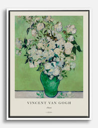
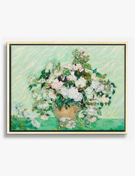
Roses and oleanders: the overlooked floral masterpieces
If Sunflowers shout and Almond Blossom whispers, Roses and Oleanders sit somewhere quietly beautiful in between.
Van Gogh painted his great rose still lifes in May 1890, in the last weeks before he left the asylum at Saint-Rémy. The roses were originally a vivid pink. The red pigment he used (a fugitive geranium lake) has faded almost completely over 130 years, so the versions you see in museums today read as pale cream or white against green. Some institutions now display digital reconstructions showing the original pink. Worth knowing if you are choosing a print: the "white" roses were never meant to be white.
Oleanders came earlier, painted in Arles in 1888. Van Gogh associated them with life and joy. They appear in a thick jug on a table next to a copy of Émile Zola's novel La Joie de Vivre, which is not subtle symbolism. The flowers are deep coral pink, the leaves a rich olive green, and the overall mood is warm, generous, slightly melancholic.
Both Roses and Oleanders suit rooms where you want something refined rather than energetic. A lounge, a bedroom with green or sage walls, a hallway in an older house. They are the choices for people who like Van Gogh but find Sunflowers too obvious.

Flowers in a Blue Vase and Van Gogh's still life experiments
Van Gogh moved to Paris in March 1886 to live with Theo, and that summer he painted more than 35 floral still lifes in a single concentrated burst. The reason was practical and the result was transformative.
Theo had been gently pestering his brother to brighten his palette. The dark, earthy Dutch paintings of peasants and potato eaters were not selling. In Paris, Van Gogh encountered Impressionism, the colour theories of Delacroix, and the work of Adolphe Monticelli, whose thickly painted bouquets he openly imitated. Flowers were cheap, they did not move, and every bouquet was an excuse to test how red sat against green or orange against blue.
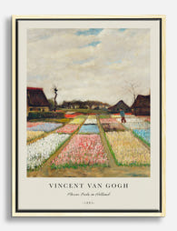
This is the period that gave us Flowers in a Blue Vase, Vase with Daisies and Anemones, Vase with Carnations, Vase with Chinese Asters and Gladioli, Vase with Red Poppies, Vase with Cornflowers and Poppies, Vase with Lilacs, Vase with Peonies and Roses, and dozens more. He painted hollyhocks, zinnias, fritillaries, marigolds, and chrysanthemums. If a flower seller had it in stock in 1886, Van Gogh probably painted it.
These works tend to be smaller and more intimate than the Arles flowers. They are perfect for narrow walls, stairwells, the wall above a desk, or a grouping of three prints in a hallway. They also work well in salon-style arrangements because the colour palettes vary so much. You can find many of them inside the broader Van Gogh print collection if you want to compare them side by side.
Wildflower fields: when the landscape became the bouquet
People forget that Van Gogh did not always paint flowers in vases. Some of his most extraordinary floral work happens outdoors, where the bouquet is the entire horizon.
Field with Poppies (1889) is a haze of red specks across a green field. Long Grass with Butterflies dissolves into pure texture. Wheatfield with Cornflowers, painted in his final months at Auvers-sur-Oise, scatters blue across gold. Then there is the Flowering Orchard series, fourteen paintings made in the spring of 1888 when Van Gogh moved to Arles and found the fruit trees in blossom.
The orchards are the secret of the catalogue. Pink peach trees, white pear blossom, almond and apricot. He painted them quickly, in the open air, racing the falling petals. They have the freshness of Almond Blossom but with more colour and movement.
These landscape florals behave differently in a room. They read as scenery rather than still life, which means they sit comfortably above a sofa or behind a dining table without competing for attention. If you want Van Gogh without the intensity of a tight bouquet, this is where to look. They pair particularly well with other botanical art prints if you are building a nature-led gallery wall.

Which Van Gogh flower painting suits your room best
Choosing a Van Gogh flower print is less about the painting and more about the room you are putting it in. Here is how we think about it.
Bedrooms and nurseries
Almond Blossom is the obvious choice and the right one. The pale turquoise and white are restful, the composition is flat and quiet, and the symbolism (new beginnings, resilience) suits the space. Pink Roses and pale Oleanders also work if your bedroom leans warmer.
Living rooms
This depends on your sofa colour. Against a dark green or navy sofa, the deep coral of Oleanders sings. Against a neutral linen sofa, Irises or the wildflower fields add depth without overwhelming. Against pale grey or white, you can afford to go brighter with Sunflowers or a Flowering Orchard.
Kitchens and dining rooms
Sunflowers were practically designed for this. The yellow lifts artificial light, the energy suits a room where people gather, and the painting can hold its own against the visual clutter of cooking. The Paris-period vases (Asters, Gladioli, Zinnias) also work well at a smaller scale above a sideboard.
Offices and studies
Irises are the move. The blue-violet is contemplative without being sleepy, and the painting rewards looking at it for long stretches. Long Grass with Butterflies has a similar quietly absorbing quality.
Hallways and stairwells
Long thin walls suit the smaller Paris still lifes, hung in a vertical run of two or three. Or a single large Wheatfield with Cornflowers to draw the eye down a corridor.
A practical note on size. The intimate vase paintings (Carnations, small Roses) lose their character if you blow them up to 100x150cm. They were painted at modest scale and want to be hung that way, ideally 40x50cm or 50x70cm framed. The Arles Sunflowers and the wildflower landscapes, on the other hand, were built for ambition. Go large. A 70x100cm framed Sunflowers above a sideboard will out-perform a small one every time.
Building a collection around Van Gogh's floral artwork
One Van Gogh print is a statement. Three is a collection. Here is how to build the second without it feeling like a gift shop.
Pair by season
Almond Blossom (late winter), Flowering Orchard (spring), Irises (early summer), Sunflowers (high summer), Wheatfield with Cornflowers (late summer). Pick three consecutive seasons and you have a coherent visual story rather than a random assortment.
Pair by colour temperature
Cool collection: Almond Blossom, Irises, Wheatfield with Cornflowers. Warm collection: Sunflowers, Oleanders, Red Poppies. Mixed collections can work but need a unifying frame colour, usually black or a warm oak, to hold them together.
Pair vase with landscape
A formal still life next to a wildflower field creates contrast without clashing. Vase with Cornflowers and Poppies hung beside Field with Poppies, for example, gives you the same flower in two completely different registers.
Mix Van Gogh with other floral artists
You do not need to build a Van Gogh-only wall. His work sits beautifully alongside Japanese woodblock botanicals, vintage scientific illustrations, or contemporary floral art prints in a similar palette. The trick is consistency of framing. Solid wood frames in a single finish (we use FSC-certified solid wood across the range, never MDF) will pull a mixed gallery wall together even when the artwork styles differ.

A final point on prints themselves. Van Gogh's colour was the entire point of his work, so the reproduction matters. Look for giclée printing on matte paper that does not glare under lamplight, and frames with UV-protective glazing so the colour does not shift over years of sunlight. The original Roses faded once. There is no need for your version to do the same.
Pick the flower that suits the room, hang it at eye level (centre of the print roughly 145cm from the floor), and resist the urge to default to Sunflowers just because everyone knows them. The Oleanders, the orchards, the cornflowers in wheat: this is where the quieter pleasures of his work live.

Fab products featured in this blog
-

Sunflowers Poster by Vincent Van Gogh Art Print
Translation missing: en.products.product.sale_price From €19,95€33,25 -
Van Gogh Almond Blossom Canvas Print
Translation missing: en.products.product.sale_price From €64,95€92,95 -

Van Gogh Sunflowers Vase Canvas Print
Translation missing: en.products.product.sale_price From €64,95€92,95 -

Almond Blossom by Van Gogh Art Print
Translation missing: en.products.product.sale_price From €16,95€23,95 -

Flower Beds in Holland Exhibition by Vincent Van Gogh Art Print
Translation missing: en.products.product.sale_price From €19,95€33,25 -

Roses by Vincent Van Gogh Art Print
Translation missing: en.products.product.sale_price From €19,95€33,25 -
Van Gogh Roses Bouquet Canvas Print
Translation missing: en.products.product.sale_price From €64,95€92,95 -

Almond Blossom by Vincent Van Gogh Art Print
Translation missing: en.products.product.sale_price From €19,95€33,25 -

Allotment With Sunflower by Vincent Van Gogh Art Print
Translation missing: en.products.product.sale_price From €19,95€33,25 -

Van Goghs Sunflower Allotment Canvas Print
Translation missing: en.products.product.sale_price From €64,95€92,95 -

Sunflowers by Vincent Van Gogh Art Print
Translation missing: en.products.product.sale_price From €19,95€33,25 -
Van Gogh Flower Fields Canvas Print
Translation missing: en.products.product.sale_price From €64,95€92,95 -

Almond Blossom by Van Gogh Canvas Print
Translation missing: en.products.product.sale_price From €64,95€92,95 -
Roses by Vincent van Gogh Canvas Print
Translation missing: en.products.product.sale_price From €64,95€92,95 -

Imperial Fritillaries In A Copper Vase by Vincent Van Gogh Art Print
Translation missing: en.products.product.sale_price From €19,95€33,25 -

Still Life (Nature Morte) by Vincent Van Gogh Art Print
Translation missing: en.products.product.sale_price From €19,95€33,25 -

Van Gogh Garden Path Art Print
Translation missing: en.products.product.sale_price From €16,95€23,95 -

Van Gogh Sunflowers Detail Canvas Print
Translation missing: en.products.product.sale_price From €64,95€92,95 -

Sunflowers Detail by Vincent Van Gogh Art Print
Translation missing: en.products.product.sale_price From €19,95€33,25 -

Roses by Vincent van Gogh Art Print
Translation missing: en.products.product.sale_price From €16,95€23,95


More from The Frame

Why William Morris Prints Look Brilliant in Mod...
William Morris has been quietly miscategorised for decades. His patterns get filed under "country cottage" or "Arts and Crafts revival" and rarely escape, which is a shame because his tree...

Why Arts and Crafts Nature Prints Are the Antid...
The minimalism hangover: why bare walls stopped feeling calming For about a decade, the aspirational interior was a white box with one boucle chair in it. That look has officially...

Botanical Petal Art: Why Close-Up Prints Feel M...
Full florals have had a long run, and they're not going anywhere. But if you've noticed that the botanical art appearing in design magazines, boutique hotel lobbies, and the better-styled...