You're Overthinking Your Celestial Gallery Wall
General gallery wall rules fall apart with themed collections, so here's the playbook for celestial walls done properly.

Most celestial gallery walls fail for the same reason: they treat the theme as a checklist instead of a palette. You don't need a moon, a constellation map, three stars, a planet diagram, and a galaxy spiral on one wall. You need a coherent night sky that happens to live above your sofa.
This guide is the antidote to themed wall chaos. The rules are stricter than a normal gallery wall, but they're simple.
Why celestial gallery walls work (and the one rule that keeps them cohesive)
Celestial imagery has a built-in advantage: the night sky is naturally tonal. Deep blues, blacks, soft greys, the occasional warm cream of a moon. That limited palette is doing half your design work before you've hung anything.
The problem is that celestial art is also extremely literal. A moon is a moon. A constellation is a constellation. When you stack five literal references on one wall, the brain reads it as a theme park, not a gallery.
The one rule that keeps a celestial wall cohesive: treat it like one continuous sky, not a collection of space objects. Every print should feel like a different window onto the same night. If two prints look like they could be from completely different universes, one of them has to go.

Choosing your anchor piece: start with one large night sky print
Every good gallery wall has a focal hierarchy. With themed collections, this matters even more, because without a clear anchor, the eye bounces between repeated motifs and the whole arrangement reads as wallpaper.
Pick one piece at 70x100cm or larger and let it carry the wall. We think a moody, atmospheric night sky works best as an anchor: something with depth and tonal range rather than a single graphic moon. A photographic deep-sky image, an abstract painted night, or a dense star field all work. A flat illustrated crescent moon does not.
Place this piece slightly off-centre in your final arrangement, with the smaller works orbiting it. Browse night sky art prints for anchor candidates and look for ones with genuine tonal depth, not just a black background with white dots.
A note on size: if you're working above a sofa or bed, your anchor should sit roughly two-thirds the width of the furniture below. Anything smaller and the wall feels under-furnished. Larger and you're better off with a single statement print and skipping the gallery format entirely.
Mixing subjects without making it look like a planetarium gift shop
Here's where most celestial walls go wrong. Someone buys a moon phase chart, a constellation map, a Saturn illustration, a galaxy photograph, and a star field, hangs them together, and wonders why it looks like a science museum gift shop.
The fix is the one type per piece rule. Each individual print should commit to a single celestial subject. A moon print should be a moon, not a moon with stars and a planet floating beside it. Prints that try to cram every space motif onto one canvas multiply the chaos when you put them next to other prints.
Then, across the full wall, limit yourself to three subject categories maximum. For example:
- Moon (any phase, any style)
- Star fields or constellations (pick one, not both)
- Abstract night sky or galaxy
That's it. Drop planets. Drop solar system diagrams. Drop anything with educational labels. You're decorating, not teaching astronomy.
The other balance to strike is photographic versus illustrated. Mixing styles is fine and actually helps prevent the wall feeling flat, but the split should be roughly 60/40, not 50/50. Pick a dominant style (we'd lean photographic for a more sophisticated feel) and let the other style play a supporting role with one or two pieces. A 50/50 split makes the wall feel indecisive.
If you're leaning into the moon as your dominant motif, moon art prints gives you enough variation in style and treatment to fill out a wall without resorting to repetition.
Layout templates: three proven arrangements with dimensions
Plan on the floor before you touch a hammer. Lay everything out, photograph it from above, rearrange until it works, then translate to the wall. Better still, cut paper templates to the exact size of each frame and tape them to the wall to test.
Here are three arrangements that work for celestial collections:
The asymmetric six (above a sofa)
One 70x100cm anchor positioned left-of-centre, with five smaller prints (mix of 30x40cm and 40x50cm) clustered to the right and slightly above and below. Total wall span around 220cm. This works because the anchor weight balances the visual density of the smaller cluster.
The grid of four (bedroom or hallway)
Four prints at identical size (50x70cm works beautifully) in a 2x2 grid with consistent 5cm gaps. This is the most forgiving layout for celestial themes because the symmetry imposes order on imagery that can otherwise feel scattered. Best with matching frames and a single dominant subject like four moon phases or four constellation studies.
The horizontal trio (above a console or bed)
Three prints in a row, all at 50x70cm portrait orientation, with 5cm gaps. Centre print can be the moodiest or most detailed; the two flanking prints should echo its palette. This is the cleanest celestial arrangement and the hardest to mess up. If you're new to gallery walls, start here.
For pre-curated combinations, wall art sets take some of the guesswork out, particularly if you want pieces that have already been balanced for tone and style.

Frame consistency: why matching frames matter more with themed walls
For an eclectic gallery wall, mixed frames add character. For a celestial gallery wall, mixed frames are how you end up looking like a craft fair stall.
Themed collections need stricter visual discipline because the imagery itself is already doing a lot of work. When five prints all reference the same subject (the night sky), any inconsistency in framing reads as messy rather than charming. Matching frames give the eye a single rhythm to follow, so the differences between prints register as variation, not noise.
Pick one frame and commit. We'd push you toward black for celestial walls. Black frames echo the deep tones of the imagery, sit quietly against most wall colours, and reinforce the night sky feel. Natural oak works for softer, more illustrated celestial collections, particularly in bedrooms with warm wood furniture. White frames can work but tend to fight with the dark imagery rather than support it.
A practical note: this is where shipping quality matters. Frames that arrive separately from prints, or frames that warp because they're MDF with veneer, will ruin a themed wall faster than a normal one because the inconsistencies compound across multiple pieces. Solid wood frames with proper UV-protective glazing keep the prints looking sharp years in, particularly important for celestial imagery hung on walls that catch afternoon sun.
Tonal control: keeping your palette to two or three colours
A celestial wall should have a colour palette as deliberate as a paint chart.
Stick to two or three colours across the entire wall. The classic celestial palette is deep blue, black, and a single warm accent (cream, soft gold, dusty pink for sunset skies). That's the whole brief. Anything outside that palette has to earn its place.
The most common mistake is too many golds and yellows. A single gilded moon is striking. Three prints with heavy gold leaf detailing turn the wall into a shrine. Keep warm metallics to one piece, max.
The second mistake is too dark. If every print is a near-black night sky, the wall reads as a void. This is where matting becomes essential. A generous white or off-white mat around each print breaks up the darkness and gives each piece room to breathe. Black mats can work for high-contrast photographic prints but compound the heaviness if overused.
If you want to play it safe, black and white art prints take colour off the table entirely and let composition do all the work. A monochrome celestial wall is almost impossible to get wrong.
Spacing and hanging tips for a polished finish
The non-negotiables, briefly:
- Spacing between frames: 5 to 7cm (roughly 2 to 3 inches). Consistent throughout. Don't eyeball it, measure it.
- Centre height: the visual centre of your arrangement should sit at 145 to 152cm from the floor (roughly 57 to 60 inches), which is standard gallery hanging height. Above a sofa or bed, the bottom of the lowest frame should be 15 to 25cm above the furniture.
- Paper templates: cut newspaper or kraft paper to each frame's exact dimensions, tape to the wall with low-tack tape, live with it for 24 hours before committing. This single step prevents almost every hanging regret.
For walls that get direct sunlight, the print itself matters as much as placement. UV-protective acrylic glazing keeps colours stable for decades, which matters for celestial prints where the depth of the blacks and blues is the whole point. Faded night skies look grey and sad.
Hand the actual hanging to whoever in your house has a spirit level and patience. Or get a laser level. They cost £15 and they prevent the slow descent into madness that comes from hanging six frames by eye.

When to stop: the art of restraint with a celestial wall
The hardest part of a themed gallery wall is knowing when it's finished. Celestial imagery is addictive to collect. There's always one more beautiful moon photograph, one more atmospheric night sky, one more constellation print that would 'complete' the wall.
Three signs you've passed the point of restraint:
- You can't describe the wall in one sentence. "A collection of moody night skies" is a sentence. "Some moons, some stars, a planet, a galaxy thing, two abstract bits, and that constellation map I bought in Paris" is not.
- Two prints are doing the same job. If you have two photographic full moons of similar size and tone, one of them is filler. Remove it.
- The wall has stopped feeling like one sky. If your eye reads the arrangement as 'a bunch of separate space pictures' rather than 'a coherent atmosphere', something has broken the spell. Usually it's a print that's too literal, too colourful, or stylistically out of step.
Bedrooms can tolerate a slightly more literal celestial theme because the room itself supports the night-time mood. Living rooms and hallways need more restraint, because a heavy theme reads as costume rather than decor.
When in doubt, remove a piece. A celestial wall with four well-chosen prints almost always looks better than one with six.

The short version
Pick one anchor piece big enough to lead. Limit your subjects to three categories and your colours to three tones. Match your frames. Use matting to keep the wall from going too dark. Plan with paper templates before you hang anything. Stop adding pieces the moment you can no longer describe the wall in one sentence.
A celestial gallery wall isn't a collection of space objects. It's a single night sky, broken across a few frames, hanging quietly above your sofa.

Fab products featured in this blog
-
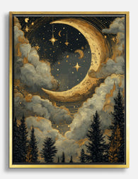
Gilded Crescent Moon Over Pines Canvas Print
Translation missing: en.products.product.sale_price From €65,95€92,95 -

Golden Crescent Moon & Night Flowers Art Print
Translation missing: en.products.product.sale_price From €19,95€33,25 -

The Drama of the Heavens — Adler Planetarium Canvas Print
Translation missing: en.products.product.sale_price From €65,95€92,95 -

Klimt Starry Forest Exhibition Poster Canvas Print
Translation missing: en.products.product.sale_price From €65,95€92,95 -

Gilded Crescent Moon Over Pines Art Print
Translation missing: en.products.product.sale_price From €19,95€33,25 -

Sun & Moon Boho Harmony Canvas Print
Translation missing: en.products.product.sale_price From €65,95€92,95 -

Moonlit Hills in Paper Cut-Out Art Print
Translation missing: en.products.product.sale_price From €19,95€33,25 -

The Starry Night by Vincent van Gogh Art Print
Translation missing: en.products.product.sale_price From €16,95€23,95 -

Celestial Muse Line Portrait Art Print
Translation missing: en.products.product.sale_price From €19,95€33,25 -

Radiant Star Glow Canvas Print
Translation missing: en.products.product.sale_price From €65,95€92,95 -

Celestial Dreams by William Morris Canvas Print
Translation missing: en.products.product.sale_price From €65,95€92,95 -

Golden Moon & Starry Florals Art Print
Translation missing: en.products.product.sale_price From €19,95€33,25 -

William Morris Moon & Stars Exhibition Poster Canvas Print
Translation missing: en.products.product.sale_price From €65,95€92,95 -

The Stargazer Art Print
Translation missing: en.products.product.sale_price From €19,95€33,25 -

Starlit Owls Canvas Print
Translation missing: en.products.product.sale_price From €65,95€92,95 -

Celestial Dreams by William Morris Art Print
Translation missing: en.products.product.sale_price From €19,95€33,25 -

Radiant Star Glow Art Print
Translation missing: en.products.product.sale_price From €19,95€33,25 -

Midnight Cloud Canvas Print
Translation missing: en.products.product.sale_price From €65,95€92,95 -

Capricorn Aura — Earth Element Canvas Print
Translation missing: en.products.product.sale_price From €65,95€92,95


More from The Frame

Thrushes, Hares, and Peacocks: The Animals in W...
Why Morris put animals at the centre of his designs William Morris wasn't decorating walls with cute creatures. He was making a quiet argument. While Victorian factories churned out cheap,...

From Dutch Masters to Modern Minimalism: The Ke...
Search "types of flower bouquet art" and you'll get wedding centrepieces, posy guides, and cascading bridal arrangements. Useful if you're getting married. Useless if you're trying to choose what goes...

Every Flower in William Morris's World: A Guide...
William Morris designed roughly 50 wallpapers and around 30 chintzes across his career, and almost every single one features a plant. If you've ever stood in front of a Morris...