You're Overthinking Your Vegetable Gallery Wall
A technical manual for planning a vegetable gallery wall with exact measurements, copyable templates, and zero guesswork.

Vegetable prints have a reputation problem. People assume they belong in a country cottage with checked curtains, when actually they make some of the most striking, surprisingly grown-up gallery walls you can hang. This guide is the technical manual: exact spacing, exact print counts, exact heights, and three layouts you can copy without thinking.
Why vegetable prints make better gallery walls than you'd expect
Vegetables have something most botanical art lacks: structural variety. A radish, a fennel bulb, an artichoke and a bunch of asparagus look nothing alike, but they share a visual language. That's the trick. You get the cohesion of a themed wall without the monotony of nine almost-identical tulips.
They also tend to come in muted, earthy palettes (terracotta, sage, aubergine, ochre) which means they sit easily against most wall colours without fighting for attention. And because vegetables read as everyday objects rather than precious botanicals, the overall effect feels considered rather than fussy. That's the line you want to walk.
The kitsch risk is real, but it comes from execution, not subject matter. A single print of a smiling tomato is kitsch. Six restrained 19th-century vegetable illustrations in matching black frames, evenly spaced, is a design statement.

Choosing a unifying thread: colour palette, era, or illustration style
"Vegetables" alone is not a unifying thread. It's a category. To make the wall feel intentional, you need to pick one of three threads and commit to it.
Colour palette
Pick three to four colours and only buy prints that fall within them. A classic combination: terracotta, sage, cream, and a single deep accent like aubergine or charcoal. Every print on the wall should contain at least two of these colours. This is the most forgiving approach because it lets you mix illustration styles freely.
Era or illustration style
The cleanest looking vegetable gallery walls almost always commit to a single illustration tradition. Vintage botanical plates from the 1800s have a specific look: detailed line work, slightly faded colour, often a Latin name in serif type at the bottom. Modern flat illustrations have another. Watercolour studies have a third. Mix them and the wall looks like a Pinterest board. Pick one and the wall looks like a curated collection.
Subject category
You can also unify by category: root vegetables only, brassicas only, alliums only. This sounds restrictive but it produces some of the most impressive walls because it gives the eye a story to follow.
Browse vegetable illustration prints and decide your thread before you start adding things to a basket. Pick first, shop second.
The grid layout: exact spacing and print sizes for 4, 6, and 9-print arrangements
Grids are the foolproof option. They look intentional, they're easy to measure, and they forgive small composition imperfections that would ruin a salon-style hang.
The single most important rule: spacing between frames must be identical across the entire grid. Inconsistent gaps are the most common reason a gallery wall looks amateur. Use 5cm between frames for a tight, contemporary grid, or 7-8cm for a more relaxed look. Pick one. Don't switch midway.
4-print arrangement (2x2 grid)
Best for: above a sideboard, between cabinets, narrow wall sections.
- Print size: 30x40cm each, framed
- Spacing between frames: 5cm
- Total wall area covered: roughly 75x100cm
- Works above furniture between 90cm and 130cm wide
6-print arrangement (3x2 grid)
Best for: above a dining table, the main wall in a galley kitchen, above a long sideboard.
- Print size: 30x40cm each, framed (portrait orientation)
- Spacing between frames: 5cm
- Total wall area covered: roughly 100x95cm
- Works above furniture between 140cm and 180cm wide
9-print arrangement (3x3 grid)
Best for: a feature wall, the empty wall opposite your kitchen, breakfast room walls.
- Print size: 21x30cm each, framed (A4 sized)
- Spacing between frames: 5cm
- Total wall area covered: roughly 75x100cm
- Works on walls at least 130cm wide with breathing room
If you have a larger wall and want a 9-print grid that feels generous, scale up to 30x40cm prints with 6cm spacing for a total area of roughly 105x130cm.
Frame consistency: why matching matters more than you think
For botanical and vegetable gallery walls specifically, identical frames are not a stylistic preference. They're load-bearing.
Here's why. Your prints are already varied (different vegetables, different colours, different compositions). The frame is the only element creating visual cohesion. If frames also vary, the eye has nothing to anchor to and the wall reads as chaos. Match the frames and the variety in the prints becomes the feature, not the noise.
The safest choices are slim black, natural oak, or warm walnut. Black sharpens; oak softens; walnut warms. Pick based on your existing wood tones in the room. If you have oak floors and oak cabinets, oak frames will disappear pleasantly. If your kitchen is high-contrast white and black, slim black frames will tie everything together.
A practical note on quality: this is the moment cheap framing reveals itself. Frames that warp, prints that bubble inside the mount, fixtures that don't line up, glazing that scratches in transit. If you're investing the effort in planning a nine-print grid, the frames need to actually arrive flat and stay flat. Solid wood frames with proper backing won't bow over time the way MDF and veneer frames do, and acrylic glazing protects against fading without the glare of glass, which matters in a kitchen with plenty of natural light.

Mixing vegetable prints with fruit and botanical pieces without it feeling random
You're allowed to mix. In fact, mixing often improves the wall, because pure vegetable grids can feel one-note. The rule: keep your unifying thread (colour, era, illustration style) and let the subject matter expand.
A vintage botanical wall might combine three vegetable plates, two fruit studies, and one flowering herb. As long as all six come from the same illustration tradition (similar paper tone, similar line weight, similar Latin-name typography), they'll read as a cohesive collection. The brain registers "antique botanical plates" before it registers "tomato versus pear."
The same logic applies to modern illustration. If you've chosen contemporary flat-style vegetable prints in a terracotta and sage palette, you can absolutely add a fruit print or two in the same illustration style and palette. Or borrow a piece from a broader botanical art collection if it shares the visual language.
What doesn't work: mixing a watercolour aubergine with a vintage engraved cabbage and a flat-illustration lemon. Three styles, three eras, no thread. The wall will look like a clearance shelf.
How to lay out your arrangement on the floor before you commit
Never hang anything on the wall first. This is the single most useful step in the entire process and the one most people skip.
The paper template method
Cut rectangles of newspaper or brown kraft paper to the exact dimensions of your framed prints. Label each one with which print it represents. Tape them to the wall with low-tack masking tape in your planned arrangement. Live with it for 24 hours.
You'll catch problems immediately: the grid is too high, the spacing looks tight in person even though it measured correctly, the whole arrangement is off-centre relative to the furniture below it. Adjust the paper, not the actual frames. Once it looks right, mark the top corner of each rectangle in pencil before removing the paper.
The floor method
Lay every framed print on the floor in the planned arrangement, exactly as it will appear on the wall. Use a tape measure to set spacing between frames. Stand on a chair and photograph the layout from directly above. Look at the photo on your phone. You'll spot composition issues you can't see when you're standing over it.
This step is especially important for grids of 6 or 9 prints, where any small misalignment becomes very visible once hung.
Hanging heights and hardware for different wall types
The standard rule: the centre of the entire arrangement should sit at roughly 145cm to 150cm from the floor. This is gallery height and it works in almost every room.
The exception: when hanging above furniture. Here, the bottom of the lowest frame should sit 15-20cm above the top of the furniture. Any closer and the art feels crowded; any further and it floats unmoored. For kitchen sideboards and dining tables, 15cm is the sweet spot.
Common mistake: hanging too high. People instinctively place art at eye level when standing, but rooms are designed to be experienced both standing and seated. Lower than you think is almost always right.
Hardware by wall type
- Plasterboard (most modern walls): Use plasterboard fixings rated for at least 5kg per frame. Self-drilling metal anchors are the easiest. Avoid plastic rawl plugs in plasterboard, they pull out.
- Solid brick or masonry: Drill with a masonry bit, use a wall plug and screw. Each fixing will hold well above the weight of any framed print.
- Lath and plaster (older homes): Find a stud where possible. If not, use specific lath and plaster anchors. Don't rely on standard plasterboard fixings here.
Framed prints that arrive ready to hang with fixtures already attached save you a frustrating hour of measuring hanging wire and adjusting D-rings. Worth checking before you buy.

Three gallery wall templates you can copy directly
These are tested arrangements with exact specifications. Copy them.
Template 1: The Vintage Kitchen Six
A 3x2 grid above a sideboard or dining table. Cream-toned vintage botanical plates featuring root vegetables and alliums.
- 6 prints at 30x40cm, portrait orientation
- 5cm spacing between all frames
- Slim oak frames, identical
- Total area: 100x85cm
- Hang centre at 150cm from floor, or 15cm above furniture
Template 2: The Modern Nine
A 3x3 grid for a feature wall. Contemporary flat illustration in a terracotta, sage and cream palette. Mix vegetables with one or two fruit prints for variety.
- 9 prints at 21x30cm, portrait orientation
- 5cm spacing between all frames
- Slim black frames, identical
- Total area: 73x100cm
- Hang centre at 145cm from floor
Template 3: The Considered Four
A 2x2 grid for between cabinets or a narrow wall. Watercolour studies of brassicas (cabbage, romanesco, cauliflower, kale) in muted greens and creams.
- 4 prints at 30x40cm, landscape orientation
- 6cm spacing between all frames
- Natural oak frames, identical
- Total area: 86x66cm
- Hang centre at 150cm from floor
If you'd rather skip the curation entirely, pre-curated wall art sets take care of palette and style matching for you, which is genuinely useful for a first gallery wall.

A note on style: considered versus kitsch
The difference between a vegetable gallery wall that looks like a serious design choice and one that looks like a 1970s tea towel collection comes down to three things: restraint in colour palette, consistency in frames, and quality of illustration.
If your prints are bright primary colours with cartoon outlines, no amount of careful spacing will save the wall. If your prints are restrained botanical illustrations or considered modern studies, even a slightly imperfect hang will look intentional. Choose well, then execute carefully.
Plan first, drill last
Spend an evening picking your unifying thread. Spend another evening laying the arrangement on the floor and photographing it from above. Spend ten minutes with a paper template on the wall before you reach for the drill.
The actual hanging takes twenty minutes. The planning is where every good gallery wall is made.

Fab products featured in this blog
-

Modern Veggie Medley Canvas Print
Translation missing: en.products.product.sale_price From €64,95€92,95 -

Vibrant Veggie Parade Canvas Print
Translation missing: en.products.product.sale_price From €64,95€92,95 -

Playful Veggie Parade Art Print
Translation missing: en.products.product.sale_price From €19,95€33,25 -

Harvest Vegetables Art Print
Translation missing: en.products.product.sale_price From €19,95€33,25 -

Fresh Market Veggies Art Print
Translation missing: en.products.product.sale_price From €19,95€33,25 -

Modern Harvest Medley Art Print
Translation missing: en.products.product.sale_price From €19,95€33,25 -
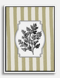
Vintage Herb Botanical Canvas Print
Translation missing: en.products.product.sale_price From €64,95€92,95 -

Folk Garden Wall Plates Canvas Print
Translation missing: en.products.product.sale_price From €64,95€92,95 -

Vintage Botanical Bounty Canvas Print
Translation missing: en.products.product.sale_price From €64,95€92,95 -

Fresh Greens Delight Canvas Print
Translation missing: en.products.product.sale_price From €64,95€92,95 -

Fresh Market Medley Canvas Print
Translation missing: en.products.product.sale_price From €64,95€92,95 -

Van Gogh Garden Path Canvas Print
Translation missing: en.products.product.sale_price From €64,95€92,95 -
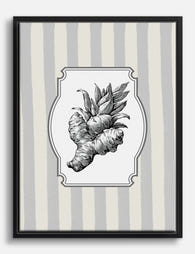
Vintage Ginger Botanical Canvas Print
Translation missing: en.products.product.sale_price From €64,95€92,95 -

Night Market Harvest Canvas Print
Translation missing: en.products.product.sale_price From €64,95€92,95 -

Vintage Market Veggies Art Print
Translation missing: en.products.product.sale_price From €19,95€33,25 -

Botanical Study Chart Canvas Print
Translation missing: en.products.product.sale_price From €64,95€92,95 -

Modern Vegan Vibes Art Print
Translation missing: en.products.product.sale_price From €19,95€33,25


More from The Frame

From Film Fan to Designer: Movie Poster Wall Id...
Film prints get a bad reputation in design circles, and it's usually deserved. Too many, hung too randomly, in too many clashing frames. Done with a bit of restraint, a...

You're Overthinking Your Colourful Gallery Wall
Most colourful gallery walls fail for the same reason: every print is shouting. You don't need ten bold pieces fighting each other, you need one or two that carry the...

Matching Prints for Your Bedroom: Sets That Mak...
You've been in the house six months. The lounge is sorted, the kitchen has its rhythm, and the bedroom walls are still completely bare. The reason is almost always the...