


 Order today for delivery by
 7 Steps to a Boho Gallery Wall That Looks Curated, Not Chaotic
The decision frameworks, spacing rules and layout recipes that turn a wall of prints into something that looks deliberate.


Boho gallery walls fail for one reason: people treat them as a free-for-all. Loose, layered and lived-in is the look, but the walls that actually achieve it are built on rules. This guide gives you those rules, with exact measurements, print quantities and a clear way to know when to stop.
1. Gallery wall or single statement print: which blank wall needs which
Before you order anything, decide what your wall actually wants. Not every empty space needs a gallery. A single large print, hung well, can carry an entire room and is significantly easier to get right.
Use a gallery wall when your wall is over 1.5 metres wide, has nothing competing with it (no sconces, no shelving, no awkward radiators), and sits behind a defined piece of furniture like a sofa, bed or sideboard. Galleries need an anchor below them or they float.
Use a single statement print when the wall is narrow, broken up by architectural features, or already busy with texture (exposed brick, panelling, a heavily patterned rug nearby). Boho rooms tend to have a lot going on at floor level. Sometimes the kindest thing you can do for the space is let one big piece breathe.
If you're somewhere in between, a pair or triptych often solves it. Two prints at 50x70cm with proper spacing reads more grown-up than seven mismatched A4s, and takes about a tenth of the planning.

2. The 3-5-7 rule: how many prints actually work together
Odd numbers work. This is not folklore, it's the way the eye groups objects. Even numbers split a composition into matching halves, which reads as formal and symmetrical. Odd numbers create a focal point with supporting weight around it, which reads as collected.
Stick to 3, 5 or 7 prints. Here's what each does:
- Three prints is the easiest configuration. Works above a small sofa, a console table or a single bed. You can run them in a horizontal line or stack them in an L-shape.
- Five prints is the sweet spot for most boho gallery walls. Enough variety to feel layered, few enough to control. Works above a standard three-seater sofa or a king bed.
- Seven prints is for properly large walls (over 2 metres wide) and requires more discipline. You need a clear anchor and obvious hierarchy or it tips into clutter.
If you find yourself wanting nine, eleven, thirteen, stop. Nine pieces is a museum wing, not a gallery wall. You're past the point where extra prints add depth and into the territory where they cancel each other out.
Permission to stop at five is the most useful thing in this article. Print it out if you need to.
3. Choosing a unifying thread so it reads as intentional
This is where most gallery walls go wrong. People collect prints they love, hang them together, and assume the love itself is the connection. It isn't. The viewer needs something visual to tie the prints together, and you need to choose one thread, not three.
You have three options. Pick one.
Colour palette
Choose three to four colours that repeat across every print. For boho, the workhorses are terracotta, cream, sage green, mustard, rust, dusty pink and warm browns. Every print on the wall should contain at least two of your chosen colours. One print can break the rule as a wild card, but only one.
Frame style
If your prints are visually varied (different subjects, different styles, different palettes), let the frames do the unifying. Pick one frame colour and stick to it across all pieces. Natural oak is the most forgiving for boho, black is sharper and more graphic, white feels softer and more Scandinavian-leaning. You can mix two wood tones if they're close, but three is a mess.
Subject matter
Pick a theme and let the styles vary. Botanicals only. Or abstract shapes only. Or line-drawn figures only. This gives you the most freedom on colour and frame, but the strictest discipline on what you can buy.
The classic boho mix that works without overthinking: two botanicals, two abstracts, one line drawing, plus a wild card (a vintage travel poster, a celestial print, a textile-inspired piece). Browse bohemian art prints and botanical art prints to see how these subjects play together when the palette is consistent.

4. Three foolproof layout templates with exact spacing measurements
Spacing is non-negotiable. Too much space and the prints stop talking to each other. Too little and the wall looks crowded. The professional consensus, used by gallerists and interior stylists, is 5 to 8cm (2 to 3 inches) between frames. Closer to 5cm for smaller prints, closer to 8cm for larger ones. Keep the spacing consistent across the whole arrangement.
Here are three templates that work every time.
Template A: The Horizontal Line (3 prints)
Three prints in a single row, all the same size. Suits above a console, a low sideboard, or a narrow sofa.
- Three prints at 40x50cm
- 6cm spacing between each frame
- Total wall width needed: roughly 1.3 metres
- Hang the centre of the middle print at 145cm from the floor (gallery standard eye level)
Template B: The Salon Cluster (5 prints)
The most flexible boho layout. One large anchor in the centre, four smaller prints around it.
- One anchor print at 50x70cm (centre)
- Two prints at 30x40cm flanking the anchor horizontally
- Two prints at 30x40cm above and below (one each), slightly offset
- 7cm spacing throughout
- Total wall area needed: roughly 1.8m wide by 1.4m tall
Imagine a rough oval shape with the anchor in the middle. The four supporting prints don't sit in a strict grid, they're arranged to keep the outer edge soft but not jagged.
Template C: The Asymmetric Stack (5-7 prints)
For taller walls or staircases. Builds vertically with weight on one side.
- One anchor print at 50x70cm at the bottom left
- One print at 40x50cm directly above the anchor
- Three to five smaller prints (30x40cm and 21x30cm) stepping up and to the right
- 5cm spacing
- Reads as a diagonal flow from bottom-left heavy to top-right light
For all three templates, the rule that holds everything together: pick one alignment edge. Either align the tops, the bottoms, or the centres of adjacent prints. Don't let every frame float independently.
If you'd rather skip the maths, pre-curated wall art sets come matched in size and style so you only need to handle the hanging.
5. Mixing print sizes: the anchor piece and supporting cast
Hierarchy is what separates 'collected' from 'cluttered'. Every gallery wall needs one print that is clearly the biggest and most visually dominant. That's your anchor. Everything else is supporting cast.
For a standard three-seater sofa, your anchor should be at least 50x70cm. For a larger sectional or a king bed, push to 70x100cm. The anchor doesn't have to be in the geometric centre of the arrangement (the asymmetric stack proves it), but it does have to be unambiguously the largest piece.
Your supporting cast should step down clearly. If your anchor is 70x100cm, your secondary prints should be 40x50cm or 50x70cm. Avoid going one size smaller, that reads as 'almost the same' and creates visual confusion. The eye wants to see a clear pecking order: hero, supporting, accent.
A useful ratio: anchor at 100%, secondaries at roughly 50-60% of the anchor's area, accents at roughly 25-30%. You don't need to measure this with calipers. Stand back, squint, and ask whether one print is obviously winning. If you can't tell, your anchor isn't pulling its weight.
On medium choice: framed prints give boho walls a more polished, intentional finish, which is the whole point of this exercise. Unframed canvas can work as one piece in the mix (often as a textural wild card), but a gallery made entirely of unframed canvas tends to drift toward the chaotic side. The frame is the discipline.

6. Hanging it straight without destroying your wall
The single best thing you can do before hammering anything is mock up your layout on paper. This is the step almost everyone skips and then regrets.
Tools you actually need
- Brown kraft paper or newspaper
- Scissors
- Masking tape (the low-tack kind)
- A pencil
- A spirit level (a phone app works, a real one is better)
- A tape measure
- Picture hooks or screws appropriate for your wall type
The paper template trick
Trace each frame onto kraft paper, cut out templates at exact size, then tape them to the wall in your chosen layout. Live with the arrangement for a day or two. Adjust spacing. Move things around. This costs you nothing and saves you a wall full of unnecessary holes.
Once you're happy, mark the hanging point on each paper template (measure where the hook or wire sits on the back of the actual frame, then mark that exact spot on the template). Hammer your hook through the paper, tear the paper away, and your hole is in precisely the right place.
Heights and levelling
The centre of your overall arrangement (or the centre of your anchor piece) should sit at roughly 145cm from the floor when the wall is freestanding. Above furniture, leave 15 to 25cm of breathing room between the top of the furniture and the bottom of the lowest frame. Any closer and the art looks like it's resting on the sofa. Any further and it loses connection.
Use the spirit level on the first frame. After that, measure the gap to the next frame consistently and the line will hold.
One practical advantage of ordering framed prints that arrive properly fitted with fixtures already attached: you're not assembling anything on a dining table at midnight, and the frame and print arrive as one piece, no warping, no bubbling, no separate boxes to wrestle with. The hanging is the only thing left to get right.
7. When to stop: the difference between 'collected' and 'cluttered'
Curated walls are defined by what's left out, not what's added. The temptation, once you've started, is to keep finding 'just one more' print that would fit. This is how five becomes nine becomes a wall you don't actually like.
Three honest tests for when you're done:
The squint test. Stand 3 metres back and squint. You should be able to see the overall shape of the arrangement as one form, with a clear focal point. If your eye darts around looking for somewhere to land, you've added too much.
The breathing room test. Each print should have visible wall around it. If your gallery is starting to touch the ceiling, the skirting, or another piece of furniture, it's outgrown its space.
The 24-hour test. Live with the wall for a day before adding anything else. Most of the time, the urge to add a tenth print is anxiety, not aesthetic judgement. Sleep on it.
A boho gallery wall is meant to look like you've gathered these pieces over years of travel, second-hand markets and gifts from people you love. Restraint is what sells that illusion. A perfectly curated wall of five prints reads as 'taste'. A crowded wall of eleven reads as 'I couldn't decide'.
If you find yourself wanting more art, hang it somewhere else. A second smaller arrangement in a hallway, a single piece in a bedroom, a leaning print on a shelf. Pieces from the abstract art prints collection often work well as solo statements once your main wall is finished.
The wall you've been staring at for months doesn't need to be solved with quantity. It needs one anchor, four or six friends, consistent spacing, and the discipline to stop.


Fab products featured in this blog
-

Boho Botanical Harmony Art Print
Sale price From 190,00 kr271,00 kr -

Boho Archway Minimal Canvas Print
Sale price From 759,00 kr1 084,00 kr -

Boho Botanical Harmony Art Print
Sale price From 190,00 kr271,00 kr -

Modern Boho Balance Canvas Print
Sale price From 759,00 kr1 084,00 kr -

Monochrome Arches and Bowls Canvas Print
Sale price From 759,00 kr1 084,00 kr -

Boho Daisy Waves Art Print
Sale price From 190,00 kr271,00 kr -

Botanical Stairway Canvas Print
Sale price From 759,00 kr1 084,00 kr -

Modern Monochrome Geometry Canvas Print
Sale price From 759,00 kr1 084,00 kr -

Boho Botanical Haven Art Print
Sale price From 190,00 kr271,00 kr -

Boho Dots and Waves Art Print
Sale price From 190,00 kr271,00 kr -

Boho Vases and House Plants Canvas Print
Sale price From 759,00 kr1 084,00 kr -

Modern Boho Harmony Art Print
Sale price From 190,00 kr271,00 kr -
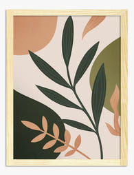
Modern Boho Botanicals Art Print
Sale price From 190,00 kr271,00 kr -

Boho Curves Collective Art Print
Sale price From 190,00 kr271,00 kr -
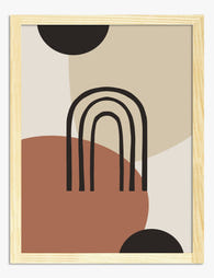
Boho Archway Minimal Art Print
Sale price From 190,00 kr271,00 kr -

Boho Stacked Shapes Art Print
Sale price From 190,00 kr271,00 kr -
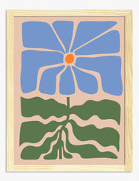
Big Blue Bloom Art Print
Sale price From 190,00 kr271,00 kr -

Boho Botanical Harmony Canvas Print
Sale price From 759,00 kr1 084,00 kr -

Boho Sun and Leaf Harmony Canvas Print
Sale price From 759,00 kr1 084,00 kr -

Boho Sun and Leaf Harmony Art Print
Sale price From 190,00 kr271,00 kr


More from The Frame

Decorating with Frog Art: How to Make It Look I...
Frog art has a reputation problem. Mention it and people picture cartoon prints in a nursery, or worse, a novelty tea towel someone brought back from a garden centre. Done...

Vintage Cup Prints: From Dutch Still Life to Mo...
Cups have been quietly starring in paintings for nearly 400 years. What began as a way for Dutch merchants to show off their imported porcelain has become one of the...

Styling Van Gogh Botanical Prints in Every Room...
Van Gogh's botanicals are some of the most reproduced artworks on the planet, which means they're also some of the most badly hung. This is a room-by-room guide to placing...