How to Build a Bird Print Gallery Wall That Actually Looks Stylish
The styling rules, layout templates and frame choices that separate a curated installation from a chaotic wall of birds.

Bird prints are having a proper moment, and gallery walls are the obvious way to showcase them. The problem is that most bird gallery walls look like a primary school nature project: too many prints, mismatched frames, no breathing room. This guide fixes all of that with specific layouts, quantities, and rules that work.
The difference between a curated gallery wall and a cluttered one
A curated gallery wall feels like one object on the wall, not fifteen. You read it as a single composition, with rhythm and intention, and only afterwards do you start noticing individual prints. A cluttered wall does the opposite: your eye bounces around with nowhere to land.
The difference almost always comes down to three things. Restraint in quantity, consistency in framing, and disciplined spacing between prints. Get those right and your gallery wall will look professionally styled even if the prints themselves are quite varied.
The mistake most people make is treating a gallery wall as a collection to display rather than a composition to design. You are not curating a museum cabinet. You are arranging shapes on a wall, and the bird prints just happen to be what fills those shapes.

How many bird prints do you actually need
Fewer than you think. The sweet spot for almost every bird gallery wall is between five and nine prints. Below five and it can feel sparse or accidental. Above nine and you start needing salon-style chaos to make it work, which is much harder to pull off than people pretend.
Here is the rough rule we use:
- 3 prints: best for narrow walls, hallways, or above a console. Linear arrangement only.
- 5 to 6 prints: the safest sweet spot for most living rooms and bedrooms.
- 7 to 9 prints: ideal above a large sofa or in a dining room as a feature wall.
- 10 or more: only if you are committing to a full salon-style hang from skirting board to ceiling. No half measures.
If you are unsure, start with five. You can always add more later, and a tightly composed wall of five looks infinitely better than a half-hearted twelve.
The other thing to consider is print size. A wall of nine A4 prints will read as fussy and small no matter how you arrange them. Mix at least one larger anchor print, ideally 50x70cm or 60x80cm, with smaller supporting prints around it. That contrast in scale is what makes a gallery wall feel grown up.
Mixing styles: pairing vintage bird illustrations with contemporary prints
You can absolutely mix vintage scientific illustrations with modern watercolours or photographic bird prints. The trick is to limit yourself to two styles maximum, and use framing and colour palette to bridge them.
A reliable formula: pair vintage Audubon-style plates (detailed linework, cream backgrounds, scientific labelling) with contemporary minimalist bird prints (flat colour, negative space, simplified forms). The vintage prints bring detail and warmth, the modern prints bring breathing room. Together they read as intentional rather than confused.
What to avoid is mixing three or more styles in one wall. Vintage plates plus moody bird photography plus colourful folk-art illustrations plus minimalist line drawings will look like a charity shop browse, no matter how good each individual print is.
To make a mix work, look for shared colour temperature. If your vintage prints have warm cream backgrounds, choose modern prints with off-white or warm neutral grounds rather than stark cool whites. Browse vintage art prints alongside contemporary bird art prints and you will quickly see which pairings have the same underlying tone.
A few pairings that always work
- Audubon-style waterbirds + simple watercolour silhouettes on cream
- Botanical-style bird-and-branch prints + abstract feather studies
- Black and white bird photography + ink line drawings of the same species
- Folk-art bird illustrations + plain typographic prints in the same palette
The best frame colours and finishes for a cohesive look
This is where most bird gallery walls fall apart. People frame each print in whatever they have lying around, and the wall ends up looking like a junk shop window.
The strongest, most editorial-looking gallery walls use identical frames throughout. Same colour, same width, same finish. The prints can vary wildly in style and content, but the frames give the eye a consistent rhythm to follow.
Three frame strategies that consistently work:
1. All black wood frames. Sharp, modern, works with vintage and contemporary prints equally well. Best against pale walls (off-white, soft grey, sage). This is the most foolproof option.
2. All natural oak or warm wood. Softer and more organic. Pairs beautifully with botanical bird prints and works particularly well in bedrooms and dining rooms with warmer palettes. Avoid against very cool grey walls.
3. All white frames with white mats. Gallery-quiet and very flattering for delicate vintage illustrations. The white mat gives detailed prints room to breathe, which matters with fine linework.
Whichever you choose, frame width matters too. Stick to slim profiles (around 2cm) for a modern look or slightly chunkier (3 to 4cm) if you want a more traditional feel. Just keep them all the same width across the whole wall.
On mats: use white mats for busy vintage prints with lots of detail, especially scientific illustrations. Skip the mat for modern prints with strong negative space already built in. Never mix matted and unmatted prints in the same gallery wall, it always looks unfinished.
A practical note. Cheap framing is the single biggest reason bird gallery walls look amateurish. Warped frames, prints that have shifted inside the mount, mismatched depths. If you are buying framed prints, look for solid wood (not MDF) and proper UV-protective glazing, particularly if the wall gets any direct sunlight. Vintage-style bird illustrations with intricate detail will fade noticeably under standard glass within a few years.

Three gallery wall layouts that work every time
Stop freestyling. Use one of these three templates and your wall will look composed before you have hung a single nail.
Layout 1: The Tidy Grid (5 or 6 prints)
A clean rectangular grid of identical-sized prints. Boring on paper, brilliant on the wall.
- 6 prints: 3 across, 2 down. Use 40x50cm prints with 5cm gaps between frames. Total wall area roughly 130x110cm.
- 5 prints: same grid but leave one corner empty (top-right works best). Looks more dynamic than a full grid.
This layout is unbeatable above a sofa or sideboard, and it forgives wildly different prints because the grid itself does the work.
Layout 2: The Anchor and Orbit (5 prints)
One large print as the visual anchor, four smaller prints clustered around it.
- 1 anchor print at 60x80cm in the centre
- 4 supporting prints at 30x40cm, one in each corner around the anchor
- Maintain a consistent 6cm gap between the anchor and each surrounding print
- Total wall area roughly 140x120cm
This is the layout we recommend most often. It handles mixed styles beautifully because the anchor print sets the mood and the smaller prints support it.
Layout 3: The Linear Run (3 to 5 prints)
Prints in a single horizontal line at matching heights. Ideal for hallways, above a console table, or along a stairwell.
- Use 40x50cm or 50x70cm prints, all the same size
- Space them exactly 5cm apart, frame edge to frame edge
- Hang so the centre of each print sits at 145 to 150cm from the floor
The linear run is the most architectural option and the easiest to get right. If you have never hung a gallery wall before, start here.
The 5cm spacing rule
Whichever layout you use, keep the spacing between frames consistent. We use 5cm as the default. Less than that and the prints feel cramped. More than 8cm and they stop reading as a single composition. The most common mistake is spacing prints too far apart out of nervousness. Tighten it up.
Test before you commit
Before putting any holes in the wall, cut paper templates the exact size of each frame and tape them up with low-tack painter's tape. Live with the layout for 24 hours. Move things around. Once you are happy, mark the nail position on each paper template, then hammer through the paper and tear it away. Foolproof.
Adding non-bird prints to the mix without losing the theme
A pure bird gallery wall is fine, but adding one or two complementary prints often makes the whole thing more sophisticated. The key word is one or two, not five.
The safest additions are botanical prints and natural history illustrations. They share the same visual language as bird prints (cream backgrounds, scientific detail, organic subject matter) and they extend the theme without diluting it. A single large botanical art print as the anchor of an Anchor and Orbit layout, surrounded by four bird prints, looks effortlessly curated.
Other additions that work:
- A single typographic print with a relevant quote (sparingly)
- An abstract print in colours pulled directly from your bird prints
- A landscape or sky study that echoes the bird prints' palette
What does not work: family photos, holiday souvenirs, prints with text in different fonts, anything in a wildly different colour temperature. If you cannot defend a print's inclusion in one sentence, leave it out.
Common mistakes and how to avoid them
We see the same mistakes again and again. Here is how to dodge them.
Using all tiny prints. A wall of A5 and A4 prints looks underscaled no matter how many you hang. Always include at least one print at 50x70cm or larger as the anchor.
Mismatched frames. The single biggest mistake. Pick one frame style and commit. If you must mix, limit to two finishes maximum (e.g. black and natural oak) and arrange them in a deliberate pattern.
Spacing prints too far apart. Anything beyond 8cm between frames and the wall stops reading as one composition. Tighten it.
Matching bird species to room too literally. Please, no chickens in the kitchen. No owls in the bedroom because owls are for sleep. Choose prints because the image is beautiful, not because the bird is thematically relevant. It always looks twee.
Hanging too high. Centre the gallery wall so its midpoint sits at roughly 145 to 150cm from the floor. Above a sofa, the bottom edge of the lowest frame should be 15 to 20cm above the back of the sofa, no higher.
Ignoring the two-thirds rule above furniture. A gallery wall above a sofa or console should span roughly two-thirds of the furniture's width. Narrower than that and it looks like an afterthought floating in space.
Bad lighting. Vintage bird prints with fine linework need decent light to be readable. A picture light, a nearby table lamp, or simply hanging the wall where it gets indirect daylight will transform how the prints look. A dimly lit gallery wall will always feel flat regardless of how good the prints are.

Recommended bird prints to start your gallery wall
You do not need to hunt down rare antique plates to make this work. Most of our favourite bird gallery walls combine reproductions of classic ornithological illustrations with contemporary minimalist prints, all printed on the same paper stock so they sit together properly.
A good starting set of five looks something like this:
- One large vintage-style anchor print (a classic plate of a single bird species, ideally a wading bird or songbird with strong silhouette)
- Two smaller vintage-style supporting prints in the same illustrative style
- Two contemporary prints with simpler compositions, in colours that pull from the vintage prints
For people who want to skip the curation altogether, pre-paired wall art sets take the guesswork out of palette and style matching. They are designed to hang together, which solves the cohesion problem before you start.
If you are buying individually, browse the full bird art prints collection with your wall layout already decided. Knowing you need one 60x80cm anchor and four 30x40cm supporters makes shopping ten times faster than scrolling and hoping for inspiration.
Final thought
The best bird gallery walls are not the ones with the most prints or the rarest finds. They are the ones where someone made a confident decision about layout, committed to identical framing, and respected the spacing. Pick five prints, pick one frame, pick one of the three layouts above, and stop second-guessing. The result will look more considered than 90% of the gallery walls on the internet.


Fab products featured in this blog
-

Vintage Bird Plate Wall Canvas Print
Translation missing: en.products.product.sale_price From 718.00 kr1,026.00 kr -

Soaring Minimal Birds Art Print
Translation missing: en.products.product.sale_price From 180.00 kr257.00 kr -

Graceful Flight Canvas Print
Translation missing: en.products.product.sale_price From 718.00 kr1,026.00 kr -

Audubon’s Woodland Birds Canvas Print
Translation missing: en.products.product.sale_price From 718.00 kr1,026.00 kr -

Audubon’s Woodland Birds Art Print
Translation missing: en.products.product.sale_price From 180.00 kr257.00 kr -

Songbirds & Wild Blooms Art Print
Translation missing: en.products.product.sale_price From 180.00 kr257.00 kr -

Vintage Garden Bird Art Print
Translation missing: en.products.product.sale_price From 180.00 kr257.00 kr -

Soaring Minimal Birds Canvas Print
Translation missing: en.products.product.sale_price From 718.00 kr1,026.00 kr -

Wood Stork by Audubon Art Print
Translation missing: en.products.product.sale_price From 180.00 kr257.00 kr -

Audubon Birds: Mockingbird & Thrush Art Print
Translation missing: en.products.product.sale_price From 180.00 kr257.00 kr -

Audubon Birds Collection Canvas Print
Translation missing: en.products.product.sale_price From 718.00 kr1,026.00 kr -

Hokusai Birds Pattern Art Print
Translation missing: en.products.product.sale_price From 180.00 kr257.00 kr -
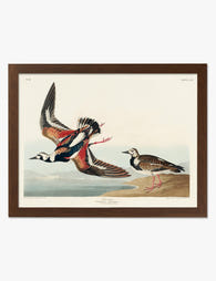
Turnstone Birds by Audubon Art Print
Translation missing: en.products.product.sale_price From 180.00 kr257.00 kr -

Mockingbird by Audubon Art Print
Translation missing: en.products.product.sale_price From 180.00 kr257.00 kr -

Birds of America by Audubon Canvas Print
Translation missing: en.products.product.sale_price From 718.00 kr1,026.00 kr -

Audubon’s Songbirds Canvas Print
Translation missing: en.products.product.sale_price From 718.00 kr1,026.00 kr -

Guillemots by Audubon Art Print
Translation missing: en.products.product.sale_price From 180.00 kr257.00 kr -

Birds of America by Audubon Art Print
Translation missing: en.products.product.sale_price From 180.00 kr257.00 kr


More from The Frame

What Interior Designers Know About Hanging Art ...
You've found the print. You've cleared the wall. Now you're standing on the sofa with a hammer, trying to remember if your friend said "eye level" or "60 inches" or...

What Interior Designers Know About Styling Mati...
Most gallery wall advice assumes you're starting with nothing. This guide assumes you already own one Matisse landscape print, or you're about to, and you want everything you hang next...

You're Overthinking Your Golden Hour Gallery Wall
Gallery walls intimidate people because they assume the curation has to be invented from scratch. With golden hour photography, half the work is already done for you. The light itself...