How to Create a Golf Gallery Wall That Looks Intentional, Not Random
The counterintuitive rule that separates curated golf walls from chaotic ones, plus three templates with actual measurements.

Most golf gallery walls fail for the same reason: too many ideas, not enough planning. The good news is that getting this right is mostly maths and one counterintuitive rule. This guide gives you the templates, measurements, and planning process to build a wall that looks deliberate from the first nail.
Why gallery walls work so well for golf art
Golf has a richer visual heritage than almost any other sport. Course maps, vintage tournament posters, illustrated holes, photography of links coastlines, typographic prints with hole names, abstract green contour drawings. A single print can only tell one story. A gallery wall lets you mix eras, styles, and moods while keeping a clear theme running through the whole arrangement.
That variety is the point. A wall of six near-identical course prints feels like a hotel corridor. A wall that pairs a 1920s Open Championship poster with a modern minimalist illustration of the 17th at Sawgrass and a typographic print of "Fairway. Bunker. Green." feels like someone with taste actually lives there.
The trick is making variety read as intentional rather than chaotic. That comes down to one rule.

The one rule: keep frames consistent, let the art do the mixing
If you take nothing else from this article, take this. The single biggest mistake people make with golf gallery walls is mixing frame styles to "add interest." Black frame here, oak frame there, a thin gold one in the corner because it matched the print. The result always looks like a charity shop window.
Frames are the structure. The art is the content. When the structure is consistent, your eye reads the wall as one composition and notices the variety in the prints themselves. When the frames vary, your eye gets stuck on the frames and the art disappears.
Pick one frame finish and use it across every print on the wall. Three options work for golf art:
- Black frames for a sharper, more graphic feel. Best with modern illustrative prints, typography, and bold colour.
- Natural wood frames (oak or ash) for warmth. Best with vintage posters, course maps, and earthy palettes.
- White frames for a lighter, more contemporary look. Best in bright rooms or smaller spaces where black would feel heavy.
Match mat widths too. If one print has a 5cm white mat border and the next has none, they will never sit comfortably together. Either mat everything consistently or mat nothing.
Three gallery wall templates
These templates work because the maths is already done. Pick the one that fits your wall and follow the sizes.
The Trio (3-print horizontal)
The easiest arrangement and the hardest to get wrong. Three prints in a horizontal line, centred above a sofa, console, or bed.
- Centre print: 50x70cm
- Left and right prints: 30x40cm each
- Spacing between frames: 5cm
- Total width: roughly 130cm
Hang the centre print at eye level (more on that below), then align the smaller flanking prints so their horizontal centres match the centre print's centre. Odd numbers work because your eye finds a focal point and triangulates outward, which is why three feels balanced and four often feels off-balance unless gridded.
The Grid (4-print or 6-print)
A clean rectangle of prints, perfect for offices, simulators, and anywhere you want order.
4-print grid:
- Four prints at 40x50cm
- 5cm gap between frames horizontally and vertically
- Total footprint: roughly 85x105cm
6-print grid (3 wide, 2 tall):
- Six prints at 30x40cm
- 5cm gaps
- Total footprint: roughly 100x85cm
Grids demand identical print sizes and identical frames. This is where consistency does the heavy lifting. If you want to mix portrait and landscape orientations, do not use the grid. Use the salon hang.
The Salon Hang (5 to 7 prints, mixed sizes)
The most flexible and the most planning-intensive. Prints of different sizes arranged around an invisible central axis, with the largest piece anchoring the composition.
A starting point for a 6-print salon hang:
- One 60x80cm anchor print, slightly off-centre
- Two 30x40cm prints
- Two 21x30cm prints
- One 40x50cm print
- 5cm spacing throughout, treated as a guideline rather than a strict rule
The salon hang feels casual but the underlying geometry is strict. Imagine a rectangle that contains all your prints. The edges of that rectangle should feel even, even if the prints inside it are scattered.

Mixing styles without chaos: vintage, modern, and typographic
A gallery wall of pure vintage golf prints can feel like a museum gift shop. A wall of pure modern illustrations can feel cold. The trick is proportion.
A reliable formula for a 6-print wall:
- 3 vintage or vintage-inspired prints (course posters, old tournament art, classic illustrations)
- 2 modern prints (minimalist hole illustrations, contemporary photography, abstract green contours)
- 1 typographic print (hole names, golf phrases, scorecard typography)
That ratio gives you a clear dominant style with supporting variety. Flip the proportions if your room leans modern: lead with contemporary illustrations and use one or two vintage pieces as accents.
Colour palette matters as much as style. Limit yourself to three or four dominant colours across the whole wall. For traditional golf art that often means cream, forest green, navy, and a warm red. For modern golf art it might be off-white, sage, charcoal, and a single accent. If a print breaks the palette, leave it out, no matter how much you like it on its own.
Typographic prints act as visual punctuation. They give your eye a place to rest between busier illustrative pieces. One per gallery wall is usually enough. Two if the wall is large.
Spacing and height: exact measurements
The professional consensus for gallery wall spacing is 5cm between frames (roughly 2 inches). Closer than 4cm and the prints feel cramped. Wider than 7cm and the wall reads as separate prints rather than one composition. Stick to 5cm and adjust only if your wall is unusually large.
The eye-level rule used by galleries is 145cm from the floor to the centre of the artwork (roughly 57 inches). For a single print, that means the vertical centre of the print sits at 145cm. For a gallery wall, the centre of the entire arrangement, treated as one rectangle, sits at 145cm.
If you are hanging above furniture, override the eye-level rule. The bottom of your lowest print should sit 15 to 25cm above the top of the sofa, console, or headboard. Any closer and it looks crowded. Any further and the art floats disconnected from the furniture below it.
The 2/3 width rule is non-negotiable. Your gallery wall should span at least two-thirds the width of the furniture beneath it. A 200cm sofa wants a gallery wall that is at least 130cm wide. Anything narrower looks undersized and apologetic. Going wider than the furniture is fine, going narrower never is.
Best rooms for a golf gallery wall (and the one to avoid)
Home office. The strongest room for golf wall art. The wall behind your desk gives you a fixed viewing distance and good lighting, and a gallery wall reads as personality without dominating the room.
Lounge or snug. Works beautifully above a sofa, especially with a salon hang. Choose warmer prints (vintage posters, course maps in earthy tones) to keep the room feeling like a place to relax rather than a sports bar.
Hallway or staircase. Long horizontal walls suit the trio template or an extended salon hang. The constraint of a narrow space actually helps because it forces a more disciplined arrangement.
Man cave, games room, or simulator. The classic context for golf prints for a man cave. Grids work especially well here because the room often has other busy elements (TV, bar, simulator screen) and you want the art to feel ordered rather than adding to the chaos.
Bedroom. Restful palettes work best. Avoid bright tournament posters above the bed. Lean into landscape photography and minimalist illustrations.
The room to avoid: the bathroom. Humidity and temperature swings are bad for paper, frames, and adhesives. Even with quality framing, you are accelerating wear on something that should last decades. Hang the gallery somewhere drier.

How to plan your layout before putting a single nail in the wall
This is the step almost everyone skips and almost everyone regrets.
Step one: measure the wall. Width, height, and the height of any furniture beneath it. Write the numbers down.
Step two: lay the prints out on the floor. Arrange them in your chosen template. Photograph the arrangement from directly above so you can see the composition flat.
Step three: cut kraft paper or newspaper to the exact size of each frame. Label each piece with the print it represents.
Step four: tape the paper templates to the wall using painter's tape (low-tack so it does not damage paint). Use a spirit level. Step back. Live with it for a day if you can.
Step five: adjust. Move pieces around. Check spacing with a ruler. Make sure the centre of the arrangement hits 145cm or sits 15 to 25cm above your furniture.
Step six: mark the nail position through the paper. Most frames have hanging hardware roughly 5 to 8cm below the top of the frame. Measure each frame's hardware position, transfer it to the paper template, then drill or hammer through the marked spot.
This process takes an hour. It saves you from a wall full of unnecessary holes and a Sunday afternoon of regret.
Why framing quality makes or breaks a gallery wall
A gallery wall multiplies every framing flaw by the number of prints on it. One warped frame looks unfortunate. Six warped frames look like a disaster.
The most common framing problems with cheaper prints are warped frames from MDF or veneer construction, frames shipped separately from prints (so you assemble them yourself and they sit unevenly), prints not properly fitted inside frames so they bubble or shift behind the glass, and glass that catches glare from every lamp in the room.
A few things to look for. Solid wood frames hold their shape over years. UV-protective acrylic glaze prevents fading and weighs less than glass, which matters when you are hanging six pieces on plasterboard. Prints that arrive already fitted into the frame in a single box are flatter, more consistent, and ready to hang. Museum-grade giclée printing on thick matte paper avoids the cheap-poster look that wrecks gallery walls when seen up close.
Frame depth consistency matters too. If three of your frames are 2cm deep and three are 3.5cm deep, the wall has an uneven shadow line that you will notice every time you walk past. Buying your prints from the same source in the same frame profile sidesteps this entirely. Pre-curated wall art sets take the guesswork out further by matching sizes, frames, and styles for you.

Final thoughts
A golf gallery wall is a planning project, not a decorating impulse. Decide your template before you choose your prints. Pick one frame finish and stick to it. Limit your palette to three or four colours. Use the 145cm centre rule, the 5cm spacing rule, and the 2/3 furniture width rule. Plan with paper on the wall before you drill anything.
Do those things and the wall will look intentional whether it is three prints or sixteen. Skip them and no amount of beautiful art will save it.

Fab products featured in this blog
-

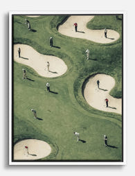
Golfers on the Green Art Print
Translation missing: en.products.product.sale_price From 184.00 kr263.00 kr -

Green Fairway Crowd Canvas Print
Translation missing: en.products.product.sale_price From 735.00 kr1,049.00 kr -

Aerial Golfers Gathering Art Print
Translation missing: en.products.product.sale_price From 184.00 kr263.00 kr -

Aerial Golfers Gathering Art Print
Translation missing: en.products.product.sale_price From 184.00 kr263.00 kr -

Golfers on the Green Art Print
Translation missing: en.products.product.sale_price From 184.00 kr263.00 kr -

Golfers on the Green Art Print
Translation missing: en.products.product.sale_price From 184.00 kr263.00 kr -
Playful Golfers Maze Canvas Print
Translation missing: en.products.product.sale_price From 735.00 kr1,049.00 kr -

Golfers on the Green Art Print
Translation missing: en.products.product.sale_price From 184.00 kr263.00 kr -

Overhead Golf Moment Art Print
Translation missing: en.products.product.sale_price From 184.00 kr263.00 kr -

The Blue Fairway Golfer Canvas Print
Translation missing: en.products.product.sale_price From 735.00 kr1,049.00 kr -
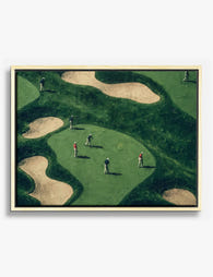
Aerial Golfers Gathering Canvas Print
Translation missing: en.products.product.sale_price From 735.00 kr1,049.00 kr


More from The Frame

Boho Sun Wall Art: How to Nail the Look Without...
Boho sun art has a reputation problem. Done badly, it screams student halls and macramé overload. Done well, it's one of the warmest, most grounding aesthetics you can put on...

Every Animal in William Morris's Designs: The C...
Most people know the thrush in Strawberry Thief and stop there. But Morris's wider body of work contains foxes, hares, peacocks, ravens, lions, herons, woodpeckers, deer, and doves, often half-buried...

Countryside Decor Ideas: How to Bring Rural Cal...
Countryside art has quietly become one of the most versatile choices in modern interiors. Not the chintz-and-bunting version, but the kind of soft, considered pastoral scenes that bring the outside...