How to Build a Gallery Wall with Impressionist Prints (Without It Looking Like a Museum Gift Shop)
The specific measurements, frame rules, and layout frameworks that separate a curated gallery wall from a chaotic one.

You love the soft light of a Monet water garden and the wild colour of a Van Gogh wheat field, and you want a whole wall of that energy in your lounge. But every time you start planning, you freeze. This guide gives you the actual measurements, frame rules, and layout frameworks to get it right the first time.
Why impressionism is one of the easiest styles to gallery-wall
Here is the secret nobody tells you: impressionism is the most forgiving art style for a gallery wall. The soft brushwork, hazy edges, and shared palette of dusty blues, sage greens, butter yellows, and rosy pinks mean almost any two impressionist pieces will speak to each other, even if one shows a Parisian street and the other shows a vase of peonies.
Compare that to a wall of mid-century graphic prints or sharp black and white photography, where any tonal mismatch screams. Impressionism blurs its own edges, and that visual softness creates natural cohesion between pieces that have nothing in common subject-wise.
This is why a haystack at sunset, a ballet dancer in pale tulle, and a cliffside in Étretat can hang together and look intentional. The colour temperature is doing the heavy lifting. Your job is just to not get in the way of it.

Planning your layout: the anchor piece approach
Every good gallery wall starts with an anchor. This is the largest piece, and it sets the visual centre of gravity for everything else. Without one, your wall looks like a collection of equally weighted prints fighting for attention.
Pick your anchor first, before anything else. We recommend something at least 60x80cm or 70x100cm, ideally a landscape you genuinely love. A Monet, a Pissarro, a Sisley river scene. Something with depth and a wide tonal range, because supporting pieces will be picking up colours from it.
Where to place the anchor
You have three options, and they each create a different feel:
Centre anchor: The largest print sits dead centre at eye level (roughly 145-150cm from floor to centre of print), with smaller pieces radiating outward. This creates a symmetrical, formal arrangement. Best for dining rooms, hallways, or above a sofa.
Off-centre anchor: The anchor sits to one side (usually left), with smaller pieces clustered on the other side and trailing across. Looser, more contemporary. Works above sideboards and in lounges with asymmetrical furniture.
Stacked anchor: Two large prints stacked vertically act as a combined anchor, with smaller pieces flanking. Good for tall, narrow walls between windows.
Choose your placement based on the furniture below the wall. The anchor's centre should sit roughly above the visual centre of the sofa, sideboard, or bed.
How many prints you need for different wall sizes
Most guides wave their hands about "your wall size" without giving you actual numbers. Here is a working formula based on professional consensus and how things actually look in real rooms:
- Wall up to 1.5m wide: 2-3 prints (one anchor at 50x70cm, one or two supporting at 30x40cm)
- Wall 1.5-2m wide: 3-5 prints (anchor at 60x80cm, plus mix of 40x50cm and 30x40cm)
- Wall 2-2.5m wide: 5-7 prints (anchor at 70x100cm, plus mix of medium and small)
- Wall 2.5m+ wide: 7-9 prints (consider two anchor pieces, or one very large 100x70cm landscape with a supporting cast)
Odd numbers almost always look better than even numbers. The eye reads odd-numbered groups as deliberate compositions and even-numbered groups as catalogues.
If you are doing a pre-curated wall art set, the maths is already done for you. If you are building from scratch, draft your list before you buy anything.
Mixing subjects: landscapes, florals, and figures that work together
The "museum gift shop" mistake is hanging seven Monet water lilies in a row. It signals that you went to one exhibition and bought everything in the shop. A curated wall mixes subjects from across the impressionist canon while keeping the palette consistent.
Our rule: for any group of five to seven prints, aim for roughly 50% landscapes, 30% florals or still lifes, and 20% figures or interiors. Adjust to taste, but resist going more than 70% on any single subject.
Impressionist landscape prints form the backbone because they tend to have the widest tonal range and naturally feel anchoring. Florals add intimacy and a closer focal length. Figures (a Degas dancer, a Renoir portrait, a Cassatt mother and child) introduce a human element and stop the wall feeling like a travel agency.
The trick is letting the colour palette unify what the subjects don't. If your anchor landscape has soft greens and pale yellows, pull a floral with the same yellow tones, then a figure study with green in the background. The wall reads as one piece.

Mixing eras within impressionism
Don't limit yourself to the obvious 1870s French canon. Post-impressionists (Van Gogh, Cézanne), American impressionists (Childe Hassam, Mary Cassatt), and contemporary impressionist-style work all sit comfortably together. Mixing across these widens your palette and makes the wall feel collected rather than themed.
Browse a broader impressionism wall art selection rather than fixating on a single artist. The cohesion comes from the style, not the signature.
Frame colour: why matching matters more than you think
This is where most gallery walls fall apart. People mix oak, black, white, and gold frames thinking variety adds interest. With graphic art, sometimes it does. With impressionism, it almost always doesn't.
The reason: impressionist work has soft, blended edges and no strong internal lines. The frame becomes the only hard graphic element on each piece. If your frames don't match, the wall reads as a series of competing rectangles rather than a unified composition. Your eye gets stuck on the frame edges instead of moving through the art.
Our position: match all your frames. Same wood, same colour, same width.
The two frame choices we recommend for impressionism:
Natural oak: Warm, light, and brings out the yellows and greens common in impressionist palettes. Best for rooms with linen, rattan, or pale wood furniture.
Matte black: Sharp and gallery-like. Makes pale colours pop and works in rooms with darker furniture or strong architectural detail. Better in modern spaces.
White frames can work but tend to disappear against most walls and lose the gallery feel. Gold frames push you straight into museum gift shop territory unless you commit to the maximalist look entirely.
If you are framing prints yourself, consistency in frame depth matters too. Mismatched depths create uneven shadow lines on the wall. Buying framed prints that ship pre-fitted, with proper FSC wood frames and UV-protective glaze, removes the guesswork. It also removes the most common gallery wall failure: warped prints that arrive separately from their frames and never quite sit flat.
Spacing and alignment: the measurements that actually look good
The standard advice is "5 to 7cm between frames." That is correct, but only if you understand why.
The gap between prints should feel like a continuation of the wall, not a separation. Too tight (under 4cm) and the prints feel cramped. Too wide (over 10cm) and the wall reads as separate prints rather than one composition.
Our preferred spacing for impressionist gallery walls: 5cm between frames, consistent across the entire arrangement. Tighter than this and the soft, atmospheric quality of the work gets squeezed. Wider and you lose the "one wall, one statement" effect.
The eye-level rule
The centre of your gallery wall (not the centre of the anchor, the visual centre of the whole arrangement) should sit at 145-150cm from the floor. This is the museum standard, and it works because it places the work at average adult eye level when standing.
If the wall is above a sofa, hang the bottom of the lowest print 20-25cm above the back of the sofa. Any closer and it feels like the art is leaning on the furniture. Any further and it floats.
Mock it up before you drill
Cut paper templates the exact size of each frame. Stick them to the wall with masking tape and live with the layout for 24 hours. Move things, rotate orientations, swap positions. This costs nothing and saves you from a wall full of misjudged nail holes.
For each template, mark the position of the hanging hook on the back so you know exactly where the nail goes. Then take the templates down one at a time, drill, and hang. This is the single best piece of advice in this entire guide.

Common gallery wall mistakes and how to avoid them
Mistake 1: Starting without a plan. You hang the first print, then improvise. Three prints in, the spacing is wrong and you have eight nail holes to patch. Always mock up first.
Mistake 2: Mixing too many frame styles. Covered above. Match your frames. We mean it.
Mistake 3: Spacing that's too generous. People over-space because they are nervous about prints "touching." A wall of prints with 12cm gaps reads as a collection of singles, not a gallery wall.
Mistake 4: Ignoring orientation balance. A wall of all-portrait prints feels stiff. A wall of all-landscape prints feels squat. Aim for roughly 60/40 in either direction, with at least one orientation contrast somewhere on the wall.
Mistake 5: Hanging too high. The single most common error in British homes. If you are looking up at your art, it is too high. Eye level means the centre of the wall, not the top.
Mistake 6: Forgetting about light. Impressionism is about light, so giving your gallery wall good lighting matters. Avoid hanging directly opposite a window where glare will wash out the work. If you are using picture lights or directional spots, angle them at 30 degrees from the wall to minimise reflection. UV-protective glazing also helps protect colours from fading where direct sunlight is unavoidable.
Mistake 7: Buying everything at once from one source. This is the actual museum gift shop trap. Build slowly, mix sources, mix eras, and let the wall develop a sense of having been collected.
Our favourite impressionist print combinations right now
A few combinations we keep coming back to:
The garden wall: Monet's water lilies as anchor (70x100cm), flanked by two Renoir florals (40x50cm each), with a Berthe Morisot garden scene (30x40cm) and a Pissarro landscape (50x70cm). Palette: sage, dusty pink, butter yellow.
The Parisian street: Caillebotte's rainy boulevard as anchor, paired with two Degas dancers, a Manet still life, and a Pissarro Montmartre scene. Palette: stone grey, soft black, ivory, accents of crimson.
The coastal set: Monet's cliffs at Étretat anchoring, with Boudin beach scenes and a Sisley river view. All cool blues, pale sand, and overcast greys. Calming, especially in bedrooms.
The floral lean: A wall built around floral art prints, with one Cézanne fruit still life as a tonal counterpoint. Best in dining rooms, kitchens, and dressing rooms.

Where to start tomorrow
Pick your anchor piece first. Measure your wall. Decide your frame colour and commit to it across every print. Cut paper templates and tape them up before you buy a single nail. Keep your spacing at 5cm. Mix subjects but lock the palette.
The gallery wall you are nervous about is genuinely easier than you think. Impressionism is doing most of the work for you. You just need to not undo it with mismatched frames and improvised spacing.

Fab products featured in this blog
-

Renoir Landscape Hues Art Print
Translation missing: en.products.product.sale_price From 180.00 kr256.00 kr -
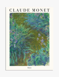
Monet’s Irises Garden Art Print
Translation missing: en.products.product.sale_price From 180.00 kr256.00 kr -

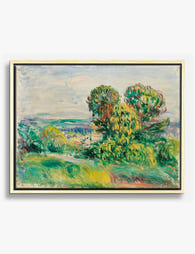
Renoir’s Tranquil Pathway Canvas Print
Translation missing: en.products.product.sale_price From 717.00 kr1,024.00 kr -

Van Gogh Garden Path Canvas Print
Translation missing: en.products.product.sale_price From 717.00 kr1,024.00 kr -

Parisian Stroll Art Print
Translation missing: en.products.product.sale_price From 180.00 kr256.00 kr -

Renoir’s Cagnes Garden View Canvas Print
Translation missing: en.products.product.sale_price From 717.00 kr1,024.00 kr -

Parisian Street Stroll Art Print
Translation missing: en.products.product.sale_price From 180.00 kr256.00 kr -

Garden Stroll by Renoir Art Print
Translation missing: en.products.product.sale_price From 180.00 kr256.00 kr -

Landscape Between Storms by Renoir Art Print
Translation missing: en.products.product.sale_price From 180.00 kr256.00 kr -

Gustav Klimt Flower Garden Art Print
Translation missing: en.products.product.sale_price From 180.00 kr256.00 kr -

Monets Garden Bliss Art Print
Translation missing: en.products.product.sale_price From 180.00 kr256.00 kr -

Bookshop Stroll Art Print
Translation missing: en.products.product.sale_price From 180.00 kr256.00 kr -

Kandinsky Violet & Green Canvas Print
Translation missing: en.products.product.sale_price From 717.00 kr1,024.00 kr -

Claude Monet Irises Art Print
Translation missing: en.products.product.sale_price From 180.00 kr256.00 kr -

Renoir Provençal Landscape Canvas Print
Translation missing: en.products.product.sale_price From 717.00 kr1,024.00 kr -
Renoir’s Breezy Landscape Canvas Print
Translation missing: en.products.product.sale_price From 717.00 kr1,024.00 kr -

Parisian Street Stroll Canvas Print
Translation missing: en.products.product.sale_price From 717.00 kr1,024.00 kr -

Vibrant Hillside Journey Art Print
Translation missing: en.products.product.sale_price From 180.00 kr256.00 kr -

Monets Garden Path Canvas Print
Translation missing: en.products.product.sale_price From 717.00 kr1,024.00 kr


More from The Frame

How to Build a Blossom Gallery Wall That Actual...
Most blossom gallery walls fail for the same reason: they're a collection of pretty things rather than a composition. The fix is planning, not taste. This guide gives you the...

How to Build a Winter Sports Gallery Wall That ...
Most winter sports gallery walls fail for the same reason: people buy four prints they like, hang them roughly equidistant, and call it done. A gallery wall that looks intentional...

How to Style Matisse Portrait Prints in Every R...
You've fallen for a Matisse face. Now you're staring at a wall, second-guessing the size, the frame, the room, the lot. This is the practical guide that takes you from...