


 Order today for delivery by
Spring Botanical Prints: From Victorian Specimen Art to Modern Walls
Three centuries of flower art, decoded, and how to choose the right style for every wall in your home.


Botanical prints have been quietly running the interior design world for 300 years. The reason is simple: flowers and foliage sit comfortably in almost any room, pull colour from the garden indoors, and never feel like a trend. The trick is knowing which style of botanical print belongs on your walls, not just which flower you like.
A quick history of botanical art (and why it never goes out of style)
Botanical illustration began as science, not decoration. In the 17th and 18th centuries, European botanists needed accurate records of newly discovered plants, and skilled artists were commissioned to document every leaf, root, and seed pod with forensic precision. Pierre-Joseph Redouté's rose plates and Maria Sibylla Merian's insect and plant studies are still reproduced today, which tells you something about their staying power.
The Victorian era turned this scientific work into something more decorative. As printing techniques improved and the middle classes grew interested in natural history, botanical plates moved from academic journals into drawing rooms. Pressed-fern albums, hand-coloured lithographs, and framed specimen prints became genuine status symbols.
What makes botanical art endure is its honesty. A well-drawn fern looks like a fern. There's no code to crack, no mood to interpret, just the quiet pleasure of looking at something living. That's why botanical art prints outlast almost every other category on our walls.
Scientific illustration vs. painterly florals vs. modern graphic botanicals
Three broad styles dominate the botanical world, and knowing the difference will save you a lot of second-guessing.
Scientific illustration
Think clean white backgrounds, precise linework, Latin names in small type at the bottom, and often a cross-section showing the plant's internal structure. The colour palette is usually restrained: olive greens, muted ochres, dusty pinks. These prints have an academic, almost museum-like feel. They're the botanical equivalent of a well-tailored shirt.
Scientific plates work beautifully in sets because they were originally produced in series. Hang three or four together and you get an instant library-of-a-19th-century-naturalist mood.
Painterly watercolour florals
Looser, softer, more atmospheric. Edges bleed, backgrounds wash into pale sage or cream, and the focus is on light and movement rather than botanical accuracy. A watercolour peony might show you the feeling of a peony more than its exact petal structure.
These are the warmest, most forgiving botanical prints. They soften a room instantly and pair well with linen, wool, and anything with a bit of texture.
Modern graphic botanicals
Flat colour, bold shapes, confident composition. Sometimes a single monstera leaf in sage green on a cream background. Sometimes a stylised bouquet in terracotta and black. The reference point is the plant, but the execution is pure graphic design.
Graphic botanicals suit contemporary interiors, concrete floors, mid-century furniture, and anywhere you want freshness without fuss. They're also the most forgiving at larger sizes because the simplified shapes hold up at scale.

Which botanical style works in which room
Different rooms ask for different energy. Here's how we'd match them.
Bedrooms
Painterly watercolours win here. Soft-edged florals, misty botanical studies, pale eucalyptus. The looseness of watercolour reads as calm, and calm is what you want above a bed. Avoid anything too high-contrast or clinical.
For a north-facing bedroom with cool light, lean into warmer tones: blush peonies, apricot roses, buttery wildflowers. For a south-facing room that's already full of warm light, cooler sages and dusty blues will balance things out.
Living rooms
This is where you can be most ambitious. Scientific plates in a grid of four or six look brilliant above a sofa. Modern graphic botanicals in XL sizes make a confident statement over a sideboard. If your living room is already busy with pattern, go for a single large painterly piece rather than a set.
Kitchens and dining rooms
Scientific illustrations of herbs, citrus, and vegetables feel at home here. There's a lovely circularity to seeing a lemon print above a bowl of lemons. Keep framing crisp, white or natural oak, to echo the clean lines you want around food.
Bathrooms
Canvas is often the smart choice here. Humidity can be unkind to paper over time, and canvas handles damp air far more gracefully. A single tropical leaf print on canvas, hung opposite the mirror, lifts a bathroom instantly.
Hallways and entrances
Narrow walls love vertical botanical prints. A tall study of climbing jasmine or a stem of foxgloves works harder than a square format in these spaces. Think of it as visual punctuation as you move through the house.
Pairing botanical prints with existing decor: wood, marble, textiles
Botanical art rarely clashes, but it does have preferences.
Natural wood
Oak, walnut, ash. These warm woods are botanical art's best friend. A watercolour fern above an oak console looks almost inevitable, like it was always meant to be there. Match the frame to the undertone of your wood: warm oak with natural wood frames, cooler ash with white or black.
Marble and stone
Marble has its own veining and movement, so pair it with botanical prints that have clear negative space. Scientific illustrations on white backgrounds work beautifully. Avoid busy painterly compositions above a heavily veined marble fireplace, as the two will fight for attention.
Textiles
Linen, wool, bouclé, and velvet all pair well with botanical art, but they ask for different styles. Rough linen loves loose watercolour. Smooth velvet looks sharper next to graphic prints or precise scientific plates. If your sofa already has a floral pattern, do not add floral art above it. Choose a single leaf study instead.
Brass and metal fixtures
Brass pulls the warm tones out of botanical prints. If your lighting or hardware is brass, lean into prints with ochre, mustard, and burnt sienna notes. Chrome and nickel pair better with cooler green and blue botanicals.

Size and framing recommendations for botanical prints
Scale is where most people get botanical prints wrong. The default instinct is to buy too small.
Single prints
Above a sofa or sideboard, your print (or set) should span 60 to 75% of the furniture width. A standard three-seat sofa is around 220cm wide, so you want artwork covering roughly 130 to 165cm. That usually means a single 70x100cm print or two 50x70cm prints side by side.
Centre the artwork so the midpoint sits around 145 to 150cm from the floor. This is roughly eye level for most people and the standard used in galleries.
Sets and pairs
For a set of three or four prints, leave 5 to 8cm between frames. Any more and they stop reading as a group. Any less and they look crowded.
Framing choices
Frame finish changes the entire personality of a botanical print. The same watercolour rose looks:
- Natural oak: relaxed, modern, Scandinavian
- Black: graphic, confident, slightly formal
- White: light, airy, gallery-like
- Dark walnut: traditional, warm, library-ish
For scientific illustrations, we almost always recommend black or dark wood. It echoes the museum-plate heritage. For loose watercolours, natural oak or white keeps things soft. For modern graphic botanicals, white or black both work depending on how bold you want to go.
A note on construction: botanical prints suffer when framing is cheap. Warped MDF frames, prints that aren't fitted flat, and glass that catches every bit of glare will ruin even the best art. Our framed prints arrive in one box with the print already fitted inside solid FSC wood frames, UV-protective acrylic glaze instead of glass, and fixtures attached. You unwrap, you hang, you're done.
For bathrooms or kitchens where humidity is a factor, canvas is the smarter pick. Hand-stretched over a solid wood frame with mirrored edges, it holds up where paper might eventually struggle.
Creating a botanical-themed set: how to pick prints that belong together
A good botanical set has a unifying thread. Random selection almost never works. Here are the four threads that reliably hold a group together.
By colour palette
Pick two or three colours and stick to them. Sage, cream, and soft ochre. Dusty pink, charcoal, and off-white. The individual plants can vary wildly as long as the palette agrees.
By plant family
All ferns. All roses. All grasses. This feels like a genuine collection rather than an assortment, and the visual rhythm is instantly cohesive.
By artistic style
Four scientific plates. Three watercolours by the same artist. A trio of graphic leaf prints. Consistency of style trumps consistency of subject.
By era
Victorian scientific plates together, mid-century botanical illustrations together, contemporary graphic work together. Mixing eras can be done, but it takes a confident eye.
Mixing styles (when you want to)
You can absolutely combine styles, but you need a bridge. The easiest bridges are colour (every print contains sage green, say) or framing (every print, regardless of style, sits in the same black frame). Without a bridge, mixed-style sets look like a shop display.
Our top spring botanical picks and where we'd hang them
Spring is the obvious time to refresh botanical walls, but we'd argue it's also the easiest. The colours are forgiving, the subjects are familiar, and the mood is universally welcome. Here's where we'd put our favourites from the spring edit.
Blossom studies for bedrooms
Soft pink and white blossoms in loose watercolour, framed in natural oak at 50x70cm, hung above a linen headboard. Nothing more calming to wake up to.
Wildflower meadows for living rooms
A single XL canvas, around 100x150cm, of a loose wildflower meadow above a low sofa. The scale does the work. If you're nervous about size, remember that canvas feels lighter visually than framed paper, so you can go bigger than you think.
Scientific herb plates for kitchens
A grid of four 30x40cm herb illustrations (basil, rosemary, sage, thyme) in matching black frames above a kitchen bench. Timeless, useful, slightly witty.
Graphic leaf prints for hallways
A tall 50x70cm print of a single monstera or fig leaf in sage on cream, in a thin black frame, at the end of a hallway. Draws the eye through the space.
Pressed flower compositions for home offices
A pair of pressed-style botanical prints in white frames, hung above a desk. Clean, quiet, not distracting. Browse more in our floral collection or the broader nature prints edit for options that lean more landscape than specimen.

A note on seasonal rotation
One of the quiet pleasures of botanical art is that you can rotate it. Keep your frames up year-round and swap the prints inside with the seasons: blossoms in spring, meadow flowers in summer, pressed leaves in autumn, evergreens in winter. The frame becomes the fixture, the print becomes the variable. It's cheaper, more sustainable, and keeps your walls feeling alive.

Where to start
If you're new to botanical prints, buy one piece first and live with it for a week before adding more. Choose the style that matches the room you spend most time in, size it generously (bigger is almost always better), and frame it in a finish that already appears elsewhere in the space. The right botanical print should feel like it was waiting for your wall, not asking for attention on it.

Fab products featured in this blog
-

Spring Botanical Medley Art Print
Sale price From 190,00 kr271,00 kr -

Spring Botanical Medley Canvas Print
Sale price From 759,00 kr1 084,00 kr -

The Botanical House Art Print
Sale price From 190,00 kr271,00 kr -

Studies in Botanical Ornament by William Morris Art Print
Sale price From 190,00 kr271,00 kr -

Bold Botanical Vases Art Print
Sale price From 190,00 kr271,00 kr -

The Botanical House Canvas Print
Sale price From 759,00 kr1 084,00 kr -

Gardens of the World Botanical Art Print
Sale price From 190,00 kr271,00 kr -

Bold Botanical Sketch Art Print
Sale price From 190,00 kr271,00 kr -

British Botanical View Art Print
Sale price From 190,00 kr271,00 kr -

The Plants and the Flowers Art Print
Sale price From 190,00 kr271,00 kr -
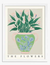
Botanical Bloom Vase Art Print
Sale price From 190,00 kr271,00 kr -

Studies in Botanical Ornament by William Morris Art Print
Sale price From 190,00 kr271,00 kr -

Wildflower Bouquet Botanical Study Art Print
Sale price From 271,00 kr474,00 kr -

Pale Wildflower Study Art Print
Sale price From 271,00 kr474,00 kr -

The Botanical House — Heritage Botanical Art Print
Sale price From 190,00 kr271,00 kr


More from The Frame

Spring Home Decor Trends 2025: The Wall Art Tha...
Spring 2025 isn't about pastel overload or a sudden explosion of tulip prints. The interiors conversation has shifted toward quieter, more considered choices, and your walls are where that shift...

The 7 Contemporary Art Styles You'll Actually S...
"Contemporary art" gets used as a catch-all for anything that isn't a Monet print or a motivational quote, which is useless if you're trying to work out what to put...

Klimt Beyond The Kiss: Why His Landscapes and F...
Why Klimt's Landscapes Are Criminally Overlooked Everyone knows The Kiss. Fewer people know that Gustav Klimt spent every summer from 1900 to 1916 painting trees, flower beds and lakeshores so...