


 Order today for delivery by
 Vintage Art Prints vs. Antique Originals: Why Modern Giclée Reproductions Are the Smarter Buy
Why a $50 museum-grade reproduction often looks better on your wall than a $2,000 fragile, foxed original.


There's a particular romance to owning a genuine antique print. The trouble is that romance rarely survives contact with the wall it's hung on. Once you account for fading, foxing, conservation costs and frames that don't fit modern rooms, the case for a museum-grade reproduction gets surprisingly strong.
This is an honest comparison of what you actually get for your money, where originals genuinely earn their price, and where you're paying for provenance you'll never see from across the room.
What counts as a 'genuine antique print' and why it matters less than you think
The word "vintage" is doing a lot of unpaid work online. Antique dealers use it to mean a print that was physically produced decades ago, often between the 1850s and the 1950s, on the original presses, with the original inks. Galleries selling modern artwork use the same word to describe brand new prints made in a vintage style.
Both are legitimate. They're just very different products at very different prices, and the listings rarely make the distinction obvious. A genuine 1930s London Transport poster is a piece of printing history. A 2024 giclée print of a 1930s London Transport design is a high-resolution reproduction of that same artwork.
For a serious collector, the difference is everything. For someone furnishing a hallway, the difference is mostly philosophical. You're looking at the same image either way. The question is whether the physical object hanging on your wall needs to be the original artefact, or whether you're buying the design itself.
Most people, when they're honest with themselves, are buying the design. They want a beautiful Underground poster above the console table, not a museum acquisition. Once you accept that, the practical case for reproductions gets a lot easier to make.

The problem with originals: fading, foxing, and fragile paper
The thing nobody mentions when they sell you a genuine antique print is that it has been quietly deteriorating for the last century. Paper is organic. Inks are unstable. Light is the enemy of pigment. A poster designed in 1925 to be pasted on a Tube station wall for six weeks was never engineered to look pristine in 2024.
What you tend to see, in person, on antique originals:
Foxing. Brownish-red spots scattered across the paper, caused by fungal growth and oxidation over decades. It's almost universal on prints over fifty years old that haven't been kept in climate-controlled storage. Mild foxing can be reduced by a paper conservator. Heavy foxing is essentially permanent without aggressive treatment that risks damaging the print further.
Fading. Original four-colour lithography used inks that were never archival. Reds and yellows are particularly vulnerable. A poster that was once vivid scarlet may now read as dusty pink, especially if it's been displayed at any point in its life.
Brittleness. Paper dries out. Folds become tears. Edges chip. Anything that's been folded for storage, which includes most surviving travel posters, will have permanent creases that show through any frame.
Backing damage. Many antique posters were originally pasted onto walls or boards. Removing them often takes a layer of paper with it, leaving thin patches and adhesive residue.
None of this is a defect. It's what happens to paper over a century. But it's rarely shown clearly in listing photos, and it's the reason "ready to hang" almost never applies to genuine antiques. Most need linen backing (typically £200 to £500 from a paper conservator), tear repair, deacidification, and acid-free mounting before they're stable enough to frame. That's before you've bought the frame itself.
How modern giclée printing captures (and often surpasses) the original detail
Giclée is a specific, technical process, not a marketing word. A proper giclée printer uses between 11 and 12 separate pigment-based ink cartridges, sprayed in microscopic droplets onto archival paper. Original early-20th-century lithography used four. The mathematical result is that a modern giclée can reproduce colour gradations the original press physically couldn't achieve.
This sounds counterintuitive. How can a reproduction be more detailed than the original? The answer is that we're usually reproducing from high-resolution scans of the original artwork or proof, not from a printed copy. The source file holds detail that the original printing process compressed or lost. A modern wide-gamut printer puts more of that detail back than the 1925 press ever could.
The other thing giclée gets right is permanence. Pigment-based archival inks on cotton-rag or thick matte paper are tested to retain colour for 100 to 200 years under normal indoor lighting. Our art prints use UV-protective acrylic glaze on top of that, which means even direct sunlight won't fade them within any timeframe you need to worry about.
Compare that to a 1930s original, where the ink chemistry was never designed to last and where every hour on a sunlit wall is one hour closer to invisible. The reproduction will outlive the original by a comfortable margin.

Framing matters more than provenance for how a print actually looks
Here is the part of the conversation antique dealers are reluctant to have. The single biggest factor in how a print looks on your wall is the framing, not whether the print is original.
A pristine 1930s original badly framed (cheap moulding, acidic mount board, ill-fitting glass, shipped separately to the print) looks worse than a modern giclée properly framed. This isn't an opinion. It's what you see, every time, in person.
The failures we see most often with antique prints:
- Acidic mount boards that yellow the print edges within a year or two
- Cheap glass with green tint that distorts colours
- Frames shipped separately from the print, then assembled badly at home, leaving dust, gaps, and warped paper
- Imperial sizes that don't fit standard frames. Original Underground posters came in Double Crown (508 x 762mm), Double Royal (635 x 1016mm), and Quad Royal (1016 x 1270mm). Almost no off-the-shelf frame matches these dimensions, so you're paying for custom framing on top of everything else.
A reproduction printed to standard modern sizes (60x80cm, 70x100cm, 50x70cm) sidesteps every one of these problems. When we send a framed print, the frame is solid FSC-certified wood, the glaze is UV-protective acrylic rather than glass, the mount is acid-free, and the whole thing arrives in one box, properly fitted, ready to hang. No assembly. No warping. No bubbling.
That last point matters more than it sounds. A huge proportion of complaints in the framed art category are about prints arriving separately from frames, or being fitted so poorly that the paper ripples within a few months. Solving that boring logistical problem is most of what makes a framed print look good a year after you bought it.
Cost comparison: original vintage London posters vs. museum-grade reproductions
Real numbers from the current market, because the gap is more dramatic than people expect.
Genuine vintage London Transport posters, sourced from established auction platforms, currently average around £1,900 (roughly $2,427), with a typical range from £80 (about $104) for damaged or minor pieces to £6,300 (about $8,053) for clean examples by named designers. That's the print alone. Add £200 to £500 for conservation if it needs linen backing or repair. Add another £150 to £400 for custom framing in the original Imperial size with conservation-grade materials.
A realistic all-in cost for a wall-ready genuine antique London poster sits between £1,500 and £4,000, with serious examples going considerably higher.
A museum-grade giclée reproduction of the same design, framed in solid wood with acid-free mount and UV-protective glaze, ready to hang straight out of the box: somewhere between £40 and £200 depending on size. You can browse our vintage London prints for current pricing, but the order of magnitude is roughly 5% to 10% of the cost of an original.
For that price difference, you get a print that's brighter, sharper, in a frame that fits your wall, with no foxing, no fading, no tears, and a 99-day returns window if you change your mind. The original gets you provenance. That's a real thing, and we're not pretending it isn't. But you should be clear-eyed about what you're paying for.

When an original is worth it and when it really isn't
We're not going to pretend originals are never the right call. Roughly 5% of the antique poster market genuinely justifies the price.
An original is worth it when:
- It's a numbered limited edition by a named designer with documented provenance. McKnight Kauffer, Tom Eckersley, Cassandre, Abram Games. These have collector value that may appreciate.
- You're a serious collector who values the physical object as a historical artefact, separate from how it looks on the wall.
- The print is in genuinely excellent condition, with no foxing, minimal fading, and intact paper. This is rarer than listings suggest.
- You have somewhere climate-controlled to store and display it (stable humidity, no direct sun, acid-free housing).
An original is not worth it when:
- You want it primarily because it'll look beautiful in your living room. A reproduction will look better.
- You're treating it as an investment without a named designer or rare subject. Most antique posters don't appreciate meaningfully and are hard to resell quickly.
- You can't or won't pay for proper conservation framing on top of the purchase price.
- The example you're looking at has visible foxing, fading, or repairs. You're paying full price for compromised condition.
A useful filter: if you removed the certificate of authenticity, would you still want this specific physical object? If yes, buy the original. If you'd rather have a brighter, cleaner version of the same image at a tenth of the cost, buy a reproduction and stop second-guessing yourself.
How to spot a fake 'antique'
If you do go for an original, a few tells separate genuine vintage from a modern reproduction being sold as antique:
- Modern fonts. Pre-1960 posters use specific period typefaces. Anything that looks like a current digital font is a red flag.
- Pixelation under magnification. Original lithography shows a dot pattern, but it's organic and irregular. Modern inkjet shows a uniform grid of dots.
- Wrong paper. Antique posters were printed on specific stocks. Modern matte paper feels and looks different under raking light.
- Margin text inconsistencies. Printer marks, registration crosses, and small-print credits are notoriously hard to fake convincingly. Blurry or misaligned margin text usually means a scan-and-reprint job.
- Dimensions. Originals match Imperial sizes almost exactly. A "vintage" poster in 50x70cm is, by definition, not from 1930.
None of this matters if you're knowingly buying a reproduction. It only matters if you're being told something is original.
A note on storage, display, and the boring practicalities
Genuine antique prints need ongoing care that nobody mentions at the point of sale. Stable humidity (ideally 45 to 55%), temperatures under 21°C, no direct sunlight ever, acid-free storage when not displayed. Skipping any of this accelerates deterioration.
Reproductions are far more forgiving. Our vintage art prints use water-based inks on FSC-certified paper with UV-protective glaze, which means a sunny wall isn't a problem. You can hang them in a bathroom without the paper warping (the canvas options handle humidity even better). You don't need to think about them.
That low-maintenance reality is part of the value calculation people often miss. An original is a thing you have to look after. A reproduction is a thing you can enjoy.

The honest summary
Buy an original if you want the artefact, you've verified the condition, you can pay for conservation framing, and you understand you're spending mostly on provenance. That's a legitimate choice for the small fraction of buyers who genuinely care about owning the historical object.
Buy a museum-grade reproduction if you want the design on your wall, looking sharp and bright, in a frame that fits your room, for somewhere between 5% and 10% of what an original costs. That's not a compromise. In most cases, it's the better-looking print.
The mistake is buying an original because you've been told that's the "real" version, then discovering at home that it's foxed, off-square in its frame, and dimmer than the picture in the listing. Provenance doesn't fix any of that. Good printing and good framing do.

Fab products featured in this blog
-

Georges Richard Cycles Vintage Poster Art Print
Sale price From 190,00 kr271,00 kr -
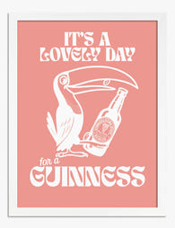
It's A Lovely Day For A Guinness Art Print
Sale price From 190,00 kr271,00 kr -

Lovely Day for a Guinness Art Print
Sale price From 190,00 kr271,00 kr -

Lovely Day for a Guinness Canvas Print
Sale price From 759,00 kr1 084,00 kr -

South End Free Art Exhibition, 1895 Canvas Print
Sale price From 759,00 kr1 084,00 kr -
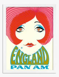
Pan Am England - Vintage Travel Poster Art Print
Sale price From 190,00 kr271,00 kr -

Woman and the Plate Wall Art Print
Sale price From 190,00 kr271,00 kr -

Springfield Bicycle Club by Bradley Art Print
Sale price From 190,00 kr271,00 kr -

Vintage Garden Blooms Art Print
Sale price From 190,00 kr271,00 kr -

Bearings Decoration Day Cycle Races Art Print
Sale price From 190,00 kr271,00 kr -

Fahrräder I Vintage Bicycle Chart Canvas Print
Sale price From 759,00 kr1 084,00 kr -
It's A Lovely Day For A Guinness Canvas Print
Sale price From 759,00 kr1 084,00 kr -

Flea Market Furniture Poster Art Print
Sale price From 190,00 kr271,00 kr -

Columbia Bicycles Vintage Poster Art Print
Sale price From 190,00 kr271,00 kr -

London Calling Vintage Travel Art Print
Sale price From 190,00 kr271,00 kr -

Bearings Decoration Day Cycle Races Canvas Print
Sale price From 759,00 kr1 084,00 kr -

Vintage Garden Bird Art Print
Sale price From 190,00 kr271,00 kr -

Silent But Judging Art Print
Sale price From 190,00 kr271,00 kr


More from The Frame

Frog Art for the Bathroom: Why It Works and How...
Frog art has quietly become one of the most-searched subjects for bathroom walls, and it's not hard to see why. The pairing makes sense on an instinctive level, but the...

Decorating with Frog Art: How to Make It Look I...
Frog art has a reputation problem. Mention it and people picture cartoon prints in a nursery, or worse, a novelty tea towel someone brought back from a garden centre. Done...

Vintage Cup Prints: From Dutch Still Life to Mo...
Cups have been quietly starring in paintings for nearly 400 years. What began as a way for Dutch merchants to show off their imported porcelain has become one of the...