What Makes a Typography Print Worth Hanging? 6 Things to Look For
A no-nonsense buyer's guide to spotting typography prints that earn their wall space, and the ones that don't.

Typography prints are the most overdone, undervalued category in wall art. Most are mass-produced rubbish destined for a charity shop within a year. A few are genuinely brilliant. This guide is about telling them apart before you spend any money.
Why most typography prints look cheap (and how to avoid them)
The typography print market has a quality problem. A trendy quote in a free font, slapped onto thin paper, run through a basic four-colour printer, and shipped in a flimsy frame. You've seen them. They're everywhere, and they all start to look the same after about six months on a wall.
Cheap typography prints give themselves away quickly. The paper curls at the edges within weeks. The ink fades when sunlight hits it. Up close, the letters pixelate. The kerning (the space between letters) is uneven. The frame warps because it's made from MDF wrapped in a plastic veneer. The whole thing looks like it was made for a stock photo.
The good news is that quality typography prints are easier to identify than you might think, once you know what to look for. The bad news is that almost no one selling them online explains the difference. Words like "premium" and "high quality" appear on every product page. They mean nothing on their own. Below is what they should mean.

Font choice matters: the typefaces that look best at scale on a wall
A font that looks elegant at 12pt on a business card can look horrible blown up to 70x100cm on a wall. Scale changes everything. The first thing to understand about typography art prints is that some typefaces are designed to be read up close, and others are designed to dominate a space.
Sans-serif fonts for big, bold statements
Helvetica, Futura, Brandon Grotesque, Avenir, Gotham. These are the workhorses of large-scale typography. They have clean geometry, consistent stroke widths, and they read clearly from across the room. If your print is going above a sofa, on a feature wall, or anywhere people will see it from more than a couple of metres away, sans-serif almost always wins.
We particularly rate the geometric sans-serifs (Futura, Avenir) for typography prints because their precision holds up beautifully at large sizes. Every curve and corner is intentional. There's no wobble, no fussiness, just confident shapes.
Serif fonts for intimate, readable pieces
Garamond, Caslon, Didot, Baskerville. Serif typefaces have small decorative strokes (the "feet") at the ends of letters, and they reward closer inspection. They're brilliant for smaller prints (around 30x40cm or 50x70cm) hung in spots where you'll actually read them: above a desk, in a hallway, beside a reading chair.
A long quote or poem set in a beautiful serif rewards a slow read. The same quote in Helvetica at the same size will feel like an airport sign.
Display and script fonts: handle with care
Hand-lettered scripts and decorative display fonts can be gorgeous, but they date faster than anything else in design. The brushy hand-lettered look that was everywhere in 2017 already looks like a specific year. If you're choosing the best fonts for wall art that you want to keep for a decade, lean classic. The longer a typeface has been around, the longer it'll keep working.
Layout and whitespace: the difference between art and a screensaver
Font choice is half the battle. Layout is the other half, and it's where most cheap typography prints fall apart completely.
Good typography design treats whitespace as a material, not an absence. The space around the letters is doing as much work as the letters themselves. Look at a poster you genuinely love and you'll notice the words aren't crammed edge to edge. There's air. The composition has a focal point and a hierarchy.
What good layout looks like
- Generous margins. The text doesn't push to the edges of the paper. Quality designers usually leave at least 10-15% of the print as breathing room.
- Considered hierarchy. If there are multiple words or lines, the eye knows where to start. Larger words pull focus, smaller words support them.
- Tight, even kerning. The spacing between letters should look natural and consistent. Bad kerning (where some letters bunch together and others sit too far apart) is the single fastest way to spot an amateur.
- Intentional alignment. Centred, left-aligned, or asymmetric, but never accidentally somewhere in between.
What bad layout looks like
- Text stretched to fill the available space, distorting letter shapes
- Multiple decorative fonts fighting for attention
- Random ornamental flourishes (laurel wreaths, star bursts, banner ribbons) added to fill gaps
- Cramped margins that make the whole piece feel claustrophobic
If you're buying online, zoom in on the product image. If the seller hasn't provided a high-resolution image you can examine closely, that's already telling you something.

Print quality: why giclée on thick matte paper beats standard printing
This is the section nobody else writes, and it's the most important one. The technical difference between a quality print and a cheap one is enormous, and almost entirely invisible from a thumbnail image.
Giclée vs standard printing, in plain English
Standard inkjet printing uses four ink cartridges (cyan, magenta, yellow, black) and dye-based inks. It's fine for documents. It's not fine for art you want to keep.
Giclée printing (pronounced "zhee-clay") uses 8 to 12 pigment-based ink cartridges and prints at very high resolution onto archival paper. The differences in practice:
- Colour range. More inks mean more colours can be reproduced accurately, including subtle greys and muted tones that four-colour printing flattens out.
- Detail. A 300 DPI giclée print holds detail you can examine from 20cm away. A standard print pixelates the moment you get close.
- Lifespan. Pigment inks can last hundreds of years without noticeable fading. Dye-based inks start fading within 5 to 10 years, faster in direct sunlight.
Our prints use giclée printing on thick matte paper because it's the only format that does justice to typography. Letterforms have crisp edges. Blacks are properly black, not a muddy dark grey. The matte finish means no glare, so you can read the print from any angle without fighting the light in the room.
Paper weight and finish
For typography, you want matte paper around 200gsm or heavier. Thinner paper curls, ripples in humidity, and feels flimsy when you hold it. Glossy paper creates reflections that make text harder to read and shows every fingerprint.
Acid-free, archival paper is the other thing to look for. Cheap paper yellows over time as the acids in the pulp react with light and air. Archival paper stays bright for decades.
Red flags in product descriptions
If a product description doesn't mention paper weight, ink type, or printing method, assume the worst. Vague language ("premium quality cardstock", "professionally printed") almost always means standard printing on standard paper. Sellers who invest in proper materials tell you about it because it costs them more.
Framing quality: the detail most people overlook until it's too late
You can have a beautifully designed, perfectly printed typography piece, and ruin it with bad framing. This is where so many online prints fall apart, sometimes literally.
What goes wrong with cheap frames
The classic problem is that the frame and print arrive separately. You unbox a flimsy MDF frame, then realise the print is slightly the wrong size, doesn't sit flat, and has bubbled where it's been pressed against the backing board. The acrylic is scratched. The fixtures are missing. You spend half an hour with a screwdriver trying to make it look acceptable.
The other problem is materials. MDF frames warp in humid rooms and chip if you knock them. Plastic veneers peel. Glass is heavy and dangerous if it falls. None of these issues are visible in a product photo.
What to look for in a quality frame
- Solid wood, not MDF or veneer. Solid wood is heavier, sturdier, and ages well. We use FSC-certified solid wood across our framed prints because it's the only material that lasts.
- UV-protective acrylic glaze, not glass. Acrylic is lighter, safer, and the UV protection prevents fading even when prints are hung in direct sunlight. This matters more than people realise, especially for typography prints with strong blacks that can grey out under UV exposure.
- Print and frame fitted together before shipping. This is the difference between art that arrives ready to hang and a flat-pack assembly project. We ship frame and print fitted in a single box, with the fixtures already attached.
- Proper spacing. The print should sit flush against the backing without bubbling or warping. If a seller can't show you a photo of the actual fitted frame from multiple angles, be suspicious.
If you'd rather skip framing entirely, that's a legitimate choice for typography. Unframed prints have a cleaner, more contemporary feel and they're easier to swap out as your taste changes. The trade-off is that they're more vulnerable to humidity and handling. Both options have their place.

How to tell if a typography print will age well in your home
The six-month test: would you still want this on your wall in six months when the trend has moved on? Most typography prints fail this test because they're built around something temporary, a current quote, a viral phrase, a font that defines a specific aesthetic moment.
The things that age badly
- Trendy quotes. Anything you've seen 50 times on Instagram in the last year. By the time it's on a print, it's already on the way out.
- Of-the-moment fonts. Hand-lettered brushy scripts, ultra-condensed display fonts, anything you can identify as "very 2023".
- Saturated, fashion-led colours. Last season's particular shade of millennial pink, that exact mustard yellow. They look fresh now, dated quickly.
- Pop culture references. Specific to a show, song, or moment that won't carry the same weight in five years.
The things that age well
- Classic typefaces. Helvetica is 70 years old and still works. Garamond is 500 years old and still works.
- Restrained colour palettes. Black on cream, charcoal on white, deep navy on off-white. Black and white art prints survive every interior change because they don't compete with anything.
- Personal meaning over universal slogans. A line from a poem you love, a phrase in a language you speak, a place name that means something to you. These don't go out of fashion because they were never in fashion.
- Strong, simple compositions. A single word, perfectly set. A short phrase with generous space around it. The fewer moving parts, the longer the design holds up.
If you're building a more pared-back scheme, our minimalist art prints sit alongside typography pieces particularly well, and they share the same design discipline: nothing extra, nothing decorative for its own sake.
Our picks: typography prints that get the fundamentals right
A few principles we'd apply if we were buying typography for our own walls right now.
Start with one piece, sized properly
For a feature wall above a sofa or bed, look at 70x100cm or larger. Smaller than that and a single typography print can feel lost. For a corridor, stairwell, or beside a desk, 50x70cm or 30x40cm reads better at close range.
A common mistake is buying a print that's technically large but sized wrong for the wall it's going on. Measure the wall, mock it up with masking tape, then choose the size.
Pick the typeface to match the use
A bold sans-serif statement piece in the lounge. A more delicate serif print in the bedroom or study. The function of the room should inform the typeface, not the other way round.
Don't be afraid of one big word
The most effective typography prints are often the simplest. A single word, set beautifully, in a great typeface, on quality paper, in a solid wood frame. That's an entire piece of art. It doesn't need a quote, a flourish, or an inspirational sentiment.
Buy once, properly
The real economics of typography prints aren't about saving money on the cheap end. A £30 print that warps, fades, and ends up binned within a year costs more than a £150 piece that you'll hang for a decade. Spend the money on the print quality and the framing. Those are the two things that determine whether the piece survives in your home.
If you're starting a typography wall from scratch, our new in collection is a reasonable place to see what's been added recently without committing to anything yet.

The shortcut to a typography print worth hanging is this: classic typeface, generous layout, giclée printing on thick matte paper, solid wood frame, restrained colour. Get those five things right and you'll have something you still like in ten years. Get any of them wrong and the print won't last the year.

Fab products featured in this blog
-

Bold Nine Typography Art Print
Translation missing: en.products.product.sale_price From 180.00 kr257.00 kr -

Bold Typographic Five Art Print
Translation missing: en.products.product.sale_price From 180.00 kr257.00 kr -

Bold Typography Statement Art Print
Translation missing: en.products.product.sale_price From 180.00 kr257.00 kr -

Blah Blah Modern Typography Art Print
Translation missing: en.products.product.sale_price From 180.00 kr257.00 kr -

Bold Four Typography Art Print
Translation missing: en.products.product.sale_price From 180.00 kr257.00 kr -

Bold Vamp Typography Art Print
Translation missing: en.products.product.sale_price From 180.00 kr257.00 kr -

Bold Icon Typography Art Print
Translation missing: en.products.product.sale_price From 180.00 kr257.00 kr -
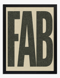
Bold Fab Typography Art Print
Translation missing: en.products.product.sale_price From 180.00 kr257.00 kr -

Prada Marfa Typography Art Print
Translation missing: en.products.product.sale_price From 180.00 kr257.00 kr -

Good Times Typography Art Print
Translation missing: en.products.product.sale_price From 180.00 kr257.00 kr -
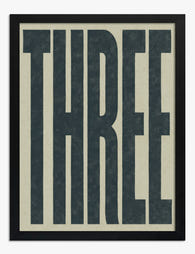
Bold Three Typography Art Print
Translation missing: en.products.product.sale_price From 180.00 kr257.00 kr


More from The Frame

You're Overthinking Your Golden Hour Gallery Wall
Gallery walls intimidate people because they assume the curation has to be invented from scratch. With golden hour photography, half the work is already done for you. The light itself...

Building a Bauhaus Gallery Wall: Layouts, Sizin...
Bauhaus prints look effortless on a single wall but turn chaotic the moment you start grouping them. The bold shapes, primary colours, and high contrast that make Kandinsky and his...

The Only Street Scene Gallery Wall Guide You'll...
Street photography is the trickiest genre to hang as a gallery wall. The subject matter is inherently chaotic: strangers, signage, weather, light, accidents of timing. Get the curation wrong and...