
 Order today for delivery by
 Zen Art Prints for Your Home: Styles, Placement, and What Actually Works
A practical guide to choosing, placing, and pairing zen art prints so your walls feel genuinely calm, not just trendy.


Zen has become shorthand for "vaguely calming things," which is a shame because the real aesthetic is far more interesting than stacked stones and silhouetted Buddhas. Done well, zen-inspired wall art does something specific to a room: it slows your eye, opens up space, and gives your brain somewhere quiet to land. Done badly, it just adds another cliché to the pile.
What 'zen' actually means in wall art (beyond a cliché)
Zen, as an aesthetic, traces back to Japanese Buddhist thought, where ideas like ma (the meaningful use of empty space), mu (emptiness or absence), and mono no aware (a gentle awareness of impermanence) shape how a composition is built. You don't need to memorise the terminology, but it helps to know what you're borrowing from. Zen art isn't decoration that happens to be quiet. It's decoration designed around quietness.
Practically, that means three things. Generous negative space, where the empty parts of the image matter as much as the painted parts. A connection to nature rather than abstraction for its own sake. And a tolerance, even a fondness, for imperfection: an off-centre branch, a single brushstroke that wobbles, paper that shows its grain.
This is also why zen art and "generic minimalist art" aren't the same thing. Minimalism can be sterile, geometric, even aggressive. Zen leans organic, warm, and human. A clean white room with a single graphic line print is minimalist. A clean white room with an ink-wash mountain dissolving into mist is zen.
It's worth saying plainly: zen aesthetics come from a living cultural and religious tradition. Bringing zen-inspired art into your home is a lovely thing to do, but the more you understand the philosophy behind it, the less your walls will feel like a Pinterest mood board and the more they'll feel like a considered space.

Japanese minimalism: clean lines, negative space, and subtle beauty
Japanese minimalist prints are the most recognisable expression of zen on a wall: a single branch of plum blossom against pale paper, a heron mid-step, a calligraphic stroke that takes up a tenth of the frame. The remaining nine-tenths is the point.
Negative space works on your brain the way silence works in music. There's design research, particularly around visual cognitive load, suggesting that crowded compositions force your eye to work harder and your mind to process more. Pull out the visual clutter and you give your nervous system a break. This is the same principle behind biophilic design, which favours natural forms and visual breathing room because they regulate stress responses.
When you're choosing a Japanese-inspired print, look for compositions where the subject sits off-centre, often pushed to one edge. The asymmetry isn't accidental. It mirrors how things actually appear in nature: a single tree on a hillside, a bird on a wire, a moon over water. You can browse the traditional Japanese art prints collection for ukiyo-o-influenced work, or stay closer to abstract minimalism with minimalist art prints.
A note on scale. Japanese minimalist prints are often ruined by being hung too small. If you're working with a piece that's mostly empty space, you need to commit. A 30x40cm print of a single branch will look apologetic above a sofa. A 70x100cm of the same image will look intentional and architectural.
Wabi-sabi textures: embracing imperfection in abstract prints
Wabi-sabi is the philosophical cousin of zen minimalism, and it's where things get tactile. Where Japanese minimalism celebrates clean restraint, wabi-sabi celebrates wear: cracked glaze, oxidised metal, paper that's been folded and reopened, ink that bled where it shouldn't have.
In wall art, this translates to abstract pieces that read as textured rather than designed. Think washed-out ochres and clay tones. Visible brushwork. Compositions that look more like a fragment of an ancient wall than a polished graphic. The matte paper used in proper giclée printing helps here, because gloss kills the illusion of texture instantly. You want the surface to feel as quiet as the image.
Wabi-sabi prints work brilliantly in rooms that risk feeling too new or too perfect. A freshly renovated kitchen, a rental with bright white walls, a new-build with flawless plaster. The art reintroduces age and softness without you having to commit to actual antiques.
The trade-off is that wabi-sabi pieces can read as "scuffed" or "incomplete" to people who prefer crisp graphic work. If your taste runs toward sharp lines and bold colour, this won't be your thing, and that's fine. Zen has more than one accent.
Nature as meditation: water, stone, and botanical motifs
If you trace any zen artwork back far enough, you'll usually find nature. Mountains, water, single stems, mist, birds, stones. These aren't random subjects. They're the things classical Japanese and Chinese painters used because they reward long looking.
A few specific motifs and what they tend to do in a room:
Water and mist. Ink-wash seascapes, fog rolling through valleys, the suggestion of a river. These create depth and movement without colour or noise. They work especially well in rooms with limited natural light because they don't compete with what little light there is.
Stone and mountain. Heavier, more grounding. A mountain print above a bed or a sofa anchors the room. Stacked stone imagery (the suiseki tradition) reads as quiet rather than busy if the colour palette stays restrained.
Botanical. Single stems, bamboo, pine, plum blossom, ferns. This is where zen overlaps most with contemporary interiors, because botanical work fits almost anywhere. The botanical art prints collection has plenty of pieces that lean zen if you stick to monochrome or muted palettes and avoid maximalist tropical prints.
Animals at rest. Cranes, koi, a single deer. These work best when the animal is small within the frame, so the space around it does the emotional work.
The colour palette across all of these tends to live in muted greens, warm greys, ink black, paper white, soft ochre, and faded indigo. These are the same tones research on colour psychology consistently links to lower arousal and calmer moods. If you're picking between two prints and one is louder, the quieter one is almost always the more zen choice.

Where to hang zen art for the biggest impact
Zen art is more sensitive to placement than most genres because it relies on the space around it. Hang it badly and the whole effect collapses.
Eye level, properly measured
The standard rule is that the centre of the artwork should sit at roughly 145 to 150cm from the floor, which is average eye level standing. In a room where you'll mostly be sitting (a lounge, a reading nook), drop that to about 140cm so the work meets your eye when you're on the sofa. Zen art especially rewards being viewed at the right height, because it's designed to be looked at, not just glanced at.
Bedrooms
The single best room for zen art. You want low stimulation, you spend time looking at the walls from a horizontal position, and the palette of most zen work pairs naturally with bedding. Hang above the headboard, centred, and go larger than you think. One generously sized 60x80cm or 70x100cm framed print does more for a bedroom than three small ones.
Living rooms
Trickier, because lounges tend to have more visual competition: TVs, bookshelves, cushions, throws. Zen art works here if you give it a dedicated wall and don't crowd it. Above a sofa, leave 15 to 25cm of breathing room between the top of the sofa back and the bottom of the frame. Don't flank it with smaller prints unless you're deliberately creating a sparse gallery wall (more on that below).
Bathrooms and entryways
Both excellent for zen art if the conditions are right. Bathrooms benefit from canvas prints because the poly-cotton handles humidity better than paper, although a properly framed print with UV-protective acrylic glaze will also be fine away from direct splashes. Entryways set the tone for the whole house, and a single quiet piece by the door does more work than a busy gallery wall.
Kitchens and home offices
Kitchens, only if you have wall space away from heat and steam. Home offices, absolutely yes. A zen print directly in your peripheral vision while you work lowers the cognitive temperature of the room.
Lighting
Zen art with muted palettes can disappear under cold overhead lighting. Warm bulbs (2700K to 3000K) bring out the ochres and inks. North-facing rooms with cool natural light suit cooler ink-wash work; south-facing rooms with warm light flatter the ochre and clay end of the spectrum.
Pairing zen prints with modern, Scandi, and japandi interiors
Zen art doesn't belong only in Japanese-style rooms. It pairs well with several contemporary interior styles, but the rules differ.
Modern / contemporary
Clean architecture, neutral palettes, sculptural furniture. Zen art slots in naturally here, but watch the scale. Modern rooms often have tall ceilings and large furniture, and small prints will get lost. Go big and go framed, ideally in a slim black or natural oak frame. Avoid ornate or heavy frames; they fight the architecture.
Scandinavian
Light woods, white walls, soft textiles, hygge warmth. Scandi and zen share a lot: restraint, natural materials, a love of negative space. The difference is mood. Scandi is cosy; zen is contemplative. To stop the room becoming too sweet, lean into the more austere end of zen: ink-wash work, monochrome botanicals, a single stark mountain. Skip pastel cherry blossoms unless you want it to read as cute rather than calm.
Japandi
This is the obvious pairing, and the one most people overlook the nuances of. Japandi isn't just "Scandi plus a bamboo print." It's a specific fusion of Scandinavian functionality and Japanese wabi-sabi sensibility: low furniture, matte finishes, muted earth tones, handmade ceramics, paper lampshades. Zen art is almost mandatory here, but you want pieces that lean into the wabi-sabi side: textured abstracts, ink work, faded botanicals. Avoid anything too graphic or too polished. The whole point of Japandi is that nothing looks new.
Transitional and traditional
You can absolutely put a zen print in a more traditional room, but you'll need to commit to one wall as the quiet wall. Don't try to integrate a minimalist ink-wash piece into a gallery wall of oil portraits and floral watercolours. Give it its own space.
What clashes
Busy patterned wallpapers, maximalist colour schemes, anything chintzy, very ornate antique furniture, neon or industrial decor with hard metal finishes. Zen art needs a calm room to do its job. If the room is already loud, the art will lose.

Common mistakes and how to avoid them
A few quick patterns to watch for.
Overcrowding. The single most common failure. Zen relies on negative space, so a zen gallery wall with eight prints is a contradiction. If you want a grouping, limit yourself to two or three pieces with deliberate space between them (10 to 15cm minimum) and a consistent palette.
Wrong scale. Going too small. A zen print needs room to breathe within the frame, and a tiny print on a big wall just looks lonely rather than serene.
Clashing frames. Heavy, ornate, or very dark frames overpower zen work. Stick to slim profiles in natural oak, black, or white. The frames on our prints use solid FSC-certified wood rather than veneered MDF, which matters because natural wood ages quietly and doesn't develop the plasticky look cheaper frames get within a year or two.
Glossy finishes. Gloss creates glare and kills the matte, paper-like quality that makes zen art feel authentic. Matte giclée on thick paper, or the smooth matte finish of canvas, both work. Anything reflective fights the meditative effect.
Ignoring the room around it. A zen print in a chaotic room just looks like a chaotic room with a zen print in it. The art can't do all the work.
Our favourite zen-inspired prints in the collection
Rather than naming individual pieces, here's how we'd approach building a zen-leaning wall from what's available.
For a bedroom, start with one large piece above the bed. An ink-wash landscape or a single botanical stem at 70x100cm framed in oak will set the entire tone of the room. Browse the calm and serene art prints collection for the right mood.
For a Japandi lounge, look at textured abstracts and wabi-sabi pieces in warm neutrals. A canvas print works beautifully here because the matte poly-cotton surface reads as more handmade than paper, and the mirrored edge wrapping means you keep the full composition without cropping. A 100x70cm landscape orientation above a low sofa, unframed, gets you that proper Japandi feel.
For a home office or hallway, consider a pair of smaller prints in conversation: a stem and a stone, a mountain and a mist study. Keep the palette consistent and leave generous space between them.
For bathrooms or humid spaces, canvas is your friend. It handles atmospheric moisture better than paper-based prints and still gives you sharp giclée detail.

A final thought
The mistake most people make with zen art is treating it as a style to be applied. It works better as a subtraction. Pick one wall, pick one piece you can genuinely live with, hang it at the right height, and resist the urge to add a second thing next to it for at least a month. If the room feels calmer, you've understood the brief. If it feels empty, the room probably needed the emptiness more than you thought.

Fab products featured in this blog
-

Zen Flow Minimalist Art Print
Translation missing: en.products.product.sale_price From 178.00 kr255.00 kr -

Zen Frog Harmony Canvas Print
Translation missing: en.products.product.sale_price From 713.00 kr1,018.00 kr -

Zen Cat Balance Art Print
Translation missing: en.products.product.sale_price From 178.00 kr255.00 kr -

Bamboo by Katsushika Hokusai Art Print
Translation missing: en.products.product.sale_price From 178.00 kr255.00 kr -

Zen Cat Pose Art Print
Translation missing: en.products.product.sale_price From 178.00 kr255.00 kr -
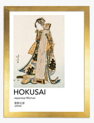
Hokusai Japanese Elegance Art Print
Translation missing: en.products.product.sale_price From 178.00 kr255.00 kr -

Kyoto Street Scene Art Print
Translation missing: en.products.product.sale_price From 178.00 kr255.00 kr -

Zen Black Cat Pose Art Print
Translation missing: en.products.product.sale_price From 178.00 kr255.00 kr -

Zen Pup in Profile Art Print
Translation missing: en.products.product.sale_price From 178.00 kr255.00 kr -

Tranquil Islands by Shin Bijutsukai Art Print
Translation missing: en.products.product.sale_price From 178.00 kr255.00 kr -
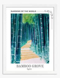
Kyoto Bamboo Path Art Print
Translation missing: en.products.product.sale_price From 178.00 kr255.00 kr -

Modern Bauhaus Retreat Art Print
Translation missing: en.products.product.sale_price From 178.00 kr255.00 kr -

Serene Minimalist Silhouette Art Print
Translation missing: en.products.product.sale_price From 178.00 kr255.00 kr -

Zen Black Cat Canvas Print
Translation missing: en.products.product.sale_price From 713.00 kr1,018.00 kr -

Indigo Organic Rhythm Art Print
Translation missing: en.products.product.sale_price From 178.00 kr255.00 kr -

Bamboo Grove Kyoto Path Art Print
Translation missing: en.products.product.sale_price From 178.00 kr255.00 kr -

Kyroto Tranquil Bamboo Grove Art Print
Translation missing: en.products.product.sale_price From 178.00 kr255.00 kr -

Kamisaka Sekka Ivy Elegance Art Print
Translation missing: en.products.product.sale_price From 178.00 kr255.00 kr -

Vintage Willow Elegance Art Print
Translation missing: en.products.product.sale_price From 178.00 kr255.00 kr -

Elegant Geisha by Hokusai Art Print
Translation missing: en.products.product.sale_price From 178.00 kr255.00 kr


More from The Frame

Why William Morris Prints Look Brilliant in Mod...
William Morris has been quietly miscategorised for decades. His patterns get filed under "country cottage" or "Arts and Crafts revival" and rarely escape, which is a shame because his tree...

Why Arts and Crafts Nature Prints Are the Antid...
The minimalism hangover: why bare walls stopped feeling calming For about a decade, the aspirational interior was a white box with one boucle chair in it. That look has officially...

Botanical Petal Art: Why Close-Up Prints Feel M...
Full florals have had a long run, and they're not going anywhere. But if you've noticed that the botanical art appearing in design magazines, boutique hotel lobbies, and the better-styled...