Solid wood. Professionally framed. Arrives ready to hang.
Make your print ready to hang.
Dining Room Art Prints
4.8
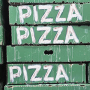
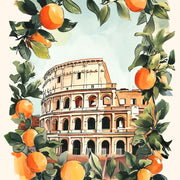
Dining rooms carry a mood, and the art on the wall sets it. Warm Amalfi coastlines and old Italian travel posters make a table feel like somewhere you'd linger; Mediterranean art prints do the same in softer light. If your table is where friends eat and drink for hours, food & drink art prints lean into that. For something quieter behind the chairs, try vintage art prints in muted tones.
The paper quality is excellent, and the print looks beautiful. The only downside was that it took a few weeks to arrive, but overall, I’m very pleased with it.
Beautiful print and the frame looks really nice .
I hung it in my newly remodeled bathroom to remind me that Tuscany is on my bucket list to visit It’s contemporary, bright, just what I wanted.
Most dining room art advice treats style as an afterthought, listing every possible subject and material and leaving you to work out what actually goes together. This guide does the...
Dining rooms have spent a decade playing it safe with grey, beige and "calming" abstract shapes. That era is ending. The trends shaping dining walls now are warmer, more personal,...
Most room-by-room art guides give you mood words like "calming" for bedrooms and "energising" for kitchens, then leave you to figure out the rest. This isn't that guide. Here you'll...
Choosing art for the dining room
Answers on scale above a table, hanging height, colour matching and framed versus unframed
How should I choose art for an open-plan kitchen-diner so both zones feel connected?
Treat the whole space as one visual sequence rather than two rooms. Start from the sightlines you use most, then pick pieces that share a palette, subject family or style, so a color from the cabinets, backsplash or upholstery reappears in the dining artwork. Give the dining wall the larger statement piece, since it is usually the focal point, and keep kitchen-side prints smaller and quieter. Vary subjects slightly so each zone keeps its own character, and choose matching frames or all unframed prints for an easy through-line. You may also like our Kitchen Art Prints.
Which colors work best for dining room art if my walls and furniture are neutral?
With neutral walls and furniture, the safest and most effective approach is art built on warm earth tones that echo your wood finishes: terracotta, ochre, caramel, olive and clay, lifted by one saturated accent such as deep blue, forest green or oxblood. Pull that accent from something already in the room, like a rug or chair fabric, so the piece reads intentional rather than random. If you prefer calm, choose tonal cream, sand and charcoal works and let texture and scale supply the drama. Black-and-white pieces in warm-metal frames also sharpen a neutral scheme.
How do I pick dining room art that suits a traditional or formal dining room?
Lean on classic subjects and symmetry. For a traditional or formal dining room, choose old master style still lifes with fruit, wine or table settings, pastoral landscapes, botanical studies or classical portraits, in rich colors such as deep green, burgundy, navy and warm gold that echo your wood furniture, drapery and rug. Framed prints generally read more formal than unframed; dark wood or gilded frames suit the look. Hang one large piece centered above the sideboard at eye level, or a matched pair or set for balance. Framed pieces arrive ready to hang. For a related option, explore our Food & Drink Art Prints.
What size art print works best above a dining table?
For a standard 6-seater dining table (roughly 150cm wide), we'd go with a single large print at 70x100cm or a pair of 40x50cm prints hung side by side with about 5cm between them. The art should fill roughly two-thirds of the table's width so it feels intentional, not lost. Our framed dining room art prints go up to 70x100cm, which is the sweet spot for making a real statement without overwhelming the space. If your table sits against the wall, hang the centre of the print at around 145cm from the floor so it reads well both standing and seated.
Which subjects actually work in a dining room?
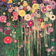
Still life, botanical prints, and warm abstract compositions are our top picks for dining room wall art. They create a sense of abundance and warmth without being distracting during conversation. We'd steer you away from anything too busy or overly dramatic (dark moody landscapes can feel heavy when you're eating). For a modern dining room, a bold abstract or a clean architectural print brings energy. For a more traditional setting, classic still life or muted botanical prints feel right at home.
Will the prints fade if my dining room gets a lot of natural light?
Not a chance. Our framed art prints use UV-protective acrylic glaze that prevents fading even in direct sunlight, and our museum-grade inks are rated to last hundreds of years. So if your dining table sits next to a big south-facing window, you're completely covered. The acrylic glaze also eliminates glare, which is a genuine bonus in bright dining spaces where you'd otherwise get a blinding reflection off standard glass during meals.
I've had framed prints arrive warped or badly fitted before. How are yours different?
This is the most common complaint in the art print world, and it's exactly what we built Fab to fix. Every framed print ships as one piece, already properly fitted into a solid FSC-certified wood frame with fixtures attached, ready to hang straight out of the box. No separate frame to wrestle with, no bubbling behind the glass, no warped MDF. Thousands of customers have told us the quality is better than expected, and we back everything with a 99-day returns policy if you disagree.
How do I choose dining room art that ties the whole room together?
Pull one or two accent colours from what's already in the room, whether that's your chair upholstery, a rug, or even your crockery, and look for prints that echo those tones. You don't need an exact match; a print that picks up on the warmth of your wooden table or the cool grey of your walls will feel cohesive without looking like a paint chart. If your dining room is mostly neutrals, that's actually the best canvas for art. Go for a print with one confident pop of colour to give the space a focal point it's probably missing.
Choosing a selection results in a full page refresh.