
 Order today for delivery by
 Orange Art Prints
Orange does the work of a lamp: it warms a room fast. Here you'll find everything from burnt terracotta and rust to bright Campari reds and sunlit citrus, bold graphic pieces, vintage drinks posters, still lifes and landscapes. If you want a specific mood, orange abstract art prints tend to feel modern and calm, while orange floral art prints bring softer warmth. Neighbouring shades sit in red art prints and yellow art prints.


Striped Summer Shade Art Print
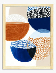
Bowl Study in Navy and Rust Art Print

Klimt Art Nouveau Bloom Exhibition Poster Art Print

Prague Old Town Square Sketch Art Print

Beagle on Blue Bones Art Print

Coffee Pot and Mugs with Faces Art Print

Italian Coastal Pathway Art Print

Fresh Tabletop Gathering Art Print

Fairway Waves Golfer Art Print

Queen of Cocktails Art Print

William Morris Inspired Red Fox Art Print

Little Tiger Watercolour Study Art Print

Desert Pastel Serenity Art Print

Espresso Martini — Classic Cocktails Art Print

Positano Coastline Vibes Art Print

Adriatic Promenade Art Print

Eclipse in Coral and Olive Art Print

Spotted Boston Terrier on Orange Art Print

Modernist Living Room Poster Art Print

Four French Bulldogs Pop Portrait Art Print

Ocean Sunset, Matisse Inspired Art Print

Brazil Icons in Watercolour Art Print

Sunlit Italian Courtyard Art Print

Disco Ball Orange Art Print

Red Peacock and Gold Blossom Art Print

Blue Pug on Orange Art Print

Moonrise Over the Red Peak Art Print

Matisse Nude with Oranges Art Print

Salute! Italian Feast Art Print
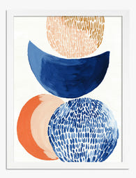
Stacked Shapes in Navy and Orange Art Print

Cornwall Land's End Travel Poster Art Print

Margarita - Classic Cocktails Art Print

Italian Riviera Coastline Art Print

Winter Stroll Together Art Print

Khonsu, Egyptian Moon God Art Print

Sunlit Mediterranean Village Art Print
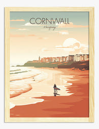
Cornwall Newquay Surfer Travel Poster Art Print

Eclipse in Olive and Coral Art Print

Gallery of Cats Art Print

Blue Afghan Hound on Orange Art Print

Border Collie in Blue and Orange Art Print

Peach Retro Risograph Art Print

Striped Beach Umbrella Against Blue Sky Art Print

White Petals, Bright Ground Art Print

Playful Pups in Shades Art Print

Mediterranean Coast Retreat Art Print
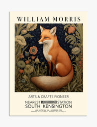
William Morris Fox Exhibition Poster Art Print
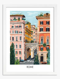
Rome Pastel Cityscape Art Print
More Fab art curations


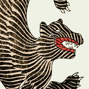


Colour Ideas From The Frame
How orange behaves on different walls, and what to hang beside it from The Frame, Fab's blog.

Best Orange Artwork for Bedrooms: Shades, Sizes...
Orange has a reputation problem in bedrooms. Designers regularly warn against bright, saturated oranges because they stimulate rather than soothe, which is the opposite of what you want in a...
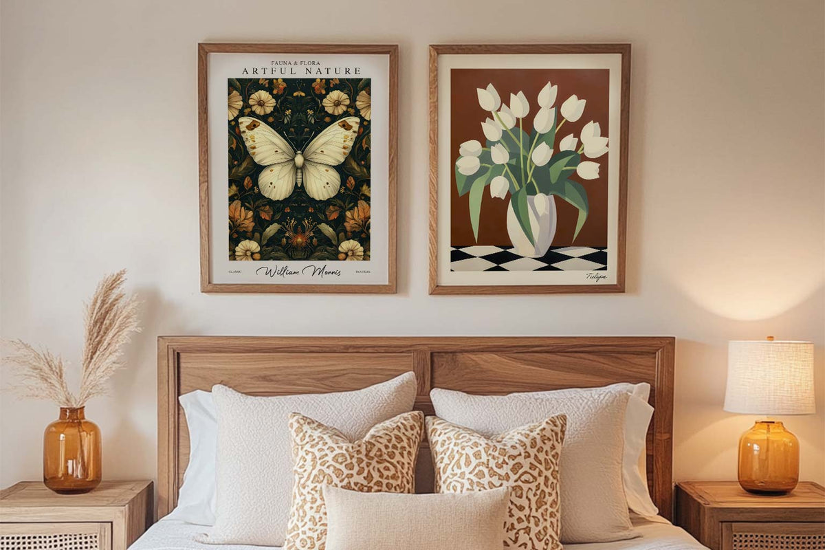
Starter Art Prints for First-Time Buyers
A blank wall can be intimidating. You know you want art, but where do you even start? You scroll through endless options online, walk through galleries feeling lost, or stare...
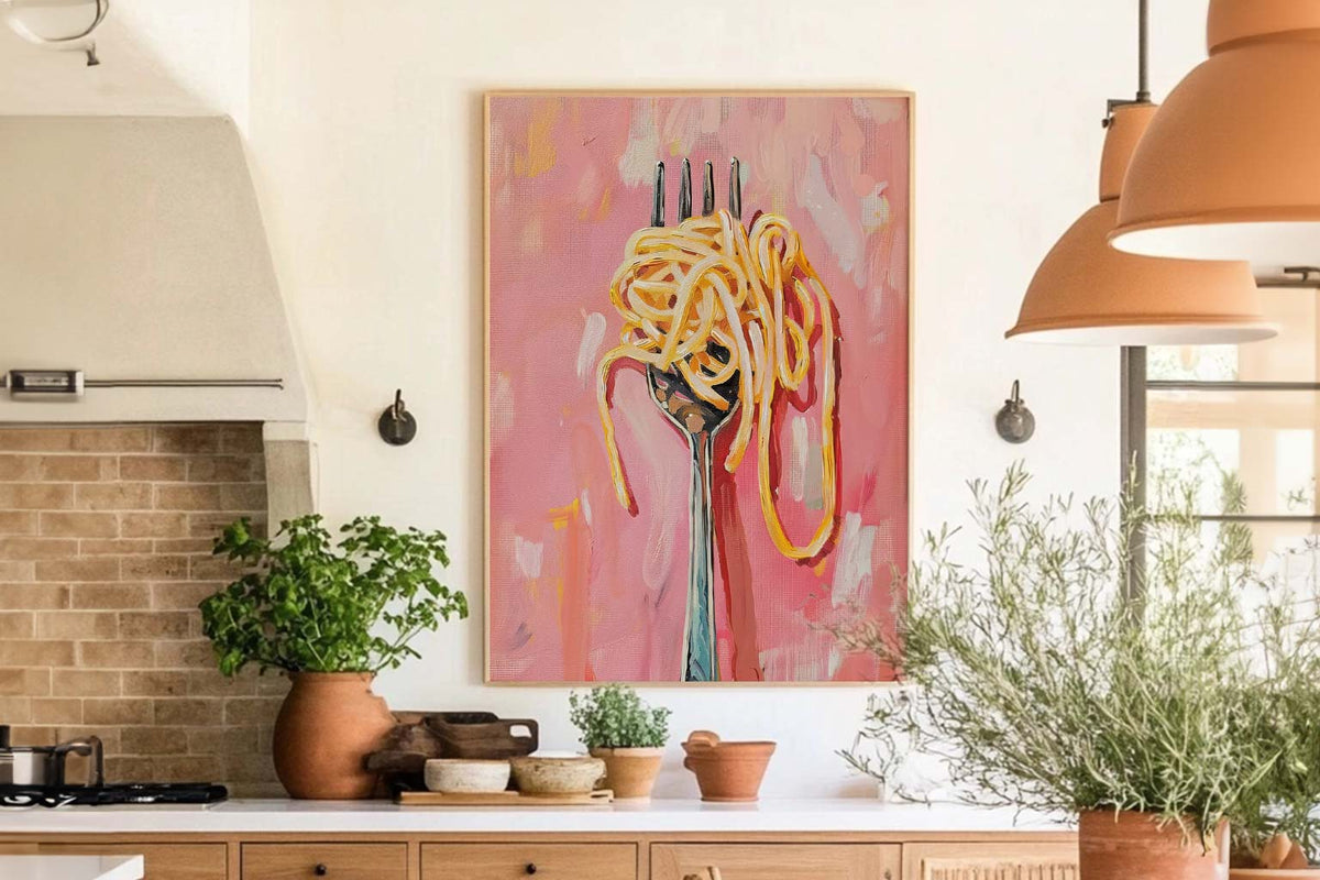
The Best Wall Art for Kitchens and Dining Spaces
Your kitchen isn't just for cooking. Your dining room isn't just for eating. These are the spaces where life happens. Where you have your morning coffee, where friends gather around...
 Buying orange art: your questions



Short answers on shades of orange, framing choices, delivery and sending something back