
 Pide hoy, entrega el
 Are Botanical Prints Still in Style? Why They Work Better Than Ever in Modern Homes
The Victorian parlour association is fading fast, and biophilic design has quietly made ferns and foliage feel current again.


Yes, botanical prints are still in style. But the version of botanical art that feels current in 2025 looks very little like the pastel rose bouquets in gilt frames you might be picturing. The difference between a botanical print that feels timeless and one that feels dated comes down to a handful of specific choices, and this article walks through all of them.
A brief history of botanical prints on walls: from curiosity cabinets to Instagram
Botanical illustration started as science, not decoration. In the 17th and 18th centuries, artists like Maria Sibylla Merian and Georg Ehrenreich Ehret worked alongside naturalists to document plant species with a precision no camera could match. Their plates ended up bound in reference volumes, hung in universities, and pinned inside the curiosity cabinets of wealthy collectors.
By the Victorian era, botanical prints had moved firmly into the home. Pressed ferns, hand-tinted lithographs, and framed plates became a shorthand for education and refinement, which is exactly why the aesthetic later came to feel stuffy. That parlour association is the ghost most people are worried about when they ask whether botanical prints still work.
The 20th century flattened the category into wallpaper motifs and greetings-card florals, and by the 1990s botanicals were quietly filed under "grandmother's house." Then something shifted. Around 2015, biophilic design principles started filtering out of architecture journals and into mainstream interiors, and nature imagery came back with a completely different mood.

Why biophilic design put botanical art back at the centre of interiors
Biophilic design is the practice of bringing natural elements into built spaces, based on the idea that humans function better when surrounded by references to the living world. That means real plants, natural materials like linen and oak, views of green space, and yes, art depicting the natural world.
The wellness-adjacent case for it has been made in offices and hospitals for years, and it has now filtered into how people think about their homes. If you can't have a garden view from every room, a well-chosen botanical print does a surprising amount of the same emotional work.
This is why the trend has legs. It isn't a passing aesthetic mood, it's tied to a broader shift in how people want their homes to feel: calmer, more grounded, more connected to the outside. Botanical art prints slot into that conversation naturally, which is why they're showing up in interiors that would have rejected them a decade ago.
The version doing the heavy lifting now looks nothing like the Victorian original. Think a single fern silhouette on a deep charcoal ground, or a large-scale monstera leaf in monochrome, or a heritage plate lifted from the Kew Gardens archive and printed at proper museum quality. The subject matter is old. The styling is not.
Vintage botanical prints vs modern botanical art: which suits your space
The single most useful thing you can do before buying is decide which side of this divide you're on, because they look and behave very differently.
Vintage botanical prints
Vintage botanical prints are the heritage-style plates: hand-drawn illustrations with Latin nomenclature, often on aged cream backgrounds, sometimes signed by figures like Redouté or lifted from 19th-century reference books. They carry a scholarly, slightly formal air. They work brilliantly in period properties, in book-lined studies, in bathrooms with panelled walls, and anywhere you want a sense of quiet permanence.
Where they fail is in interiors that lean minimalist or overtly contemporary. A single vintage plate in a stark white-walled flat can look marooned. They want context: warm wood, ceramics, old rugs, other layered objects. If you go this route, our vintage art prints and Kew Gardens botanical collection are worth a proper look, because the printing quality is what stops them tipping into "hotel gift shop."
Modern botanical art
Modern botanical art is graphic, high-contrast, and typically simpler in composition. A single stem against a flat colour ground. A dark, moody floral that reads almost like a still life painting. A pared-back ink drawing with generous negative space. The palette skews sage, black, deep green, terracotta, or clean off-white, rather than pastel.
This version plays much better with contemporary furniture, mixed-material interiors, and rooms that lean architectural. It also scales up more comfortably. A modern single-stem print at 70x100cm can hold a whole wall, whereas a vintage plate at the same size can feel like it's shouting.
Neither is better. They're just answering different questions.

The rooms where botanical prints work hardest right now
Botanical art is one of the few categories that genuinely works almost anywhere, but "works" isn't the same as "works hardest." A few rooms make botanicals sing.
Bathrooms. This is the sleeper hit. The steam-and-plant association makes botanicals feel completely at home, and a print above the bath or beside the basin adds warmth to what is otherwise a hard-surfaced room. Our UV-protective acrylic glaze matters here, because it doesn't fog or reflect harshly the way glass does, and the prints handle humidity better than framed paper alone would.
Kitchens. Herbs, citrus studies, and vegetable plates all belong here, and they work particularly well in a galley or above a run of open shelving. Keep the scale modest and the framing simple.
Bedrooms. Botanicals in a bedroom tend to work best when they're moody rather than cheerful. A dark floral above the bed, or a pair of ferns flanking a mirror, brings the calm of the garden inside without turning the room into a cottage tea shop.
Living rooms. This is where scale becomes critical, and where most people go wrong. If you're looking at options for living room wall art, plan for something significantly larger than your instinct tells you. More on that below.
Hallways and stair walls. A gallery of smaller botanical plates works well here because you view them at close range as you walk past. This is one of the few places we'd recommend a grouping of six or eight prints rather than one large piece.
How to keep botanical prints feeling fresh (hint: it's about what you pair them with)
The print itself is only half of the equation. What surrounds it determines whether the room reads as "considered contemporary interior with botanical accent" or "chintzy tea room."
Pair with clean-lined furniture. Botanicals want a bit of tension against their subject matter. A sharp, modern sofa in bouclé or clean linen throws a heritage print into relief. Pile them onto an already-fussy furniture arrangement and the whole thing collapses into pattern soup.
Use natural materials, but not too many. Oak, linen, rattan, wool, ceramic. Two or three natural textures in a room is grounding. Six is a farmhouse.
Mix in non-botanical art. The fastest way to date a botanical print is to hang it in a room where every piece of art is also botanical. Break it up. An abstract, a photographic landscape, a piece of typography. The botanical becomes one voice in a conversation rather than the whole chorus.
Keep the framing quiet. Ornate gold, distressed white, and heavy carved wood all pull botanicals backward in time. A slim black, natural oak, or plain white frame keeps everything current. Fab's frames are solid FSC-certified wood in clean profiles, which does most of the work for you.
Size up. The most common mistake is buying too small. A 30x40cm print above a three-seater sofa looks like a postage stamp. As a rule of thumb, art above furniture should span roughly two-thirds of the furniture's width. Most people undersize by about a third. Trust the bigger option.

Colour palettes that bring botanical wall art to life
The colour you choose does more work than the specific plant depicted. Four palettes are doing the heavy lifting in current interiors.
Sage and cream. Soft, restful, and endlessly workable. Sage botanicals against off-white walls give you the biophilic hit without any visual noise. Works particularly well in bedrooms and north-facing rooms that need warming without brightening.
Deep green and black. The moody end of the spectrum. Think dark-ground florals, ferns on charcoal, or ink-black botanical silhouettes. These punch above their weight in small rooms because the darkness creates depth. Excellent in downstairs loos, snugs, and dining rooms.
Terracotta and rust. A warmer, earthier route that suits interiors leaning towards Mediterranean or mid-century. Dried grasses, seed heads, and autumnal foliage sit naturally in this palette. Pair with cream walls and warm woods.
Black and white. The safest choice and, done well, the sharpest. Line-drawn botanicals or high-contrast photographic plates in monochrome will hold up in almost any interior for decades. If you're nervous about commitment, start here.
The palette you avoid is dusty pastel: powder pink, baby blue, lemon yellow. These are the colours that read as dated fastest, because they carry the strongest association with the 1980s and 1990s incarnation of the botanical trend.
The quality question: why printing and framing make or break the look
You can buy the same botanical image at wildly different price points, and the difference in how it looks on your wall is enormous. This isn't marketing. It's a function of three things.
Print quality. Cheap botanical prints tend to have flat, oversaturated colour and visible dot patterns when you get close. Museum-grade giclée printing on thick matte paper, which is what we use, holds fine detail like leaf veins and stamens, and the matte finish means no glare and no plasticky sheen. Botanical subjects live or die by detail, so this matters more here than in almost any other art category.
Ink longevity. Botanicals in bathrooms, kitchens, and sunny rooms are exposed to more light and moisture than most art. Fugitive inks fade to yellow within a couple of years. Archival, water-based inks under UV-protective acrylic glaze will hold their colour for hundreds of years even in direct sunlight. That's the difference between a print you own for a decade and one you replace after eighteen months.
Framing. This is where most botanical prints go wrong, and where most retailers cut corners. Warped frames, prints shipped separately from their frames, cardboard backings that bubble, glazing that arrives cracked. Our framed prints arrive in one box, properly fitted, ready to hang, with the fixtures already attached. It sounds like a small thing until you've spent an hour trying to fit a print into a frame that doesn't quite match its dimensions.
If you're weighing framed against unframed, framed almost always looks more considered for botanicals specifically, because the frame acts as a visual boundary between the natural subject and your interior. Unframed canvas works better for large, graphic modern botanicals where you want the image to feel immersive.

Where to land
Botanical prints aren't dated. The Victorian version of them is. If you're picking a piece today, choose one clear direction (heritage-scholarly or graphic-modern), size up more than feels natural, pair it with clean-lined furniture and one or two natural textures, and spend where it counts on print and framing quality. Do those things and botanical art will look as current in ten years as it does today. Skip them and no amount of trend backing will save it.
For most people starting out, a single well-scaled piece in a considered palette does more work than a wall of small prints. Begin there. You can always build outwards once you know how it feels in the room.

Productos Fab destacados en este blog
-

Lámina botánica vintage en verdes profundos
Precio de oferta Desde €16,95€23,95 -

Lámina botánica Morris Heritage
Precio de oferta Desde €16,95€23,95 -

Lámina botánica moderna en verde y marfil
Precio de oferta Desde €16,95€23,95 -
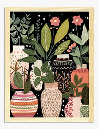
Lámina jarrones botánicos estilo boho
Precio de oferta Desde €16,95€23,95 -

Lámina elegancia botánica en verde claro
Precio de oferta Desde €16,95€23,95 -

Lámina botánica Morris en verde petróleo
Precio de oferta Desde €16,95€23,95 -

Lámina botánica moderna con estallido floral
Precio de oferta Desde €16,95€23,95 -

Lámina botánica de jarrones boho
Precio de oferta Desde €16,95€23,95 -

Lámina botánica moderna en verde intenso
Precio de oferta Desde €16,95€23,95 -

Lámina botánica de mariposa inspirada en William Morris
Precio de oferta Desde €16,95€23,95 -

Lámina jardines botánicos de Dublín
Precio de oferta Desde €16,95€23,95 -

Lámina jarrones con flores de estilo moderno
Precio de oferta Desde €16,95€23,95 -

Lienzo botánico vintage en verde oscuro
Precio de oferta Desde €65,95€93,95 -

Lámina botánica azul fluida
Precio de oferta Desde €16,95€23,95 -

Lámina botánica de magnolias y pájaro inspirada en William Morris
Precio de oferta Desde €16,95€23,95 -

Lámina botánica verde de Morris
Precio de oferta Desde €16,95€23,95 -

Lámina explosión botánica vibrante
Precio de oferta Desde €16,95€23,95 -

Lámina sendero del jardín de Edimburgo
Precio de oferta Desde €16,95€23,95 -

Lámina hojas botánicas de William Morris
Precio de oferta Desde €16,95€23,95


Más de The Frame

What Peacock Feathers Symbolise in Art: From An...
Few motifs have travelled as far or meant as many things as the peacock feather. It has been carved into Persian palaces, embroidered onto Mughal thrones, painted by Art Nouveau...

Room by Room: How to Style Matisse Botanical Pr...
You've decided on Matisse. Now you need to know where it goes, how big, and what frame. This is the part most guides skip. Living room: the statement print above...

Why Water Lily Art Is Having a Moment in Calm, ...
The loudest botanical prints have had their run. Monstera leaves, banana palms, oversized ferns in stark black frames all shouted "nature" in a way that now feels slightly performative. Water...