The Best Flower Prints for Every Room in Your Home (With Specific Picks)
A practical room-by-room guide to choosing floral art that actually suits the space, not just the Pinterest board.

Flowers are one of the few subjects that work in almost any interior, which is exactly why most flower prints end up feeling forgettable. The trick is matching the style, scale, and frame to the room rather than buying whatever looks nice on a screen. Here's how to do it properly.
Why flower prints work in almost every room (and the one room where they don't)
Floral imagery has a soft, organic quality that softens hard architectural lines, balances minimalist furniture, and adds colour without committing to a feature wall. There's also a body of research from environmental psychology suggesting that exposure to plant and flower imagery has a measurable calming effect, which is part of why florals turn up so often in hotels and spas.
The one room where they usually fall flat is a serious home office, the kind you use for client calls or focused work. Florals can read as decorative rather than considered, and a busy bouquet behind your head on Zoom rarely does you favours. If you work from home in a professional capacity, save the flowers for elsewhere and choose something more architectural for the office wall.
Everywhere else is fair game. The rest of this guide is about doing it well.

Living room: go big or go paired
The living room is where most people undersize their art. A 30x40cm print floating above a three-seater sofa looks like a postage stamp. As a rule, your art (or arrangement) should span roughly two-thirds the width of the sofa or sideboard it sits above. For a standard 200cm sofa, that means a single piece around 100x70cm or 70x100cm, or a pair of 50x70cm prints hung side by side with about 5cm between them.
This is the room to be bold. Large-scale floral paintings, oversized poppies, dramatic dark-background still lifes, abstract florals with strong brushwork. The best flower prints for the living room have enough visual weight to anchor the seating area without competing with the sofa for attention.
If your living room is mostly neutral (oatmeal sofa, oak floors, cream walls), one statement floral in a saturated palette does more work than three quieter pieces. If your living room is already busy with pattern and colour, a moody botanical study with a dark green or near-black background can ground everything else.
A pairing trick that almost always works: two prints from the same artist or series, hung as a diptych above the sofa. It reads as more intentional than a single piece and avoids the "one lonely print" problem. Browse the full living room wall art range with this two-thirds rule in mind and you'll narrow your options quickly.
Bedroom: soft tones and simple compositions
The bedroom is the one room where you can almost never go wrong with restraint. Soft tones means dusty pink, sage green, oatmeal, faded ochre, pale blue, muted lavender. Simple compositions means one or two stems against a clean background, a single bloom in close-up, or a loose watercolour rather than a tight, busy bouquet.
Avoid anything with high contrast or strong reds. You're trying to wind down in this room, and a punchy crimson rose is the visual equivalent of a triple espresso. Save those for the dining room.
For sizing above the bed: a single piece should be roughly the width of the headboard minus 20cm, so for a standard 150cm double bed, aim for a 100x70cm landscape print or a 70x100cm portrait if your ceilings are tall. For king-size beds (180cm wide), a triptych of three 40x50cm prints hung with 5cm gaps works beautifully and gives you a 130cm spread.
Watercolour florals and loose ink botanicals are particularly well suited here because the softness of the medium reinforces the softness of the space. The flower art prints collection has plenty of options in this register, and you can also look at proper botanical art prints if you prefer something more structured and illustrative.
A quick note on the difference, because it matters. Botanical prints are traditionally scientific or illustrative: a single plant species rendered with detail and accuracy, often with Latin names. Floral art is more painterly and expressive: bouquets, still lifes, abstract studies. Bedrooms tend to suit either, but if your style leans heritage or country, botanicals look more considered. If your style is contemporary or romantic, floral art usually wins.

Hallway: the underrated power of a single botanical print
Hallways are narrow, often dimly lit, and tend to get ignored. Most people either leave them blank or default to a row of small prints that feels like an afterthought. There's a better move: one single, well-framed botanical print at eye level, ideally somewhere you naturally pause (above a console, at the end of the hallway, or opposite the front door).
A single structured botanical illustration, the kind with a clearly drawn fern, eucalyptus stem, or magnolia branch on a pale background, works particularly well in hallways because it reads quickly. You're not lingering in a hallway. You want something your eye can resolve in a glance.
Stick to portrait orientation in narrow hallways (50x70cm is a good default) and landscape only if you have a console or radiator cover beneath it to balance the proportions. Vintage-style botanical illustrations in cream mounts and slim black frames are a classic for a reason. They look expensive without trying.
If you have a longer hallway and genuinely want more than one print, hang them as a series of three or four identical-sized botanicals, all the same frame, evenly spaced. Same artist or same style. This is not the place to mix and match.
Kitchen and dining room: vintage florals that hold their own against the chaos
Kitchens are visually busy. Tiles, appliances, open shelving, that pile of post on the counter. Subtle art gets lost. The answer isn't louder art, it's art with structure and history.
Vintage-style florals (think 18th and 19th century botanical illustrations, French market posters, antique seed packet artwork) hold up beautifully in kitchens because they have built-in visual weight from their reference period. A pair of vintage rose lithographs in slim gold frames above a kitchen banquette will outlast every trend cycle.
In dining rooms, you can push further. This is the room for moody Dutch still lifes, oversized peony paintings, dark backgrounds, dramatic chiaroscuro. Dining rooms are often used at night under softer lighting, and rich, saturated florals come alive in that context in a way they don't under bright overhead light.
Sizing is more forgiving here because dining rooms tend to be more formally arranged. A single 70x100cm portrait above a sideboard, or a pair of 50x70cm prints flanking a mirror, both work well.
One practical note: kitchens and dining rooms get more grease and food particles in the air than people realise. UV-protective acrylic glazing (which is what we use across our framed prints) is easier to wipe clean than glass and won't shatter if a frame ever takes a knock from a kitchen cupboard door.

Bathroom: what to consider with humidity and light
Bathrooms are the room everyone forgets, and they're also the room with the most practical constraints. Humidity is the big one. Standard framed prints with paper-backed mounts and traditional glass can develop condensation, warping, and even mould spotting over time in a poorly ventilated bathroom.
A few things actually matter here:
Canvas prints handle humidity better than framed paper prints. A hand-stretched canvas on a solid wood frame doesn't trap moisture the way a sealed frame does, and the poly-cotton blend is more forgiving in fluctuating conditions. If your bathroom has minimal ventilation, canvas is the safer choice.
If you do go for framed prints, choose acrylic glazing over glass. Acrylic is lighter, won't shatter, and creates less condensation differential than glass. Our framed prints use UV-protective acrylic as standard, which also matters in bathrooms with a south-facing window, because direct sunlight will fade unprotected prints surprisingly fast.
Keep prints away from the direct splash zone. Above the toilet, on the wall opposite the bath, or above a vanity is fine. Directly above the bath itself or next to the shower screen is asking for trouble regardless of materials.
For style, bathrooms are the natural home of black-and-white botanical photography, simple line drawings of stems and leaves, or pale watercolour single blooms. The cleaner the better. Busy florals fight with tilework. Sizing should be modest: 30x40cm or 40x50cm is usually right unless you have a very large bathroom.
How to pick the right frame finish for each space
Frame finish does more heavy lifting than most people realise. Here's the shortlist we'd recommend.
Natural oak or ash: the most versatile finish. Works in bedrooms, hallways, and any room with wooden floors or Scandi-leaning furniture. Soft enough not to compete with the art.
White: best in bedrooms with very pale walls, bathrooms, and gallery walls where you want the frames to recede and the art to do the talking.
Black: the right choice for living rooms, dining rooms, and statement pieces. Adds graphic weight and works particularly well with bold, saturated florals or black-and-white photography.
Warm gold or brass: dining rooms, formal living rooms, and anywhere with vintage-style or traditional florals. Don't use gold with cool-toned modern florals; the temperatures clash.
A general principle worth knowing: solid wood frames hold their shape over years and don't warp the way MDF or veneer frames do. This matters more in older homes with seasonal temperature swings, and it's why every frame we make is FSC-certified solid wood with the print properly fitted before it ships, in one box, ready to hang.

Size guide: a quick cheat sheet by room
A rough reference for the most common scenarios:
- Above a 200cm sofa: one 100x70cm landscape print, or a pair of 50x70cm portraits
- Above a 150cm double bed: one 70x100cm portrait, or a pair of 40x50cm prints
- Above a 180cm king bed: one 100x70cm landscape, or a triptych of three 40x50cm prints
- Hallway console: one 50x70cm portrait at eye level (roughly 145cm to the centre of the print)
- Above a dining sideboard: one 70x100cm portrait, or a 60x80cm landscape
- Bathroom (above vanity or toilet): one 30x40cm or 40x50cm print
- Kitchen wall above a banquette or shelf: a pair of 30x40cm prints, or one 50x70cm
Hang centres at roughly 145-150cm from the floor when the wall is otherwise empty. When hanging above furniture, leave 15-20cm of breathing room between the top of the furniture and the bottom of the frame.
A final word
Pick the room first, then the print. Most bad art purchases happen the other way around: someone falls for an image, orders it in whatever size looked good on screen, and ends up with something that doesn't fit the wall or the space. Start with the dimensions, the light, and the existing palette, and the right print becomes much easier to spot. Florals are forgiving, but they're not magic. Treat them like any other design decision and they'll quietly hold the room together for years.

Productos Fab destacados en este blog
-

Lámina jardín de flores de Gustav Klimt
Translation missing: es.products.product.sale_price Desde €16,95€22,95 -

Lámina prado de flores silvestres inspirada en Klimt
Translation missing: es.products.product.sale_price Desde €16,95€22,95 -

Lámina sueño floral de Klimt
Translation missing: es.products.product.sale_price Desde €16,95€22,95 -

Lámina jardín de flores de Klimt
Translation missing: es.products.product.sale_price Desde €16,95€22,95 -
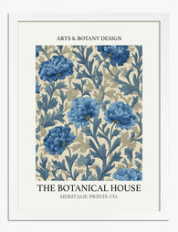
Lámina floral azul clásica
Translation missing: es.products.product.sale_price Desde €16,95€22,95 -

Lámina jardín de flores de Klimt
Translation missing: es.products.product.sale_price Desde €16,95€22,95 -

Lámina flores de jardín vintage
Translation missing: es.products.product.sale_price Desde €16,95€22,95 -
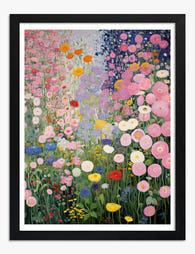
Lámina armonía floral de Klimt
Translation missing: es.products.product.sale_price Desde €16,95€22,95 -

Lámina paraíso floral de Klimt
Translation missing: es.products.product.sale_price Desde €16,95€22,95 -

Lámina botánica morada vintage
Translation missing: es.products.product.sale_price Desde €16,95€22,95 -

Lámina sinfonía floral de Klimt
Translation missing: es.products.product.sale_price Desde €16,95€22,95 -

Lienzo jardín de flores estilo Klimt
Translation missing: es.products.product.sale_price Desde €64,95€91,95 -

Lámina escena animada de mercado de flores
Translation missing: es.products.product.sale_price Desde €16,95€22,95 -

Lámina damero en blanco y negro con flor surrealista
Translation missing: es.products.product.sale_price Desde €16,95€22,95 -

Lámina armonía floral en azul
Translation missing: es.products.product.sale_price Desde €16,95€22,95 -

Lámina rosas de Vincent van Gogh
Translation missing: es.products.product.sale_price Desde €16,95€22,95 -

Lámina flores del jardín de Gustav Klimt
Translation missing: es.products.product.sale_price Desde €16,95€22,95 -

Lámina bosque de flores silvestres inspirada en Klimt
Translation missing: es.products.product.sale_price Desde €16,95€22,95 -

Lienzo jardín de flores de Klimt
Translation missing: es.products.product.sale_price Desde €64,95€91,95 -

Lámina jarrones con flores de estilo moderno
Translation missing: es.products.product.sale_price Desde €16,95€22,95


Más de The Frame

What Interior Designers Know About Styling Japa...
Japanese bird prints are quietly the most versatile art you can buy. They sit happily in a modernist flat, a Victorian terrace, or a beige rental, and they rarely fight...

Botanical Prints vs. Floral Art: What's the Dif...
If you've searched for "botanical art prints" and ended up scrolling through everything from Victorian fern studies to neon abstract peonies, you're not imagining the chaos. The two categories get...

Modern Floral Prints That Don't Look Dated: 7 S...
Floral prints have a reputation problem. Mention them to anyone under 40 and they picture chintz curtains, peach watercolour bouquets in oval frames, or those identical rose prints that haunted...