
 Pide hoy, entrega el
 Láminas botánicas vs tropicales: la guía definitiva para elegir el arte de hojas perfecto para tu casa
One is a quiet 19th-century herbarium. The other is a Tulum holiday on your wall. Here is how to choose.


Estás haciendo scroll entre arte de hojas y dudando entre un helecho prensado delicado y una monstera gigante que ocupa media pantalla. Parecen primas, pero en la pared se comportan de forma muy distinta. Esta es la guía que por fin te explica cuál merece un lugar en tu casa, y por qué.
Qué hace que una Lámina sea "botánica" o "tropical" de verdad
Las Láminas botánicas beben de la ilustración científica. Piensa en herbarios victorianos, especímenes prensados, trazos a mano y nombres latinos en cursiva al pie. La composición suele ser serena: un tallo, un ramito de helecho, un estudio de vainas sobre papel crema o marfil. El detalle es fino, la paleta contenida y la sensación, académica.
Las Láminas tropicales son otra historia. Hojas grandes, alto contraste y un lenguaje muy contemporáneo. Monstera deliciosa con sus cortes y perforaciones. Hojas de platanera del tamaño de un plato. Palmeras, ave del paraíso, filodendro. Las composiciones son gráficas, a menudo muy encuadradas, y suelen usar verdes más intensos, negros profundos y, a veces, un toque de terracota o coral. Donde las botánicas susurran, las tropicales se anuncian.
La prueba sencilla: si parece que pertenece a un cajón de museo, es botánica. Si parece que pertenece al lobby de un hotel en Marbella, es tropical. Las dos son preciosas. Simplemente hacen trabajos distintos.

La zona gris: botánica moderna
Hay una tercera categoría que conviene nombrar porque confunde a mucha gente. Las ilustraciones botánicas modernas se sientan entre ambos mundos. Estudios de una sola hoja con líneas limpias, a menudo un helecho o un tallo de eucalipto, a veces impresos en colores inesperados como óxido o azul marino. Tienen la contención del trabajo botánico tradicional pero la confianza gráfica de lo tropical. Si te debates entre los dos estilos principales, suele ser la respuesta.
El ambiente que crea cada estilo: calma estudiosa vs jungla atrevida
Las Láminas botánicas calman. Se leen como consideradas, un punto vintage y con curiosidad intelectual. Una pared con estudios botánicos parece la casa de quien lee en el desayuno y tiene opiniones firmes sobre el té. El ritmo es pausado.
Las Láminas tropicales energizan. Aportan movimiento, escala y un optimismo muy de vacaciones a la estancia. Una gran monstera sobre el sofá cambia la temperatura del espacio. El ánimo es generoso y algo teatral.
Ningún ambiente es mejor que el otro. Pero conviene ser honesto con lo que de verdad quieres vivir a diario. Si trabajas desde casa y necesitas que el salón te ayude a desconectar a las 19:00, una pared llena de tropicales potentes puede jugar en tu contra. Si tu piso ya es tranquilo y te apetece darle vida, una sola Lámina de hoja de platanera sobre la consola lo cambia todo.
Qué estancias piden hojas tropicales (y cuáles no)
Las Láminas de hojas tropicales funcionan en espacios que ya tienen energía, o que quieres despertar.
Los salones son el acierto más evidente. Una monstera de 70 x 100 cm sobre el sofá te da un punto focal y una historia de color fácil alrededor. Los comedores también brillan, sobre todo si la habitación es sencilla: las tropicales hacen que las cenas se sientan un poco más de ocasión. Recibidores y pasillos ganan muchísimo: llegas a casa y te recibe algo con personalidad en lugar de una pared en blanco.
Los baños son un lugar infravalorado para las hojas tropicales. La asociación hoja + vapor funciona, y nuestros Lienzos aguantan mejor la humedad que las Láminas enmarcadas con cristal, porque no hay cristal que se empañe o atrape condensación. Puedes explorar toda la colección de láminas tropicales para ver qué escalas encajan en tu espacio.
Dónde sufren las tropicales: dormitorios pequeños, cuartos estrechos tipo caja y cualquier espacio con menos de 2,4 m de altura de techo en el que buscas calma. Una palmera enorme sobre una cama individual abruma, no relaja. Las Láminas tropicales necesitan aire alrededor. Si la pared mide menos de 1,5 m de ancho, normalmente es mejor ir a lo botánico.
Error común con las tropicales: demasiados estampados
Una sola Lámina tropical potente en una habitación con papel pintado con dibujo, alfombra con dibujo y cojines con dibujo es caos. Las tropicales piden al menos una superficie tranquila cerca. Pared lisa, sofá liso, alfombra lisa. Dale a la hoja espacio para brillar.
Dónde lucen las Láminas botánicas: dormitorios, estudios y rincones tranquilos
Las Láminas botánicas se ganan el sitio en las habitaciones pensadas para bajar revoluciones.
Los dormitorios son su hábitat natural. Un par de pequeños estudios de helechos enmarcados sobre la mesilla, o una fila de tres especímenes prensados sobre el cabecero, crean orden y serenidad para que el cuarto cumpla su función. Despachos en casa y rincones de lectura son la pareja obvia, porque las propias Láminas evocan estudio. Una cuadrícula de nueve ilustraciones botánicas de 30 x 40 cm sobre el escritorio se ve intencionada y con un punto clásico.

Salitas acogedoras, pasillos con poca luz y paredes de escaleras también funcionan muy bien. Las Láminas botánicas no necesitan mucha iluminación para lucir. El detalle recompensa la mirada cercana, justo lo que haces en un pasillo estrecho. Puedes ver toda la variedad en nuestra colección de láminas botánicas.
La única habitación donde las botánicas tradicionales pueden quedarse cortas es un salón muy moderno y minimalista. Si tu sofá es anguloso, tu mesa de centro es de travertino y tu iluminación son tiras LED cálidas, un estudio victoriano de helechos puede parecer un invitado despistado. Ahí la botánica moderna, o una ilustración de tallo único con líneas limpias, gana su sitio.
Por qué lo botánico funciona mejor en pequeño
Las Láminas botánicas tradicionales nacieron para libros y folios. Se leen más auténticas en tamaños contenidos: 30 x 40 cm, 40 x 50 cm o agrupadas en cuadrícula. Poner un helecho victoriano a lo grande puede hacerlo parecer un póster de un póster. Las tropicales, en cambio, piden escala. Una monstera pequeña se ve tímida. La misma imagen a 70 x 100 cm se ve segura.
Choques de paleta de color a vigilar
El error más común es elegir una Lámina por sus méritos y luego llevarla a una habitación con la que no puede convivir.
Las botánicas combinan mejor con:
- Neutros cálidos (crema, avena, beige piedra, topo suave)
- Verde salvia, eucalipto, oliva empolvado
- Terracota y arcilla apagadas
- Madera natural y ratán
- Paredes en blanco roto, nunca blanco puro
Las botánicas chocan con:
- Mobiliario negro en alto brillo
- Tonos joya saturados (esmeralda, zafiro, rubí)
- Acabados de cromo y acero pulido
- Esquemas de grises muy fríos
Las tropicales combinan mejor con:
- Paredes blanco nítido
- Toques de negro puro (marcos, zócalos, bases de lámpara)
- Maderas cálidas (nogal, teca, mango)
- Terracota, mostaza, coral profundo, ocre
- Texturas de hormigón y yeso
Las tropicales chocan con:
- Florales cursis y estampados menudos
- Todo en tonos pastel
- Papeles pintados muy recargados
- Paletas campestres tipo cottage (rosa, cuadros vichy, azules con ramitas)
Si tu casa ya tiene mucho en marcha, elige la Lámina que calme, no la que sume ruido. Si tu casa es tranquila y algo vacía, al revés.
¿Se pueden mezclar? Cómo combinar tropical y botánico en una pared de galería
Sí, pero con normas. Mezclar botánicas y tropicales puede parecer curadísimo o que no te decidiste. La diferencia está en la disciplina.
Regla 1: unifica los marcos
Lo más importante: usa un mismo marco en todas las Láminas. Mismo color, mismo grosor de perfil, mismo acabado. El roble natural funciona con ambos estilos. El negro fino también. El marco se convierte en el tejido conector que permite que convivan imágenes muy distintas. Nuestras Láminas enmarcadas llegan listas para colgar con herrajes incluidos, lo que hace que una pared de galería de 6 o 9 piezas sea mucho menos engorrosa de lo que parece.
Regla 2: mantén una paleta de color compartida
Elige un verde y sé fiel. Si tu monstera tropical es de un verde bosque profundo, busca Láminas botánicas en verdes similares en lugar del salvia suave típico de los especímenes prensados. O al revés: ilustraciones botánicas pálidas junto a tropicales desaturadas. El ojo detecta la coherencia de color antes que la coherencia de estilo.

Regla 3: usa una proporción 1:3
Por cada Lámina tropical protagonista, usa tres botánicas más pequeñas. Una grande de 70 x 100 cm como ancla tropical, rodeada de tres o cuatro botánicas de 30 x 40 cm, se lee como deliberado. Mitad y mitad se lee como indecisión.
Regla 4: varía los tamaños con intención
Una pared de galería con todas las Láminas del mismo tamaño parece un calendario. Mezcla una pieza grande (tu ancla tropical), dos medianas y tres o cuatro pequeñas. La tropical suele ser la mayor del conjunto, porque lo tropical pide escala y lo botánico, intimidad.
Regla 5: limítate a tres tipos de hoja
Más de tres plantas distintas en una pared y el ojo se inquieta. Monstera, helecho y eucalipto es interesante. Monstera, helecho, eucalipto, palmera, higuera y platanera es un vivero. La colección de láminas de hojas es un buen lugar para reducir a las tres que te hablan.
Nuestras elecciones: lo mejor de cada estilo en la colección
Si quieres una tropical protagonista
Una gran Lámina de monstera de 70 x 100 cm, enmarcada con perfil fino negro o como Lienzo sin marco, es la opción tropical más fiable que conocemos. Funciona sobre sofás, sobre camas en dormitorios amplios y en la pared larga del comedor. Las hendiduras de la hoja aportan interés interno para que nunca se sienta plana, y la silueta se lee desde lejos.
Las Láminas de hoja de platanera son una gran alternativa si quieres algo menos visto. La forma de la hoja es más simple, así que se sienta más discreta sin perder escala.
Si quieres un ancla botánica
Un par de estudios de helechos, enmarcados en roble natural a 50 x 70 cm y colgados en paralelo sobre la cama o el sofá, es el gesto botánico más atemporal. Los helechos tienen una simetría silenciosa que otras plantas no tienen, por eso llevan doscientos años siendo favoritos de los ilustradores.
Si buscas un toque más de color, fíjate en Láminas botánicas con vainas, hojas otoñales o flores silvestres prensadas. Aportan calidez sin perder el aire estudioso.
Si quieres una cuadrícula pequeña
Cuatro a seis Láminas botánicas pequeñas (30 x 40 cm) en una cuadrícula ajustada sobre una consola, escritorio o cómoda te dan el efecto herbario sin comprometer toda la pared. Es la disposición de hojas más "friendly" para alquiler: bajo coste por pieza, pocos clavos por pieza, gran impacto visual.

Si quieres tender puentes entre ambos estilos
Las ilustraciones botánicas modernas de hojas tropicales únicas son la respuesta diplomática. Una monstera de líneas limpias dibujada como si fuera de herbario. Un filodendro representado como planta prensada. Estas Láminas calman y a la vez tienen presencia, y funcionan en casas que no se casan del todo con una dirección. En la colección más amplia de láminas de naturaleza tienes opciones que esquivan la elección por completo.
La última palabra para acertar
Elige para la casa en la que vives, no para la de Pinterest. Si pasas la mayoría de tus tardes en el sofá y quieres desconectar, seguramente quieras botánicas, o una tropical tranquila, no una jungla. Si tu salón es donde los amigos acaban a las 23:00 con la segunda botella de vino, tira a tropical y deja que trabaje por ti.
Compra un poco más grande de lo que crees. Cuelga el centro de la Lámina a unos 145–150 cm del suelo, no más alto. Y deja que lo que elijas viva al menos una semana en la pared antes de decidir si funciona. La mayoría de las Láminas que se sienten raras el primer día se sienten perfectas el sexto.

Productos Fab destacados en este blog
-

Lámina hoja de monstera minimalista en beige
Precio de oferta Desde €16,95€23,95 -

Lámina hoja de monstera tropical
Precio de oferta Desde €16,95€23,95 -

Lámina paraíso botánico en recortes
Precio de oferta Desde €16,95€23,95 -
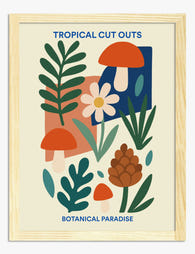
Lámina collage botánico tropical
Precio de oferta Desde €16,95€23,95 -

Lámina hojas de monstera retro
Precio de oferta Desde €16,95€23,95 -

Lienzo selva interior ecléctica
Precio de oferta Desde €65,95€93,95 -

Lámina botánica tropical alegre
Precio de oferta Desde €16,95€23,95 -

Lámina botánica vintage de palmeras
Precio de oferta Desde €16,95€23,95 -

Lámina paraíso botánico en estilo de recortes
Precio de oferta Desde €16,95€23,95 -

Lámina botánica azul petróleo de estilo clásico
Precio de oferta Desde €16,95€23,95 -

Lámina de plantas en maceta sobre fondo amarillo
Precio de oferta Desde €16,95€23,95 -

Lámina formas botánicas tropicales
Precio de oferta Desde €16,95€23,95 -

Lámina botánica moderna en verde intenso
Precio de oferta Desde €16,95€23,95 -

Lámina invernadero tropical
Precio de oferta Desde €16,95€23,95 -

Lámina guía para amantes del pan
Precio de oferta Desde €16,95€23,95 -

Lámina botánica oscura de inspiración clásica
Precio de oferta Desde €16,95€23,95 -

Lámina botánica de monstera
Precio de oferta Desde €16,95€23,95 -

Lámina botánica de monstera en verde petróleo y beige
Precio de oferta Desde €16,95€23,95 -

Lámina botánica de jardín en collage
Precio de oferta Desde €16,95€23,95 -

Lámina monstera tropical
Precio de oferta Desde €16,95€23,95


Más de The Frame

Guía completa para tu pared de galería de Roma:...
Roma es una de las pocas ciudades que te regala tres lenguajes visuales completamente distintos con los que jugar: arquitectura antigua monumental, cálidos tejados de terracota y el golpe gráfico...

La guía definitiva para montar una pared-galerí...
Una pared-galería de William Morris vive o muere por la contención. Los estampados ya hacen gran parte del trabajo, así que tu papel es darles aire, estructura y un marco...

El mayor error al decorar la pared con láminas ...
El mayor error con el arte de perros en la pared es tratarlo como una categoría aparte. No dedicarías una pared entera a “retratos humanos” o a “fotos de edificios”,...