A Visual Guide to Klimt's Patterns: Spirals, Mosaics, and Everything Between
Decode the spirals, mosaics, and geometric grids running through Klimt's most famous works, then pick the right print for your wall.

Klimt's patterns are the reason people fall in love with his work, but most shoppers can't name what they're actually looking at. This guide breaks down the recurring motifs across his decorative paintings so you can identify them at a glance and pick a print that matches the energy of your room.
Klimt's Pattern Vocabulary: An Overview
Gustav Klimt didn't paint patterns to fill space. Each motif in his Golden Phase (roughly 1903 to 1910) carries symbolic weight borrowed from Byzantine mosaics, Egyptian funerary art, Mycenaean spirals, and Japanese textiles. Understanding what you're looking at changes the print from a pretty thing on a wall into something with intent.
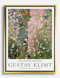
There are five core pattern families to know: spirals, triangles and grids, eye and organic forms, checkerboards and rectangles, and circles within circles. Most Klimt works mix two or three of these at once. The Kiss alone contains rectangles, circles, spirals, and gold leaf squares, all assigned to different parts of the composition for different symbolic reasons.
Once you can name the patterns, choosing between his works becomes much easier. You stop asking "do I like this?" and start asking "do I want spirals or grids on my wall?"

The Spiral: Movement, Desire, and the Stoclet Frieze
The spiral is Klimt's signature shape. He picked it up partly from Mycenaean and Minoan art he saw in museums, and partly from the swirling lines of Art Nouveau, which was the prevailing decorative movement of his era. In his hands the spiral becomes shorthand for life force, sensuality, and feminine energy.
The Stoclet Frieze, designed for a Brussels mansion between 1905 and 1911, is the clearest place to see spirals at full volume. The "Tree of Life" panel is essentially a network of curling, branching spirals in gold, each one terminating in a small rosette or eye. The whole composition reads like a single breathing organism.
You'll also find spirals on the woman's dress in The Kiss, on the floating figures in Water Serpents, and embedded in the wallpaper-like backgrounds of his portraits of Vienna society. If a Klimt print feels like it's moving even though nothing is, spirals are doing the work.
Where spirals work in a room
Spiral-heavy prints add visual motion. They suit rooms where you want softness and flow: bedrooms, reading corners, snugs. We'd avoid hanging a spiral-dense print like the Tree of Life directly above a busy patterned sofa. Give it a calm wall and let the print be the source of movement.
Triangles and Geometric Grids: Order Within Chaos
If spirals are Klimt's feminine vocabulary, triangles and grids are his structural counterweight. Look closely at the male figure in The Kiss: his robe is covered in black and white rectangles and hard-edged triangles, deliberately contrasted with the woman's swirling circles. This is the male/female pattern symbolism that runs through most of his Golden Phase work, with rectangles and verticals reading as masculine and circles and spirals as feminine.
Triangles appear elsewhere as decorative grid units, often nested or rotated. In Adele Bloch-Bauer I, you can spot small triangle clusters tucked between the eye motifs and gold panels, providing geometric rhythm against the organic swirls. They're rarely the star, but they're load-bearing.
This is where the question of klimt geometric designs meaning gets interesting. The grids aren't just decoration. They function as a frame, a sense of architectural order holding the more dreamlike elements in place.
When to choose geometric Klimt
If your space already leans soft (linen, curves, warm neutrals), a Klimt print with a strong geometric backbone gives the room a structural anchor. These prints also sit well alongside other geometric art prints in a gallery wall, because the visual grammar is consistent even when the styles aren't.

Eyes and Organic Forms: The Egyptian and Byzantine Influence
In 1903 Klimt travelled to Ravenna and saw the sixth-century Byzantine mosaics at the Basilica of San Vitale. He saw them twice that year. The trip rewired his work. The flat gold backgrounds, the frontal poses, the jewel-like fragments of colour set into shimmering mosaic surfaces: all of it shows up in everything he painted afterwards.
The eye motif is the most striking import. In Adele Bloch-Bauer I, dozens of small almond-shaped eyes float through the gold background, sometimes paired, sometimes alone. These come partly from Byzantine icon tradition and partly from Egyptian wadjet (Eye of Horus) symbolism, which Klimt would have known from Vienna's collection of antiquities. The eye carries protective, watchful associations in both traditions.
Alongside the eyes, you'll find organic forms that look like cells, seeds, or single-celled organisms under a microscope. Klimt was fascinated by contemporary biology and the early microscopy images circulating in Vienna. Some of those amoeba-like shapes in his backgrounds are essentially scientific illustrations dressed in gold leaf.
Reading the symbolism
The cluster of "is it ancient or is it modern" is exactly what makes Klimt feel timeless. The patterns reference funerary art that's 3,000 years old and biological imagery that was cutting-edge in 1905. That's the klimt pattern symbolism shoppers often sense without being able to articulate.
These eye-and-organic prints carry the most weight emotionally. They feel watchful. We'd hang them somewhere you spend contemplative time: a study, a stairwell, a hallway you walk through slowly rather than past.
Checkerboards and Rectangles: Klimt's Modernist Side
The checkerboard is the pattern people forget Klimt used, partly because it feels too clean for someone associated with gold-drenched excess. But it's everywhere once you start looking. The Stoclet Frieze frames many of its swirling sections inside hard checkerboard borders. Portrait of Friederike Maria Beer has checkerboard panels in the dress. Even The Kiss includes small rectangular gold tiles that read as a kind of irregular checkerboard.
This is Klimt the modernist. Vienna in 1900 was a hotbed of design reform, and the Wiener Werkstätte (which Klimt was closely associated with) championed clean geometric forms in furniture, jewellery, and textiles. The checkerboards in his paintings are a nod to that contemporary design language, sitting cheek by jowl with the Byzantine gold and Egyptian eyes.
Rectangles and vertical bars also dominate the man's side of The Kiss, as mentioned, and structure many of his landscape backgrounds. They're the calm in his pattern repertoire.
Pattern density and "breathing room"
If you find Adele Bloch-Bauer I overwhelming (and many people genuinely do, there's no shame in it), a more rectangle-and-checkerboard-leaning Klimt will give you the same artist with significantly more visual breathing room. Density is a real selection criterion. Some prints are saturated edge to edge; others leave generous flat zones for the eye to rest.

How to Match a Klimt Pattern to Your Room's Energy
Here's the practical part. Forget which painting is most famous. Start with the room.
Calm, restful rooms (bedrooms, reading nooks): Spirals and organic forms. Their movement is gentle and looping rather than sharp. Tree of Life detail prints, Water Serpents fragments, and the female figure from The Kiss all sit well in these spaces. Aim for a print size of around 50x70cm or 60x80cm above a bed or sofa.
Structural, considered rooms (studies, dining rooms, hallways): Geometric grids and checkerboards. These reward longer looking and don't fight with task lighting. Look for Stoclet Frieze geometric details, the male figure from The Kiss, or portrait backgrounds with strong rectangular structure.
Statement rooms (lounges, entrance halls): The eye-and-mosaic prints, especially Adele Bloch-Bauer I or full Kiss compositions. These need room to breathe. A 70x100cm framed print on a calm wall will do more than three smaller prints fighting for attention.
Period or Art Nouveau interiors: Almost any Klimt suits these, but spiral-heavy works feel most native. They share visual DNA with the broader art nouveau art prints movement, with the same whiplash curves and organic flow.
A note on colour
Klimt's gold reads as warm, not yellow. It plays well with sage green, deep navy, terracotta, plaster pink, and warm off-whites. It fights with cool greys and stark blue-whites. If your walls lean cool, the print will look like an interruption rather than a continuation. Either repaint or choose a Klimt print with more colour variety (the Tree of Life with its blues, the late landscapes with their meadow tones).
Picking Your Print: Busy Patterns vs. Restrained Geometry
The final decision usually comes down to pattern density. Here's how to think about it.
Choose a busy, pattern-saturated print if: your walls are mostly bare, your furniture is plain, and you want the artwork to be the focal point of the room. Adele Bloch-Bauer I, the full Kiss composition, and the Tree of Life in its complete form all fall here. These prints do not share attention well, but on the right wall they're remarkable.
Choose a restrained, geometry-led print if: you already have patterned textiles, books on display, or other art on adjacent walls. A Klimt landscape with restrained mosaic detailing, or a cropped detail focusing on a single geometric panel, will add depth without adding noise.
Choose a detail or crop if: you want Klimt's vocabulary without the full painting. Many of the most striking Klimt prints available now are zoomed-in fragments, a single hand from The Kiss, the eye-clustered background of a portrait, the spiralling base of the Tree of Life. These read as abstract pattern works in their own right and often suit modern interiors better than full reproductions.
On format and framing
For Klimt specifically, we lean towards framed prints over canvas. The gold detail and intricate pattern work benefit from the crispness of matte paper behind UV-protective acrylic, which keeps the colours stable even in bright rooms. A solid wood frame in oak or black echoes the architectural feel of the Wiener Werkstätte. Canvas works if you want a softer, less formal hang, but you lose a little of the jewel-like precision.
Whatever you pick, scale up rather than down. Klimt's patterns reward size. A 70x100cm print shows pattern detail a 30x40cm print simply can't. If you're hanging above a sofa or bed, the print should be roughly two-thirds the width of the furniture beneath it.

A quick pattern-to-painting reference
- Spirals: Tree of Life, Water Serpents I and II, the woman in The Kiss
- Triangles and rectangles: the man in The Kiss, Stoclet Frieze framing panels
- Eyes and organic forms: Adele Bloch-Bauer I, Judith I, Portrait of Fritza Riedler
- Checkerboards: Portrait of Friederike Maria Beer, Stoclet Frieze borders
- Circles within circles: the woman's dress in The Kiss, Hope II
Use this list when you're browsing. If you find yourself drawn to a particular Klimt print, identify which patterns are doing the work, then look for other prints in his catalogue that share the same vocabulary. That's how you build a coherent collection or a confident single-print decision.
The patterns aren't decoration. They're language. Once you can read it, choosing becomes the easy part.

Productos Fab destacados en este blog
-

Lámina árbol en espiral de Gustav Klimt
Translation missing: es.products.product.sale_price Desde €16,95€23,95 -

Lienzo árbol en espiral de Gustav Klimt
Translation missing: es.products.product.sale_price Desde €64,95€92,95 -

Lámina bosque estrellado de Klimt
Translation missing: es.products.product.sale_price Desde €16,95€23,95 -

Lámina sinfonía floral de Klimt
Translation missing: es.products.product.sale_price Desde €16,95€23,95 -
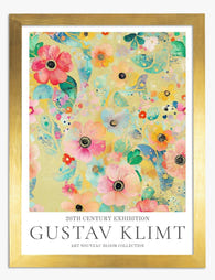
Lámina sinfonía floral de Klimt
Translation missing: es.products.product.sale_price Desde €16,95€23,95 -

Lámina sinfonía floral de Klimt
Translation missing: es.products.product.sale_price Desde €16,95€23,95 -

Lámina sinfonía floral de Klimt
Translation missing: es.products.product.sale_price Desde €16,95€23,95 -

Lienzo Sendero dorado del jardín de Klimt
Translation missing: es.products.product.sale_price Desde €64,95€92,95 -

Lámina sinfonía floral de Klimt
Translation missing: es.products.product.sale_price Desde €16,95€23,95 -

Lámina cascada de flores de Gustav Klimt
Translation missing: es.products.product.sale_price Desde €16,95€23,95 -
Lienzo sinfonía floral de Gustav Klimt
Translation missing: es.products.product.sale_price Desde €64,95€92,95 -

Lámina sinfonía floral de Gustav Klimt
Translation missing: es.products.product.sale_price Desde €16,95€23,95 -

Lienzo sendero sereno de Gustav Klimt
Translation missing: es.products.product.sale_price Desde €64,95€92,95 -

Lienzo sinfonía floral de Klimt
Translation missing: es.products.product.sale_price Desde €64,95€92,95 -

Lienzo sinfonía abstracta y vibrante de Klimt
Translation missing: es.products.product.sale_price Desde €64,95€92,95 -

Lámina sinfonía floral de Klimt
Translation missing: es.products.product.sale_price Desde €16,95€23,95 -

Lámina sinfonía floral de Klimt
Translation missing: es.products.product.sale_price Desde €16,95€23,95 -

Lámina sinfonía floral de Klimt
Translation missing: es.products.product.sale_price Desde €16,95€23,95 -

Lámina bosque bañado por el sol de Klimt
Translation missing: es.products.product.sale_price Desde €16,95€23,95


Más de The Frame

Kids' Room Art: Playful Without Childish
Most kids' room art falls into two camps: aggressively cute (rainbows, cartoon animals, alphabet posters) or weirdly adult (minimal black and white prints that could hang in a dentist's office)....

Nursery Art That Grows with the Room
Most nursery art gets retired by the time the cot comes down. That's a waste of money, wall space and the chance to build something genuinely meaningful. This guide is...

Office and Study: Art That Helps You Focus or A...
The art you hang in a workspace isn't neutral decoration. It either supports the kind of thinking you do at your desk, or it quietly works against it. The trick...