Moon Phase Wall Art: 7 Ways to Display the Lunar Cycle at Home
From minimalist horizontal rows to gallery wall integrations, here's how to display the lunar cycle without it looking like a craft project.

Moon phase art has earned its place in the modern home, but most styling advice stops at "hang them in a row" and leaves you guessing about spacing, sizing, and frame choices. The difference between a moon phase display that looks intentional and one that looks like an afterthought comes down to a few specific decisions. Here are seven ways to get it right.
The horizontal row: the classic moon phase layout done right
The horizontal row is the most recognised arrangement for a reason. Eight prints showing new moon through waning crescent read as a sequence, and the eye naturally follows them left to right the same way it reads a sentence.
Spacing is where most people go wrong. For prints sized 20x20cm or 30x30cm, leave 5 to 8cm between frames for a tight, considered look. Push it to 10 to 12cm if your wall is wider than 2 metres and you want the sequence to breathe. Anything more and the prints stop reading as a set.
The row should sit at eye level, which gallery convention puts at 145 to 150cm from floor to the centre of the artwork. Above a sofa or bed, drop the bottom edge of the frames to roughly 20cm above the furniture so the art feels anchored rather than floating.

For an eight-print sequence in 30x30cm frames with 8cm gaps, you'll need around 3 metres of clear wall, which suits most sofas, console tables, and king beds. If your wall is shorter, drop to 20x20cm prints or split the cycle into two stacked rows of four. Browse our moon art prints collection to see how the full lunar cycle reads as a set.
A note on alignment
The tops and bottoms of every frame in the row should align perfectly. Measure from the floor or the ceiling to the top edge of each frame, not the hanging hardware, because frames vary slightly in where the hook sits. A laser level pays for itself the first time you hang a sequence like this.
Vertical stacks: making moon phases work in narrow spaces
Narrow walls beside doorways, between windows, or in stairwells are the most underused real estate in any home. A vertical stack of moon phases turns that awkward 40cm-wide strip into a feature.
We'd suggest three to five prints stacked rather than the full eight, because vertical sequences over 1.5 metres tall start to feel like a column and lose their rhythm. Three 25x25cm prints with 6cm gaps gives you a stack about 90cm tall, which fits beautifully beside a doorway or above a slim console.
Vertical arrangements also work well in entryways and powder rooms, where horizontal wall space is limited but ceiling height is generous. In a hallway, hang the stack so the middle print sits at eye level, which usually means the top print starts around 175cm from the floor.
Stairwell stacks
Stairwells are the exception to the eye-level rule. Stagger the prints to follow the diagonal of the staircase, keeping the spacing between each frame consistent at 8 to 10cm. The sequence should climb with the stairs, not fight against them.
Mixing moon phases into a wider gallery wall
A full eight-print lunar cycle can dominate a room, which is sometimes the point and sometimes not. If you want moon phase imagery as a thread in a larger story rather than the headline, a gallery wall is the answer.
The ratio matters. We think moon phase prints work best as 20 to 30 per cent of a gallery wall, not the majority. Three or four phases (new, first quarter, full, last quarter, for example) mixed with botanical prints, abstract shapes, or black and white photography creates contrast without losing the celestial theme.

Cluster the moon phases together within the gallery rather than scattering them randomly. A 2x2 grid of phases in one corner of the wall, balanced by larger statement pieces elsewhere, reads as intentional. Scattered phases just look lost.
For frame consistency across a mixed gallery, pick one finish for the moon phases (we usually go black) and let the other prints vary in frame style. This gives the cycle visual cohesion within the chaos. Our wall art sets include pre-curated combinations if you'd rather not build a gallery from scratch.
Spacing within a gallery
Gallery walls use tighter spacing than standalone rows. Aim for 5 to 7cm between all frames regardless of size. The eye reads the cluster as a single composition when the gaps are consistent, even if the individual prints vary wildly in size and content.
Choosing between photography and illustration for moon phases
This is the styling decision most guides skip entirely, and it shapes the whole feel of your display.
Photographic moon phase prints, the high-detail astrophotography kind, bring drama and realism. They suit darker rooms, masculine interiors, and homes with industrial or modernist leanings. Pair them with black frames and black and white photography elsewhere in the room. They reward close viewing, which is where giclée printing on thick matte paper genuinely earns its keep, holding crater detail without glare.
Illustrated moon phases, whether watercolour, line art, or geometric, feel softer and more decorative. They work in bedrooms, nurseries, meditation corners, and any space leaning towards Scandinavian, boho, or Japandi styles. Watercolour phases in particular pair beautifully with neutral palettes and natural textures like rattan and linen.
The hybrid option is silver gelatin style prints or vintage astronomical illustrations, which give you the scientific feel of photography with the warmth of illustration. These suit traditional, library-style, or eclectic interiors with antique furniture.
Browse our minimalist art prints for the illustrated approach, or our black and white art prints for the photographic side of the spectrum.
What size moon phase prints to choose for different walls
Most moon phase displays fail because the prints are too small. A row of 13x18cm prints on a 4-metre living room wall looks apologetic. Here's how to scale properly.
Above a king or super king bed (wall width around 180 to 200cm): Eight prints at 20x20cm with 6cm spacing, or four larger prints at 30x30cm with 8cm spacing showing key phases only.
Above a three-seater sofa (wall width around 220cm): Eight prints at 25x25cm with 8cm spacing fills the space without overwhelming it. Alternatively, three statement prints at 40x40cm work if you want fewer, larger phases.
Narrow hallway or between windows (wall width 60 to 100cm): Vertical stack of three to four prints at 20x20cm, or a 2x2 grid of 25x25cm prints.
Open plan living room feature wall (over 3 metres wide): Go large. Four 50x50cm prints with 10 to 12cm spacing, or a horizontal row of eight 30x30cm prints with generous gaps. This is also where canvas can earn its place at sizes up to 100x100cm if you want a single dramatic full moon as the centrepiece.

The two-thirds rule
A reliable shortcut: your art arrangement (including spacing) should span roughly two-thirds the width of the furniture it sits above. A 200cm sofa wants an art arrangement around 130 to 140cm wide. Anything narrower looks undersized; anything wider starts to feel uncomfortable.
Frame colour and finish: matching your interior style
Frame choice is doing more work than most people realise. It either lets the moon imagery sing or buries it.
Black frames suit modern, minimalist, monochrome, and industrial interiors. They sharpen the contrast of photographic moon phases and give illustrated phases more graphic weight. This is our default recommendation for anyone unsure: a slim black frame works in 80 per cent of homes.
Natural oak or ash frames belong in Scandinavian, Japandi, and modern farmhouse interiors. The warm wood softens the celestial imagery and pairs naturally with linen, ceramics, and houseplants. Choose oak over walnut for lighter rooms; walnut works in spaces with darker floors and richer textiles.
White frames disappear against white walls, which is sometimes exactly what you want. If the print itself is doing all the work (a dramatic full moon photograph, for example), a white frame keeps the focus on the image. They suit gallery-style interiors and very minimalist spaces, but can look insubstantial against off-white or coloured walls.
Brass or gold frames lean boho, art deco, or maximalist. They work with jewel tones, velvet textures, and richer wall colours like deep green, navy, or burgundy. Use sparingly: a full eight-print row in brass is a lot, so we'd suggest mixing brass moon phase frames into a gallery wall rather than running them solo.
A practical note on quality. Cheap frames warp, especially in bedrooms and bathrooms where humidity fluctuates. Solid wood frames hold their shape, and UV-protective acrylic glaze (rather than glass) means no fading even on a sun-drenched wall, plus no risk of shattered glass if a frame falls. It also weighs significantly less, which matters when you're hanging eight of them in a row.
Where to hang moon phase art for maximum impact
Placement determines whether your display becomes a focal point or fades into the background.
Above the bed is the most popular choice and for good reason. The horizontal sequence echoes the horizontal line of the headboard, and moon imagery has obvious resonance with sleep and dreaming. Centre the arrangement on the bed (not the wall, if the bed isn't perfectly centred) and leave 20 to 25cm between the top of the headboard and the bottom of the frames.
Above a sofa works similarly. The two-thirds width rule applies, and the row should sit 20 to 30cm above the back cushions. Avoid hanging directly above where someone's head rests when they sit; aim for the centre of the sofa instead.
In a meditation or reading corner, a small vertical stack near a chair creates a contemplative anchor. Hang it so the centre print sits at the eye level of someone seated, which is around 110 to 120cm from the floor, not the standing 145cm convention.
In hallways and entryways, moon phases work as a journey. A horizontal row along a long hallway draws you down the space; a vertical stack at the end terminates the view. Lighting matters here more than anywhere else, because hallways are usually dim. A small picture light or a strip of warm LED above the artwork transforms the display after dark.

Avoid hanging moon phase art directly opposite bright south-facing windows if the prints aren't UV-protected. Direct sunlight will fade unprotected inks within months. With UV-protective glazing and museum-quality inks, this stops being a concern, but it's worth checking before you commit a sequence to a sunny wall.
A word on hanging height
The biggest mistake people make is hanging art too high. The 145 to 150cm centre rule comes from gallery curation and assumes an average standing eye level. In rooms where you spend most of your time seated (living rooms, bedrooms), drop everything by 10 to 15cm. Art is meant to be looked at, not looked up at.
Getting started
Pick your wall first, measure it properly, and work backwards to print size and spacing from there. The lunar cycle is one of the most forgiving subjects in wall art because it already comes with a built-in rhythm and sequence; your job is just to give it the room to breathe. Hang it at the height of the people who actually live there, not the height of an imagined gallery visitor, and the rest tends to fall into place.

Productos Fab destacados en este blog
-
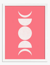
Lámina fases de la luna en rosa
Translation missing: es.products.product.sale_price Desde €16,95€23,95 -
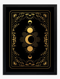 Foil dorado
Lámina de fases lunares en foil dorado
Translation missing: es.products.product.sale_price Desde €23,95€38,95 -

Lámina paisaje iluminado por la luna
Translation missing: es.products.product.sale_price Desde €16,95€23,95 -

Lienzo fases lunares en rosa
Translation missing: es.products.product.sale_price Desde €64,95€92,95 -

Lámina de yoga lunar minimalista en blanco y negro
Translation missing: es.products.product.sale_price Desde €16,95€23,95 -

Lienzo sol y luna en armonía
Translation missing: es.products.product.sale_price Desde €64,95€92,95 -

Lienzo media luna moderna y minimalista
Translation missing: es.products.product.sale_price Desde €64,95€92,95 -

Lienzo órbita en blanco y negro Madmoon
Translation missing: es.products.product.sale_price Desde €64,95€92,95 -

Lámina media luna minimalista
Translation missing: es.products.product.sale_price Desde €16,95€23,95 -

Lienzo postura de yoga del guerrero a la luz de la luna
Translation missing: es.products.product.sale_price Desde €64,95€92,95 -

Lienzo media luna minimalista moderna
Translation missing: es.products.product.sale_price Desde €64,95€92,95 -

Lienzo musa del sol y la luna
Translation missing: es.products.product.sale_price Desde €64,95€92,95 -

Lienzo yoga bajo la luna en blanco y negro
Translation missing: es.products.product.sale_price Desde €64,95€92,95 -

Lámina costa de Cornualles a la luz de la luna
Translation missing: es.products.product.sale_price Desde €16,95€23,95 -
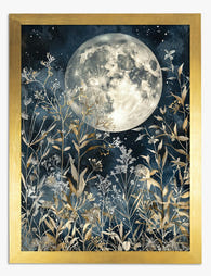
Lámina noche de flores silvestres bajo luna llena
Translation missing: es.products.product.sale_price Desde €16,95€23,95 -

Lienzo luna llena sobre flores silvestres
Translation missing: es.products.product.sale_price Desde €64,95€92,95 -

Lámina sol y luna boho minimalista
Translation missing: es.products.product.sale_price Desde €16,95€23,95 -

Lámina luna llena entre colinas brumosas
Translation missing: es.products.product.sale_price Desde €16,95€23,95 -

Lámina media luna luminosa en equilibrio
Translation missing: es.products.product.sale_price Desde €16,95€23,95


Más de The Frame

What to Hang in Awkward Corners
Corners are the dead zones of most homes. Your eye skims past them, furniture refuses to sit flush against them, and you end up with a triangular patch of wall...

Art for Narrow Walls and Hallways
Narrow walls are the most under-decorated surfaces in most homes. Not because they're hard to style, but because most advice treats every awkward space as the same problem when really...

What to Put on a Big Blank Wall
Big blank walls feel impossible because they multiply your options instead of narrowing them. Every idea seems plausible, nothing feels right, and the wall stays empty for another six months....