Why the Victorians Were Obsessed with the Night Sky: A History of Celestial Patterns
How astronomical discovery, spiritualism and Arts and Crafts philosophy collided to put stars on Victorian walls.

The Victorian era looked up. Between gas lamps, telescopes and seances, the night sky became one of the 19th century's most loaded visual symbols, and its echo still shapes how we decorate today. This is the story of how stars and moons travelled from observatories into parlours, and why they're back on the walls of modern homes.
The Victorian fascination with astronomy and the cosmos
The 19th century was the first era in which ordinary people could genuinely participate in astronomy. Telescopes became affordable for the middle classes, illustrated periodicals reproduced star charts for armchair stargazers, and public lectures on celestial mechanics drew crowds in the same way West End theatres did.
Three events in particular lit the touchpaper. The founding of the Royal Astronomical Society in 1820, granted its royal charter in 1831, gave the science institutional legitimacy. The return of Halley's Comet in 1835 was witnessed and obsessively documented by a literate public. And the discovery of Neptune in 1846, predicted mathematically before it was ever observed, felt like proof that the universe was knowable, ordered and (crucially) decorative.
Add to this the Victorian appetite for symbolism. A culture that assigned secret meaning to flowers, hair colours and fan positions was always going to find the moon and stars irresistible. By mid-century, the cosmos wasn't just science. It was sentiment, romance and mild rebellion against industrial soot, all rolled into one.

When were celestial motifs most popular? A timeline from the 1860s to 1900
Celestial decoration didn't arrive all at once. It rolled out across forty years, moving from the body to the wall in a slow, traceable arc.
1860s: Jewellery first
The first wave was personal. After Prince Albert's death in 1861, Queen Victoria's mourning aesthetic dominated jewellery for over a decade, but alongside the jet brooches a softer counter-trend emerged: crescent moons studded with seed pearls, star-set diamonds, and comet brooches commemorating Donati's Comet of 1858 and the Great Comet of 1861. These were small, intimate objects. The cosmos started out as something you wore against your skin.
1870s: Spiritualism enters the chat
The 1870s spiritualist revival, with its seances, theosophy and renewed interest in astrology, gave celestial imagery a second engine. Stars and moons were no longer just astronomical, they were occult, feminine and slightly transgressive. This is when you start to see them slip from jewellery into smaller domestic objects: book covers, embroidered cushions, ceramic tiles.
1880s to 1890s: Onto the walls
By the 1880s, celestial motifs had migrated into wallpaper friezes, textile borders and stained glass. Aesthetic Movement designers in particular loved a starry ceiling. By the 1890s, the Arts and Crafts movement was in full swing, and although its leading figures stayed largely loyal to botanical subjects, a handful of designers were quietly stitching crescent moons into the canon.
1900 onwards: Edwardian softening
The Edwardian period took the Victorian cosmos and made it lighter, more whimsical, more nursery-friendly. Pale blue grounds, silver stars, smiling moons. The seriousness of mid-Victorian celestial symbolism gave way to something more decorative and less mystical.
William Morris and the Arts and Crafts approach to celestial design
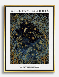
Here's where we have to be honest. If you search for William Morris celestial motifs online, you'll find a flood of products described as Morris night-sky designs. Most of them are modern creations in the spirit of Morris, not patterns he actually drew.
Morris himself was a botanical purist. His philosophy of "truth to nature" demanded direct observation: the willow he could see from his window at Kelmscott, the strawberries his daughters picked, the acanthus leaves he sketched in person. Stars and moons sat awkwardly with this. You can't really observe a constellation in the way you can observe a leaf, and the symbolic, abstracted quality of celestial imagery was closer to the medieval allegory Morris admired in manuscripts than the lived nature he wanted to celebrate in wallpaper.
So why does the pairing feel so right?
Because the broader Arts and Crafts movement absolutely embraced the night sky. C.F.A. Voysey used moons and stars in textile designs and book illustrations. Mary Jane Newill, working in Birmingham, produced wood engravings featuring crescent moons threaded between trees. Walter Crane, a Morris contemporary and friend, scattered stars across his children's book illustrations and decorative panels. The Arts and Crafts approach to celestial design was hand-drawn, slightly irregular, framed by foliage and integrated into the natural world rather than floating in cold isolation.
That's the real visual language people are reaching for when they say "Morris celestial." It's the Arts and Crafts night sky: warm, organic, with a star tucked behind a branch.

Stars, moons and comets: the specific motifs and what they meant
Victorian decorative grammar was specific. Each celestial element carried a meaning, and designers borrowed from astronomy, mythology and folk tradition in roughly equal measure.
The crescent moon
The crescent was the era's favourite. It carried associations of femininity (Diana, Selene, the goddess of the hunt), cycles (the lunar month, fertility, women's lives) and romance. The word "honeymoon" was a Victorian fixture, and a crescent moon brooch given as a wedding gift was code for the first month of married life. On wallpaper, a crescent slipped into a border could quietly signal a domestic, feminine room without spelling it out.
Stars
Stars were guidance, navigation and wish-making. Five-pointed stars were the most common, but six-pointed and eight-pointed stars carried specific religious and mystical weight. A scattered star pattern across a ground colour, what we'd now call a "star print," appeared in nursery wallpapers from the 1880s onwards, where it served the dual purpose of decoration and gentle bedtime mythology.
Comets
Comets meant change. The Donati Comet of 1858 and the Great Comet of 1861 were both extensively engraved in the popular press, and comet motifs in jewellery and decoration referenced specific events the way a commemorative mug might today. A comet brooch wasn't generic celestial decoration. It was likely a memento of a particular night sky, a particular year.
Suns and rays
Sunburst patterns, often gilded, anchored the celestial vocabulary at the masculine, daytime end. They were popular in hallway wallpapers and overmantel decoration, where their radiating geometry suited Victorian symmetry.
How celestial patterns moved from wallpaper to fine art prints
The shift from pattern to picture is the part most histories skip. For most of the Victorian period, celestial decoration was repeating, secondary, a frieze rather than a focal point. You'd have stars in your wallpaper border, not a framed picture of the moon over your fireplace.
Two things changed this. First, the rise of the chromolithograph in the 1860s and 1870s made richly coloured prints affordable for middle-class homes. Suddenly, a single celestial image, framed and centred, could be the hero of a wall. Second, the late-century vogue for astronomical illustration, popularised by figures like Étienne Léopold Trouvelot, whose pastel renderings of solar eclipses and planetary surfaces were exhibited and reproduced widely, gave the public images they actually wanted to hang.
By 1900, you could buy a print of the Pleiades, a chart of the constellations or a romantic moonrise over a marsh. The cosmos had moved from the edge of the room to the centre of the wall. Modern vintage art prints drawing on this tradition have a clear lineage to follow, and the best contemporary reproductions honour the warmth and texture of those original chromolithographs rather than reaching for a colder, more digital aesthetic.

The modern revival: why celestial decor is trending again
Celestial decoration is having its biggest moment since the 1890s. The reasons are partly aesthetic, partly cultural and partly practical.
Aesthetically, we're in a deep maximalist swing. Wallpaper is back, dark walls are back, layered textiles are back, and the muted Victorian palette of ink blue, plum, sage and ochre suits modern lighting (warm bulbs, dimmers) far better than the bright whites of the 2010s. Celestial motifs sit naturally in this palette.
Culturally, the resurgence of interest in astrology, tarot and "soft mysticism" in the 2020s mirrors the Victorian spiritualist boom of the 1870s with eerie precision. The same audience that's reading birth charts is also buying moon prints, and the visual language of the two overlaps almost completely.
Practically, celestial designs are forgiving. They work in bedrooms, bathrooms, hallways and children's rooms. They don't lock you into a colour story the way a botanical print might. And they pair effortlessly with the genuine Morris botanical canon, which is why so many people are looking for William Morris night sky art prints that bridge the two traditions.
The honest caveat: most of these designs are modern compositions in a Victorian visual idiom, not historical reproductions. That's fine. The Arts and Crafts movement was always about making, not preserving. A well-drawn contemporary celestial print in the Morris tradition is closer to the spirit of the original movement than a strictly archival reproduction.
Bringing Victorian celestial art into a contemporary home
You don't need to commit to a full Victorian parlour to use these motifs well. The trick is restraint and pairing.
Start with one statement print
Pick one large piece, 70x100cm or close, and let it anchor the room. A celestial chart, a moon study or a constellation map at this scale reads as art rather than decoration. Frame it properly. The warmth of solid wood (oak for lighter rooms, black or dark walnut for moody ones) carries the Victorian feel without tipping into pastiche. A framed art print arriving ready to hang, with the print fitted properly inside the frame rather than shipped as separate components, makes the difference between a piece that looks considered and one that looks flat-packed.
Pair celestial with botanical
This is the move. Hang a celestial print alongside a Morris-style botanical, ideally in matching frames. The pairing reproduces the actual Arts and Crafts visual logic: stars seen through branches, moons rising behind foliage. It also gives you the warmth of botanical pattern (which prevents the room from feeling clinical) with the focal drama of celestial imagery.
Mind the scale of the wall
Celestial prints reward dark walls. A deep navy, forest green or oxblood ground makes the lighter tones of a moon or star chart sing. If you can't repaint, hang the print against a dark piece of furniture (a tall bookcase, a black-painted door surround) to create a similar contrast.
Don't over-theme
A bedroom with celestial bedding, celestial curtains, a celestial rug and three celestial prints stops feeling Victorian and starts feeling like a planetarium gift shop. One or two strong pieces, in conversation with non-celestial furniture and textiles, is the Victorian approach. The 19th-century parlour was layered, not themed.

A note on light
Celestial prints often feature deep, rich grounds with bright, fine details. Direct sunlight is the enemy of any deeply pigmented print over time, though prints made with archival inks and protected by UV-resistant glazing will hold their colour for generations even in bright rooms. If you're hanging in a south-facing space, this matters. If you're hanging in a north-facing bedroom, less so.
The Victorians put the night sky on their walls because it gave them something modernity couldn't: a sense of vastness, mystery and meaning that survived industrialisation. That's not a bad reason to do the same. Pick one piece, frame it well, and give it a wall it can actually hold.

Productos Fab destacados en este blog
-
Lienzo cielo nocturno de William Morris
Translation missing: es.products.product.sale_price Desde €64,95€92,95 -

Lienzo luna celestial inspirado en William Morris
Translation missing: es.products.product.sale_price Desde €64,95€92,95 -

Lámina sueños celestiales de William Morris
Translation missing: es.products.product.sale_price Desde €16,95€23,95 -

Lienzo sueños celestiales de William Morris
Translation missing: es.products.product.sale_price Desde €64,95€92,95 -

Lámina cielo nocturno de William Morris
Translation missing: es.products.product.sale_price Desde €16,95€23,95 -

Lienzo noche a la luz de la luna de William Morris
Translation missing: es.products.product.sale_price Desde €64,95€92,95 -
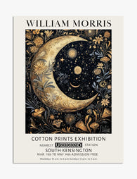
Lámina luna y estrellas estilo William Morris
Translation missing: es.products.product.sale_price Desde €16,95€23,95 -

Lámina noche de luna de William Morris
Translation missing: es.products.product.sale_price Desde €16,95€23,95 -

Lienzo jardín a la luz de la luna, inspirado en William Morris
Translation missing: es.products.product.sale_price Desde €64,95€92,95 -

Lámina botánica a la luz de la luna estilo William Morris
Translation missing: es.products.product.sale_price Desde €16,95€23,95


Más de The Frame

How to Build a Sunset Gallery Wall That Actuall...
Sunset prints are some of the most rewarding art you can hang, and some of the easiest to get wrong in multiples. Warm tones dominate, saturation levels fight each other,...

How to Display Poster Prints So They Actually L...
There is a moment in everyone's adult life when you look at the curling poster taped above your desk and realise it has to go. Not the image, that part...

Botanical Prints vs Floral Prints: Which Style ...
Most online stores use "botanical" and "floral" as if they mean the same thing. They don't. The difference shapes the mood of a room, the furniture it pairs with, and...