Why Multiple Ireland Art Prints Work Better Than a Single Statement Piece
A systematic approach to displaying multiple Irish prints together without veering into tourist-shop territory.

Ireland is too varied to capture in one image. The Cliffs of Moher in November fog, a Dublin doorway in primary red, sheep scattered across a Connemara hillside, these are different moods that belong together. A gallery wall lets you tell that fuller story without your living room looking like a souvenir shop.
Why a gallery wall works brilliantly for Ireland art
A single large print of, say, the Cliffs of Moher is a beautiful object, but it flattens Ireland into one note. You get drama without context, scenery without story. Multiple prints let you mix scale, mood, and geography in a way that feels considered rather than touristy.
There's also a practical reason. Irish landscapes share a recognisable palette of greens, greys, and slate blues, which means several prints naturally hang together as a set. That shared tonal range does the heavy lifting for you, so a gallery wall of Ireland art prints tends to look cohesive almost by default, provided you avoid a few specific mistakes we'll get to.
The third reason is rhythm. A wall with five prints invites the eye to move, pause, and return. A single print is taken in once and finished.

How many prints you actually need
The sweet spot is three to five prints for most walls. Two looks like you couldn't decide. Six or more starts to look like a museum gift shop unless the wall is genuinely vast.
Three prints work well in tighter spaces: above a console table, in a hallway, or flanking a doorway. You can run them horizontally in a row, stack them vertically, or arrange them as a triangle. Three is the easiest number to get right because there are fewer relationships between prints to manage.
Five is the magic number for a proper feature wall above a sofa or bed. It gives you enough variety to mix orientations and sizes without becoming chaotic. We'd suggest one larger anchor piece (around 60x80cm or 70x100cm) with four smaller prints (40x50cm or 50x70cm) arranged around it.
Four is the trickiest number. A 2x2 grid can look static and corporate, while an asymmetric arrangement of four often feels lopsided. If you land on four, commit to a clean grid with identical sizes and frames.
Mixing coastal, countryside, and urban Irish scenes without clashing
The instinct is to pick all coastal prints, or all green countryside, because they're "the same kind of thing." This is exactly what makes a wall feel themey rather than curated. You want variation within a recognisable family.
Our rule of thumb: aim for roughly 60% countryside and coastal, 20% architectural or urban (Dublin doors, Galway shopfronts, a Georgian terrace), and 20% detail or atmospheric shots (a stone wall, a peat fire, fog rolling over a field). That ratio gives you a wall that reads as Ireland without feeling like a tourist board commission.
The "one city scene" rule is worth following strictly. A single Dublin or Galway print acts as a punctuation mark in a wall of landscapes, adding human scale and a hit of saturated colour. Two or more urban prints in a five-piece wall and the architectural energy starts to fight the landscapes.
Mix orientations deliberately. If all five prints are landscape format, the wall feels horizontally heavy. Aim for at least one or two portrait orientations, particularly for doorway shots, lighthouses, or vertical compositions of cliffs.
Keeping your colour palette cohesive across different prints
Irish photography prints tend to fall into a recognisable palette: mossy and emerald greens, slate and charcoal greys, oatmeal and sand neutrals, and the occasional blast of saturated red, blue, or yellow from a painted door or boat. Your job is to make sure those colours talk to each other across the wall.
The simplest method is to lay all your chosen prints out on the floor and squint. If one print feels like an outlier, a sun-soaked summer field among five misty winter shots, it'll feel like an outlier on the wall too. Replace it with something that shares more tonal DNA with the others.
A useful trick is the strategic black and white print. If your selection is heavy on green and grey (which most Ireland collections will be), one black and white print acts as a visual rest stop and adds graphic contrast. We'd suggest making it the most architectural image in the set: a Dublin doorway, a stone bridge, a lighthouse.
Avoid mixing seasons too aggressively. Five prints split between deep winter, high summer, and golden autumn light will feel disjointed. Pick a dominant season and let the other prints sit within a half-step of it tonally.

The best frame colour to unify your gallery wall
If you do nothing else, match your frames. Five different prints in five different frame colours will look chaotic no matter how well-edited the images are. Five different prints in identical frames look intentional even if the images are quite varied.
You have three sensible options for Ireland art:
Black frames give the most contemporary, gallery-like result. They suit prints with strong contrast, dramatic skies, and architectural subjects. Black frames work particularly well in rooms with white or pale grey walls, and they prevent green-heavy landscapes from feeling washed out.
Natural oak or light wood frames are our default recommendation for Ireland prints. The warm tone bridges the cool greens and greys in the imagery without competing, and it softens the overall feel so the wall doesn't read as cold or clinical. This works in nearly every room.
White frames are the most minimal option and let the images speak loudest. They suit lighter, brighter Irish scenes (summer coastal shots, painted doors, harbour scenes) better than moody winter landscapes, which can look slightly anaemic against white.
Whatever you choose, the frames should match across the entire wall. The matte paper and UV-protective acrylic glaze on Fab framed prints means you don't get the glare that makes glass-fronted gallery walls hard to photograph and harder to actually look at, which matters when you've got five of them on one wall.
Layout templates: grid vs organic arrangements
There are two camps. Both work for Ireland prints, but they suit different rooms and different print mixes.
The grid layout
A grid is a clean rectangular arrangement, typically 2x2, 2x3, or 3x3, with all prints the same size and identically framed. Grids look architectural, calm, and unfussy. They suit modern interiors, hallways, and any wall where you want the prints to feel like a single composed piece rather than a collection.
Grids demand consistency. All prints should be the same orientation (all landscape or all portrait), the same size, and tightly spaced (5cm or 2 inches between frames). One off-size print and the whole effect collapses. This is where pre-built wall art sets genuinely save time, because the sizing and proportions are already worked out.
The organic (salon-style) layout
An organic layout mixes sizes and orientations around a central anchor print. It feels more relaxed, more collected-over-time, and more forgiving of varied subject matter. This is the right choice if you want to mix a large coastal landscape with smaller portrait-orientation Dublin shots.
The trick to organic layouts is keeping the outer edges of the arrangement roughly aligned to an invisible rectangle. Without that boundary, organic becomes random. We'd also suggest keeping spacing tight and consistent (around 5 to 7cm between prints) so it reads as one composition.
Step-by-step hanging guide with measurements
Don't hang anything until you've done this properly. Hammering nails based on intuition is the single biggest cause of gallery walls looking off.
1. Measure your wall. The art arrangement should fill roughly two-thirds of the available wall width. Above a 200cm sofa, your gallery wall should span around 130 to 150cm.
2. Cut paper templates. Trace each frame onto kraft paper or newspaper and cut to size. Mark the position of the hanging hardware on each template (Fab framed prints arrive ready to hang with fixtures already attached, so you can measure from the back).
3. Lay it out on the floor first. Arrange the templates on the floor in front of the wall. Photograph it. Move things around. Photograph again. Compare. This is where you catch problems before they become holes in your plaster.
4. Tape templates to the wall. Use painter's tape so it doesn't damage paint. Step back. Live with it for an hour, ideally a day.
5. Set the centre point at eye level. The midpoint of the entire arrangement should sit roughly 145 to 150cm from the floor (gallery standard). Above a sofa, leave 15 to 20cm between the top of the sofa and the bottom of the lowest frame.
6. Maintain consistent spacing. 5cm between frames for grids, 5 to 7cm for organic arrangements. Use a ruler. Eyeballing this is how walls end up looking wonky.
7. Hammer nails through the templates. This is the magic step. The template tells you exactly where to put the nail.
8. Tear off the paper and hang. The frames go straight up where the templates were.

Common gallery wall mistakes and how to avoid them
Too many Cliffs of Moher. The cliffs are stunning, but five variations of the same view is a postcard rack, not a gallery wall. One iconic landmark per wall is plenty.
Hanging too high. The most common mistake. The centre of the arrangement should be at eye level, not the top frame. Above a sofa, the bottom of your lowest frame should be 15 to 20cm above the back cushions.
Inconsistent spacing. A 3cm gap here, a 9cm gap there, and the whole thing looks accidental. Pick a number, stick to it, measure it.
All landscape orientation. Without at least one portrait print, the wall feels horizontally heavy and static. Doorways, lighthouses, and figures work well as vertical breaks.
Mismatched frames. We've said it, but it bears repeating. Frame consistency does more for cohesion than image consistency. You can mix coastal, urban, and countryside scenes happily as long as the frames agree.
Forgetting the room. A gallery wall of stormy Atlantic coastal prints above a beige sofa in a sunlit south-facing room will feel like a mismatch. Match the mood of the prints to the mood of the room. Bright, painted-door Dublin scenes for kitchens. Misty Connemara for bedrooms and snugs. Dramatic coastal cliffs for living rooms with good natural light.
Buying prints from five different sources. Even if the imagery is well-chosen, slight differences in paper finish, print quality, and frame profile will undermine the whole arrangement. Order your set together so the materials match.

A final thought before you start hammering
The difference between a gallery wall that feels curated and one that feels chaotic isn't the prints themselves. It's the discipline around them: matching frames, consistent spacing, a sensible ratio of subjects, and a paper template on the floor before any nails go in. Get those right and almost any combination of Irish scenes will hang together.
Start with three prints. See how the wall lives with them for a week. Add two more if it wants them. Restraint is doing more work than you think.

Productos Fab destacados en este blog
-
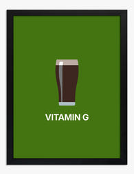
Lámina pinta de cerveza irlandesa
Translation missing: es.products.product.sale_price Desde €16,95€23,95 -

Lámina jardines botánicos de Dublín
Translation missing: es.products.product.sale_price Desde €16,95€23,95 -

Lámina sendero de jardín en Dublín
Translation missing: es.products.product.sale_price Desde €16,95€23,95 -

Lámina escena del mercado de flores de Dublín
Translation missing: es.products.product.sale_price Desde €16,95€23,95 -

Lámina de los Jardines Botánicos de Dublín
Translation missing: es.products.product.sale_price Desde €16,95€23,95 -

Lienzo jardines botánicos nacionales de Dublín
Translation missing: es.products.product.sale_price Desde €65,95€93,95 -
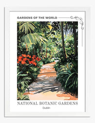
Lámina sendero de jardín en Dublín
Translation missing: es.products.product.sale_price Desde €16,95€23,95 -
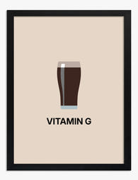
Lámina vaso de cerveza Guinness minimalista
Translation missing: es.products.product.sale_price Desde €16,95€23,95 -
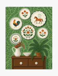
Lámina encanto folclórico con galería de platos
Translation missing: es.products.product.sale_price Desde €16,95€23,95 -

Lámina pila de libros de colores
Translation missing: es.products.product.sale_price Desde €16,95€23,95 -
Lámina reflejo a rayas
Translation missing: es.products.product.sale_price Desde €16,95€23,95 -

Lámina mercado de flores en Dublín de Matisse
Translation missing: es.products.product.sale_price Desde €16,95€23,95 -
Lámina retrato de musa campestre
Translation missing: es.products.product.sale_price Desde €16,95€23,95 -

Lienzo oasis exuberante de Dublín
Translation missing: es.products.product.sale_price Desde €65,95€93,95 -

Lienzo sendero del Jardín Botánico Nacional de Dublín
Translation missing: es.products.product.sale_price Desde €65,95€93,95 -

Lámina paisaje sereno de las Tierras Altas de Escocia
Translation missing: es.products.product.sale_price Desde €16,95€23,95 -

Lámina formas orgánicas en tonos tierra sobre verde profundo
Translation missing: es.products.product.sale_price Desde €16,95€23,95


Más de The Frame

Our Favourite Jungle Prints for Every Room: The...
Jungle prints have a reputation problem. Done badly, they tip a room into themed-restaurant territory faster than almost any other trend. Done well, they add depth, movement and a sense...

Thrushes, Hares, and Peacocks: The Animals in W...
Why Morris put animals at the centre of his designs William Morris wasn't decorating walls with cute creatures. He was making a quiet argument. While Victorian factories churned out cheap,...

From Dutch Masters to Modern Minimalism: The Ke...
Search "types of flower bouquet art" and you'll get wedding centrepieces, posy guides, and cascading bridal arrangements. Useful if you're getting married. Useless if you're trying to choose what goes...