
 Pide hoy, entrega el
 Láminas y cuadros de cielos abstractos
El cielo tratado como color más que como paisaje: atardeceres disueltos, luz de tormenta amoratada, veladuras suaves en rosa, gris y oro que se leen como estado de ánimo antes que como tema. Algunas piezas se quedan casi vacías; otras ganan peso y textura de verdad. Si prefieres la línea más firme, láminas de horizonte van más a tierra; láminas de atardeceres costeros traen un color más cálido; y láminas de paisajes abstractos llevan esa misma soltura de vuelta al suelo.


Lámina tonos azules serenos

Sunburst Over Blue Meadow Art Print

Soft Sky Watercolour Wash Art Print

Quiet Shoreline Abstract Art Print

Soft Horizon in Green and Cream Art Print
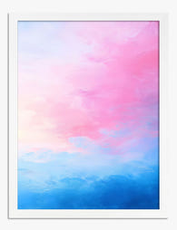
Lámina horizonte rosa

Lámina nube en cielo rosa y azul

Green Field, Blue Sky Abstract Art Print

Pastel Risograph Grid Art Print

Grey Night Sky with Stars Art Print

Lámina paisaje de la campiña inglesa en verde pastel

Lámina sombrilla de playa en bloques de color
Más colecciones de arte Fab



 Cómo elegir una lámina de cielo abstracto



Respuestas rápidas sobre dirección de color, opciones de enmarcado, dónde colocarla y qué pasa después de hacer tu pedido