Monstera, Fern, Palm, or Eucalyptus? Choosing the Right Foliage Print for Your Interior Style
A personal-shopper's guide to picking the foliage print that actually fits your room, your palette, and your mood.

Botanical prints are the safest bet in wall art, which is also why they're so easy to get wrong. The right leaf in the wrong room reads as generic, dated, or like you picked the first thing you saw. This guide cuts through the noise and matches specific foliage to specific styles, so you end up with a print that actually belongs on your wall.
Not all leaf prints are equal: why the plant you pick matters
A monstera and a sprig of eucalyptus might both technically count as "botanical," but they do completely different things to a room. One is graphic, architectural, and demands attention. The other is soft, papery, and recedes into the background in the best possible way.
Choosing foliage is really choosing a mood. Bold, structured leaves like monstera and palm bring energy and a sense of the outdoors indoors. Delicate, linear plants like ferns and eucalyptus create calm and depth without dominating. Before you start browsing foliage art prints, decide what you want the room to feel like, not just what looks pretty in isolation.
The second thing that matters is treatment. A photographic monstera against a black background is a completely different object from a pale watercolour monstera on cream. Same plant, opposite effect. We'll cover this for each type below.
Monstera prints: bold, graphic, and perfect for modern spaces
The monstera deliciosa is the architect of the houseplant world. Those split, almost cartoonish leaves photograph and illustrate beautifully because the shape itself does most of the work. A good monstera leaf print needs almost nothing else to look striking.
This makes monstera the natural partner for mid-century modern, contemporary, and minimalist interiors. If your room has clean lines, a walnut sideboard, a leather sofa with tapered legs, or warm white walls with restrained accent colours, monstera will sit perfectly in that vocabulary. The leaf is graphic enough to hold its own against bold furniture without competing.
Where monstera works best
Living rooms and home offices. The energy is alert and slightly assertive, which is what you want in spaces where people gather or focus. We'd avoid monstera in bedrooms unless you go for a very soft, illustrated version, because the visual punch can feel a bit loud at 11pm.
How to frame it
Black frames amplify the graphic quality and pull out the dark green tones. Natural oak softens it and pushes the print into warmer, more organic territory. White frames work if the rest of your room is busy and you need the print to feel airier. Avoid ornate or gold frames here. The leaf is modern, the frame should agree.

Palm leaf prints: bringing holiday energy to everyday rooms
Palm fronds carry a very specific feeling: somewhere between a Riviera hotel lobby and a Caribbean afternoon. That's either exactly what you want or completely wrong for your space, and it's worth being honest about which.
Palm leaf art prints suit coastal interiors, British colonial style, Hollywood Regency, and tropical maximalism. Think rattan furniture, linen sofas, brass accents, terracotta tiles, and walls painted in colours like clay, ochre, or deep teal. Palm prints also work beautifully in bathrooms and conservatories where the slight greenhouse energy of the room reinforces the print rather than fighting it.
The common mistake is sticking a palm print in a cool-toned Scandi room and wondering why it feels off. Palm wants warmth. It wants saturated colour around it, or at least a base of cream, sand, and terracotta tones. Drop it onto cool grey walls with a charcoal sofa and it looks marooned.
Photographic vs illustrated
A photographic palm print in deep, rich greens reads as glamorous and slightly cinematic. A line-drawn or watercolour palm reads as breezy, casual, and more suited to a relaxed coastal cottage. Pick based on whether your room is "hotel lounge" or "weekend by the sea."
Scale matters
Palms reward going big. A 70x100cm print of a single fan palm above a sofa has presence. A small palm print on a large empty wall looks like it lost its way. If you're worried about commitment, palm is the one foliage we'd push you to size up on.
Fern prints: the quiet achiever for Scandi and Japanese-inspired interiors
Ferns are the most underrated leaf in wall art. They're delicate, repetitive, slightly old-fashioned in the best way, and they bring a sense of stillness that monstera and palm simply cannot.
Botanical fern illustrations have a long tradition in pressed-plant studies and Victorian natural history plates, which is why they slot so beautifully into vintage, eclectic, and library-style interiors. But they also work brilliantly in stripped-back modern aesthetics. Scandinavian rooms with pale wood floors, white walls, and a single linen armchair come alive with a fern print because the frond's symmetry echoes the calm geometry of the space.
Japandi interiors, with their mix of Japanese restraint and Scandi warmth, are arguably the best home for fern wall art prints. The plant's fine, repeating structure feels almost like a brush stroke, which sits naturally alongside ceramics, raw wood, and paper lampshades.
Single fern or gallery wall
Ferns are the easiest foliage to gallery-wall successfully. Three or four fern studies in matching natural oak frames, hung in a tight grid, looks intentional and considered without feeling busy. Try a 30x40cm trio above a console table or down a hallway.
Frame choice
Natural wood frames, especially light oak or ash, are our default. They reinforce the botanical-study mood. If you want to lean more contemporary, slim black frames with a generous white mount also work. Avoid heavy, dark wood frames unless the rest of your room genuinely has that traditional weight.

Eucalyptus prints: soft, muted, and ideal for bedrooms
Eucalyptus is the gentlest foliage in this lineup. Those round, silver-green leaves on slim woody stems have a dusty, almost powdery quality that translates beautifully into watercolour and soft photographic prints.
This makes eucalyptus leaf prints the obvious choice for bedrooms, where you want the wall art to lower the heart rate, not raise it. The muted sage and grey-green tones sit perfectly with linen bedding, plaster pink walls, pale washed wood, and any "quiet luxury" or spa-like aesthetic. Eucalyptus also works in bathrooms (especially with the slight aromatic association people have with it) and in calm reading corners.
Why it suits minimalism
Eucalyptus has natural negative space built in. The stems are sparse, the leaves are small, and the overall composition tends to feel airy. That makes it a low-risk choice for minimalist or Scandinavian rooms where a heavier botanical would feel overstuffed.
Frame choice
Lean light. White frames, pale oak, or even a frameless canvas all let the softness of the eucalyptus breathe. Black frames can work but they tend to drag eucalyptus into something more graphic and serious, which fights the natural mood of the plant. Save the black frames for the monstera.
Pairs of stems
Eucalyptus prints often look best in pairs, either two single stems hung side by side, or a print that already shows a mirrored pair. The symmetry feels considered and works particularly well above a bed or above twin bedside tables.
Jungle leaf prints: when you want maximum impact
If monstera is one architectural leaf, a jungle print is twenty of them layered together. This is dense, dark, dramatic foliage, often photographed against deep green or near-black backgrounds, sometimes featuring banana leaves, philodendron, ferns, and tropical flowers all in one composition.
Jungle prints belong in maximalist interiors. Dark green walls, brass lighting, velvet furniture in jewel tones, patterned rugs, and a general willingness to commit. They look extraordinary in dining rooms, downstairs loos, snug rooms, and any space where you've decided that "more is more" is the brief.
The mistake here is using a jungle print as a pop of interest in an otherwise neutral room. It doesn't work that way. The print needs context. If everything around it is beige, the jungle scene looks like it walked in from a different house. Either commit to the maximalism or pick a calmer foliage.
Scale and framing
Go big or don't bother. A 70x100cm or larger canvas without a frame, or with a deep dark frame, is the right move. The mirrored-edge wrap on a canvas works particularly well for jungle scenes because nothing important gets cropped and the print feels like it extends beyond its boundaries.

Matching your foliage choice to your existing colour palette
The fastest way to ruin a foliage print is to ignore the rest of the room. Here's how to think about it.
Cool palettes (greys, blues, cool whites): Eucalyptus is your safest bet, followed by ferns. Both have grey-green undertones that harmonise rather than clash. Monstera works if the print is high contrast (black background, white leaf, or vice versa). Avoid palm and warm-toned jungle prints here.
Warm palettes (creams, terracottas, ochres, warm whites): Palm, jungle, and warm photographic monstera all sing in this context. Eucalyptus can look slightly washed out against strong warm tones, so if you do use it, look for versions with deeper green and more contrast.
Neutral palettes (beige, taupe, off-white): Almost any foliage works, which is both freeing and dangerous. The risk is the room feels too safe. Push toward stronger choices like a graphic monstera or a dense jungle scene to give the neutral palette something to lean against.
Bold or jewel-toned palettes (deep green, navy, plum): Jungle prints and dark-background monstera are made for this. Ferns can also work beautifully if they're presented as vintage botanical studies on cream, which adds a layer of contrast against rich walls.
A quick test: hold a colour swatch from your sofa, curtains, or rug against the print on screen. If the greens fight rather than relate, keep looking. Our shoppers often mention the colour feels even richer in person than on screen, which is the giclée printing doing its job, but the underlying tones still need to match your room.
Size and framing recommendations for each leaf type
A quick reference, because size is where most people hesitate.
Monstera
Go 50x70cm or 70x100cm for above-sofa or above-bed placements. Smaller than 40x50cm and the graphic impact gets lost. Frame in black for maximum modernity, oak for warmth. Photographic versions handle large scale better than illustrated.
Palm
Bigger is better. 70x100cm minimum for a single statement piece. If you're doing a pair, 50x70cm each works in a bathroom or above a bed. Natural rattan-toned wood frames lean coastal, black frames lean glamorous. Canvas works particularly well here because the matte finish flatters the saturated greens.
Fern
The most flexible. Beautiful at small sizes (30x40cm) in gallery walls, equally lovely at 50x70cm as a single piece. Natural oak frames almost always. Framed prints arrive ready to hang with fixtures already attached, which makes gallery walls considerably less painful to assemble.
Eucalyptus
Stick to medium sizes (40x50cm to 50x70cm). Eucalyptus loses its delicacy at very large scale and starts to look like wallpaper. White or pale oak frames. Pairs work better than singles.
Jungle
100x150cm canvas if you have the wall for it. The mirrored-edge wrap means none of the composition gets cut off, which matters with dense jungle scenes where the corners often hold interesting detail. Frame optional, but if you do frame it, go dark and chunky.
A final thought on mixing foliage types: it's possible, but be ruthless about one variable staying constant. Same frame across all prints, or same background colour, or same illustration style. A monstera, a fern, and a eucalyptus can absolutely live on the same wall if they share a visual language. What doesn't work is three completely different styles fighting for attention.

Pick the leaf that matches the feeling you want the room to have, not the leaf that's trending. Then commit to the right size and the right frame for that specific plant. Foliage prints fail when they're an afterthought, and they sing when they're chosen with the same care as the sofa underneath them.

Productos Fab destacados en este blog
-

Lámina hoja de monstera tropical
Precio de oferta Desde €16,95€23,95 -

Lámina monstera tropical
Precio de oferta Desde €16,95€23,95 -

Lámina hoja de monstera minimalista en beige
Precio de oferta Desde €16,95€23,95 -

Lámina hojas de monstera retro
Precio de oferta Desde €16,95€23,95 -

Lienzo moderno de hoja de monstera verde
Precio de oferta Desde €65,95€94,95 -

Lámina monstera elegante en blanco y negro
Precio de oferta Desde €16,95€23,95 -

Lienzo hojas de monstera en verde intenso
Precio de oferta Desde €65,95€94,95 -

Lámina botánica de monstera en verde petróleo y beige
Precio de oferta Desde €16,95€23,95 -

Lienzo hoja de monstera minimalista en negro sobre beige
Precio de oferta Desde €65,95€94,95 -

Lienzo monstera exuberante
Precio de oferta Desde €65,95€94,95 -

Lámina hojas grandes de monstera sobre azul sereno
Precio de oferta Desde €16,95€23,95 -

Lámina silueta moderna de monstera
Precio de oferta Desde €16,95€23,95 -

Lámina monstera junto a la piscina
Precio de oferta Desde €16,95€23,95 -

Lámina botánica de monstera
Precio de oferta Desde €16,95€23,95 -

Lienzo hoja de monstera en silueta
Precio de oferta Desde €65,95€94,95 -

Lienzo hojas de monstera con sol naranja
Precio de oferta Desde €65,95€94,95 -
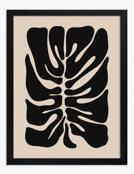
Lámina silueta moderna de monstera en beige y negro
Precio de oferta Desde €16,95€23,95 -

Lienzo momentos de monstera
Precio de oferta Desde €65,95€94,95 -

Lienzo hojas de monstera tropical pop
Precio de oferta Desde €65,95€94,95 -

Lienzo selva interior ecléctica
Precio de oferta Desde €65,95€94,95


Más de The Frame

Beyond the Fruit Bowl: Kitchen Wall Art Ideas T...
The kitchen is the most photographed, most lived-in room in your home, and yet it's usually decorated like an afterthought. A print of lemons here, a chalkboard-style coffee poster there,...

Vintage Botanical Prints in Modern Homes: How t...
Botanical prints have a reputation problem. Done badly, they read as chintzy, twee, or straight out of a 1980s guest bedroom. Done well, they're one of the most timeless things...

The Complete Guide to Decorating with Botanical...
Botanical prints are the closest thing interior design has to a universal donor. They work with almost any style, palette, and period. Almost. This is a room-by-room guide with specific...