Foil Printing vs Metallic Printing: What's the Difference and Why It Matters for Your Walls
One uses real metal leaf, the other uses sparkly ink. The difference shows up the moment light hits your wall.

Two prints can both be marketed as "metallic" and behave completely differently on your wall. One catches light like a mirror as you walk past. The other sits flat and slightly grey, looking nothing like the product photo. The difference comes down to how the metal effect is actually made, and it's worth understanding before you spend money on a statement piece.
The basics: how foil is applied to art prints
Foil printing uses real metal. A thin layer of metallic film, usually aluminium with a coloured pigment coat, gets transferred onto paper using heat and pressure. The foil sits on the surface of the print as a physical layer, which is why you can sometimes feel it with a fingertip.
There are two main methods. Hot foil stamping uses a heated metal die to press the foil onto specific areas of the design. Cold foil uses adhesive applied by a printing plate, with the foil bonded to the glue under pressure rather than heat. Both produce that signature mirror-like reflectivity. For wall art, hot foil stamping is the more common premium technique because it gives crisper edges and a denser metallic finish.
The key thing to understand: foil is a physical material applied on top of the paper. It is not ink. That single fact explains almost everything that follows.

How metallic ink printing works (and where it falls short)
Metallic ink is exactly what it sounds like: ink with tiny metallic particles, usually aluminium or bronze flakes, suspended in the pigment. When the ink dries, those particles sit on the paper and reflect a small amount of light. The effect is shimmery rather than mirror-like. Think of the difference between glitter and a polished spoon.
Metallic ink can look genuinely beautiful on the right substrate. Printed on heavy coated paper with the right press setup, it produces a soft pearlescent glow that feels expensive. The problem is most metallic ink prints sold online are not produced this way. They are printed on uncoated or lightly coated stock with consumer-grade equipment, and the metallic effect arrives looking flat, dull, and slightly grey.
There's also a longevity issue. Metallic inks contain pigment binders that can become brittle as they age, particularly when exposed to fluctuating humidity or direct sunlight. Over years of display, you may see fine cracking in heavily inked areas. Foil, being solid metal bonded to the paper, doesn't suffer from this in the same way.
Then there's the imposter problem. Quite a lot of "metallic" prints sold online aren't using metallic ink at all. They're standard CMYK digital prints where the designer has used grey or beige tones to suggest a metallic look. No actual reflectivity. Just a clever colour palette. If a print costs the same as a regular giclée and ships within 48 hours, that's usually what you're getting.
Side-by-side: light, texture, and depth compared
Put a foil print and a metallic ink print next to each other on a wall and the difference is immediate.
Reflectivity. Foil throws light. In a sunlit room, gold foil detailing will catch the light and bounce it back at full intensity, almost like a small mirror set into the page. Metallic ink, even good metallic ink, glimmers softly. It picks up light but doesn't return it with the same force.
Texture. Foil has a perceptible physical presence. Run your finger across a hot-stamped area and you can feel the slight raised edge where the foil sits proud of the paper. Metallic ink sits flush with the surface. This matters for how the print reads up close, which is exactly how art prints get viewed in real homes.
Depth. Because foil reflects light directionally, it creates a sense of dimension that flat ink cannot replicate. A foiled leaf in a botanical print looks like it has actual surface, not just a printed colour. Metallic ink reads as a printed effect, even when it's well done.
Colour fidelity. Metallic ink tends to mute the colours around it because the metallic particles diffuse light. Foil, being a separate surface layer, doesn't interfere with the giclée colours underneath. You get full colour intensity plus the metallic detail, rather than one compromised by the other.
Why foil art looks different depending on where you stand
This is the part that genuinely surprises people the first time they own a foil print. The artwork changes throughout the day.
Stand directly in front of a foil print at noon and the foiled areas might look almost white as they reflect ceiling light back at you. Walk past it in the evening with a single warm lamp on and the same areas glow deep amber. From an oblique angle, the foil might recede and the print reads almost like a regular giclée. Step in front of it and the metallic detail flares back into view.
This is what makes foil art prints particularly suited to spaces where you spend time at different times of day, like lounges, dining rooms, and hallways. The artwork is never static. It responds to morning sun, lamp light, candles, and overhead lighting differently, which keeps it interesting in a way that a flat print cannot match.
Metallic ink doesn't do this in the same way. The shimmer is consistent regardless of angle because the metallic particles are scattered randomly within the ink. You get a pleasant sparkle, but not the dramatic shifts in appearance.

What to look for when buying metallic or foil prints online
Online shopping for this category is full of pitfalls. Here's how to tell what you're actually getting.
Look for the word "foil" used specifically. Real foil sellers will say "gold foil," "copper foil," "hot stamped foil," or "foil detailing." If the product description uses vague terms like "metallic finish," "shimmer print," "metallic effect," or "foil look," that is usually code for "this is not actually foil." Genuine foil printing requires expensive equipment and slower production, so anyone using it tends to advertise it clearly.
Check the paper specification. Foil bonds best to smooth, coated, or heavyweight matte papers. If the print is described as standard 200gsm copy stock or there's no paper weight mentioned at all, the foiling is unlikely to be high quality. Premium foil prints sit on thick, archival paper because the substrate matters as much as the foil itself.
Look at how product photography handles the metallic areas. Honest sellers will show the print at multiple angles, often with one image where the foil is catching strong light and another where it's not. If every photo looks identical and the metallic effect appears uniform from every angle, you're probably looking at digital renders rather than photographs of the actual product.
Be cautious of suspiciously fast shipping on metallic prints. Real foil prints, especially when combined with giclée printing, take time to produce. Anything that ships same day from a warehouse is almost certainly mass-produced with a digital metallic effect rather than genuine foil stamping.
Ask about framing. A common failure point with metallic and foil prints is poor framing: prints arriving warped, frames shipped separately to be assembled by the buyer, or foil getting scuffed in transit because it wasn't properly fitted. The best framed art prints arrive with the print already mounted, the frame already assembled, and fixtures already attached. One box, ready to hang.
Read the returns policy. Foil quality is genuinely hard to judge from a screen. A generous returns window matters more here than for standard prints. If the seller offers 14 days, that's not enough. If they offer something close to 100 days, they're confident the product looks good in person.
How giclée printing and foil detailing work together
This is where premium wall art separates itself from everything else, and almost no one talks about it.
Giclée printing is a high-resolution archival process that uses pigment-based inks sprayed onto thick matte paper. It produces incredibly fine detail, accurate colour, and depth that holds up to close viewing. It's the standard for gallery and museum reproductions.
Foil detailing on its own is striking but limited. You can foil the whole print, but then you lose all the colour and tonal range. The really sophisticated approach is to print the full artwork in giclée first, then apply foil selectively to specific elements. A botanical illustration where the leaves are full-colour giclée and the veining is gold foil. A typographic piece where the background is deep navy giclée and a single word is copper. An abstract where the gradient washes are giclée and a geometric shape is silver.
This combination gives you the best of both. The giclée handles colour, depth, and detail. The foil adds dimension, reflection, and a focal point that catches the eye as you move through the room. The result is an art print that genuinely changes throughout the day rather than sitting flat on the wall.
The technical requirement for this to work is precise registration: the foil has to land exactly where the giclée print expects it. A misalignment of even a millimetre is visible. This is why decent foil-and-giclée combinations are made to order rather than mass produced. The print is run, then the foil is applied with the design positioned exactly to match.

Does foil art fade? Longevity and UV protection explained
Short answer: properly made foil art is one of the most durable wall art formats you can buy, but only if the giclée elements and the framing are handled correctly.
Foil itself doesn't fade. It's metal. Sunlight can dull the protective coating over decades, but the metallic layer underneath remains reflective. Where fading happens is in the printed elements around the foil. Cheap dye-based inks will lighten and shift in colour within a couple of years of being hung in a sunny room. Pigment-based giclée inks, particularly the museum-grade type, are rated to last hundreds of years even in direct sunlight without significant fading.
The other variable is UV protection in the framing. Standard glass blocks some UV but not all. UV-protective acrylic glaze blocks the vast majority of damaging wavelengths while also being significantly lighter than glass and safer if it ever falls. For foil prints in particular, acrylic has another advantage: no glare. Glass under a foil print can cause the reflections to compete with the foil's natural reflectivity, creating a confused visual effect. Matte acrylic glaze lets the foil be the only thing reflecting light from the artwork.
Metallic ink longevity is more variable. Quality metallic inks on coated stock can last decades. Lower-quality versions, particularly digital toner-based "metallic" outputs, tend to degrade more quickly. The metallic particles can dull as the binder breaks down, and you may see fine cracking in densely inked areas after several years on a wall, especially in rooms with humidity changes.
For longevity, the order of preference for wall display is roughly: hot foil on archival paper with UV-protective framing, high-quality metallic ink on coated stock with UV-protective framing, then a long way down, digital metallic effect prints with no protection.
What this all means for your next purchase
If you want a genuine, long-lasting metallic effect that responds to light and feels like a real piece of art, foil printing is the answer, particularly when combined with full-colour giclée. Yes, it costs more. The production is slower, the materials are more expensive, and the registration tolerances are tighter. For a single statement piece in a room where you want something that earns its place on the wall, that premium is generally worth it.
If you want a softer, all-over shimmer across a larger area, well-made metallic ink on coated paper does a job foil can't. Just verify the substrate and the printing method before you buy, and assume that any product described in vague metallic-adjacent language is probably neither.
The questions to ask before clicking buy: Is it actual foil or a digital effect? What paper is it printed on? Is the frame fitted properly before shipping? What's the returns window? If a seller can answer those clearly, you'll almost certainly get something you're happy to live with.


Productos Fab destacados en este blog
-
 Foil plateado
Lámina bola de espejos en foil plateado
Translation missing: es.products.product.sale_price Desde €23,95€38,95 -
 Foil dorado
Lámina reseña de chef en foil dorado
Translation missing: es.products.product.sale_price Desde €23,95€38,95 -
 Foil dorado
Lámina marea dorada con foil dorado
Translation missing: es.products.product.sale_price Desde €23,95€38,95 -
 Foil dorado
Lámina minimalista con foil dorado
Translation missing: es.products.product.sale_price Desde €23,95€38,95 -
 Foil dorado
Lámina bosque dorado con foil dorado
Translation missing: es.products.product.sale_price Desde €23,95€38,95 -
 Foil dorado
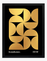
Lámina Bauhaus geométrica con foil dorado
Translation missing: es.products.product.sale_price Desde €23,95€38,95 -
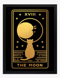 Foil dorado
Lámina luna mágica y gato en foil dorado
Translation missing: es.products.product.sale_price Desde €23,95€38,95 -
 Foil dorado
Lámina brillo infinito en foil dorado
Translation missing: es.products.product.sale_price Desde €23,95€38,95 -
 Foil dorado
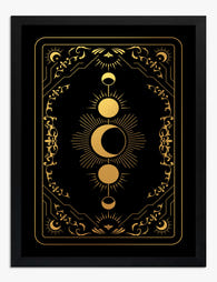
Lámina de fases lunares en foil dorado
Translation missing: es.products.product.sale_price Desde €23,95€38,95 -
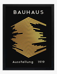
 Foil dorado
Lámina geométrica Bauhaus con foil dorado
Translation missing: es.products.product.sale_price Desde €23,95€38,95 -
 Foil dorado
Lámina Matisse lanzador de cuchillos en foil dorado
Translation missing: es.products.product.sale_price Desde €23,95€38,95 -
 Foil dorado
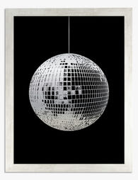
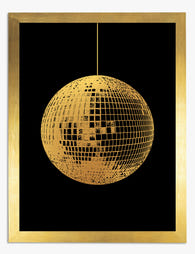
Lámina bola de discoteca en foil dorado
Translation missing: es.products.product.sale_price Desde €23,95€38,95 -
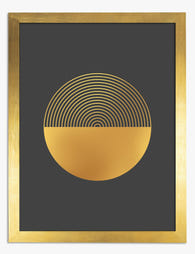
 Foil plateado
Lámina círculo infinito en foil plateado
Translation missing: es.products.product.sale_price Desde €23,95€38,95 -
 Foil plateado
Lámina media luna en foil plateado de lujo
Translation missing: es.products.product.sale_price Desde €23,95€38,95 -
 Foil dorado
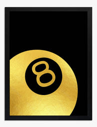
Lámina bola 8 en foil dorado
Translation missing: es.products.product.sale_price Desde €23,95€38,95 -
 Foil dorado
Lámina El cumplimiento con foil dorado de Gustav Klimt
Translation missing: es.products.product.sale_price Desde €23,95€38,95 -
 Foil dorado
Lámina Ícaro con foil dorado de Matisse
Translation missing: es.products.product.sale_price Desde €23,95€38,95 -
 Foil dorado
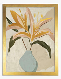
Lámina de lirios con foil dorado
Translation missing: es.products.product.sale_price Desde €23,95€38,95 -
 Foil dorado
Lámina bosque nocturno con luna y estrellas en foil dorado
Translation missing: es.products.product.sale_price Desde €23,95€38,95 -
 Foil dorado
Lámina lanzador de cuchillos con foil dorado inspirada en Matisse
Translation missing: es.products.product.sale_price Desde €23,95€38,95


Más de The Frame

How to Build a French-Themed Gallery Wall That ...
A French-themed gallery wall can go one of two ways: refined Left Bank apartment, or first-year student dorm with a beret problem. The difference is not the prints you choose....

Best Labrador Wall Art: Styles, Ideas, and What...
You love your labrador. That doesn't mean your hallway should look like a tribute to him. This is a style-first guide to choosing labrador wall art that earns its place...

How to Display Botanical Prints: Layouts, Frame...
Botanical prints are some of the easiest art to buy and some of the hardest to hang well. The detail rewards close looking, the proportions are often unusual, and the...