How to Create a Gallery Wall Without Overthinking It
No templates, no rulers - just our simple approach to creating a gallery wall that feels effortlessly you.
You've been staring at that empty wall for months. You have art you love, but every time you think about creating a gallery wall, your brain starts spiraling. How many pieces? What spacing? What if it looks wrong?
Here's the thing about gallery walls. The ones that look effortless usually weren't planned to death. They grew organically, piece by piece, adjustment by adjustment. And that's exactly how you should approach yours.
Why Gallery Walls Feel So Intimidating

Gallery walls have gotten a reputation for being tricky. You see those perfect Pinterest grids and think there's some secret formula you don't know. But most of those perfectly arranged walls were styled for photos, not real life.
The pressure to get it right the first time stops people before they even start. You worry about holes in the wall, about whether the spacing is perfect, about what happens if you want to change something later.
But here's what I've learned from helping people hang art. The best gallery walls happen gradually. You start with a few pieces, live with them, then add more when it feels right.
Start With What You Actually Love
Don't think about the wall first. Think about your art. Which pieces do you genuinely love looking at? Which ones make you feel something good when you see them?
Start there. Not with measurements or templates or color coordination, but with the art that matters to you. Everything else can work around that.
Maybe you have one large piece that always makes you happy. Or two smaller prints that you bought on the same day and just feel connected. Those are your anchor pieces. The rest of the wall builds around them.
The Magic of Imperfect Balance

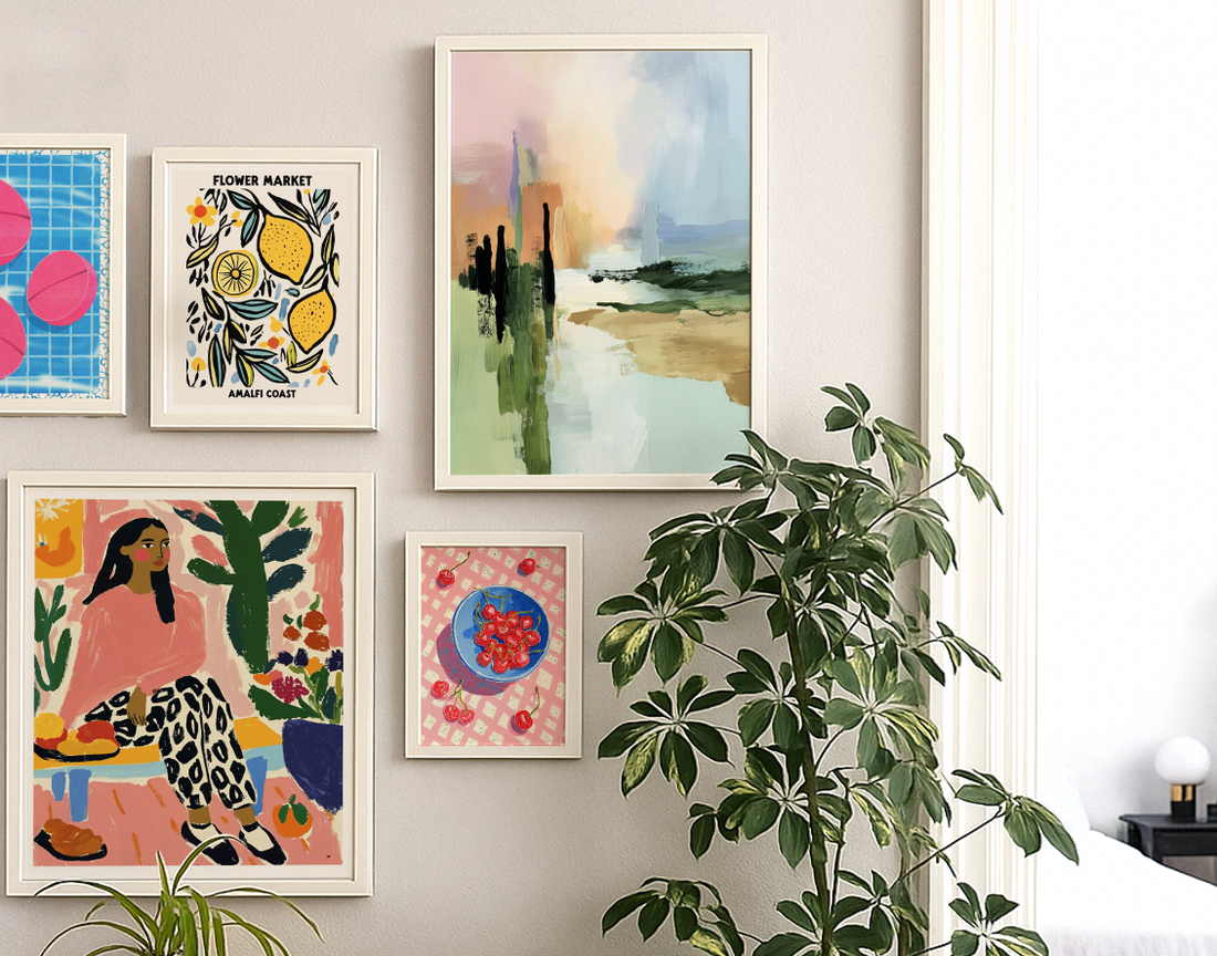
Perfect symmetry looks great in magazines, but it can feel stiff in real homes. What you want is visual balance, not mathematical precision. That means some pieces can be bigger, some smaller, some higher, some lower.
Think of it like balancing a scale, but with your eyes instead of weights. A large piece on one side might balance with two smaller pieces on the other. A dark, heavy print might need a lighter, brighter piece across from it.
This is where mixing abstract and figurative prints actually helps. The variety creates visual interest, and the different styles balance each other out naturally.
Spacing That Feels Right

The standard advice is 2 to 3 inches between frames. But in real life, spacing depends on your pieces, your wall, and what looks good to your eye.
Closer spacing makes a gallery wall feel more cohesive, like one big installation. Wider spacing lets each piece breathe on its own. Both approaches work, just for different feelings.
Here's the trick. If your pieces are similar in size and style, you can space them closer together. If they're all different, give them a bit more room so they don't compete with each other.
Frames That Work Together
Your frames don't have to match exactly, but they should feel like they belong in the same room. Similar colors, similar styles, or similar proportions.
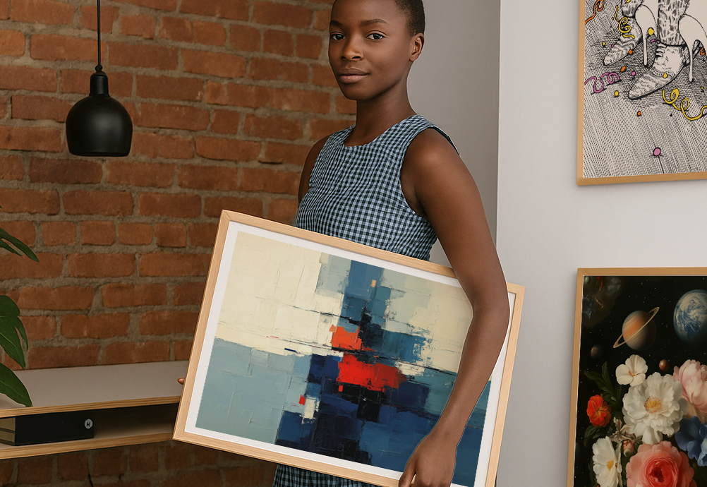
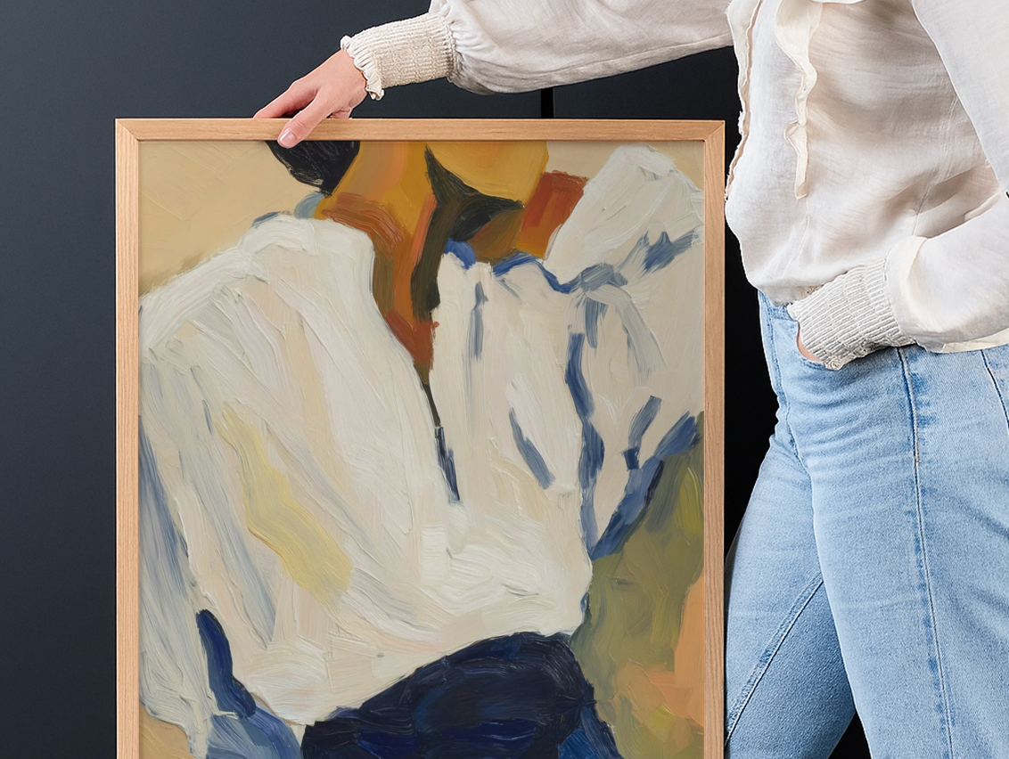
Framed vs unframed becomes interesting in gallery walls. You can mix both, but be intentional about it. Maybe your largest piece is unframed while the smaller ones have simple frames. Or maybe everything is framed except for one standout piece.
The key is having some element that ties everything together. Similar frame colors, similar matting, or just similar proportions between the art and the frames.
Layout Without the Stress
Here's where most people get stuck. They try to plan the perfect arrangement before hanging anything. But your wall isn't a puzzle with one right solution.
Try this instead. Lay your pieces on the floor roughly in the shape of your wall space. Move them around until something feels right. Take a photo with your phone so you remember the arrangement.
Or just start hanging. Put up your favorite piece first, in roughly the right spot. Then add the next piece in relation to that one. Keep going until it feels complete.
Working With What You Have
Your wall might not be perfectly centered above your sofa. Your ceiling might be lower on one side. Your furniture might be an odd size. Work with these quirks instead of against them.
How to arrange art above furniture isn't always about perfect proportions. Sometimes it's about making your specific space feel balanced and intentional, even if it wouldn't work in someone else's home.
If your wall is narrow, a vertical arrangement might work better than spreading things out horizontally. If your ceiling is low, keeping your arrangement lower and wider can make the room feel more proportional.
The Paper Template Trick
If you're nervous about making holes in the wall, cut paper templates the same size as your frames. Tape them up and live with the arrangement for a few days.
This lets you see how the spacing feels, how the proportions work with your furniture, and whether you want to add or subtract anything. Plus, you can move paper around as much as you want without worrying about wall damage.
Once you're happy with the paper version, use the templates as guides for hanging the real pieces.
Starting Small and Growing
You don't have to fill your entire wall at once. Start with two or three pieces that work well together. Live with them for a while. See what feels missing or what would make the arrangement feel more complete.
Gallery walls are living things. They can grow and change as you find new pieces or as your taste evolves. In fact, the best ones usually do.
This approach takes the pressure off getting everything perfect immediately. You can add pieces when you find them, remove pieces that stop working, or rearrange everything when you feel like a change.
When to Stop Adding
The hardest part of gallery walls might be knowing when to stop. There's always room for one more piece, right?
But more isn't always better. Pay attention to when your wall starts feeling cluttered instead of curated. When new pieces compete for attention instead of adding to the overall feeling.
A good gallery wall has some breathing room. Not empty space, but space that lets each piece contribute without shouting over the others.
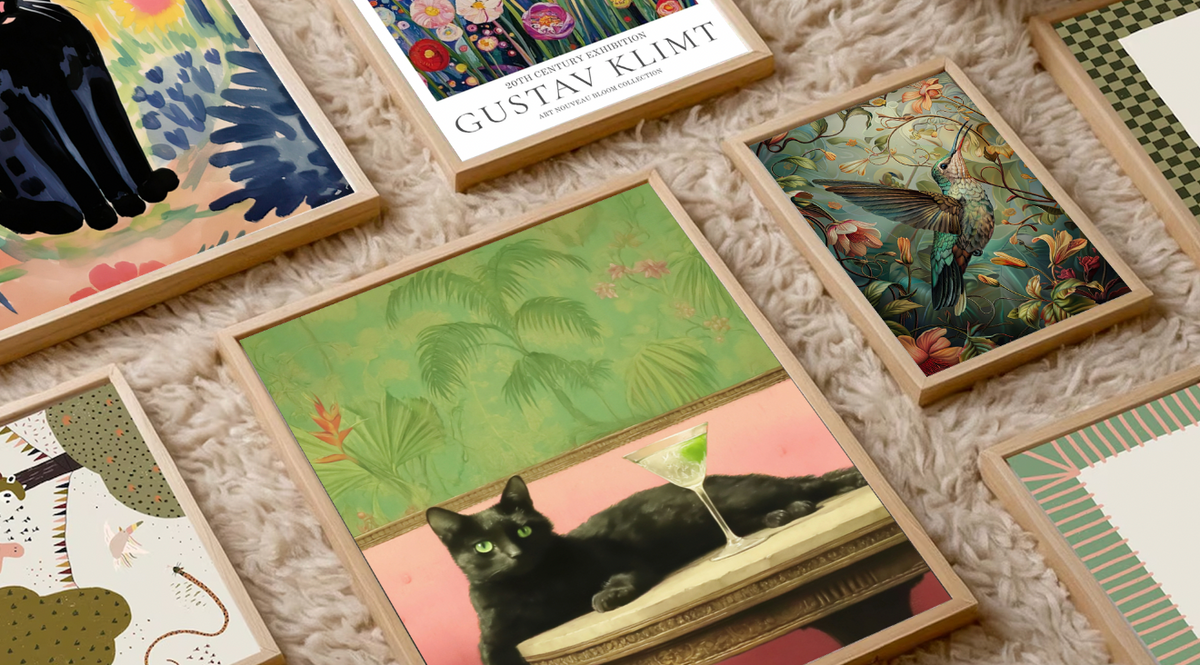
Mixing Sizes Without Chaos
Variety in sizes makes gallery walls interesting, but too much variety makes them chaotic. A good rule of thumb is to have one or two larger pieces as anchors, then fill in with smaller pieces.
Think about visual weight, not just physical size. A small black and white photograph might have as much impact as a larger, softer print. A busy, detailed piece might need more space around it than a simple, minimal one.
The goal is rhythm. Your eye should be able to move around the wall comfortably, stopping at interesting pieces without getting stuck or overwhelmed.
Hanging Hardware That Actually Works
Picture ledges are great if you want to change your arrangement regularly. You can lean pieces against the wall and move them around without making new holes.
Traditional hanging works too, but invest in good picture wire and hooks rated for the weight of your pieces. Gallery walls often end up heavier than you expect when you add up all the frames.
And here's something most people don't think about. If you're hanging multiple pieces, consider using a level to keep your horizontal lines straight. Even if your arrangement is organic, having some consistent reference points makes everything look more intentional.
Living With Your Choices
Once your gallery wall is up, give it time before you decide whether it works. Wall arrangements often need a few days to settle in. What feels wrong on day one might feel perfect on day three.
And if something really doesn't work, change it. Move pieces around, swap something out, add something new. Gallery walls aren't permanent installations. They're reflections of your taste and your life, and both of those evolve.
The best gallery walls feel personal and lived-in, not styled for a magazine. They tell the story of what you love, what catches your eye, what makes you feel at home in your space.
Ready to start your own gallery wall? Choose pieces that speak to you, trust your eye for balance, and remember that the best arrangements grow over time. Build your wall your way — and let it grow from there.
Fab products featured in this blog
-

Soft Florals Gallery Wall Art Print Set
Desde €54,95 -

Lámina flujo iridiscente
Desde €16,95 -

Lámina armonía naranja de Friedel Dzubas
Desde €16,95 -

Lámina cascada serena de Hokusai
Desde €16,95 -

Lámina ventana soleada, cóctel y cielos azules
Desde €16,95 -

Lámina ciruelas doradas del huerto
Desde €16,95 -

Lámina palmeras con hamaca
Desde €16,95 -

Lámina palmeras con hamaca dorada minimalista
Desde €16,95 -

Lámina musa en jardín de limones y tomates
Desde €16,95 -

Lámina eclipse boho minimalista
Desde €16,95 -

Lámina mujer serena en reposo
Desde €16,95 -

Lámina de utensilios de cocina inspirada en Matisse
Desde €16,95


More from The Frame
More stories, insights, and behind-the-scenes looks at the art that transforms your space.
Top Wall Art Trends for 2025: What's In, What's...
Trends aren't rules to follow blindly. They're signals about where our collective taste is heading, what's capturing our imagination, and what feels fresh right now. The wall art trending in...
Art for Gifting: How to Choose a Print for Some...
Giving someone art is either incredibly thoughtful or slightly terrifying. There's no middle ground. On one hand, you're giving them something beautiful that will live in their home for years....
9 Art Prints That Instantly Elevate Any Living ...
You know that feeling when you walk into a beautifully styled living room and everything just feels right? It's not the expensive sofa or the perfect rug. It's usually the...